
Latin category Morisawa Award
Bronze Prize
Loica
Designer
José Solé
Chile
José has been designing and making fonts for more than 12 years. He studied Graphic Design at Universidad Diego Portales in Santiago, Chile. He used to work at Dalton Maag where he was lead designer in projects such as the Lomino family for Magic Leap, Netflix Sans family extension, Agoda Sans Text and Display for Agoda. He currently works as a freelance type designer and engineer.
Judges’ Comments
-
Laura Meseguer
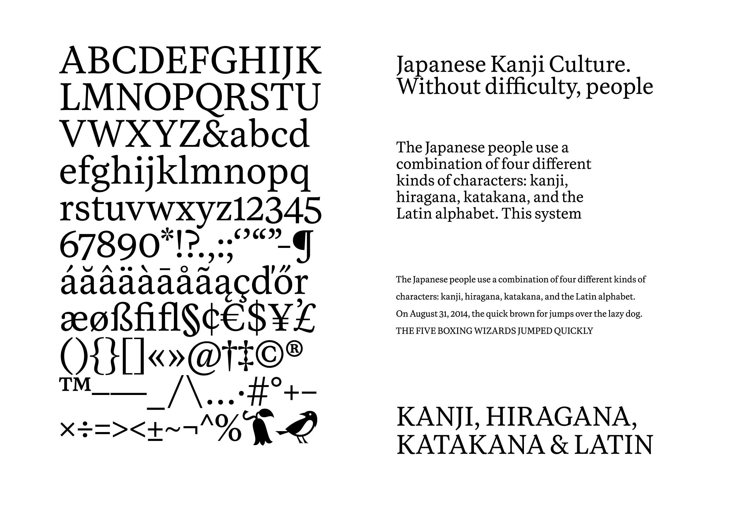
This design radiates warmth and a sense of calm above all else. In long texts, it remains clean and distraction-free, providing excellent readability and quality as a text type. The Bold style conveys a sturdy feel, with a nice attention to detail where the linear design of the “u” in the Regular style shifts to a non-linear form in Bold. The inclusion of the cute bird emoji hints at its intended use for creative texts such as poetry. It would also perform well as a screen font.
-
Ilya Ruderman
Over the past decade, the definition of “readability” in text fonts or typefaces has gradually changed, and its interpretation may also vary among type designers. I define “high readability” as being unobtrusive, not interfering with the reading experience, and not overly assertive. This typeface precisely embodies this definition. In the past, it was challenging to balance this concept with a designer’s ideas and preferences, but this design successfully achieves that balance.
-
Indra Kupferschmid
This typeface may not stand out as particularly experimental compared to other designs, but it is outstanding in its timeless design and excellent drawing and spacing quality. It exudes a warm atmosphere – the letter “g,” for instance, reminds me of a cozy jumper – gets out of the way and lets the content shine.
Intention of the work
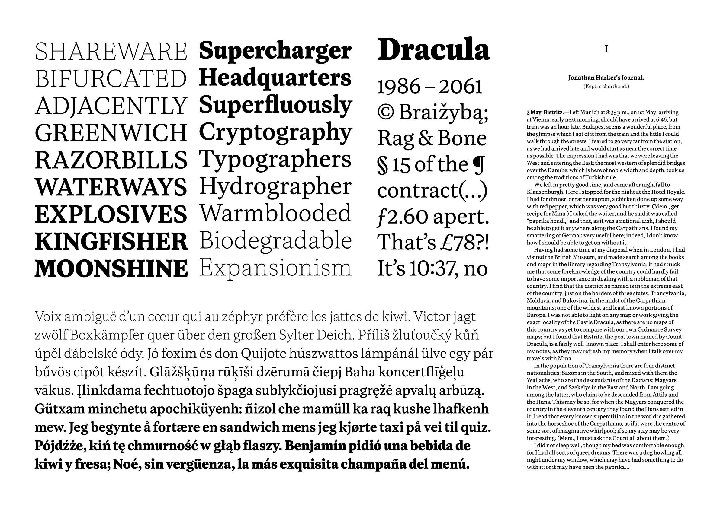
Loica started more than 10 years ago as an attempt to learn what goes into designing an “old-style” typeface. Over the years, the design has evolved along with my shifting perspective on type design. As such, this typeface has had many past lives. As I gained experience and started thinking more about the expressive quality of type, I began to modify the original design to make the letters more lively, but in a subtle way; comforting, warm, gentle. The family has bookish leanings, though it can fit well in editorial environments.
Winner’s Comment
It’s been an honor to participate in this prestigious award. Being a finalist brings me great joy, considering the esteemed panel of judges, and it provides a great level of validation for all the hard work I put into Loica.