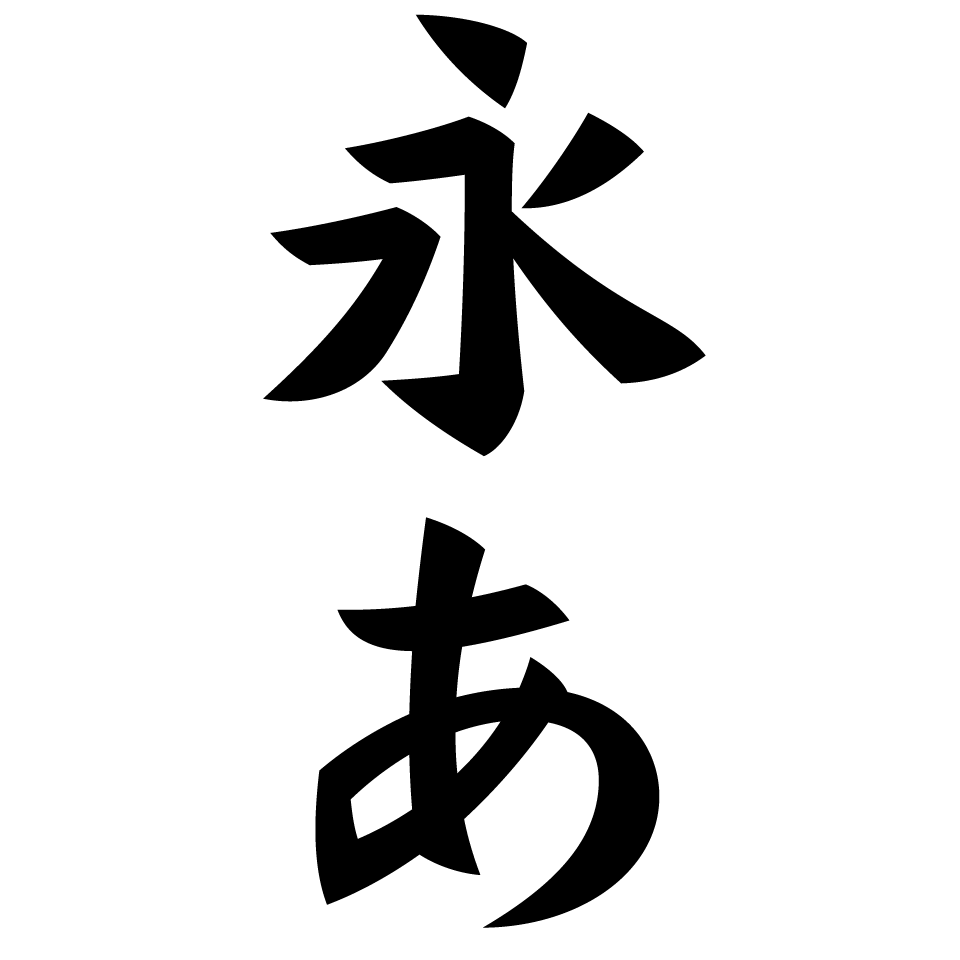
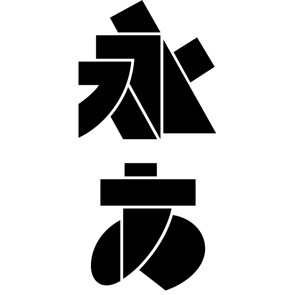
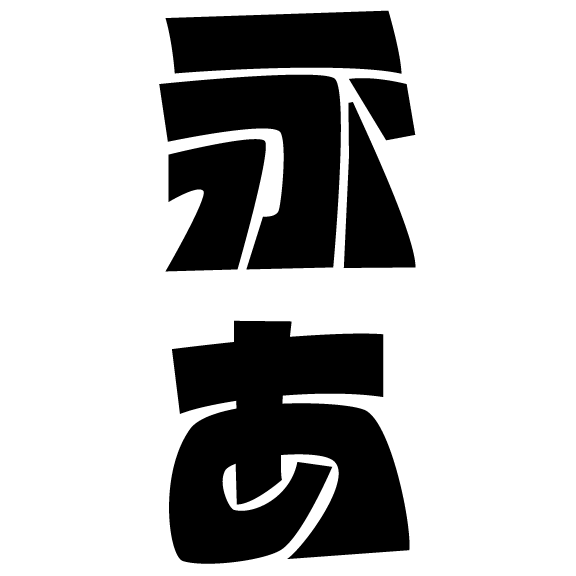
Inspired by the elegant structure of the kaisho (block style), this display type is made up of extremely abstracted outlines. By using a combination of long and short strokes and sharp terminals, I created a bold font without overcrowding the space, but with a good balance of impact and lightness. Because the triangular dot strokes look like buckwheat seeds, I named it Kuromugi (くろむぎ, old Japanese for “buckwheat” meaning “black buckwheat”).
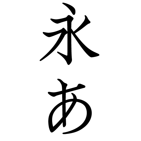
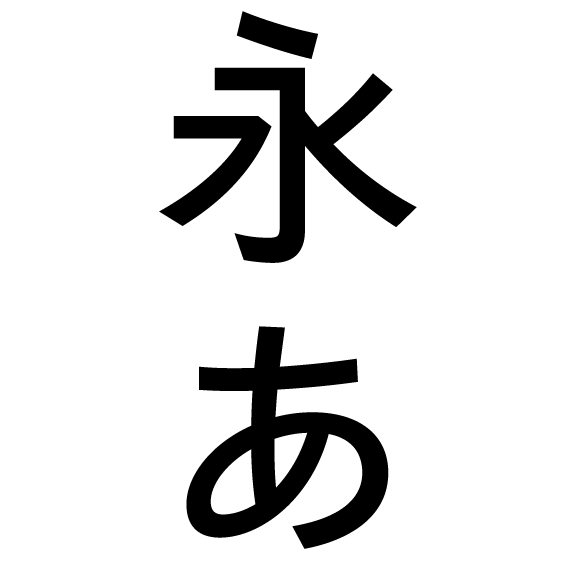
Focusing on the Insho (印象, meaning “impression” in Japanese) that each character’s shape evokes, which first caught my attention, I emphasized the sensory aspects of their appearance and feel rather than on correctness.
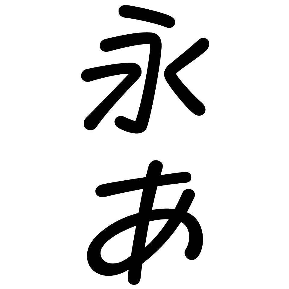
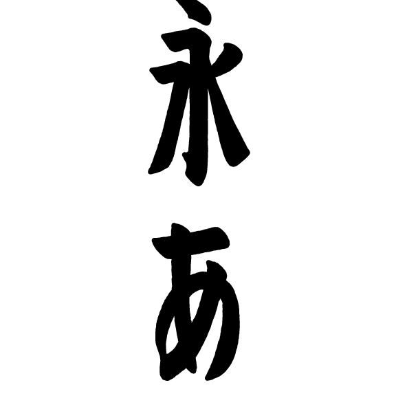
This font is based on the handwritten text used in four-panel comic strips from newspapers in the 1960s and 70s. I tried to capture the way characters are tightly packed into a limited space, and the distinctive handwriting of a cartoonist. The goal was to create handwritten characters that would stand out in a vertical setting, which has a different quality to the modern horizontal writing style.