
Japanese category Morisawa Award
Gold Prize
Kuromugi
Designer
Yoshihiko Toya
Japan
Born in Kagoshima Prefecture in 1992. Completed the Master’s Program at the Graduate School of Systems and Information Engineering, University of Tsukuba, in 2018. Interested in all aspects of typography, he studied serif typefaces at Mojijuku (Tokyo) for two years while at university. Works as a programmer.

Judges’ Comments
-
Osamu Torinoumi
While the characters are made up of hand-cut lines, like those in folk art and woodblock prints, this typeface has a handwritten feel. The spacing in the kanji is well-controlled, and the kana are skillfully executed. For instance, the terminal stroke in “な” wouldn’t typically be this smooth with a cut-paper approach, yet the simplified and decisive stroke treatment results in a beautifully finished form. In terms of overall refinement and its warm, inviting atmosphere, this typeface is truly deserving of the Gold Prize.
-
Ryoko Nishizuka
We appreciated the outstanding structure and refined stroke treatment of the characters. Their simple yet refined composition ensures they remain visually appealing at both large and small sizes. The balance between kanji and kana is well-proportioned, contributing to an overall sense of quality and stability. Creating characters that blend elements of both cut-paper typography and brush strokes requires expertise in both calligraphy and type design, and this font achieves that balance beautifully. Its versatility makes it a highly practical and adaptable typeface.
-
Issay Kitagawa
Typography gains emotional depth through physicality. The pressure applied when forming curves and the variations in brushstroke weight shape the characters in a way that not only conveys information but also creates a harmonious balance between black (the text) and white (the negative space). In both typography and design, one must not focus solely on the black. In this regard, this work demonstrates a complete mastery over the interplay between black and white, making not only the characters themselves but also the negative space beautifully composed. It gives the impression that the designer is someone who regularly writes by hand and carefully considers a third party when creating their work.
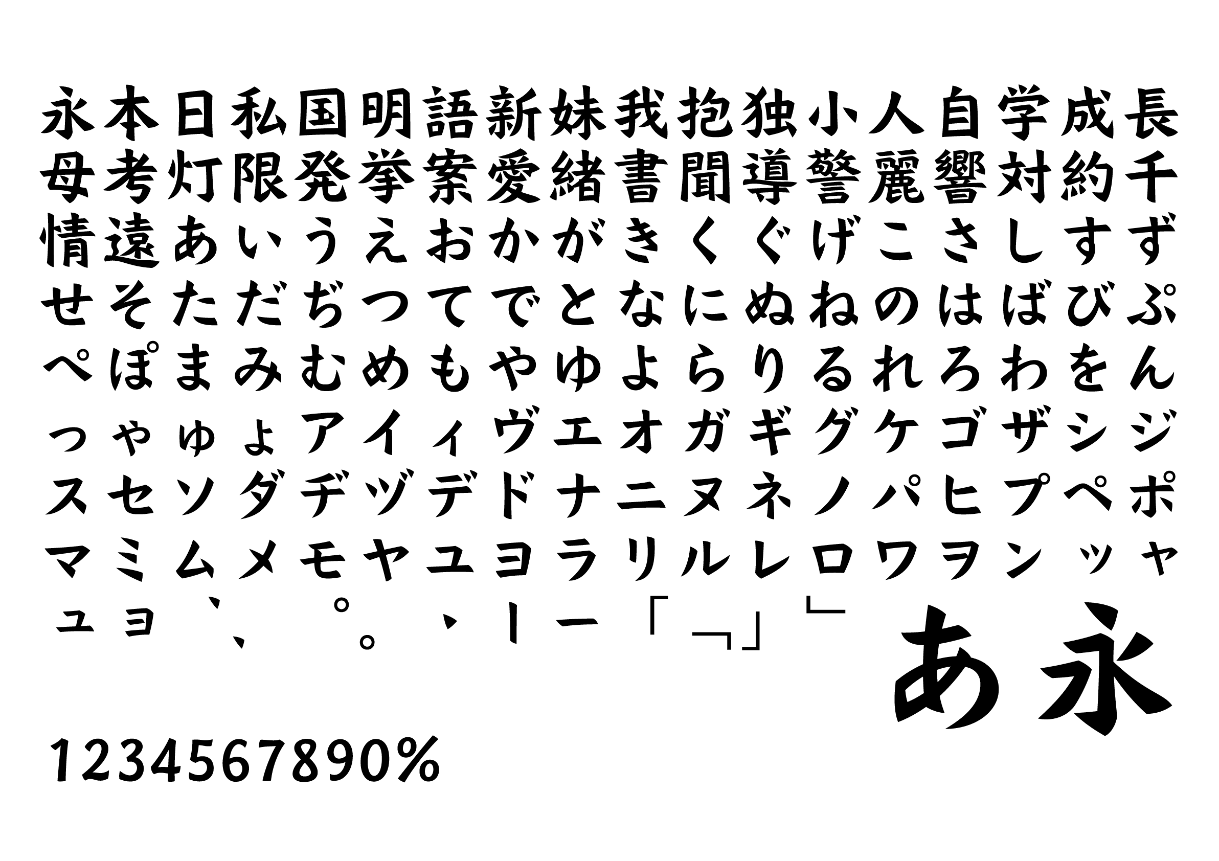
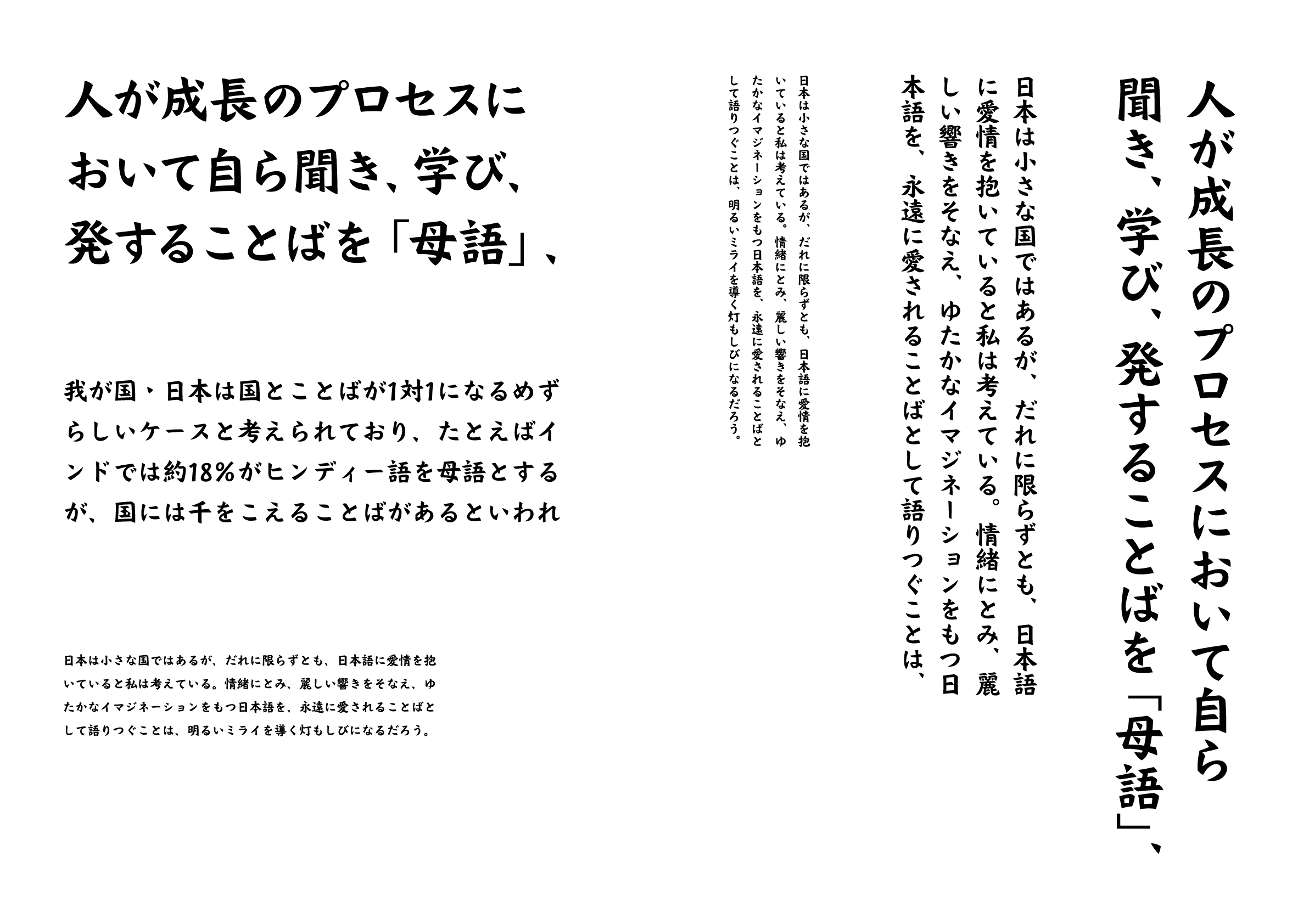
Intention of the work
Inspired by the elegant structure of the kaisho (block style), this display type is made up of extremely abstracted outlines. By using a combination of long and short strokes and sharp terminals, I created a bold font without overcrowding the space, but with a good balance of impact and lightness. Because the triangular dot strokes look like buckwheat seeds, I named it Kuromugi (くろむぎ, old Japanese for “buckwheat” meaning “black buckwheat”).
Winner’s Comment
As a non-designer, I entered this competition as a challenge to prove my passion for typography. It was a great surprise and honor to receive this award. I will continue to challenge myself with many ideas that haven’t yet taken form.