
Japanese category Morisawa Award
Silver Prize
Insho
Designer
Daisuke Fukushi
Japan
Born in Aomori Prefecture in 1979. Began working as a freelance graphic designer in 2019. Developed an interest in typefaces while at university, and has continued to self-study typeface design while working as a graphic designer.
Judges’ Comments
-
Osamu Torinoumi
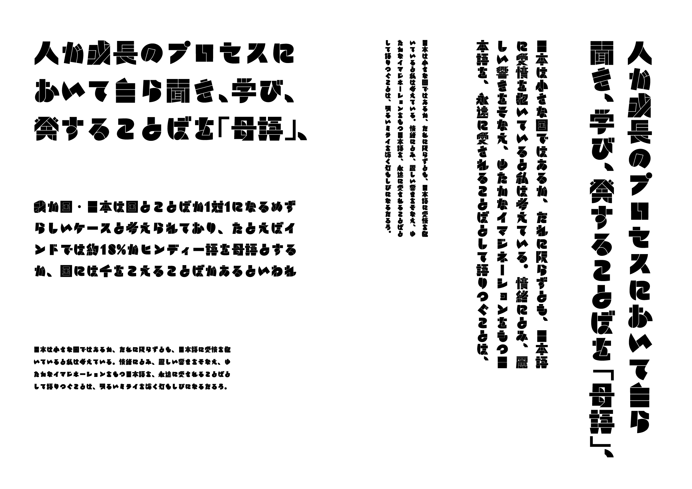
From the perspective of typefaces designed specifically for setting text—a principle I have always prioritized—this is not a style I would typically choose. However, it is a design full of playfulness. At first glance, the characters appear to be constructed from discrete stroke and dot elements, but upon closer inspection, they skillfully blend black strokes with white dividing lines to form the shapes. For example, in the character “は,” the third stroke is deliberately rendered as a single line forming a loop, allowing the outer contour to stand out. This kind of technique is executed with remarkable finesse.
-
Ryoko Nishizuka
I generally don’t like typefaces that are hard to read, but this one demonstrates an exceptional ability to push readability to its limits in an effective and compelling way. Even though some characters verge on being unreadable, the sheer appeal of the design surpasses that limitation, boldly embracing the visual intrigue of letterforms. Having long focused on creating highly legible and refined typefaces, I found this work to be a refreshing challenge—it presents shapes I could never have created myself. A truly remarkable piece.
-
Issay Kitagawa
This is a work that is formed by the remarkable use of black. Some characters, like “日,” appear purely as geometric shapes, while others, like “明,” may be difficult to read in isolation but become legible within a sentence—an intriguing contrast. This sense of incompleteness adds to its charm. I’m not sure whether the creator consciously employs the artistic and creative technique of introducing discomfort to provoke awareness, but if it’s intentional, it’s truly astonishing. It’s a typeface that makes me want to meet the designer.
Intention of the work
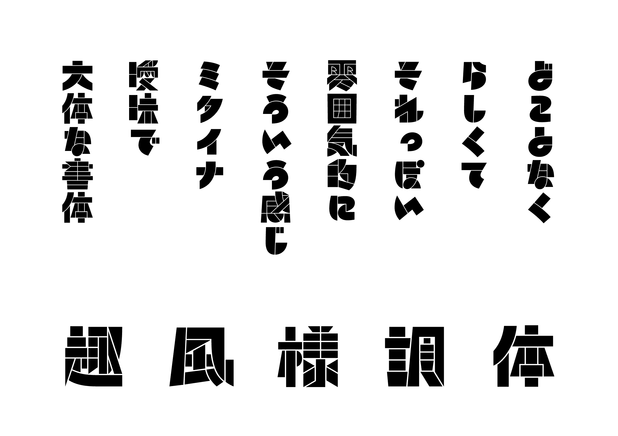
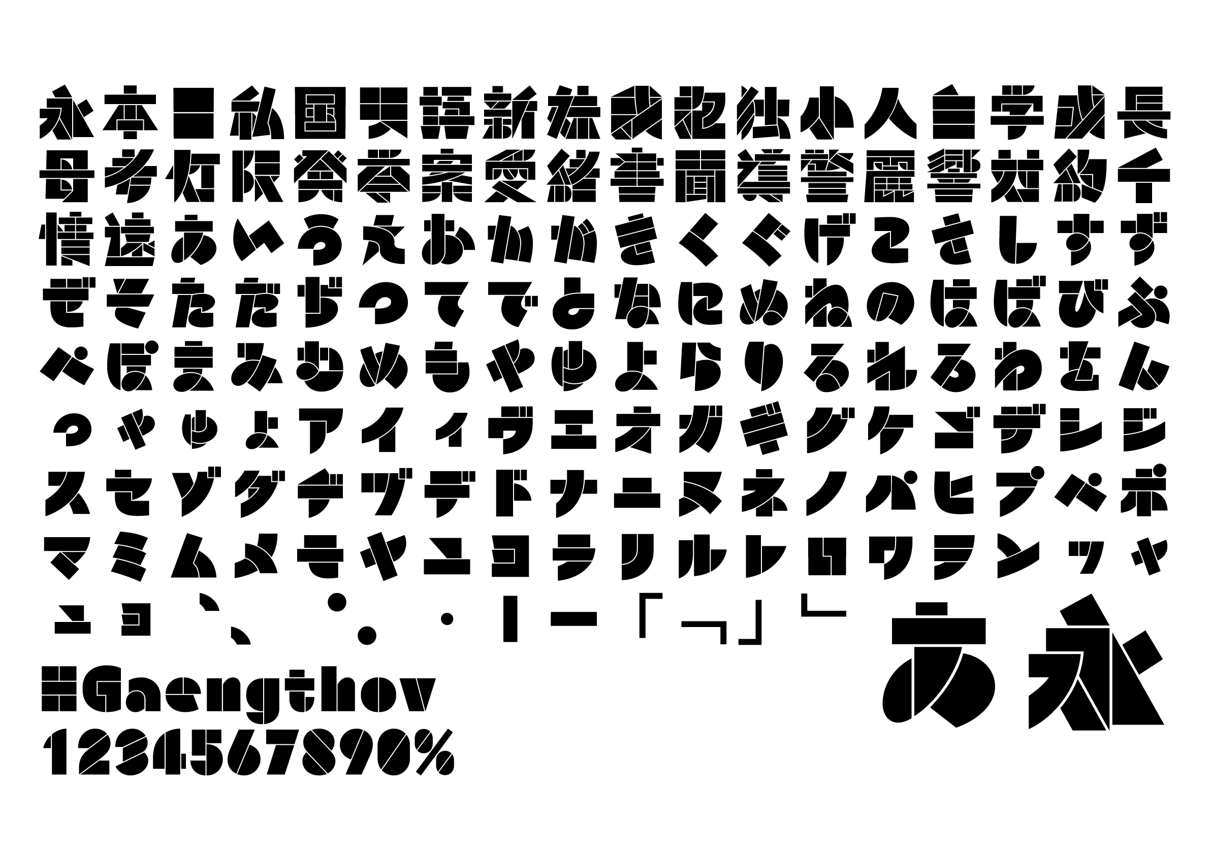
Focusing on the Insho (印象, meaning “impression” in Japanese) that each character’s shape evokes, which first caught my attention, I emphasized the sensory aspects of their appearance and feel rather than on correctness.
Winner’s Comment
I’m deeply honored of receiving this prize, and so glad that all my hard work has finally paid off; it really gave me encouragement. This typeface is the result of my earnest efforts to explore the form, while I realized that you never know what will actually lead to an idea. I would like to express my sincere gratitude for taking the time to review and critique my work.