
Japanese category Morisawa Award
Bronze Prize
kt
Designer
Ganta Uchikiba
Japan
Born in 1967. A graphic designer and graduate of Tama Art University. Presides over Gtai inc., focusing on logotypes and typography. Selected for the Tokyo TDC Annual Awards 2023: Type Design Prize, and a finalist in the Japanese category of the Morisawa Type Design Competition in 2014 and 2016, as well as receiving an Honorable Mention in 2019.
Judges’ Comments
-
Osamu Torinoumi
At first glance, this typeface reminded me of the handwritten lettering found in 1970s weekly magazines. I don’t create typefaces like this myself, but I have a deep appreciation for naturally written handwriting. Even the sample text feels playful and uniquely original, as if the designer intends for it to be used in this way. This is a typeface that only its creator could have made.
-
Ryoko Nishizuka
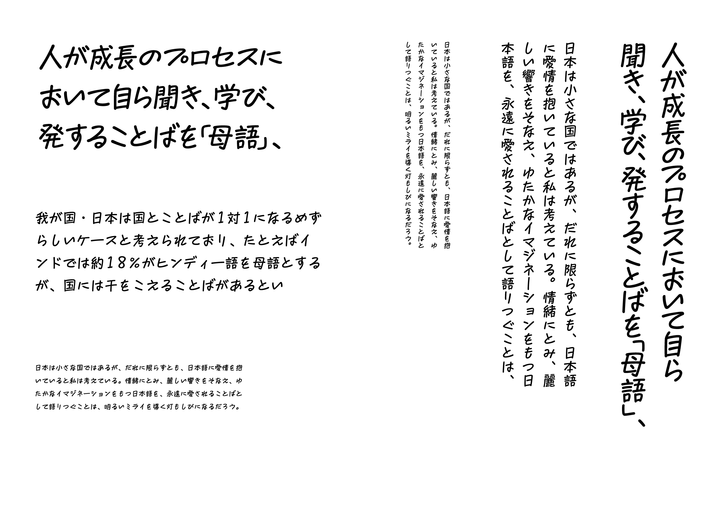
This typeface is easy to read both vertically and horizontally and remains visually appealing even when tightly spaced. The mix of slightly elongated kanji with tapered bottoms and compressed, flattened kana creates a well-balanced composition. It gives the impression of a typeface meant for casual use in satirical contexts. The concept of “hand-drawn manga lettering from the pre-digital era” also reflects the designer’s deep experience. Perhaps this typeface was created with the Showa-era nostalgia trend in mind.
-
Issay Kitagawa
This work conveys a deep sense of care for others, reflecting the idea that a typeface is something meant to be used by third parties. Since it is handwritten, it naturally carries traces of the writer’s physicality. Yet, the designer has carefully examined each detail, shaping it into a complete typeface—one that feels personal, yet independent of the designer’s own handwriting. Perhaps that is why the letters have such a natural, unpretentious quality. It is a remarkable typeface, easy to read both vertically and horizontally.
Intention of the work
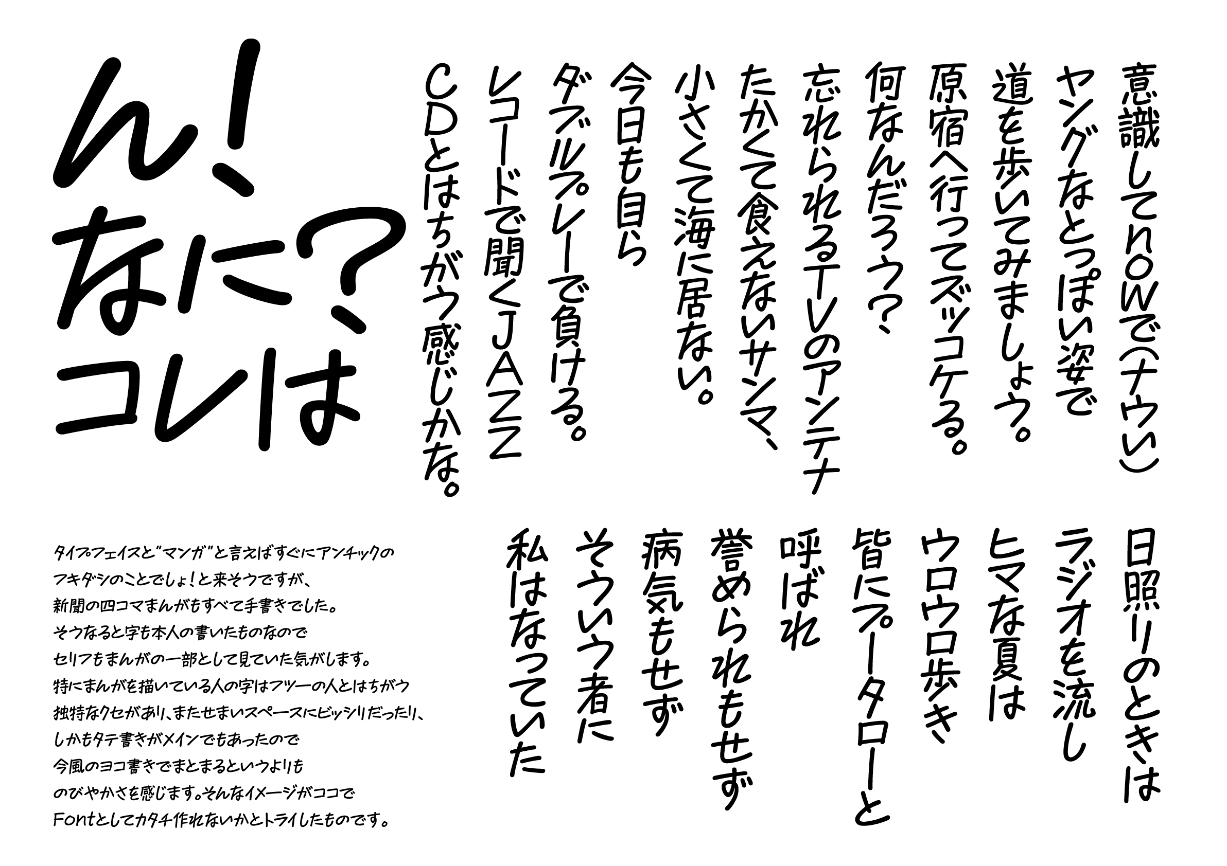
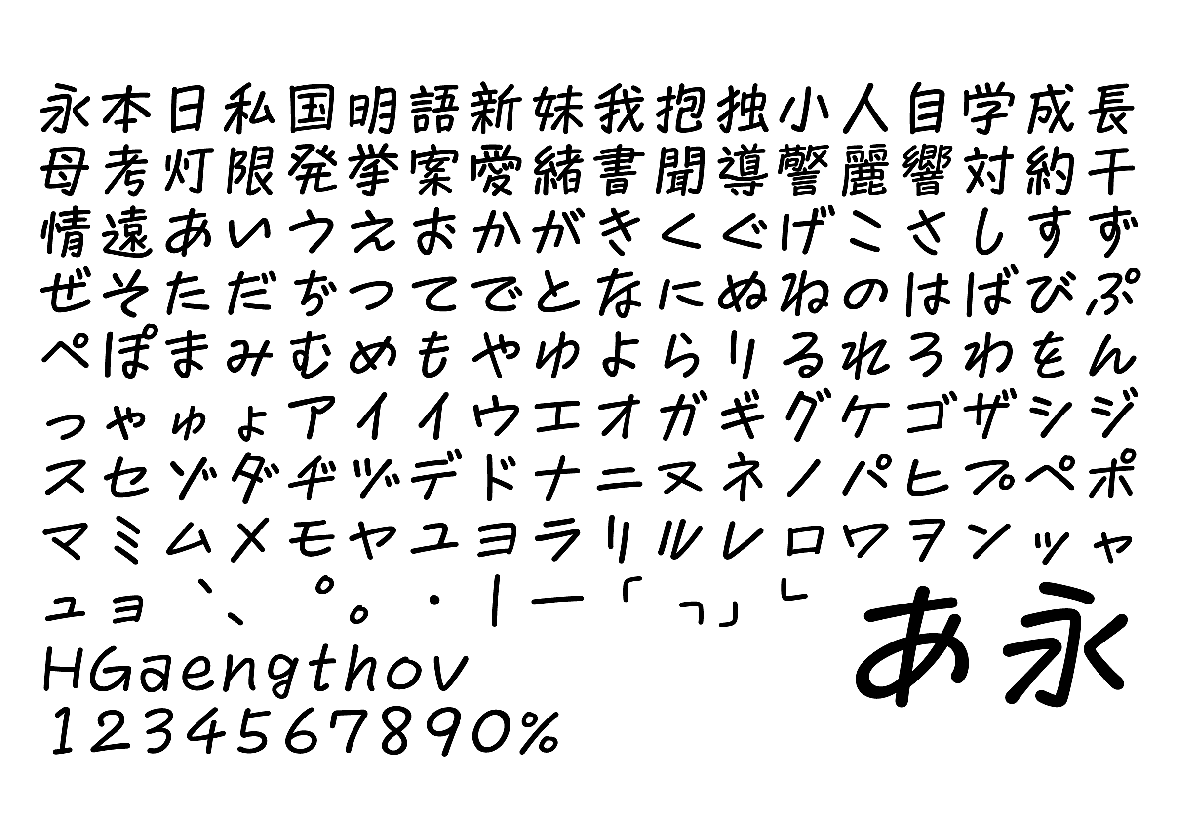
This font is based on the handwritten text used in four-panel comic strips from newspapers in the 1960s and 70s. I tried to capture the way characters are tightly packed into a limited space, and the distinctive handwriting of a cartoonist. The goal was to create handwritten characters that would stand out in a vertical setting, which has a different quality to the modern horizontal writing style.
Winner’s Comment
I believe that winning the award for the refined version of the existing prototype, which took me a long time to perfect, is the result of my painstaking efforts. I am hoping that characters will not only record sentences, but also function as a way of conveying certain images.