Japanese category Morisawa Award
Honorable Mention
Norentai
Designer
Koki Hayashi
Japan
Born in Saitama Prefecture in 1992. Graduated from the Kuwasawa Design School (Visual Design Department), he is currently working at a design company in Tokyo while expanding the scope of activities as GLAMGRAPH DESIGN.
Judges’ Comments
-
Osamu Torinoumi
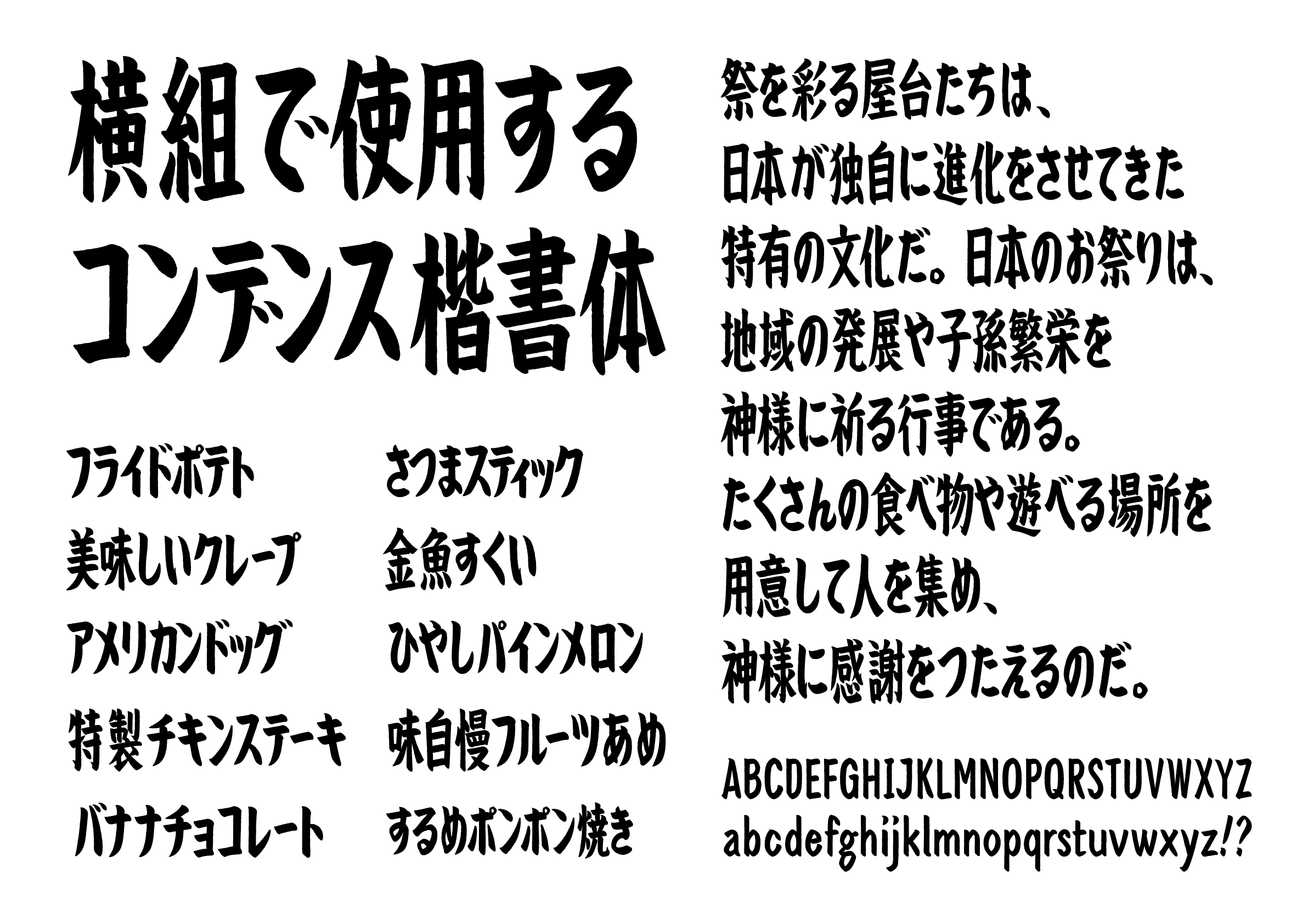
The first impression was “Well done.” The word “アメリカンドッグ (American Dog)” in the setting sample reminds me of the excitement of food stalls at a festival. The nostalgic, folksy vibe and the soft, natural look of the design are very pleasing. The impressive ability to squeeze the almost extra-bold brush strokes into a tight, virtually half-width space.
-
Ryoko Nishizuka
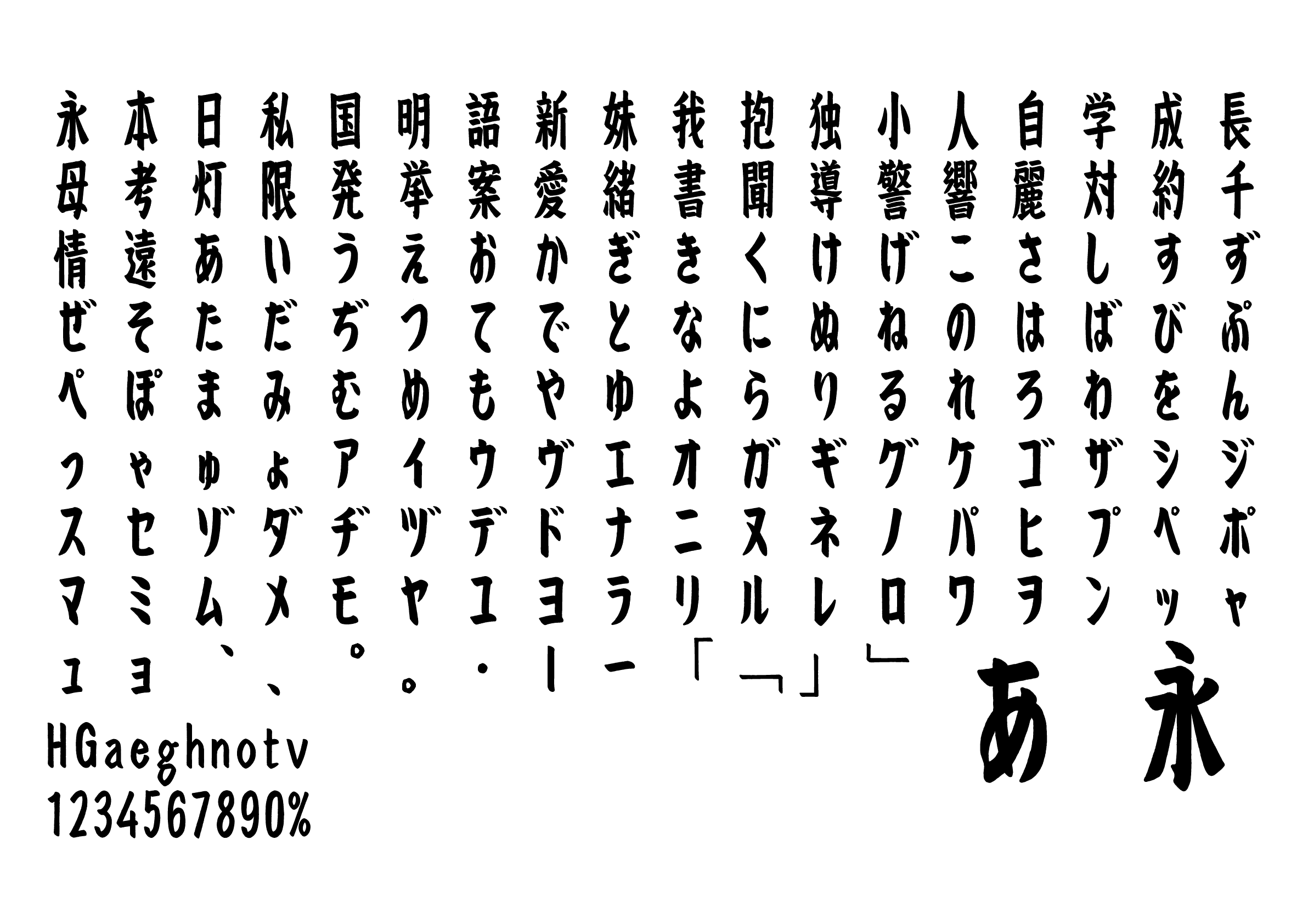
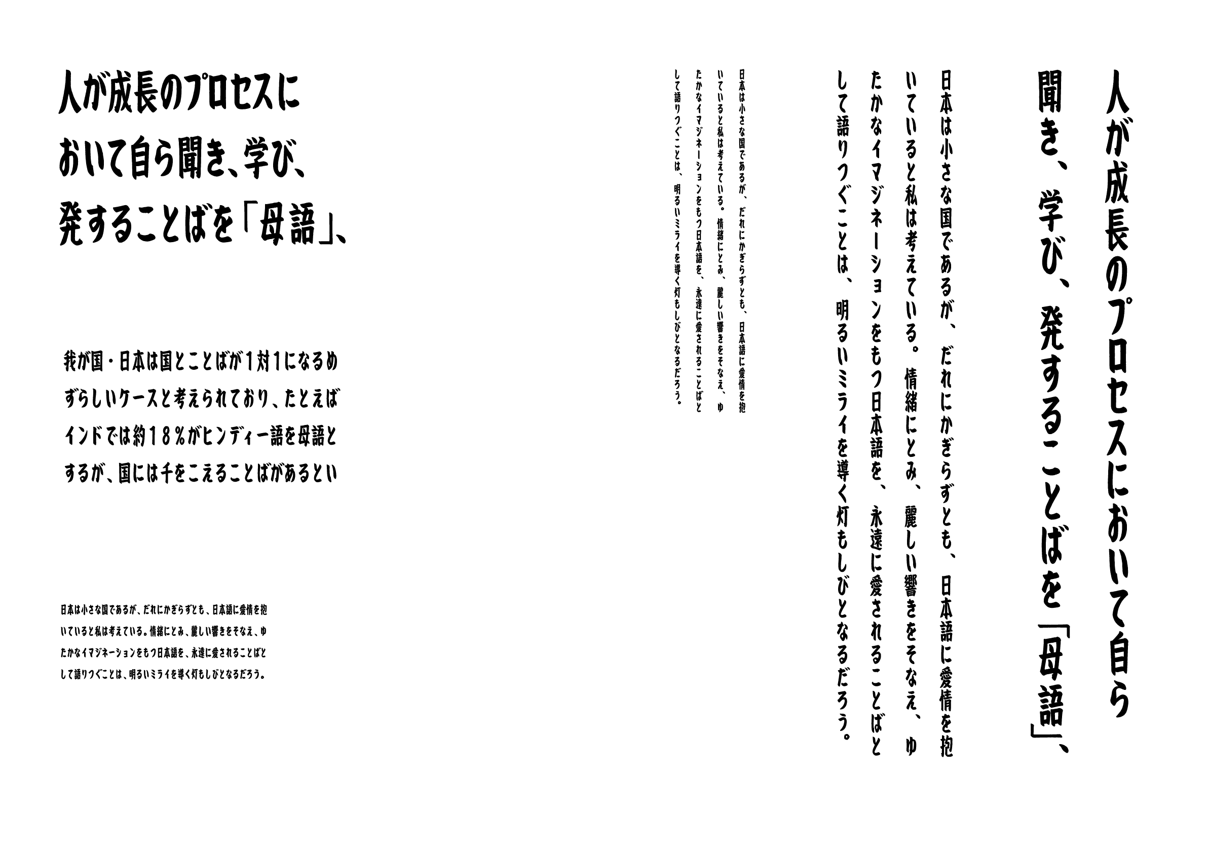
This is an interesting kaisho (block style) typeface in a tall proportion. Once the types are packed full in type space and line space horizontally, it creates a sense of nostalgia—although it is the first time seeing this typeface. The lettering looks as if it were written with a felt-tip pen with the top and bottom edges aligned, rather than in a calligraphic style. Each typeform, despite its intentional imperfections and awkwardness, has a certain charm in that it shows traces of effort. This kind of design is actually not as easy as it seems.
-
Issay Kitagawa
The solidity of this typeface would be suitable for historical descriptions at shrines and historical buildings. It would also go perfectly with a menu at a downtown deli. The characters “さ” and “き” have wonderful handwritten quality, thanks to the ingenious use of curved lines that are not uniformly drawn. Considering the distinct difference between the heavy and light strokes, and the excellent size selection of geminate consonants and palatalized sounds, the designer seems to be very skillful.


Intention of the work
This is a kaisho (block style) for display in tall proportion, which particularly suits the horizontal setting. The body is boldly elongated so that it can take up as much space as possible in a limited area, like the noren (shop curtain) from a food stall often seen at festivals in Japan. I reduced the contrast between the vertical and horizontal lines to create a typeface with a strong, impactful expression.
Winner’s Comment
I have been taking photos of noren (shop curtain) at festival stalls, out of my love for handwritten characters with a sense of humanity. I am delighted that this typeface, developed from such activities, has been so well received. I will continue to pursue the appeal of typography through research and experimentation, staying true to things that fascinate me.