
Japanese category Morisawa Award
Honorable Mention
4S
Designer
Takuya Nakazawa
Japan
Born in 1970. Having spent the past 20 years as a graphic designer, he left the design industry and now creates typefaces as a self-taught hobby.

Judges’ Comments
-
Osamu Torinoumi
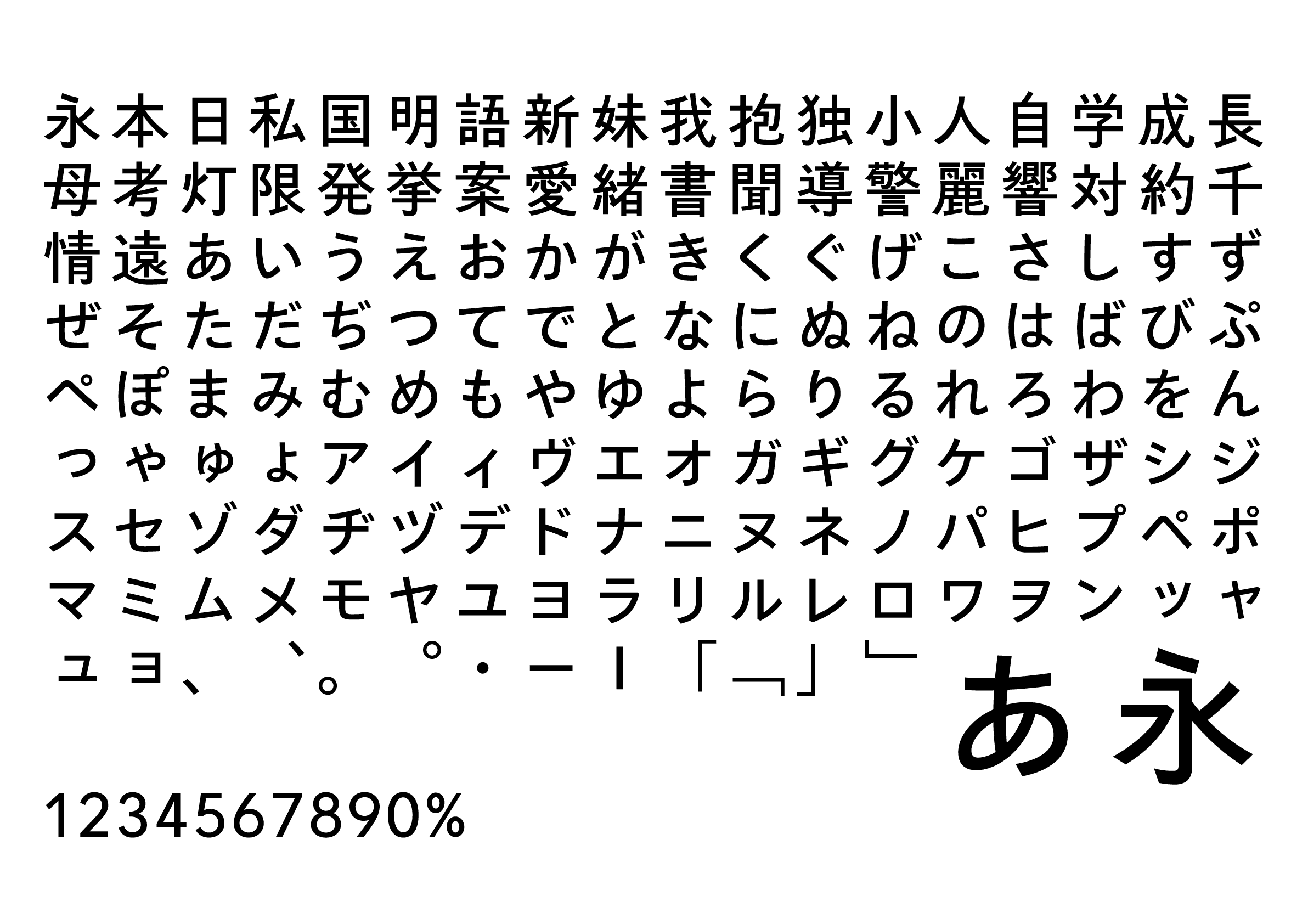
This sans serif typeface has a casual impression and an honest, free-spirited look. The only downside was the lack of perfection; I noticed inconsistencies in the thickness of the lines in some kanji and kana. For example, “鹿” in “麗” is thick as opposed to the thinness of “耳” in “聞,” which could be improved further.
-
Ryoko Nishizuka
Despite the low ratio of space occupied by the characters and the tightness of the counter, this sans serif remains neither fragile nor stifling. This may be attributed to the balance of the kanji, which is closer to the kaisho style (block style) than to the conventional sans serif, in addition to the quality of the kana. As you can see from the character for “対,” where the left side positioned much higher, the balance between the left and right side components, which greatly influences the overall expression, is perfectly controlled in this typeface.
-
Issay Kitagawa
The neatly organized sans serif typeface strikes a balance between gentle curves and straight lines. The skillful use of line variations has achieved both warmth and elegance. I think the slightly compact numbers and solid punctuation marks create a well-balanced typesetting that captures the essence.
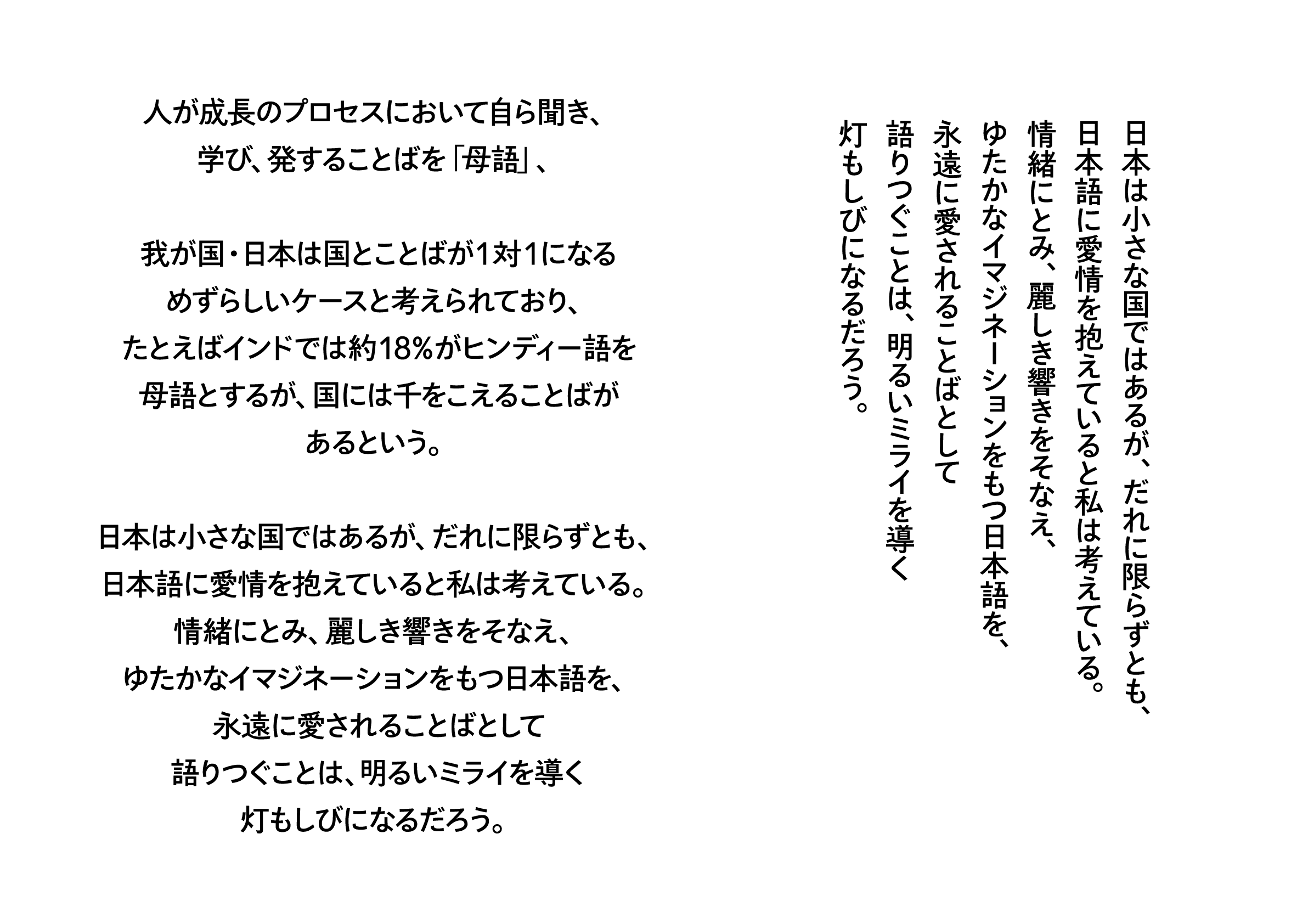
Intention of the work
I had the impression that most of the existing Japanese sans serif typefaces had a casual appearance with wide counters, lacking a sense of elegance. Therefore, I created this elegant, Japanese sans serif font with a narrower counter. Drawing inspiration from the kaisho (block style), I aimed to create a Humanist sans serif typeface with a natural, handwritten-like structure, avoiding the tendency to squeeze characters into the top, bottom, left and right corners of the square box.
Winner’s Comment
I was hesitant to submit my work due to the unsatisfactory level of completion as a result of not being able to dedicate enough time to the production, but I am both delighted and very surprised to have been selected as an honorable mention. It’s both scary and exciting to receive feedback from such prominent judges.