
Japanese category Morisawa Award
Honorable Mention
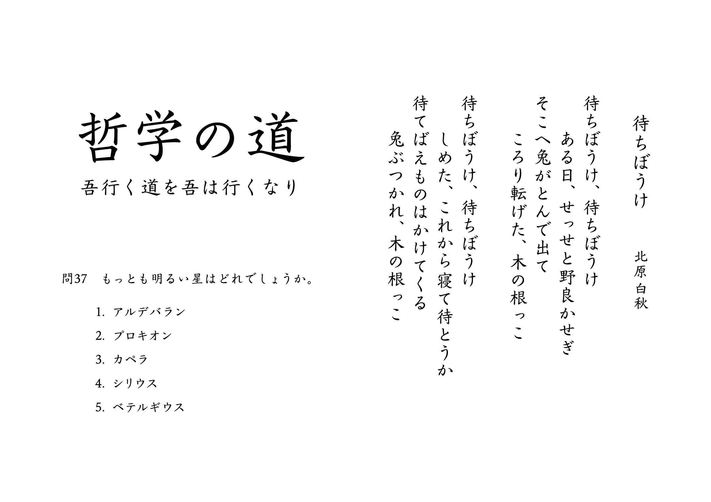
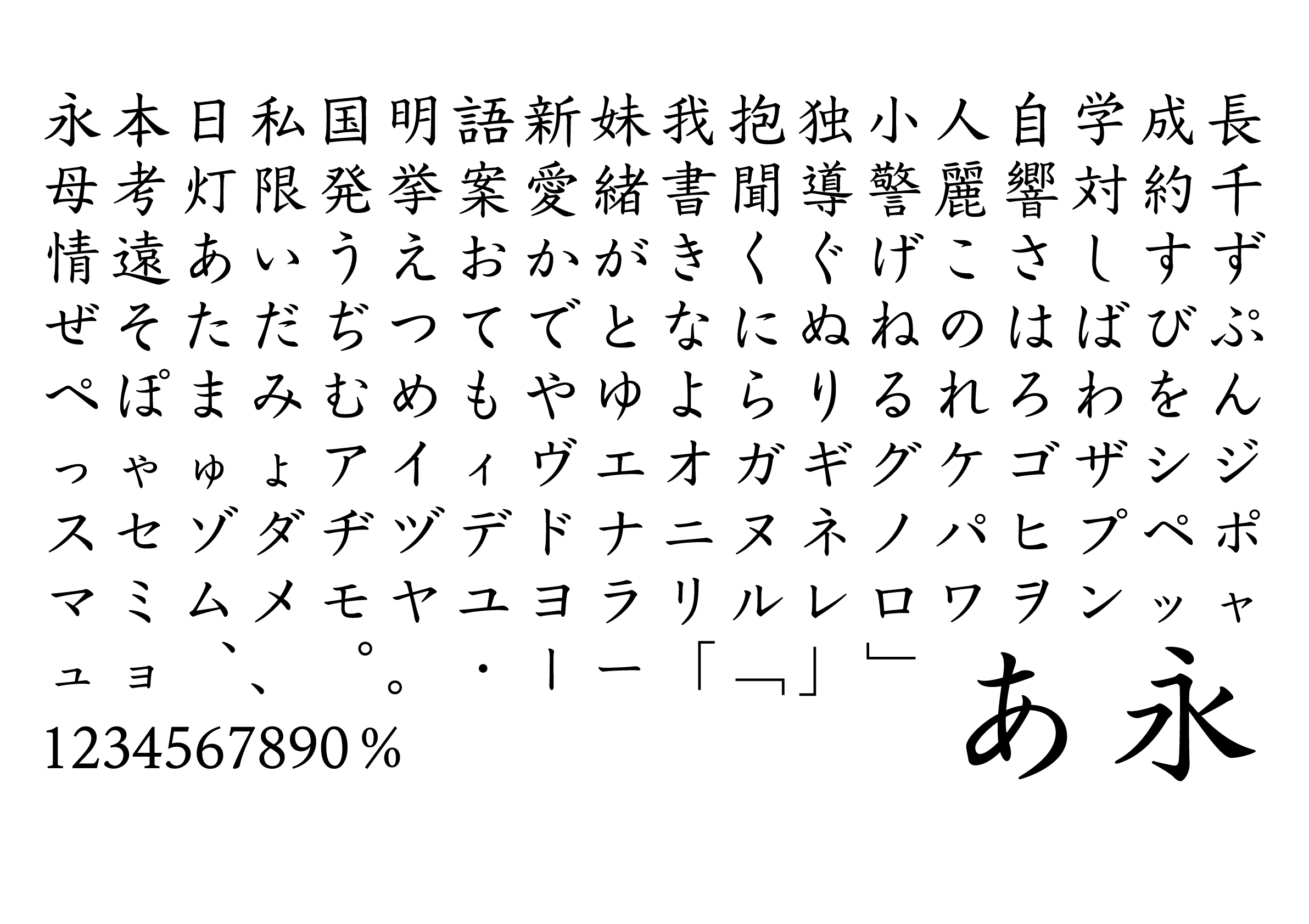
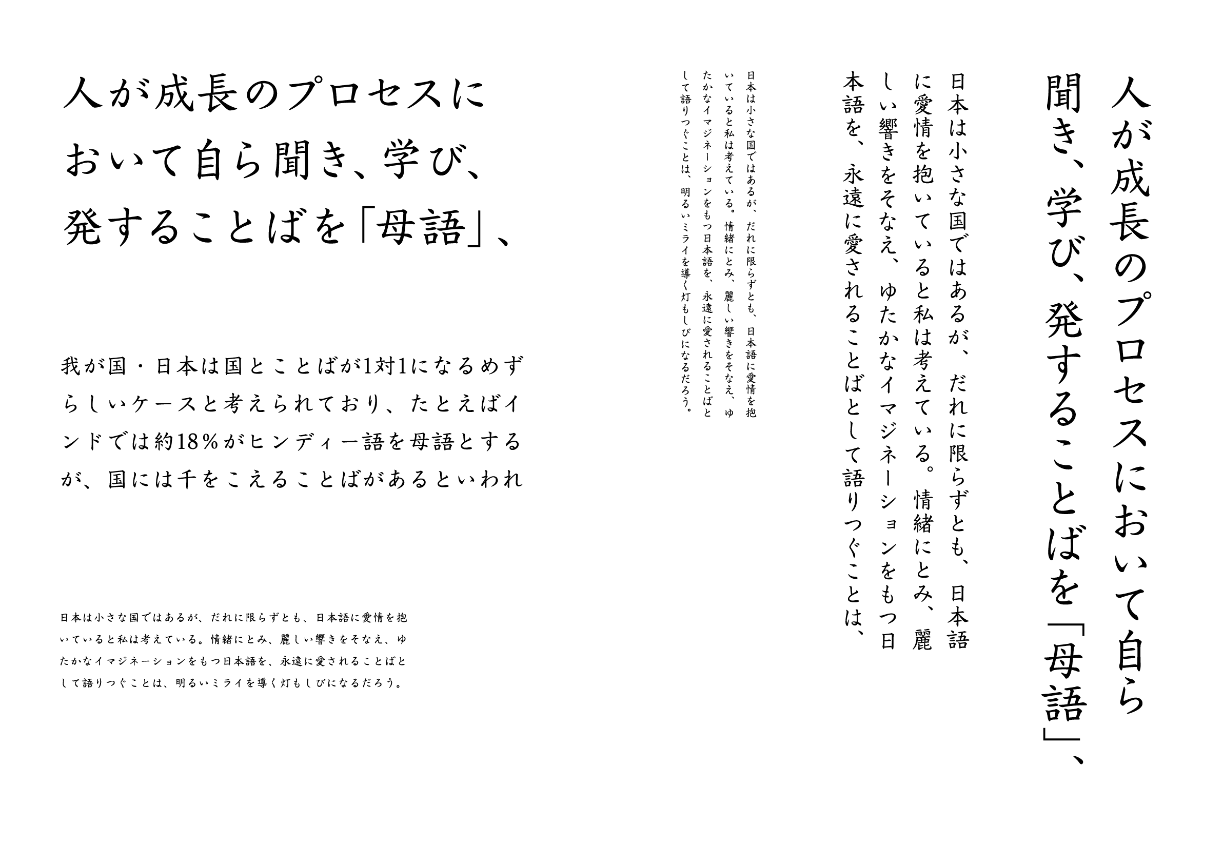
Shiratsuyu Kaisho
Designer
Jin Nagase
Japan
Born in Osaka in 2000, currently studying at Kyoto Prefectural University of Medicine. Having developed an affinity for typeface design since high school, he is currently active as an independent app developer.
Judges’ Comments
-
Osamu Torinoumi
This is a highly finished kaisho (block style) typeface. The designer’s earnest attitude toward the production of this typeface is apparent, which makes a favorable impression. However, with so many of these elegant sans serif typefaces already in existence, the novelty of this work was not considered in the evaluation, but rather, I would like to see this as a masterpiece for this designer. I hope that such meticulous work will continue in the future. A well-designed typeface.
-
Ryoko Nishizuka
This is a fine example of a calligraphic style typeface that requires the skill to write free-form strokes in a square frame in a way that looks natural. It is ingeniously designed to accommodate both vertical and horizontal writing, as evidenced by the naturally stoked brush endings in the lower part of the letter “し,” for example, which tends to be overly refined. The designer must have a good understanding of the difference between kaisho (block style) and serif in kana. The kanji characters all look very nice, but ideally, the vertical strokes could be a little more slightly thickened.
-
Issay Kitagawa
The movement of the brushstrokes is neither too fast, nor too careful, but never too slow either. There is a sense of pleasantness close to the rhythms of nature, like the murmuring of a river or a gentle breeze. The designer’s peculiarities in handwriting, which tend to appear in kaisho (block style) typefaces, have been beautifully eliminated, making it characterless in a good sense. Suitable for literary works such as novels that intend to convey the literary nature of the words themselves in a straightforward fashion, this typeface may enhance the literary experience of Gon, the Little Fox (a children’s story about a little fox) from textbooks.
Intention of the work
This is a kaisho (block style) typeface designed to convey a standard impression. The kanji characters are designed with a sense of stability, with minimal contrast in line thickness, while the kana characters are simple in shape, with a narrow counter.
Winner’s Comment
I would like to express my gratitude for selecting my work as an honorable mention. I am very pleased that the work, into which I put my utmost effort, has been well received. With this recognition, I am encouraged to further refine the perfection of this typeface.