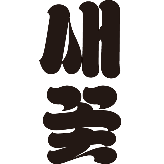
wanwan (완완), imbued with a sense of virtual nostalgia, incorporates the small marginal zone of a phototypesetting typeface, and is characterized by its finely detailed center and elongated vowel sounds. A mischievous spirit within the rigidity gives it a complex impression of nostalgia and eccentricity.
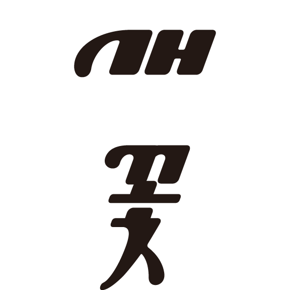
There was a time when I was reading an essay and the typeface used in the body text seemed too bland to capture the subtleties of everyday life. With this in mind, I have given this typeface a sense of sincerity and warmth. I designed a sleek and tender typeface suitable for essays, diaries, and other prose texts. The space between SeMyeongjo and SinMyeongjo, as well as the typeface’s compact size and consonant ratio, gives it a nuanced pencil-like texture, making it ideal for body text.
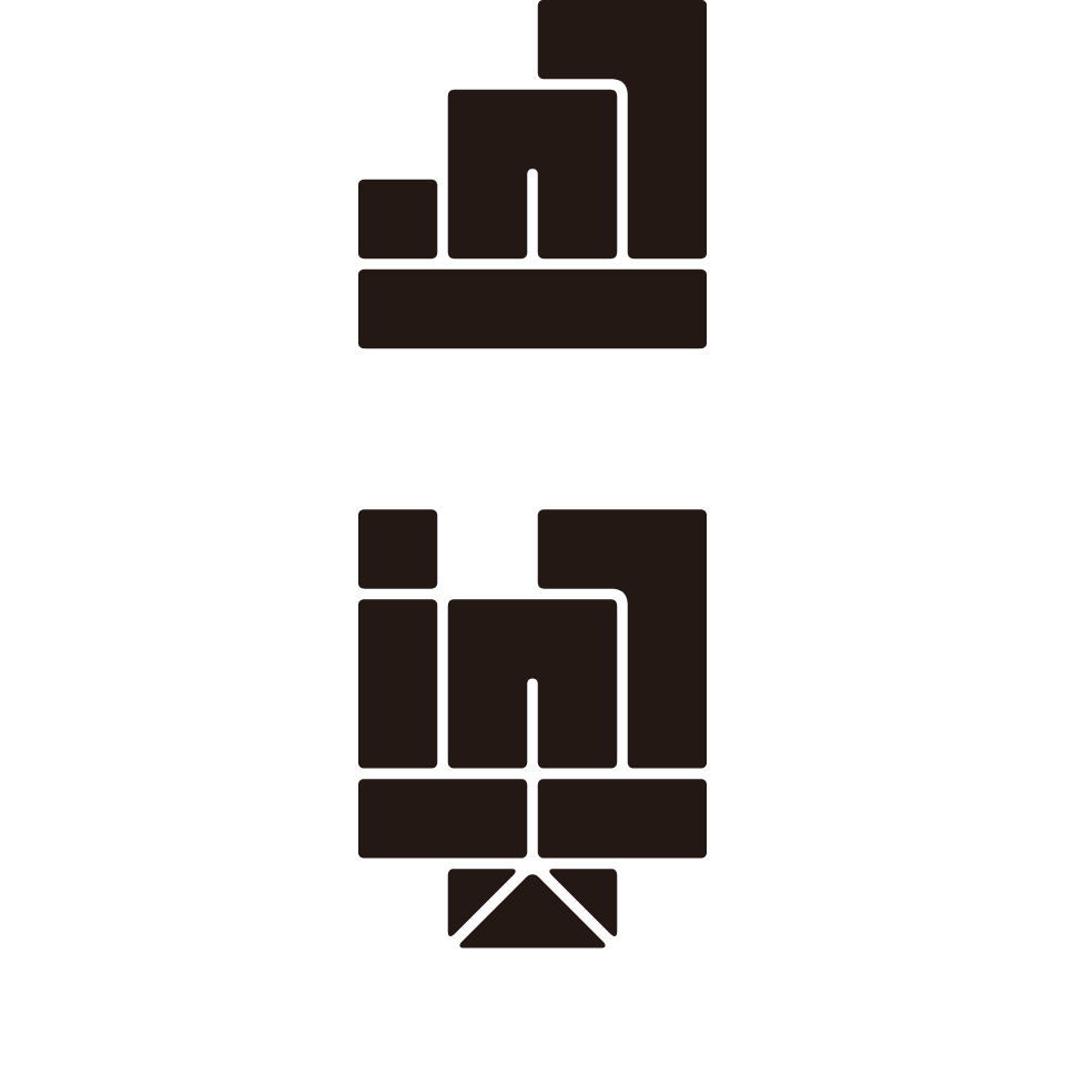
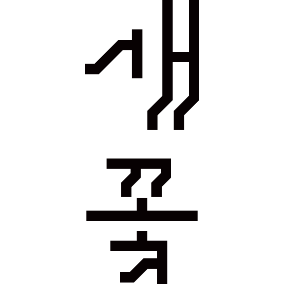
This is a unique Hangeul typeface made up of 15 basic blocks, which can be completed as the boundaries between the blocks become the strokes of the characters. Just like assembling blocks, this design allows for the space between the characters to be combined in new and interesting ways to express Hangeul.