
Hangeul category Morisawa Award
Gold Prize
wanwan
Designer
Yejin Wi
Republic of Korea
Born in Seoul. Completed her studies at the Department of Design, Seoul National University College of Fine Arts, and MA in Typeface Design at the University of Reading, UK. After working as a type designer at Sandoll for six years, she has worked as a freelance type designer working on Hangeul and other Eastern Asian scripts since 2024.
Judges’ Comments
-
Wujin Sim
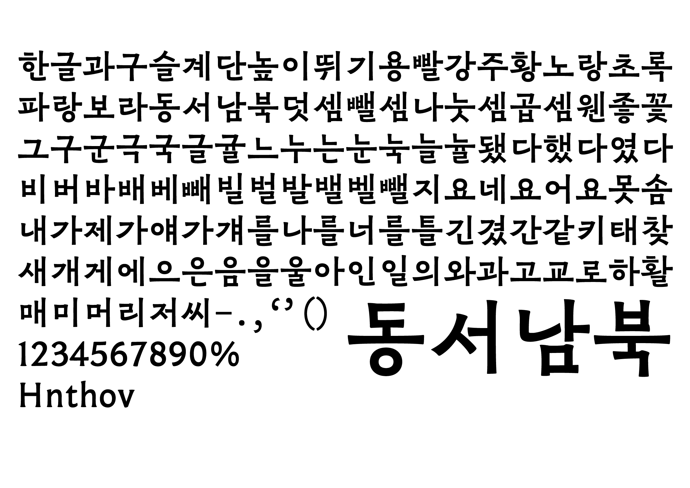
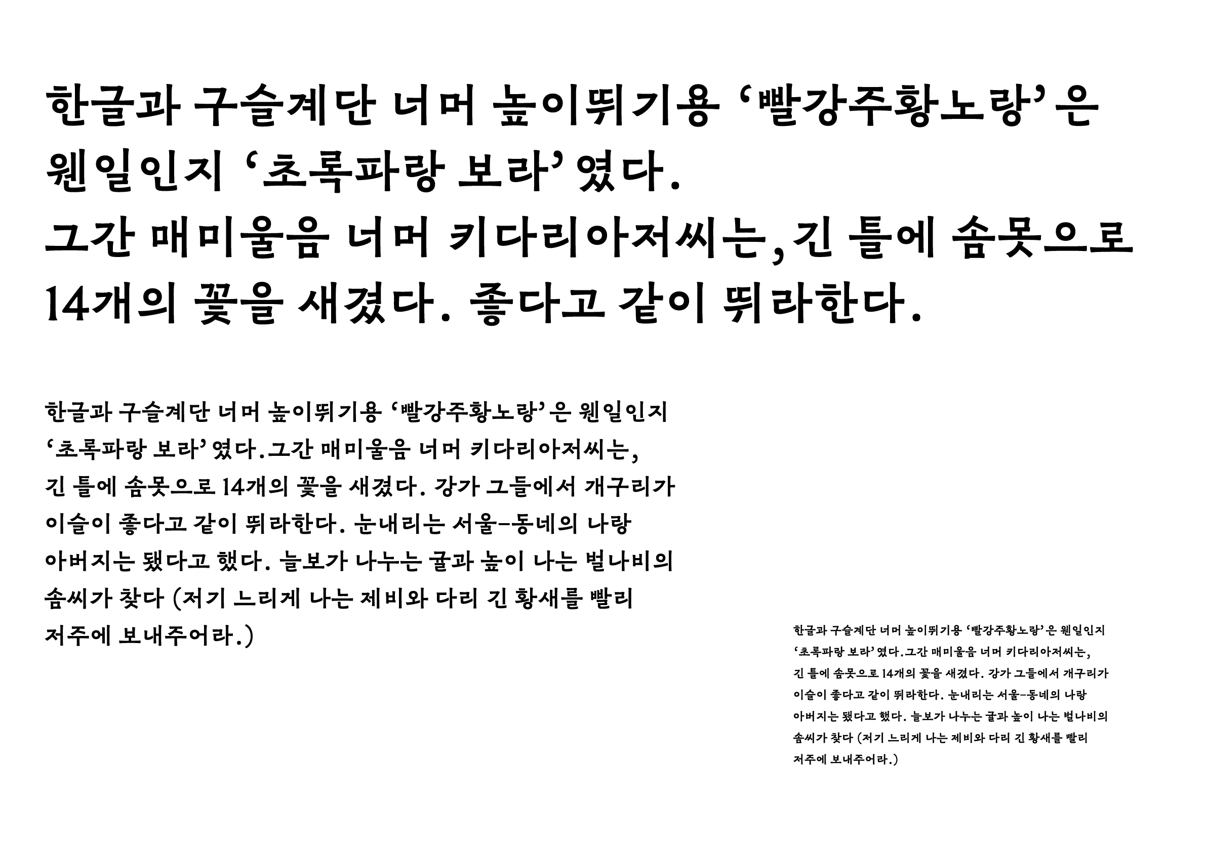
Compared to the conventional body text typefaces, the thicker strokes and larger punctuation marks make it legible even at small sizes. The combination of the handwritten structure and Chinese clerical script style gives the typeface a classic impression, yet it has a modern feel thanks to the elegant design of the sans serif style: the narrow width of the “ㄷ” and “ㅇ” strokes, as in “동,” and the stroke closure of the “ㄱ” that gracefully extends outwards, as in “긴,” are typical examples. This approach can also be seen in Simplified and Traditional Chinese type styles. I’m keen to see how this typeface, which blends the long-standing handwriting heritage of East Asia into Hangeul, continues to evolve and find new expressions moving forward.
-
Sulki Choi
The sense of modernity of this typeface comes from how it breaks away from the standard proportions of the base letters (jamo) of the Hangeul design that fill the square frame, and highlights the principles of Hangeul composition. The characters that are intentionally made to exceed beyond the traditional square frame often tend to give an unstable impression, but what gives this typeface a sense of robustness is the quality of the paragraphs and the relatively large symbols such as the “ ’ “, as well as the visual rhythm of the characters being reflected in the symbols. It’s something you’ll want to use in your body text.
-
Bon Min
While Latin and Japanese typefaces have a pair of styles—serif and sans serif—I felt the sans serif in Hangeul that pairs with serif was slightly underwhelming because the existing Hangeul sans serif typefaces have mostly been mechanical, lacking a handwritten touch. With its handwritten quality in the strokes, structure, and stroke contours, combined with its originality, I think this typeface could be a promising example of a new direction of Hangeul typeface.
Intention of the work
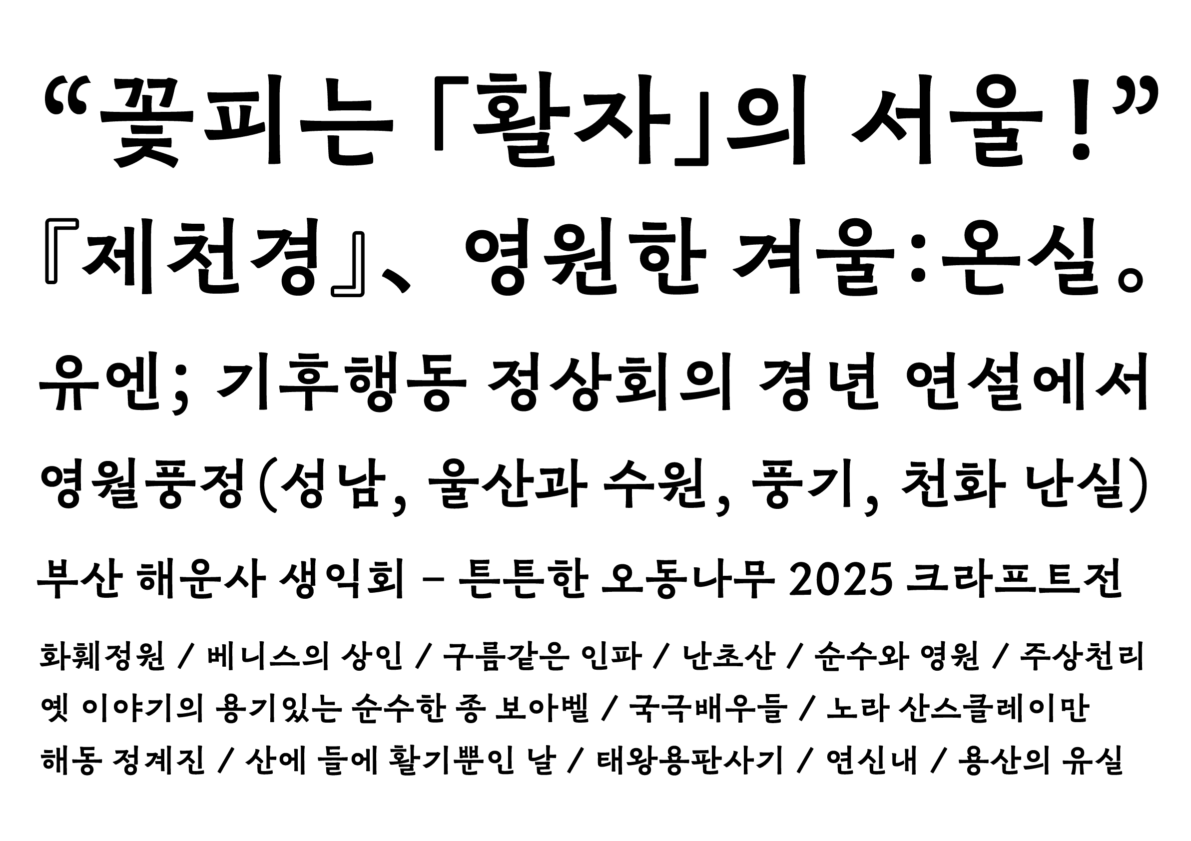
wanwan (완완), imbued with a sense of virtual nostalgia, incorporates the small marginal zone of a phototypesetting typeface, and is characterized by its finely detailed center and elongated vowel sounds. A mischievous spirit within the rigidity gives it a complex impression of nostalgia and eccentricity.
Winner’s Comment
I’m happy to be able to introduce wanwan (완완), which was developed from sketches I’ve been working on for the past six or seven years, through Morisawa’s first competition for the Hangeul category. It would be interesting to use this full-width font alongside the various kanji fonts available from Morisawa!