
Hangeul category Morisawa Award
Silver Prize
sanmun
Designer
Samyeol Ahn
Republic of Korea
Born in Seoul in 1971. After graduating from Hongik University with a degree in Visual Design, he worked as a graphic designer at Ahn Graphics from 1996 to 2001. Currently active as a freelance designer. Received the Type Design Award at the Tokyo TDC 2013 for the “Ahn sam-yeol” Hangeul typeface.
Judges’ Comments
-
Wujin Sim
This work shows a series of efforts in the body text typeface, where the slightest of changes could give noticeable results. It must have required courage and persistence in the face of the instability that ensued. And the challenge extends to both vertical and horizontal writing, which is very difficult to create properly. If the characters are confined within a square frame, vertical and horizontal stability can be achieved, but it may result in an unnatural form. This typeface overcomes the difficulty: fitting the characters to the frame compromises their form, while adjusting to the characters makes the text string unstable. This work is a testament to the designer’s challenges and efforts, and it deserves nothing less than our applause and admiration. I expect that further brush-up will make it a popular typeface in the future.
-
Sulki Choi
One of the most highly evaluated aspects of this work was its experimental spirit. Although I assumed that we should give the Silver Prize to an innovative work rather than to that with a high degree of perfection, it turned out that this Silver Prize-winning typeface was both a new experiment and highly perfected—truly an unexpected result. The heart of this experiment lies in the elaboration to suit both vertical and horizontal writing styles. The difference in typographic qualities produced by the two typesetting styles offers an enjoyable exploration of how the same characters perform differently in horizontal and vertical writing.
-
Bon Min
Among the many entries in this year’s competition that were full of originality in expressing their own legibility, this typeface was most highly evaluated for its ability to be used in both vertical and horizontal settings. It is highly experimental in its ingenious texture, which has different nuances: horizontal settings give a casual and loose impression, while vertical settings give a softer impression. It is also unique in its ability to be used as a text typeface.
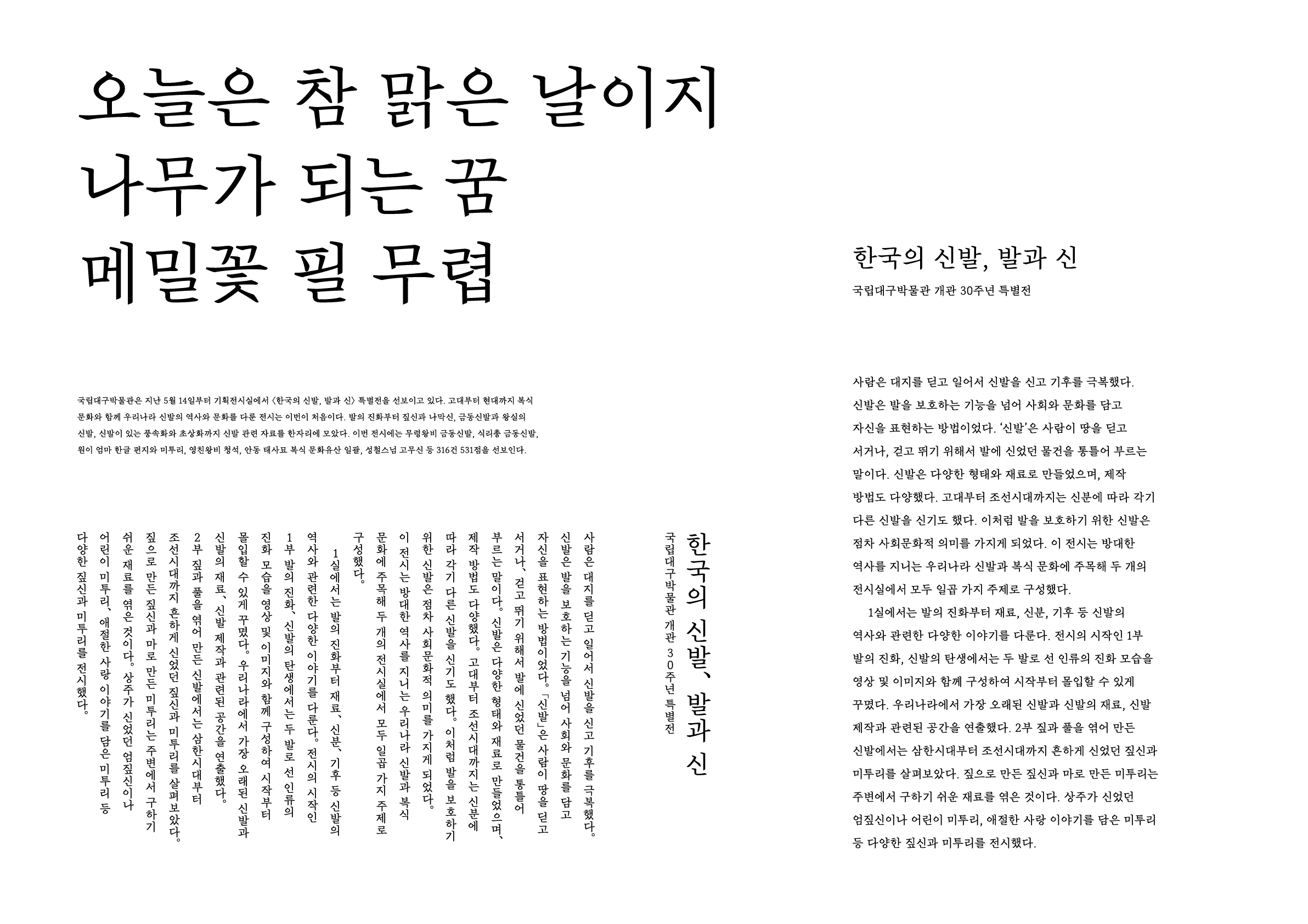
Sources referenced in the sample text of the work: Manuscripts for the Press Release of the Special Exhibition “Shoes of Korea: Feet and Footwear (2024)” and the Museum Newsletter (Issue No. 634)
Intention of the work
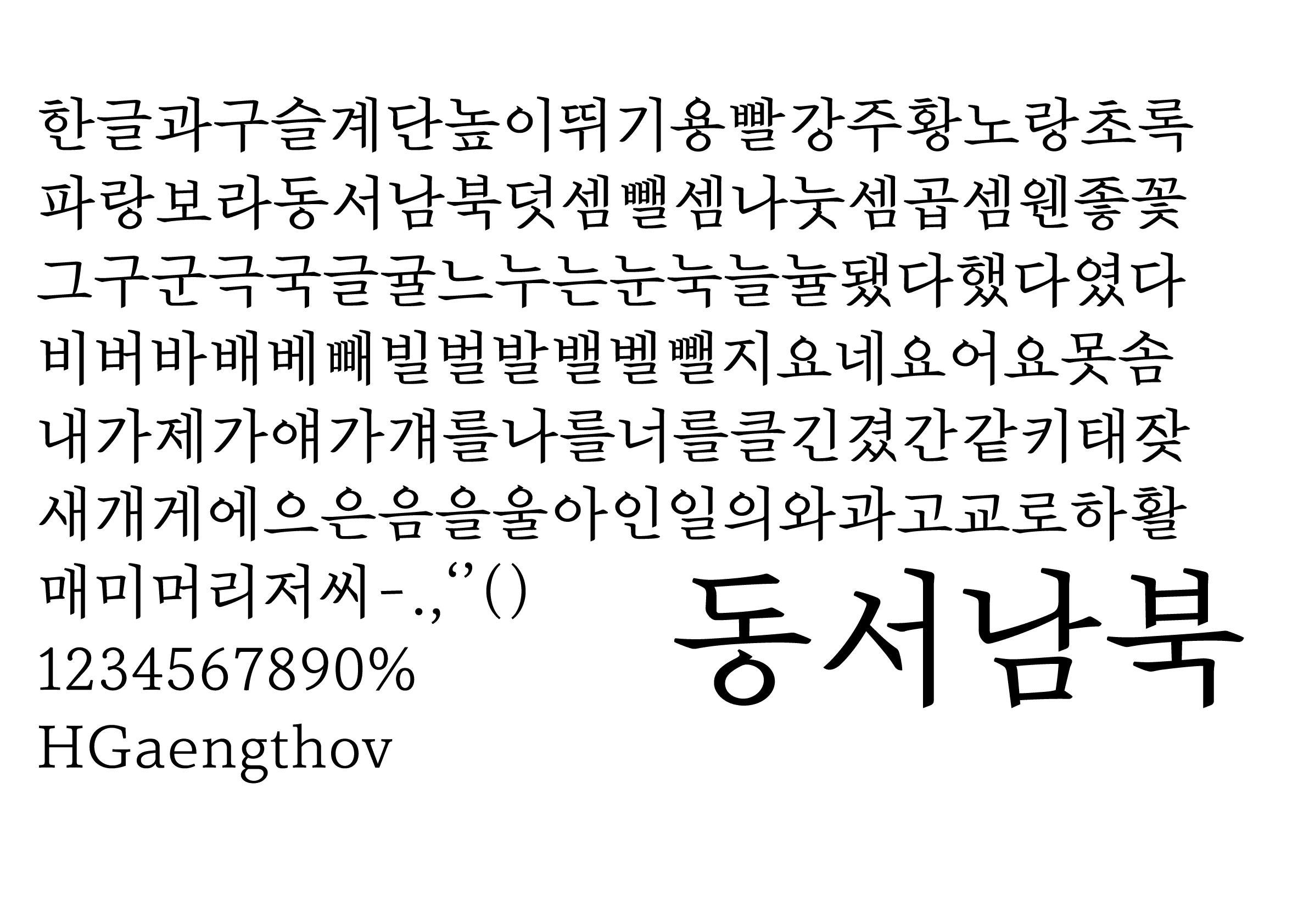
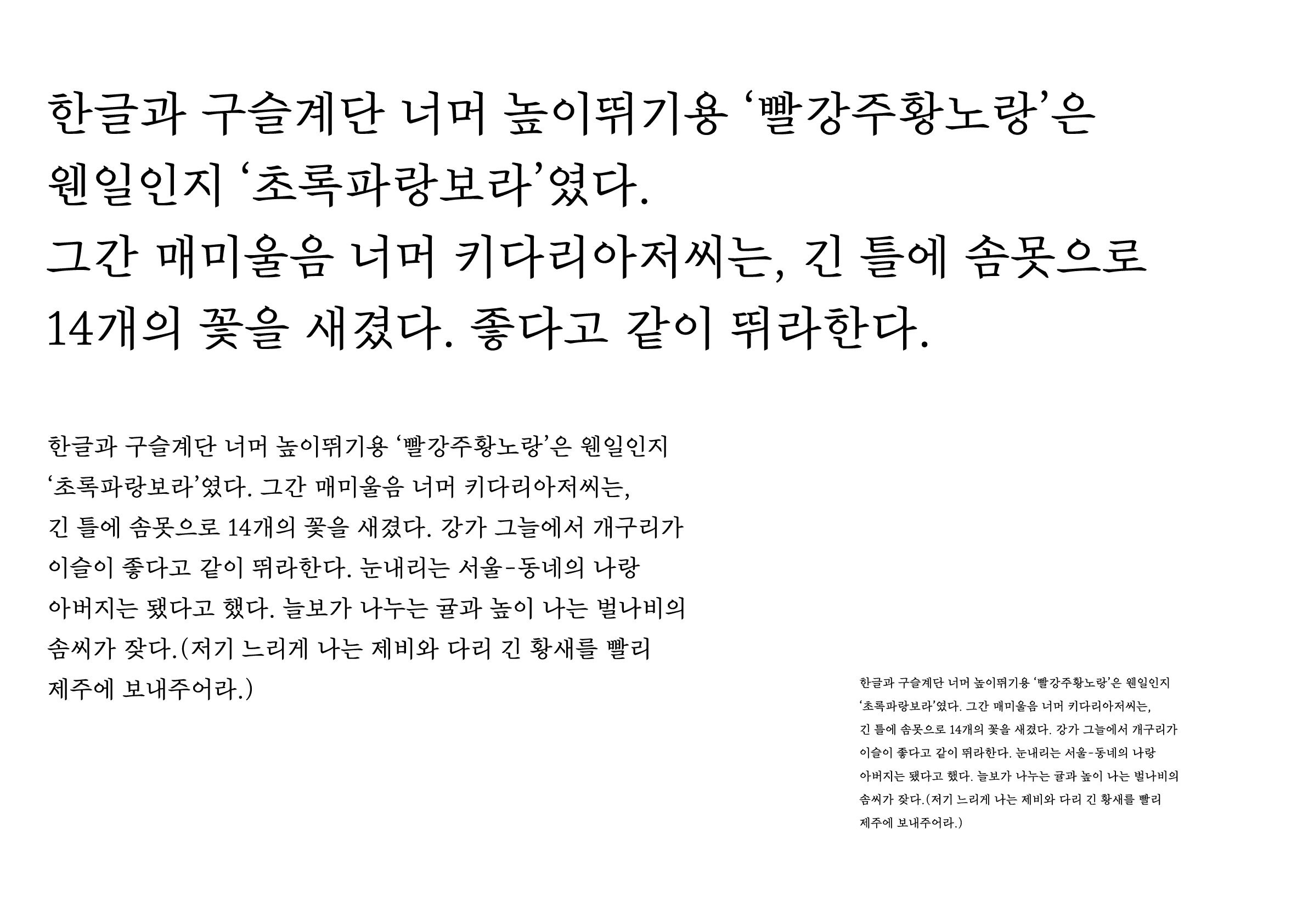
There was a time when I was reading an essay and the typeface used in the body text seemed too bland to capture the subtleties of everyday life. With this in mind, I have given this typeface a sense of sincerity and warmth. I designed a sleek and tender typeface suitable for essays, diaries, and other prose texts.
The space between SeMyeongjo and SinMyeongjo, as well as the typeface’s compact size and consonant ratio, gives it a nuanced pencil-like texture, making it ideal for body text.
Winner’s Comment
The Hangeul used as the text in the majority of books is a solid and firm typeface with its roots in Choijeongho. However, since I feel that it is not suitable for all literary genres, such as poetry, fiction, and essays, I hope to see more typefaces that express a variety of literary sensibilities in the future.