Hangeul category Morisawa Award
Bronze Prize
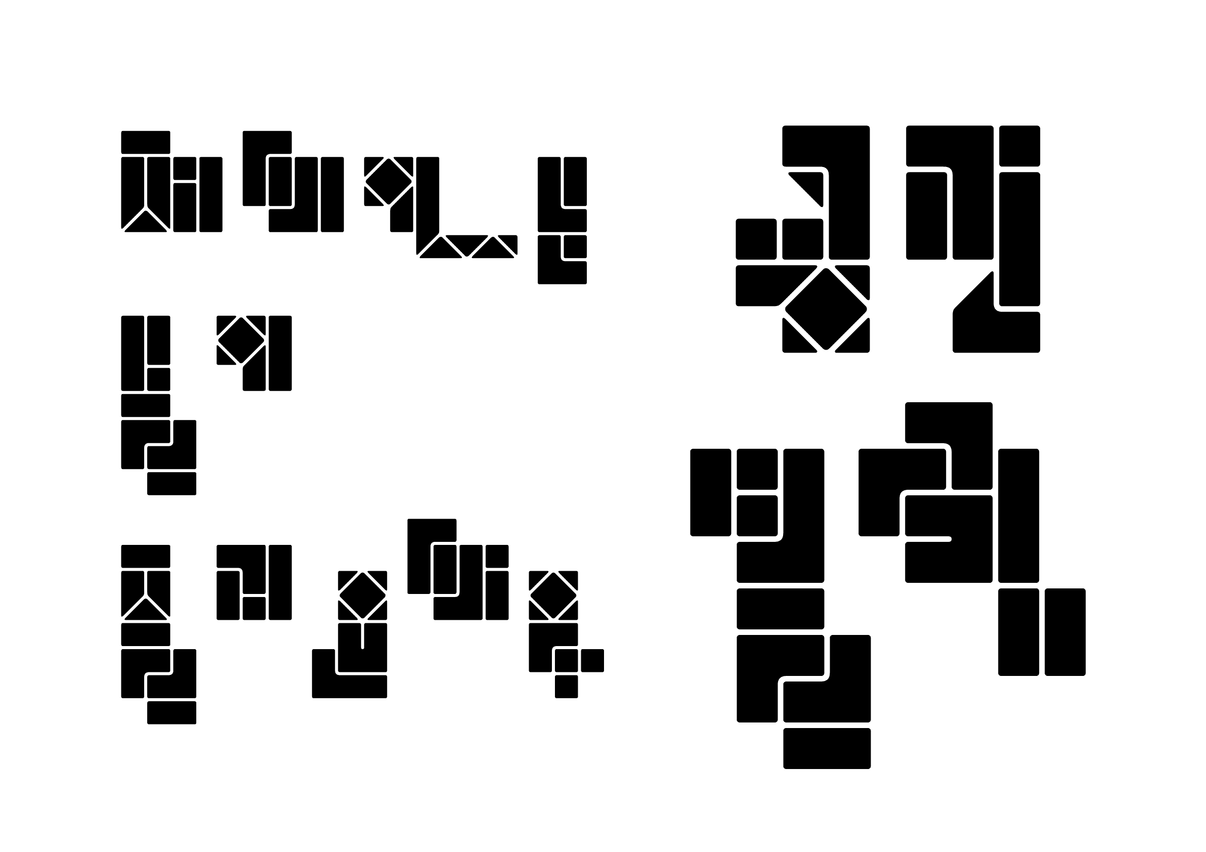
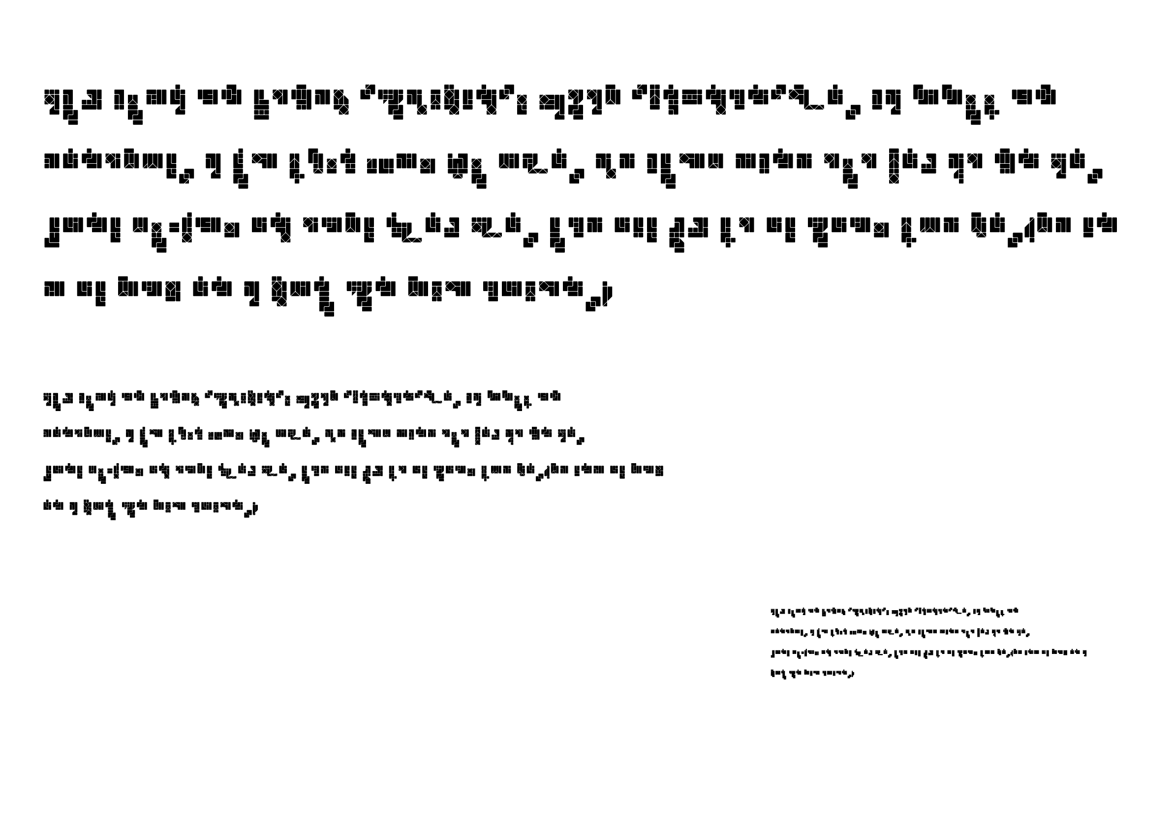
Space-Block
Designer
Seunghyub Lee
Republic of Korea
Born in Gyeongju, Republic of Korea. Studied typography at the Seoul Women’s University. After working as a font designer and content designer at the Yoondesign group, the recipient currently works as a freelance designer. Received the King Sejong Award at the 23rd Hangeul Font Design Contest (한글 글꼴디자인 공모전) in 2015.
Judges’ Comments
-
Wujin Sim
It is a creative work that reveals different facets depending on whether you focus on black or white. This typeface is so meticulously adjusted in legibility that even type designers find it perplexing; only those familiar with Hangeul can decipher it, but only after considerable effort. It gives a cold impression at first sight, but the more one looks at it, the more amusing it is. There are many typefaces with very few graphic elements used to create characters, but I have never seen a typeface with such endearing tenacity. I was especially excited to see a typeface with a creative interpretation of moa-sseugi (a syllabic method of grouping Hangeul characters). It offers a fun experience to find the designer’s ingenuity, as if you are solving a riddle by looking at the characters.
-
Sulki Choi
This work is a clear representation of the unique characteristics of the base letters (jamo) combination. When creating geometric typefaces using modules, one usually begins by following established rules, but the development of various glyphs results in inevitable exceptions to those initial rules. This work successfully solves the problem while maintaining consistency in that regard. The result is wonderful in that it achieves both of these two goals: the text is easy to read while the texture of the paragraphs changes to a multidimensional form.
-
Bon Min
Among the prize-winning works with characters engraved in white on a black background in the other categories, this work is particularly intriguing in that, as you continue reading, the characters can be read from both white and black like an optical illusion. One can identify the Hangeul characters from the white areas, and the sans serif from the black areas. With the diagonal lines giving a sense of depth to the characters, the typeface offers three different dimensional perspectives: white = line, black = surface, and the diagonal lines = three dimensional.


Intention of the work
This is a unique Hangeul typeface made up of 15 basic blocks, which can be completed as the boundaries between the blocks become the strokes of the characters. Just like assembling blocks, this design allows for the space between the characters to be combined in new and interesting ways to express Hangeul.
Winner’s Comment
Having worked as a font designer for a long time, I recently took a job in a different field. I was unsuccessful in each of the countless Morisawa competitions I entered, and this year’s entry in the Hangeul category was my last attempt at the competition. Fortunately, it led to successful results, for which I am very grateful, and it gave me the confidence to continue to create characters at my own pace, slowly but silently and persistently.