Hangeul category Morisawa Award
Honorable Mention
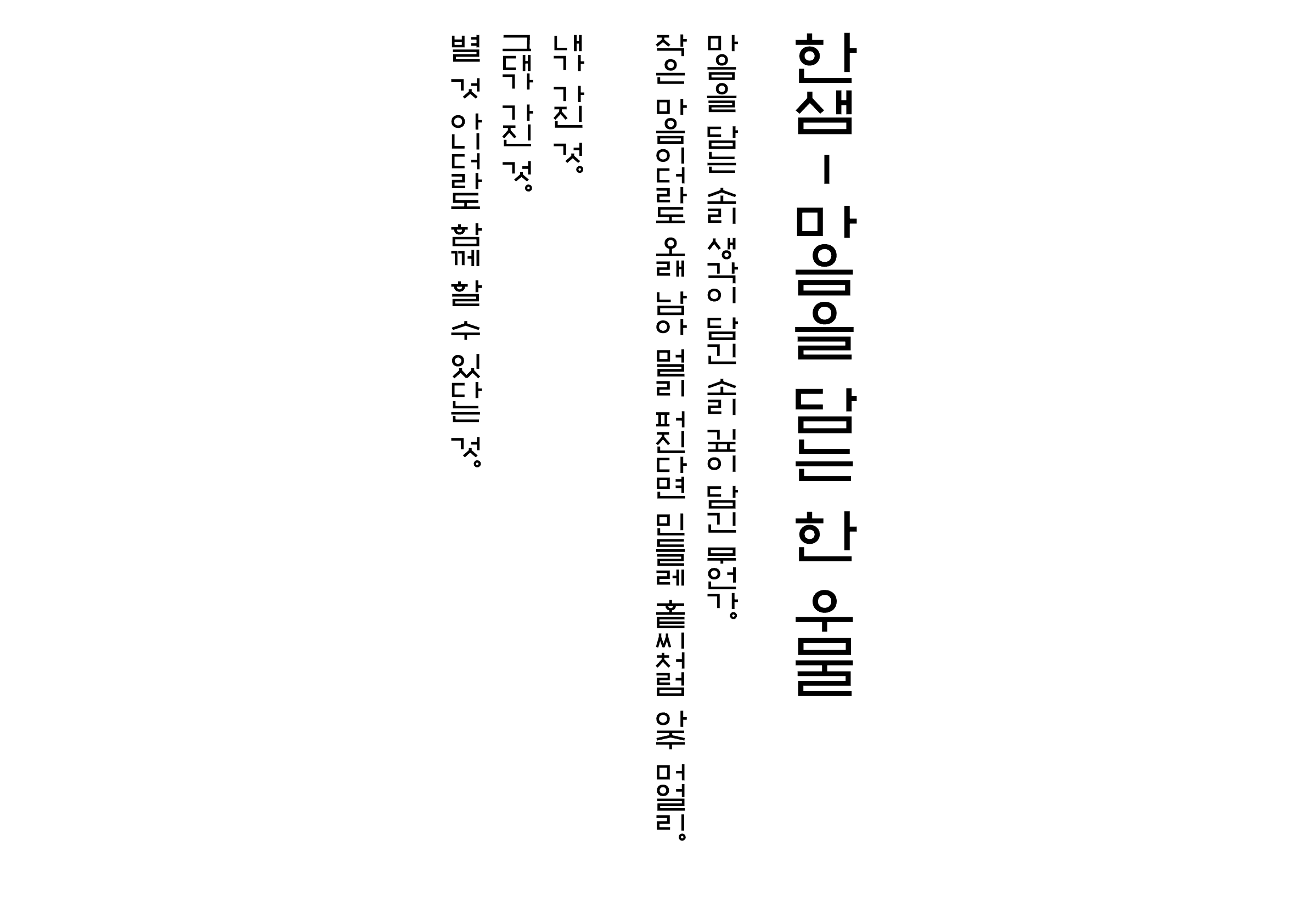
Han-saem
Designer
Soorin Park
Republic of Korea
A typography researcher, freelance type designer, and a Type Space member, currently studying MA in Visual Design at Hongik University. In 2023, she created Seogak (서각) for vertical settings. In 2024, her research paper “Consideration of ‘Partial Name’ Written in Hangeul among Wood Block Printed Korea Classic Novels” was featured in the journal of the Design History Society of Korea.
Judges’ Comments
-
Wujin Sim
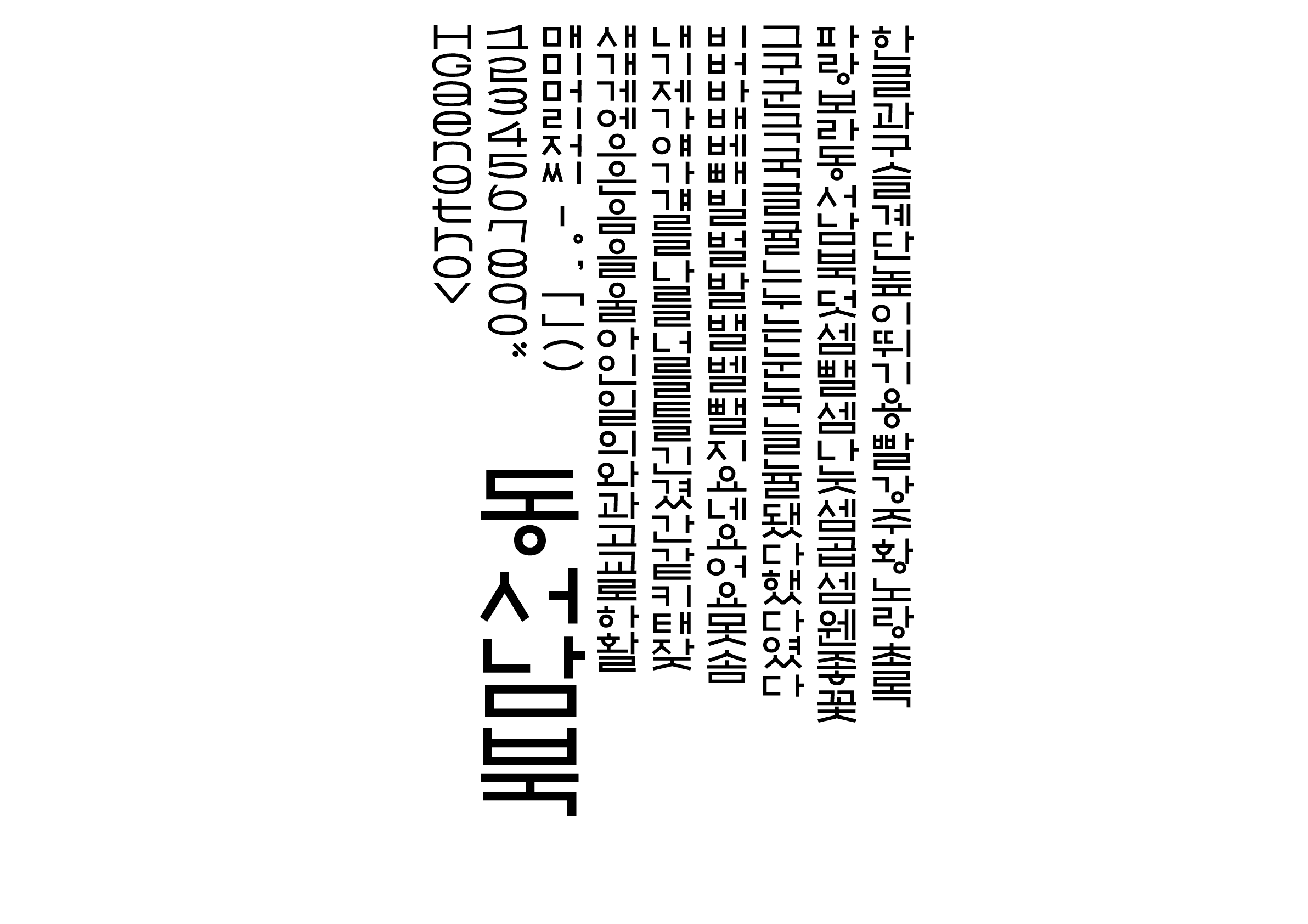
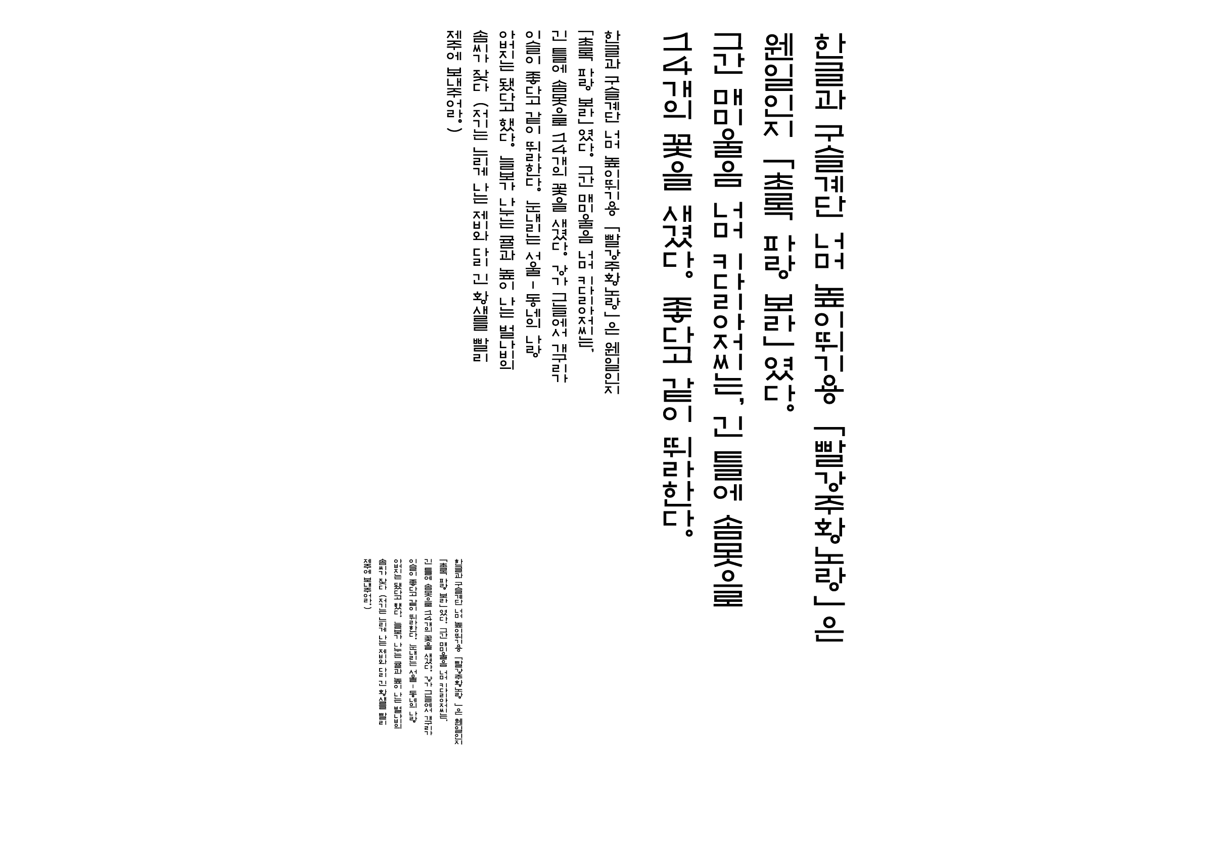
This typeface boldly takes on a modern reinterpretation of the original forms of Hunminjeongeum, the native Korean phonetic script that is a precursor to Hangeul. It successfully expresses the rare typology of “proportional width and vertical setting,” while creatively reinterpreting combinations with alphanumerics, which has been a longstanding task in vertical settings. The unique texture seen particularly in the smaller font sizes adds to the charm of vertical reading.
-
Sulki Choi
Each letter is constructed based on geometric principles, yet the overall design is reminiscent of the characters found in the Hunminjeongeum Haerye (explanations and examples of the proper sounds) manuscript. It is unfortunate that the Roman alphabet couldn’t fully reflect the geometric logic of Hangeul, but this typeface breaks free from conventional Hangeul print styles and purely captures the structural characteristics of Hangeul. It suggests new possibilities in combining syllabic characters.
-
Bon Min
Since Hangeul was traditionally used in vertical writing, setting the compression direction vertically (top to bottom) for the Hangeul typeface “Condensed” is a sensible choice. Improvements in refining the details and alphanumeric design would make it an effective communication tool for a wide range of information, including the ingredient list on narrow packaging surfaces of food and pharmaceuticals.


Intention of the work
Based on the typeface created in the early phases of Hunminjeongeum (訓民正音, the native Korean phonetic script) and Seokbosangjeol (釈譜詳節, the biography of Buddha written in Korean), which features the horizontal alignment of character strings, this typeface has a simple structure and expression for use in vertical headings.
Winner’s Comment
Han-saem (한샘) signifies endless development and growth. My entry into the competition was driven by a desire to make steady efforts in the creation and research of typefaces, so I am both honored and grateful to receive the award with Han-saem.