
Hangeul category Morisawa Award
Honorable Mention
Neoguri
Designer
Samyeol Ahn
Republic of Korea
Born in Seoul in 1971. After graduating from Hongik University with a degree in Visual Design, he worked as a graphic designer at Ahn Graphics from 1996 to 2001. Currently active as a freelance designer. Received the Type Design Award at the Tokyo TDC 2013 for the “Ahn sam-yeol” Hangeul typeface.
Judges’ Comments
-
Wujin Sim
This typeface is the result of a deep understanding of the physical movement of brushstrokes and the masterful skill in bringing it to life. There is sensitivity in its strong, playful design. The perfect balance in spacing and the proportional system are executed well, with a natural flow in the text regardless of its font size. The more you look at it, the more creative details you discover, making it undeniably a fascinating typeface.
-
Sulki Choi
Despite the character filling up the entire character box, it’s fascinating how it feels relaxed, overflowing with a rich sense of rhythm. I was genuinely impressed by the designer’s creative approach to solving each glyph like a puzzle.
-
Bon Min
The designer’s goals are clear, but the versatility of the typeface may be somewhat limited. It could be polished with more attention to detail, such as refined adjustments to stroke weight variation. Maintaining consistency in the brushwork would also improve the overall cohesiveness of the design.
Intention of the work
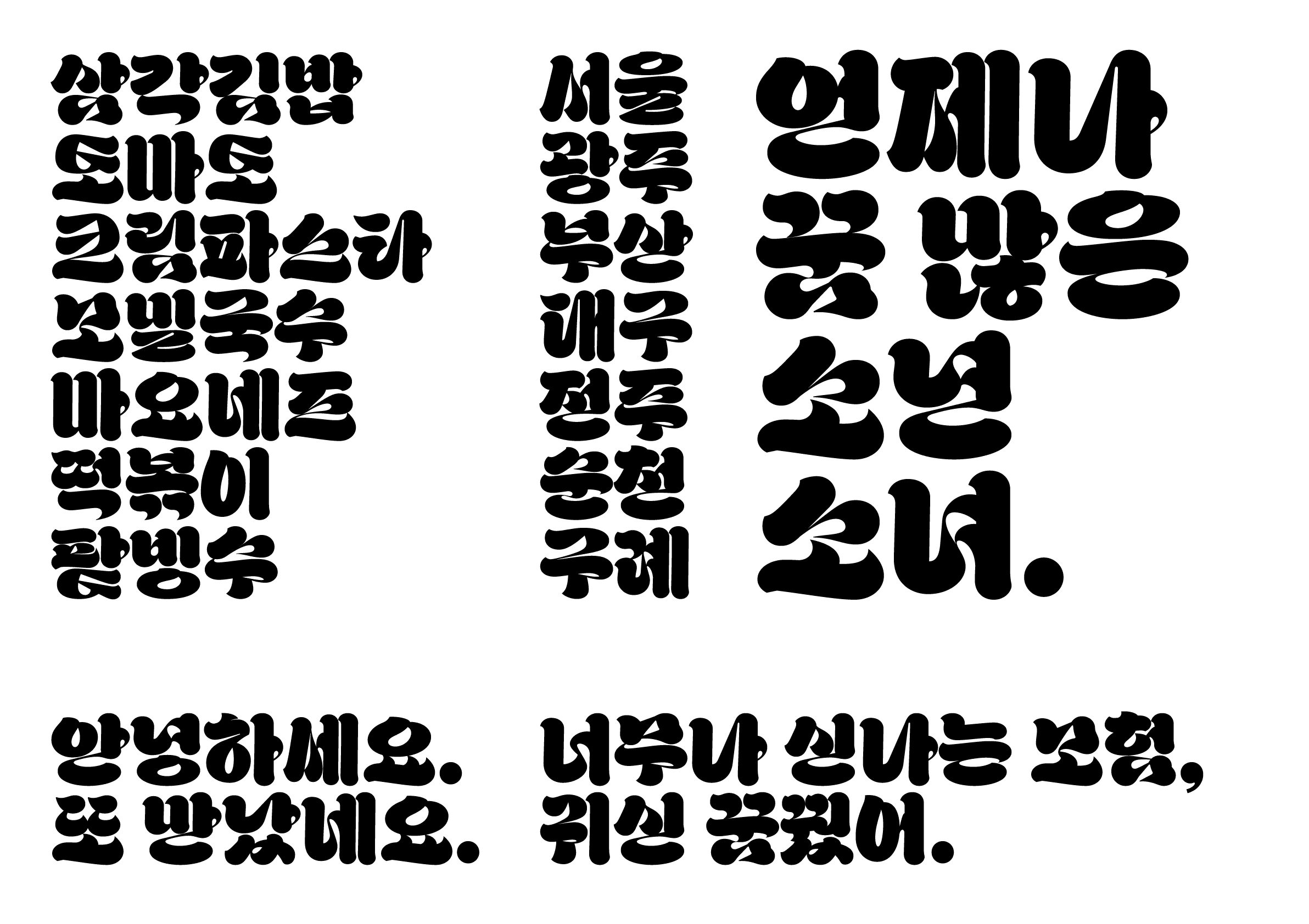
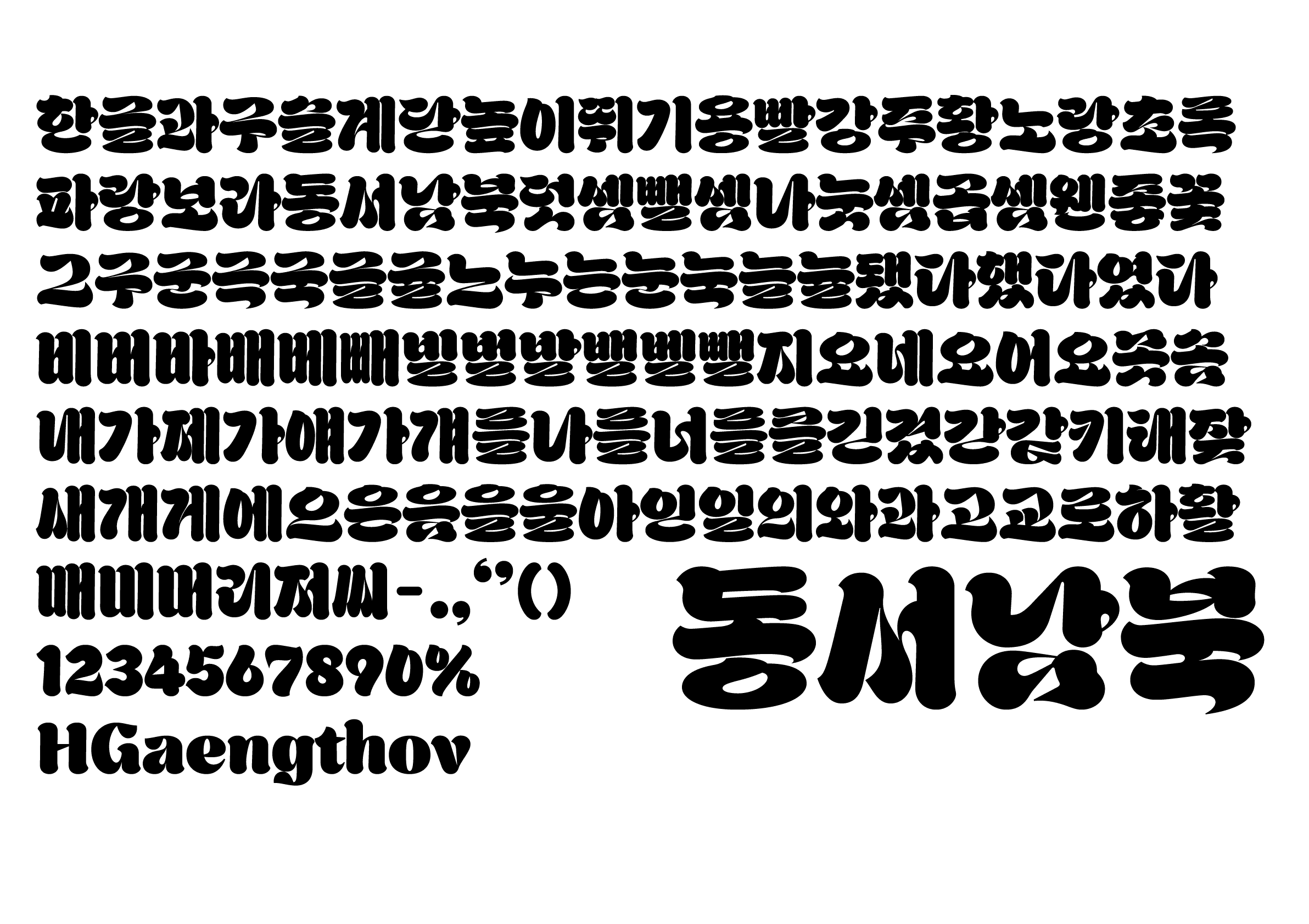
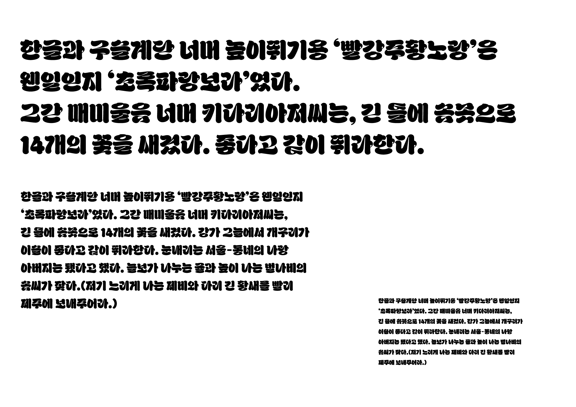
The use of the Hangeul character Heullim (a cursive stroke) is a challenge in the modern Hangeul writing system, due to its illegibility and the way strokes are used in vertical writing. However, I think that this character system holds the potential for a wide range of interpretations of strokes and many expressive possibilities. Neoguri (너구리) is a display typeface that combines the hand movements of traditional calligraphy with the spontaneity of graffiti.
Winner’s Comment
Even though it hasn't been fully refined, this experience has opened up new and diverse possibilities for Hangeul Heullim. Hopefully, one day an even more refined Heullim will come along.