
Hangeul category Morisawa Award
Honorable Mention
Code Square
Designer
Juyeon Kim
Republic of Korea
Born in Busan, Republic of Korea, in 1998. Studied Visual Design at the Graduate School of Techno Design, Kookmin University.
Judges’ Comments
-
Wujin Sim
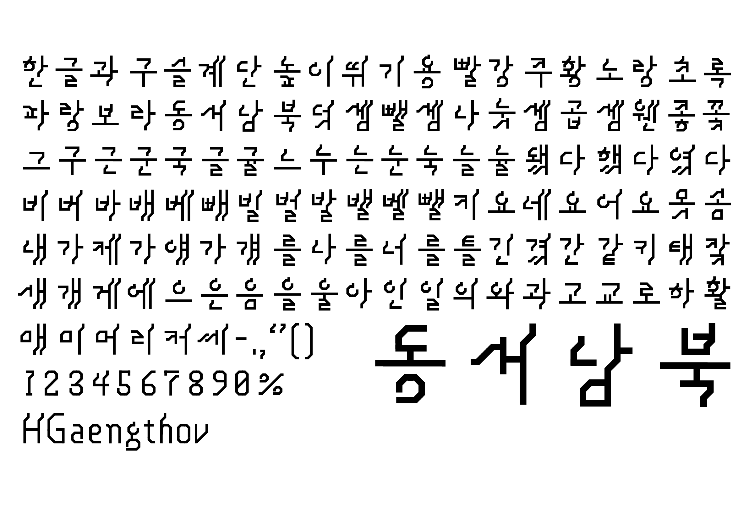
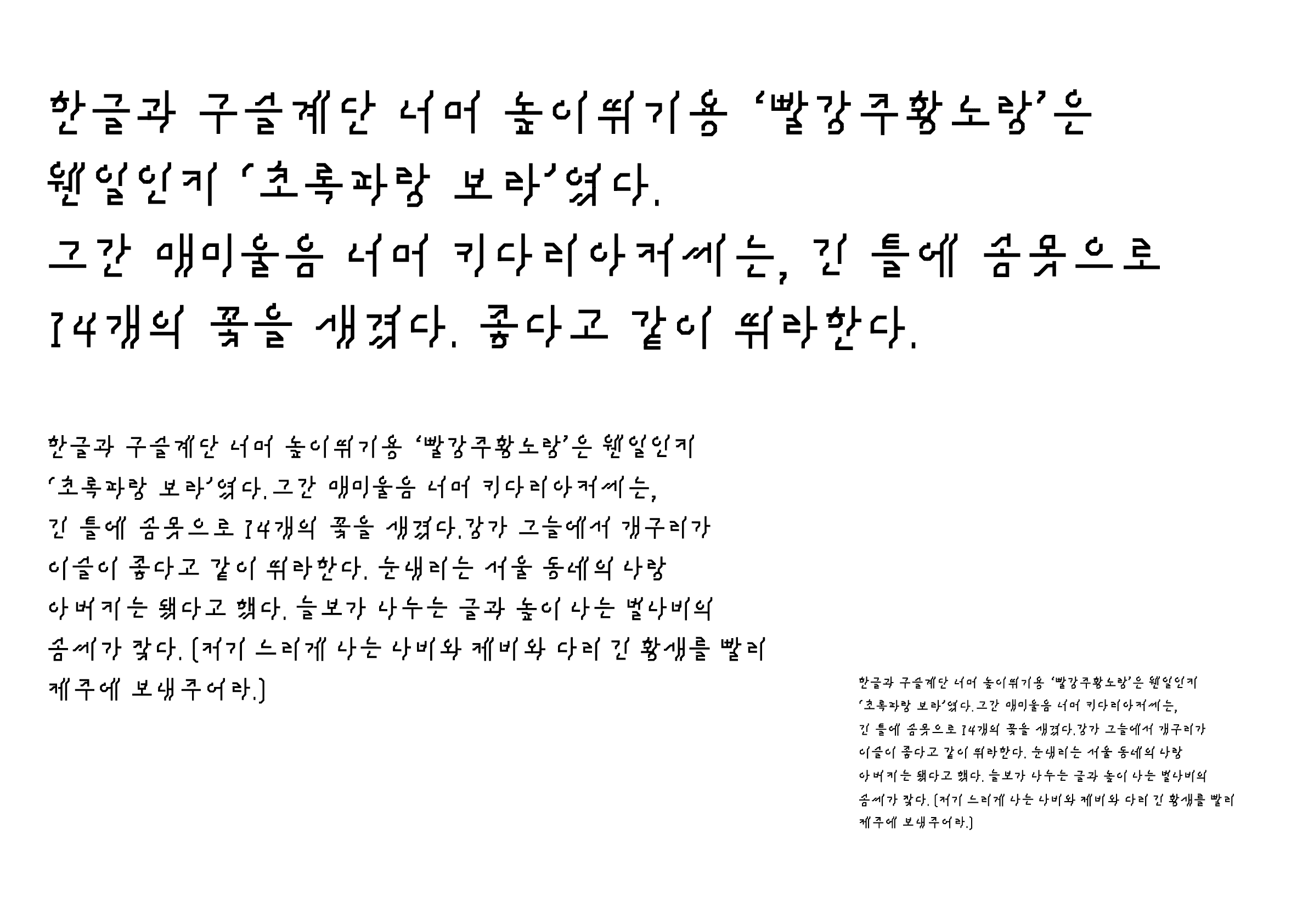
This typeface successfully captures the concept of wavy letters—a seemingly simple idea in words, but difficult to execute. Creating 45-degree angles to vertical lines allows the stems to evenly distribute across various characters, creating a stable design with a touch of flair. Although the alphanumerics and punctuation marks lack the same charm as the Hangeul characters, it remains a very interesting typeface, especially when looking at characters like “배” and “베.”
-
Sulki Choi
At a small font size, it appears to look like Heullim (a cursive stroke), while enlarged appears pixelated. It is truly fascinating how the polar opposite styles of Heullim and pixel coexist in one typeface. The principles in forming the characters are not consistent and somewhat arbitrary, but this very feature highlights the organic, irregular impression similar to handwriting.
-
Bon Min
This is an interesting attempt at adding partial slants to the strokes and giving the entire text a dynamic feel. It reminds us of the scrolling italicized text on LED display boards. If this approach were applied in Jenny Holzer’s works using Hangeul, it could yield fascinating results.
Intention of the work
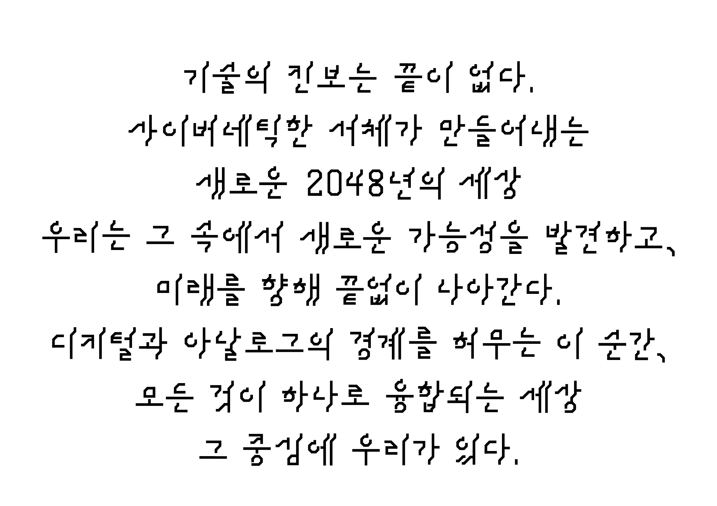
Inspired by cyberpunk, the design features a unique inflection of consonants and vowels, and an upside-down inversion of vowel formations, which are elements that convey a modern and innovative aesthetic through radical changes rarely seen in traditional Hangeul typefaces.
Winner’s Comment
I am very honored to receive this prestigious award in the competition for a font that reflects my personal preferences, and I am glad that my new endeavor has been recognized. This experience will inspire me to continue being even more creative and purposeful. I would like to thank all of you for your support!