
Hangeul category Morisawa Award
Honorable Mention
Kyulgu Sans
Designer
Soonhyung Kwon
Republic of Korea
Currently a third-year student at Hongik University’s Department of Visual Design. In 2024, the recipient launched the Gabia Gosranche font through the “Gabia Font Project.” With his love for typography, he strives to fulfill his dream of becoming a type designer.
Judges’ Comments
-
Wujin Sim
If the core element of Dotum (sans serif) is the condensation of the character elements that have existed so far, this typeface represents the future of sans serif. Setting itself apart from the traditional Dotum typefaces with exaggerated consonants, this typeface follows a more natural proportion seen in handwritten consonants, with a softness that comes from cleverly omitting sharp corners. The design could be further refined with improvements in the alphanumerics and punctuation marks.
-
Sulki Choi
A sans serif typeface that follows the recent trend in Hangeul design, focusing on the balance of space within the letterforms rather than filling up the corners. The detailing in rounding off the corners of the angled strokes creates a soft, gentle impression, while the contrasting protruding parts of the strokes are intensified, giving a sharp effect. The idea of combining seemingly contradictory details is intriguing.
-
Bon Min
The structure of the characters and the detailing at the junctions of the strokes catch the eye, creating an overall well-balanced, harmonious design.
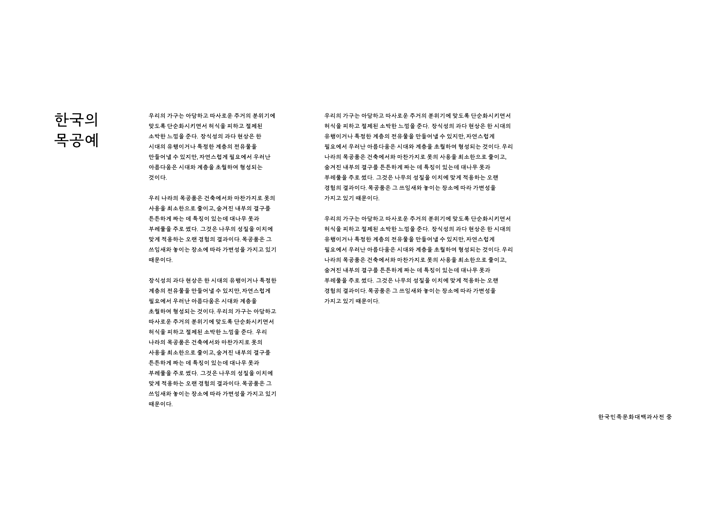
Sources referenced in the sample text of the work: Woodcraft - Encyclopedia of Korean Culture
Intention of the work
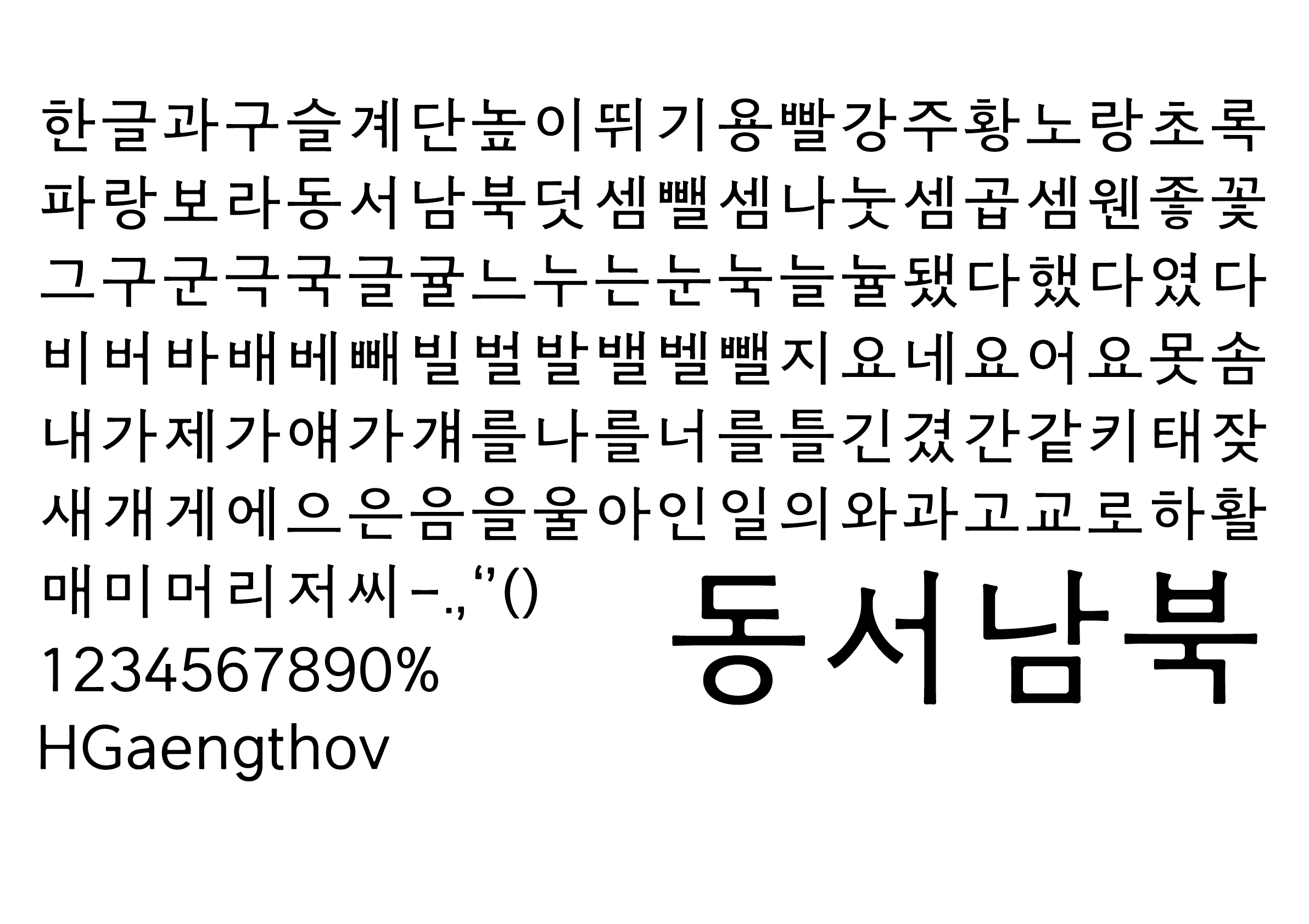
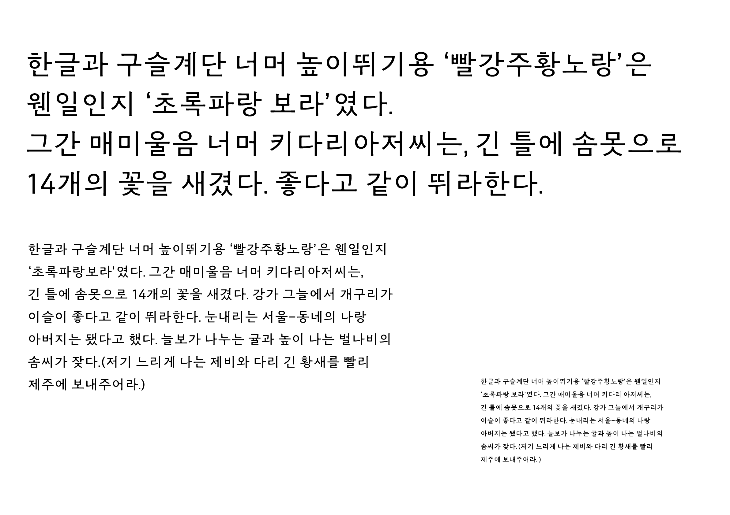
Kyulgu Sans (결구체) is a Minburi (sans serif) intended for use in body text that is characterized by a blurring effect to soften the appearance of angular strokes.
I tried to incorporate the graceful and delicate characteristics of the Buri (serif) into the Minburi.
The name of this typeface, Kyulgu, means “wood joinery,” derived from the impression of a thin and sturdy Hanok (Korean traditional house).
Winner’s Comment
I took part in this competition in order to build a foundation for my growth as a font designer.
Encouraged by this award, I would like to continue creating beautiful typefaces that contribute to visual culture.