
Simplified Chinese category Morisawa Award
Gold Prize
WENKAI
Designer
Dingci Sun
China
Born in Songxi County, Fujian Province, China. Studied at the Central Academy of Fine Arts and is currently working at Hanyi Fonts.
Judges’ Comments
-
Zhu Zhiwei
This is a very unique work that was unanimously selected for the Gold Prize. While the block style is generally written with an orderly structure, this typeface has a very relaxed feel to it. There is a sense of uniformity in the character size and the stroke thickness, resulting in a very even, beautifully assembled composition. The round, seal-script-like hand movements have no excessive turning strokes or stops, with an elastic line quality. Seemingly light, but actually well-put-together lines evoke a Zen-like aesthetic.
-
Chen Rong
This Gold Prize-winning typeface is sure to inspire many to use it. While the designer explained having adopted the style of Bada Shanren (八大山人), I personally felt more of the Great Master Hong Yi (弘一法師)’s style. The most important feature of this work above all is that it strongly conveys a generous handwritten feel with a very relaxed, modern style. The typeface is particularly beautiful when set vertically, and I think it is a fusion of old-fashioned literati and a humanist atmosphere.
-
Liu Xiaoxiang
This work caught our attention from the beginning of the evaluation process. According to the design concept, it incorporates the calligraphic style of Bada Shanren (八大山人), the biggest challenge is how easily the connection between the brush endings of the previous letters and the brush beginning of the next letters—in other words, the relationship between the letters—can be lost. In this work, however, the flow between the letters is clearly visible, and the blackness in the layout is pleasantly even and uniform.
Intention of the work
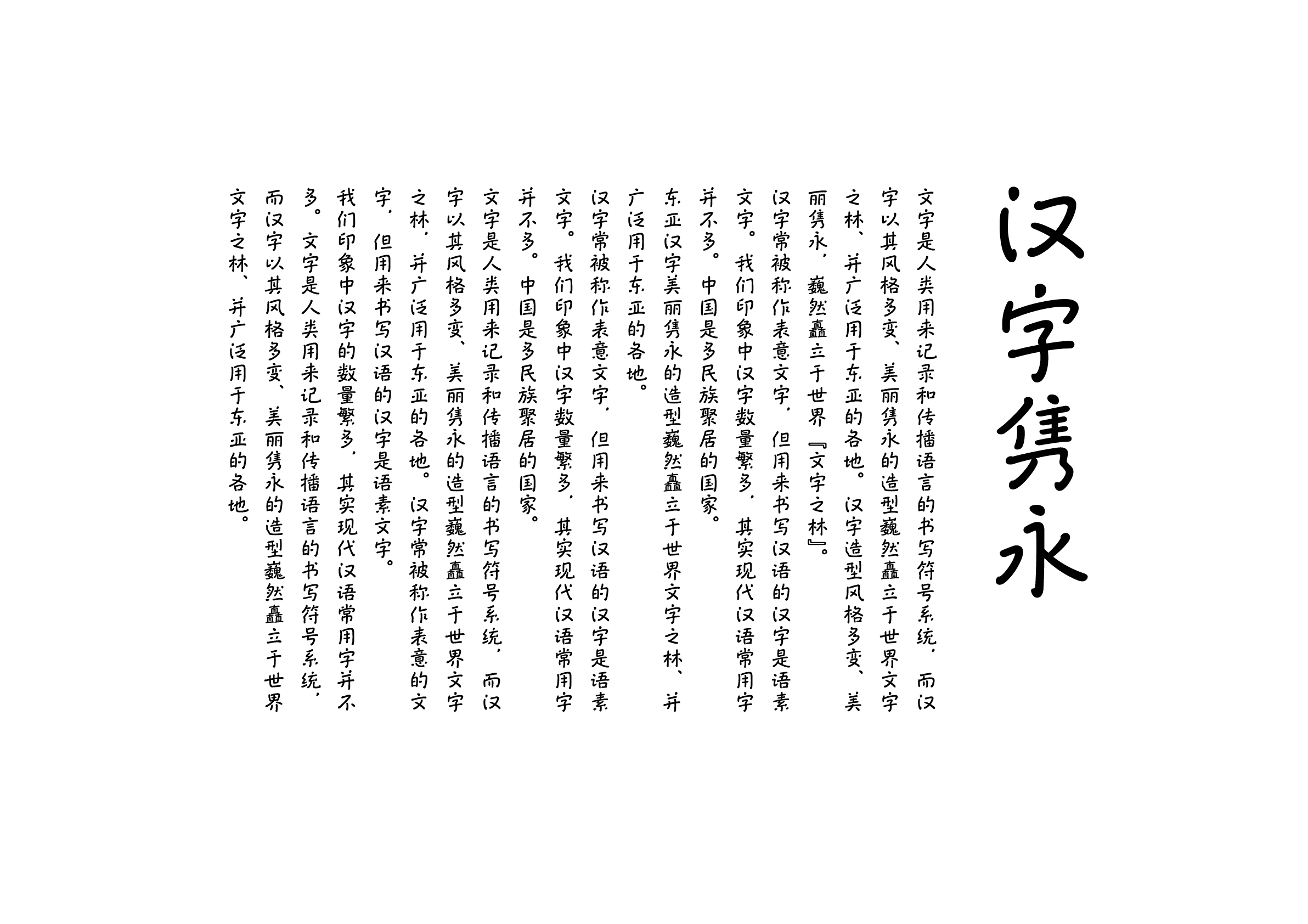
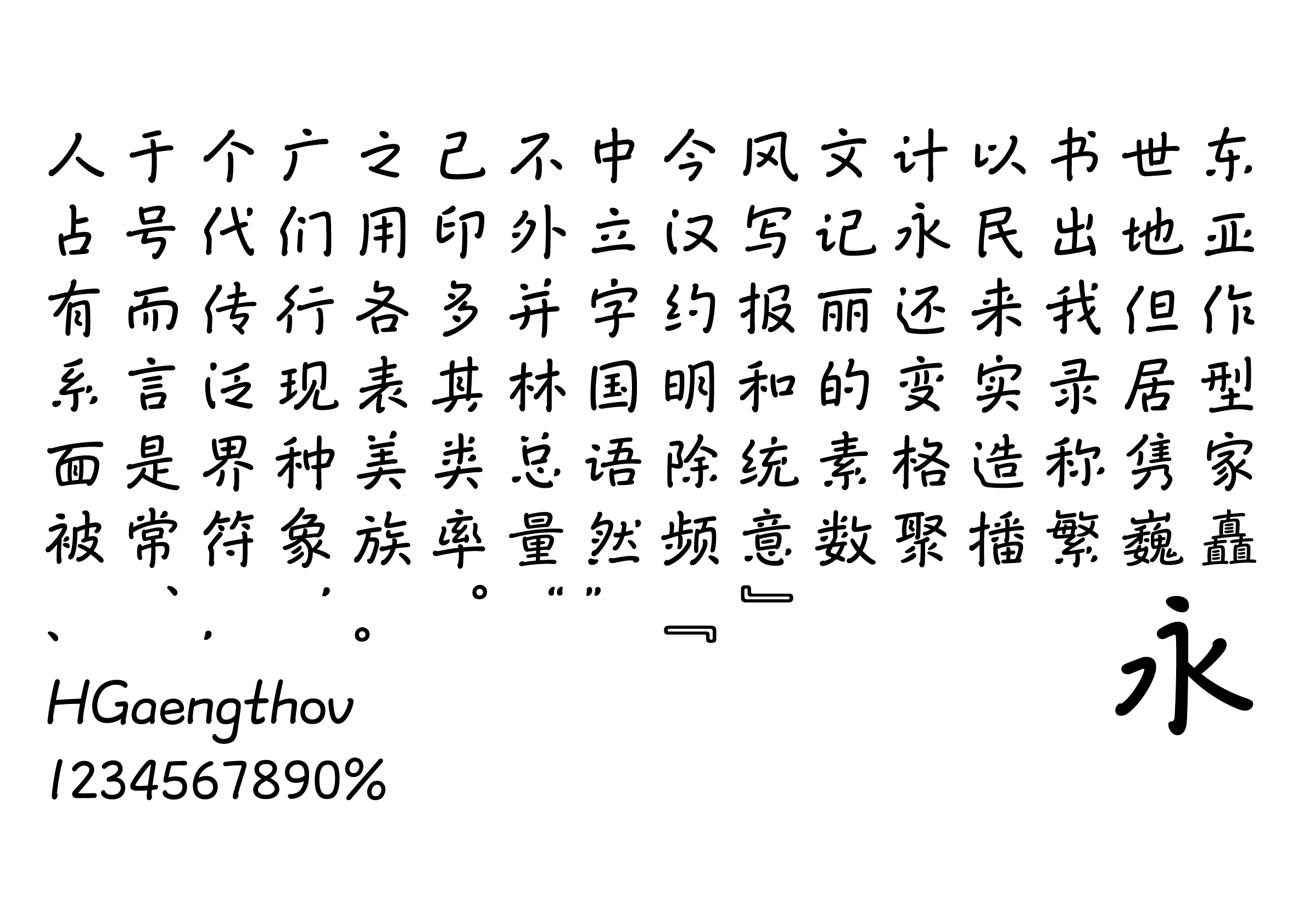
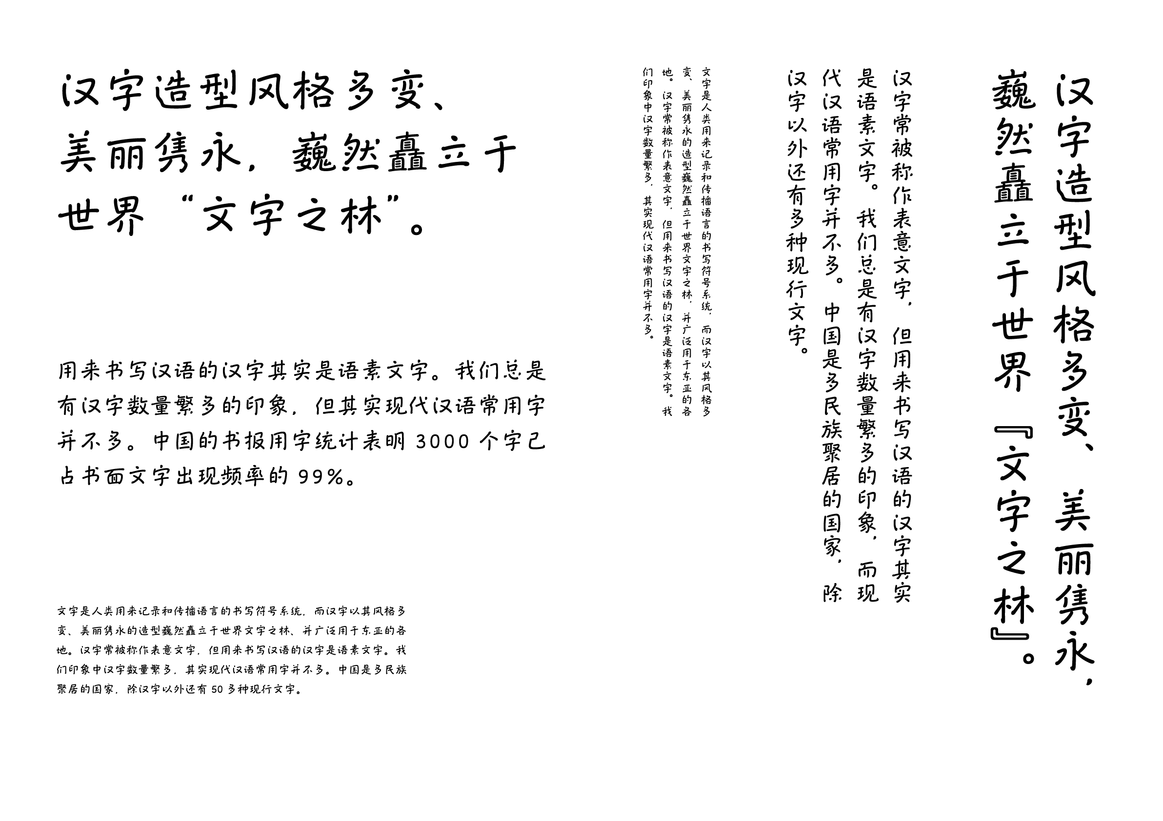
Most people associate the block style with the Four Great Calligraphic Styles of “Yan (顔), Ou (欧), Liu (柳), and Zhao (趙),” as well as the image of dynamism and rigidness. But the question is whether a good block style necessarily has to conform to this image. Bada Shanren (八大山人) known as Zhu Da (朱耷) studied the various schools of calligraphy styles to create a rounded and simple calligraphy style, utilizing the central brush-point technique (中鋒). This typeface is a new take on the traditional block style, incorporating Zhu Da’s unique brushwork to create a natural, unorthodox style of literati-style block style.
Winner’s Comment
I created WENKAI (文楷) during the loneliest summer of my life, and my only friend at the time were text. I am not diligent by nature and often felt like giving up halfway through this independent work done after my ordinary work. So, I thank myself for persevering and completing the project. This award is a great encouragement and gave me confidence that putting my heart and soul into lettering and creating with sincerity will always produce something of value.