
Simplified Chinese category Morisawa Award
Silver Prize
Xin Feng VF
Designer
Yixuan Wu
China
A subcontract font designer for Hanyi Fonts and FounderType; and a member of the MeiHeYuan Typographic Club and the Nanjing Graphic Designer Alliance (NGA). A winner of numerous awards, including the Founder Award and the Hanyi FontStar Design Competition Silver and Bronze Awards.
Judges’ Comments
-
Zhu Zhiwei
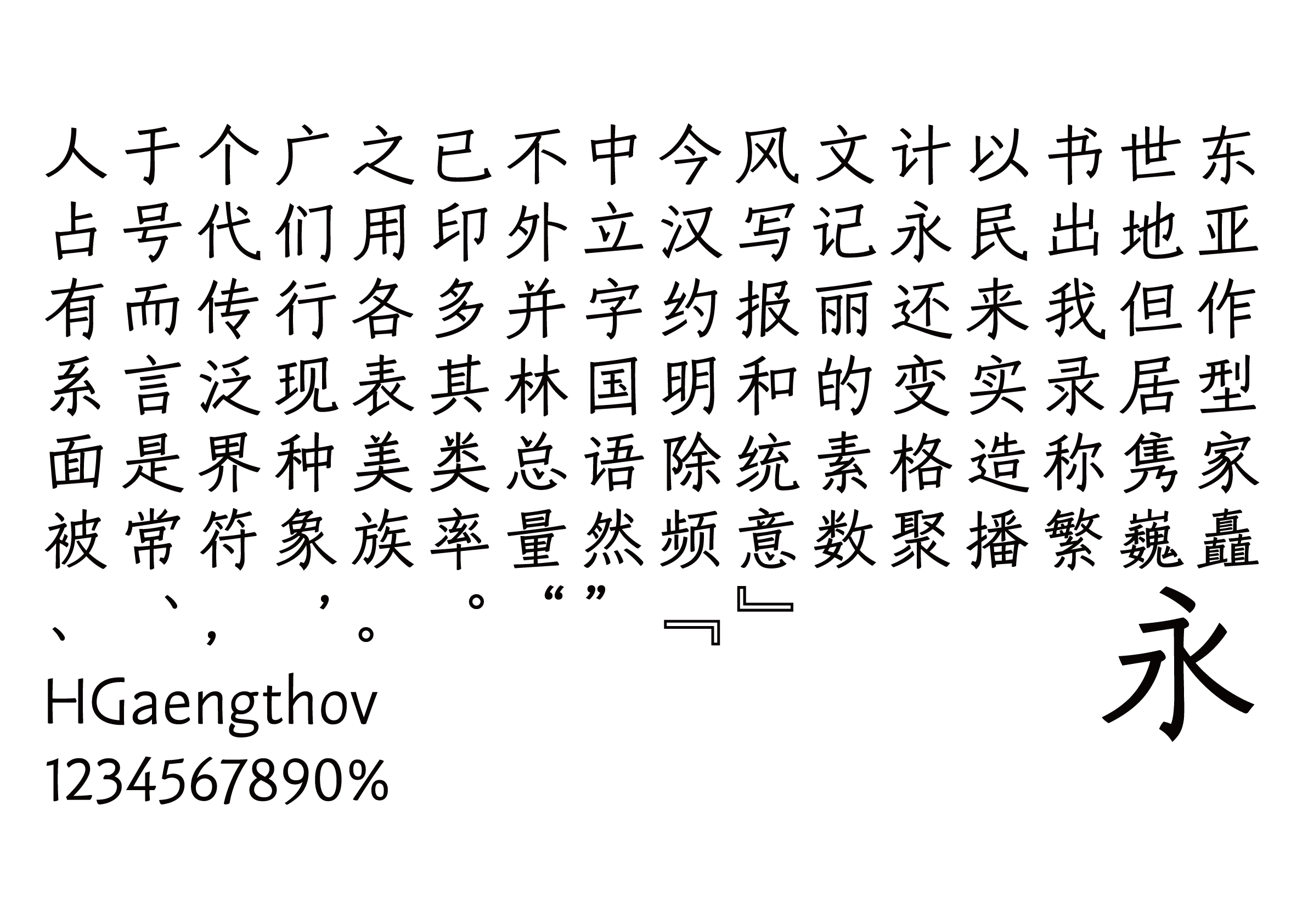
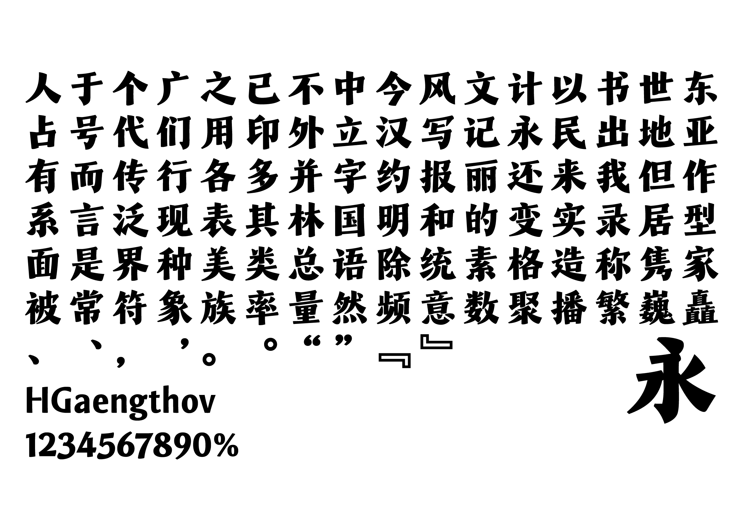
Since many of the recent sans serif typefaces have been overly rigorous in design, I was hoping to see a more dynamic design with more movement. The overall impression of this work is long and narrow, with upward-slanted horizontal strokes that give the sense of hand movement and brush strokes. A positive aspect of this sans serif, with its relaxed handwritten quality, is the font family expansion in the standardized design approach of the serif typefaces.
-
Chen Rong
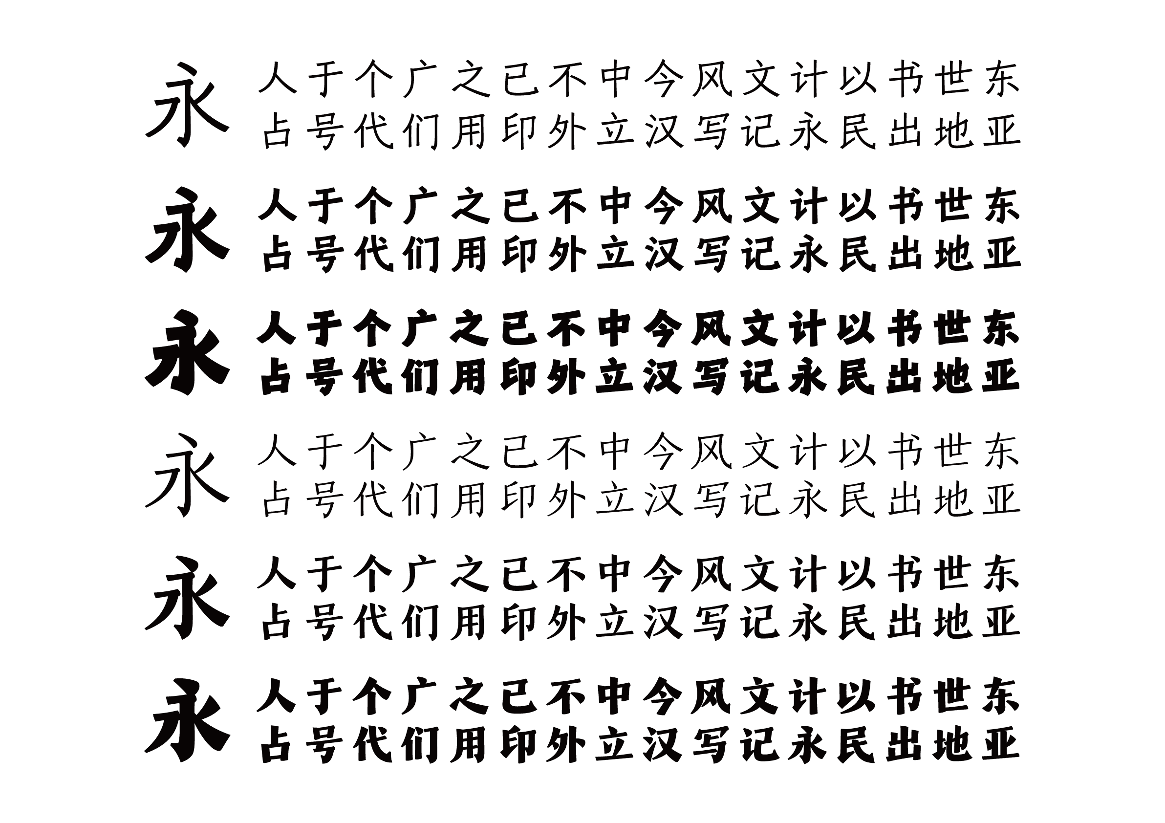
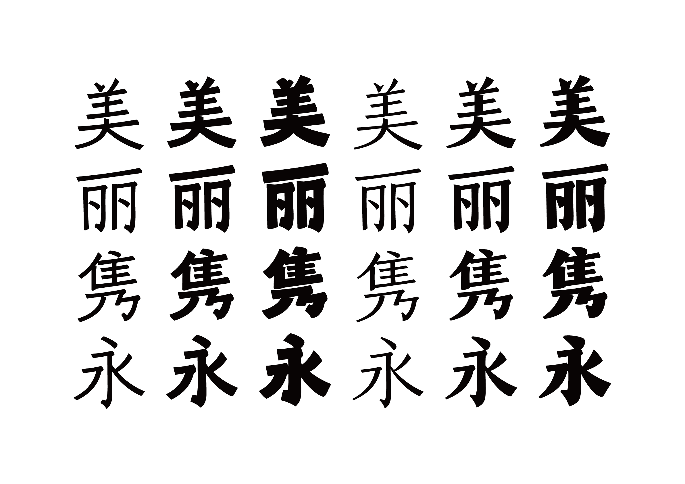
This work is a large font family with two axes of change. It would be possible to create more than nine typefaces by interpolating the master fonts from the six submitted. What is intriguing about this work is that it successfully blends font styles into a unique design without adhering to specific typefaces such as serif, sans serif, or block style. While the designer’s own calligraphic technique could use some improvement, more detailed adjustment of the position and angle of the horizontal stroke would make for a more stable horizontal setting.
-
Liu Xiaoxiang
It has the same handwritten quality as the Gold-Prize-winning typeface, but takes a completely different approach. One can see from the original sample that this typeface is composed as a font family, as evidenced by the two-axis variation in the weight and contrast. The upward-slanted horizontal strokes emphasize the handwritten quality of the characters, giving them a strong personality, while the stroke treatment and the element design seem to reflect the designer’s own ideas. I think it is a very nice handwritten typeface that flows well when set.
Intention of the work
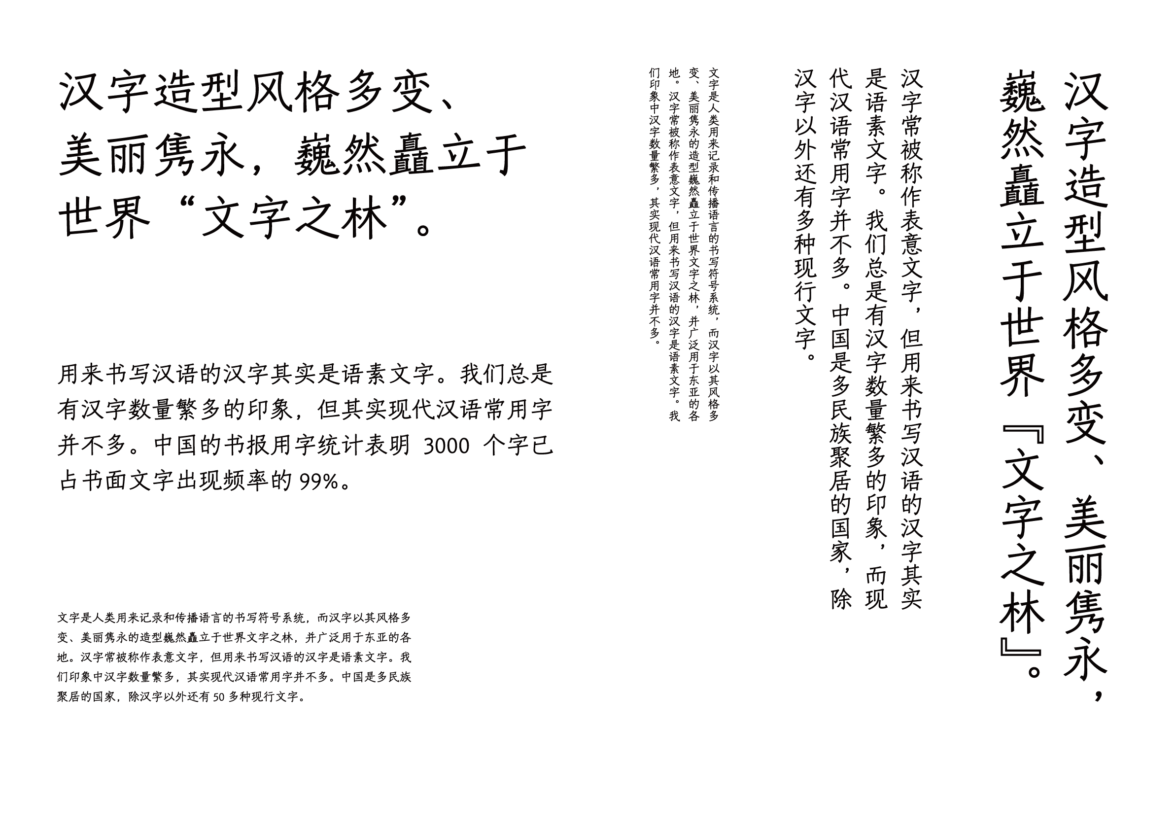
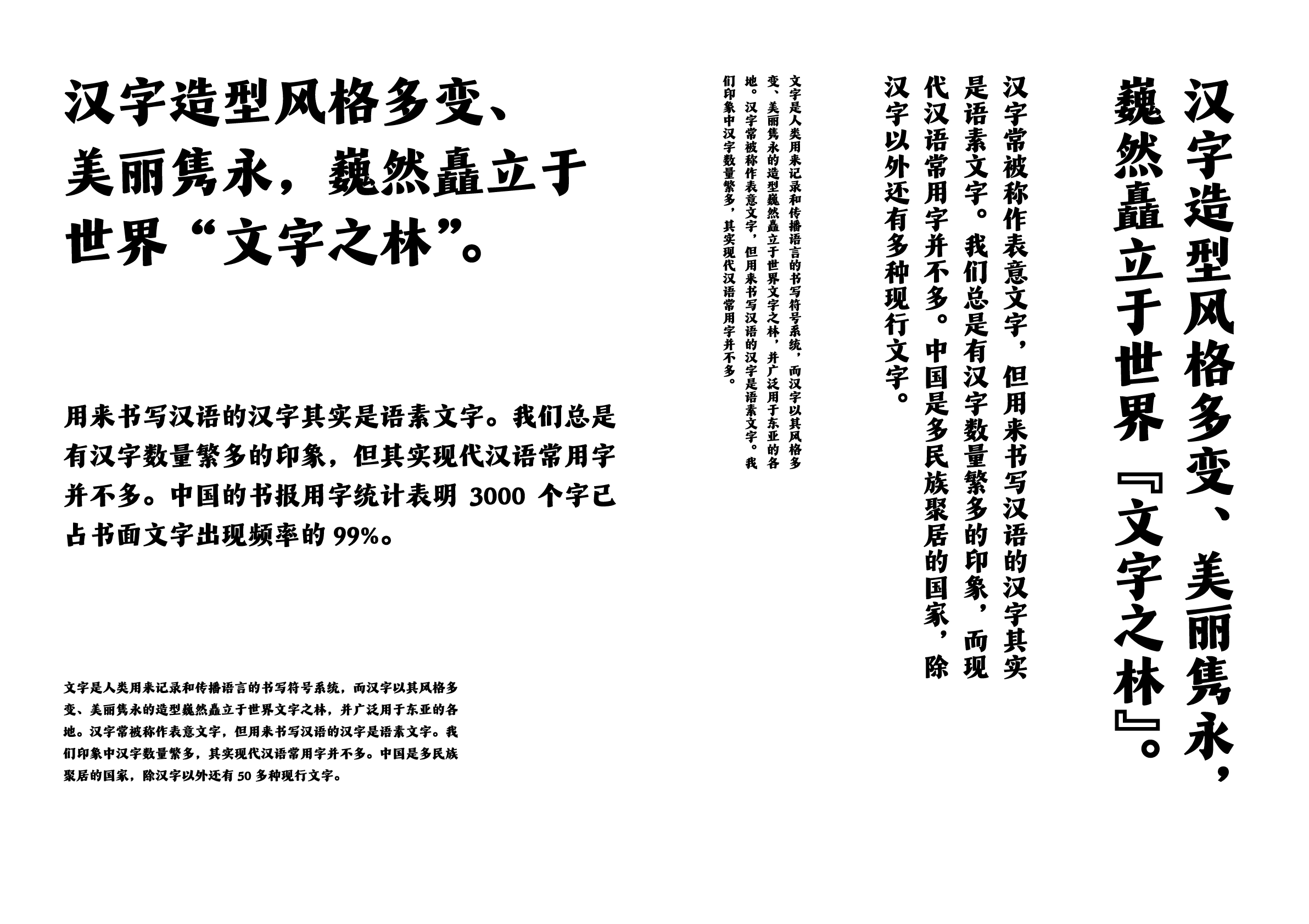
Xin Feng (新風) is a variable font family with two axes: weight and style. Inspired by the printed book Ban Ma zi lei (班馬字類), this typeface achieves a simple outline and a modern visual taste while retaining the quality of handwriting. It presents the new possibilities of font families as variable fonts with two axes, combining two styles—classic and modern—with aligned anchor points.
Winner’s Comment
Variable fonts for Chinese characters with very complex forms were rarely seen in previous competitions. This competition gave me the opportunity to create a variable font for Chinese characters. I believe the Chinese font family has the potential to go beyond simply changing the font weight for variation and create more fascinating new forms.