
Simplified Chinese category Morisawa Award
Bronze Prize
TangMoBang
Designer
Yujian Wang
China
Born in Tangshan, Hebei Province, China. Studied visual communication at university and is currently working at Hanyi Fonts. Won the Third Prize and the Jury Prize at the 2023 Hanyi Fontstar Design Competition.

Judges’ Comments
-
Zhu Zhiwei
This typeface is a thick block style with slight Wei Bei style hand movements. It is a dignified style of Bangshu (榜書, large-scale calligraphy), yet remains understated, and rather modest. Although the bold block style can be very difficult to design, the overall impression is well-balanced with strong, bold strokes. Taking a specific look at the strokes, the horizontal and vertical strokes, left and right endings, and other brush beginning and ending strokes are all consistent. The hand movements and turning strokes are all in perfect alignment. It is a work with a very high degree of perfection.
-
Chen Rong
This typeface is a bold block style used for signages called Bangshu (榜書, large-scale calligraphy) in Chinese, which requires maintaining dynamism and a bold, stern form to be used for plaques. The designer’s challenge deserves praise, as it is one of the most difficult styles in typefaces. The inner space of the characters is also meticulously designed, with excellent control over the strokes, resulting in legibility even at small sizes. Unlike traditional Bangshu calligraphy, with its rigorous nature, the rounded strokes of this typeface give it a softer and friendly impression.
-
Liu Xiaoxiang
At this level of boldness, the Chinese characters look almost like a geometric pattern to a graphic designer’s eyes, however, each character maintains its individual beauty, which is a wonderful achievement. The bold block style is very difficult to balance between characters with different stroke counts, but this work skillfully overcomes the challenge. Even in the design of alphanumeric characters, which can be tricky in setting, the seamless harmony with the Chinese characters makes it truly an prize-worthy typeface.
Intention of the work
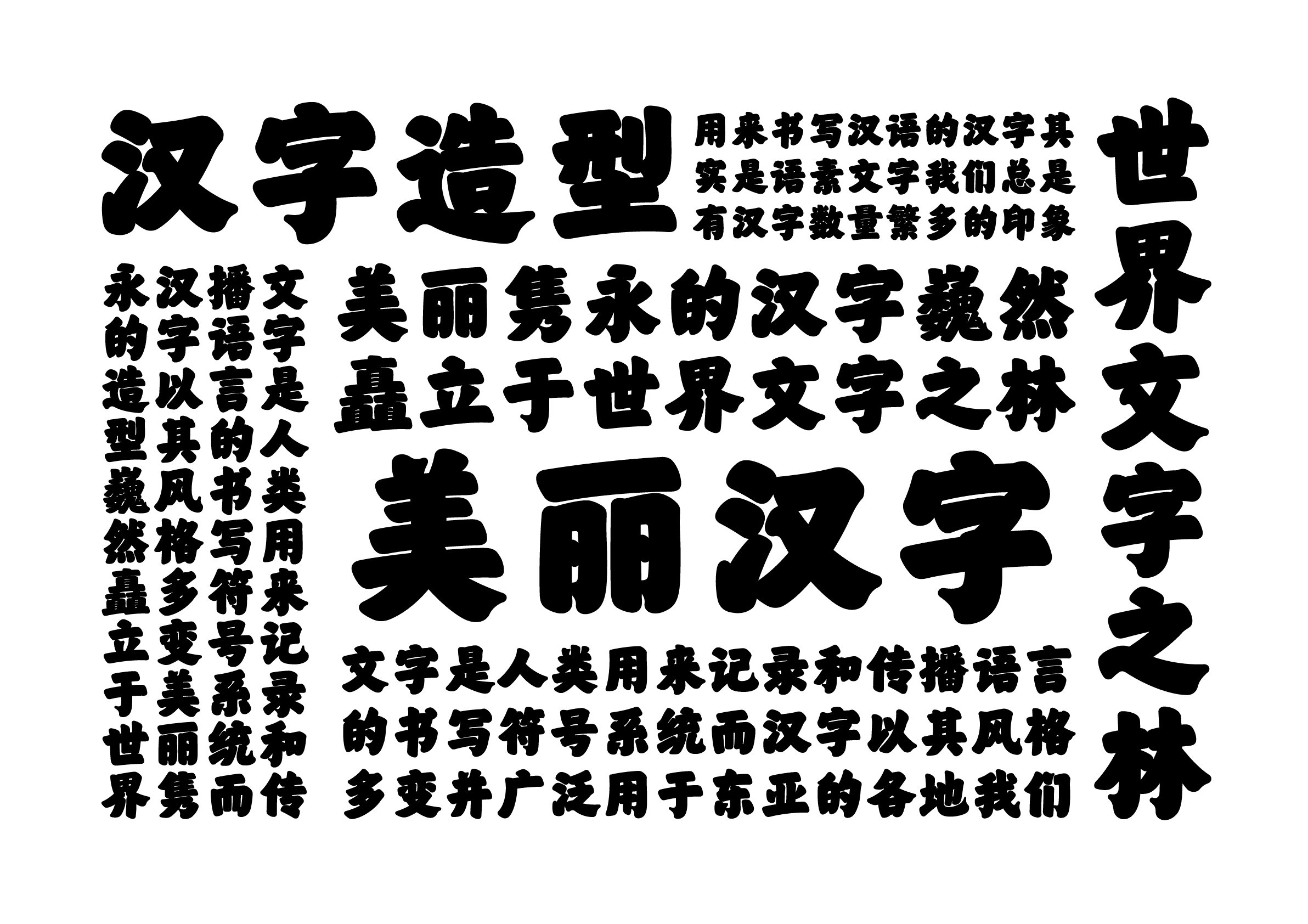
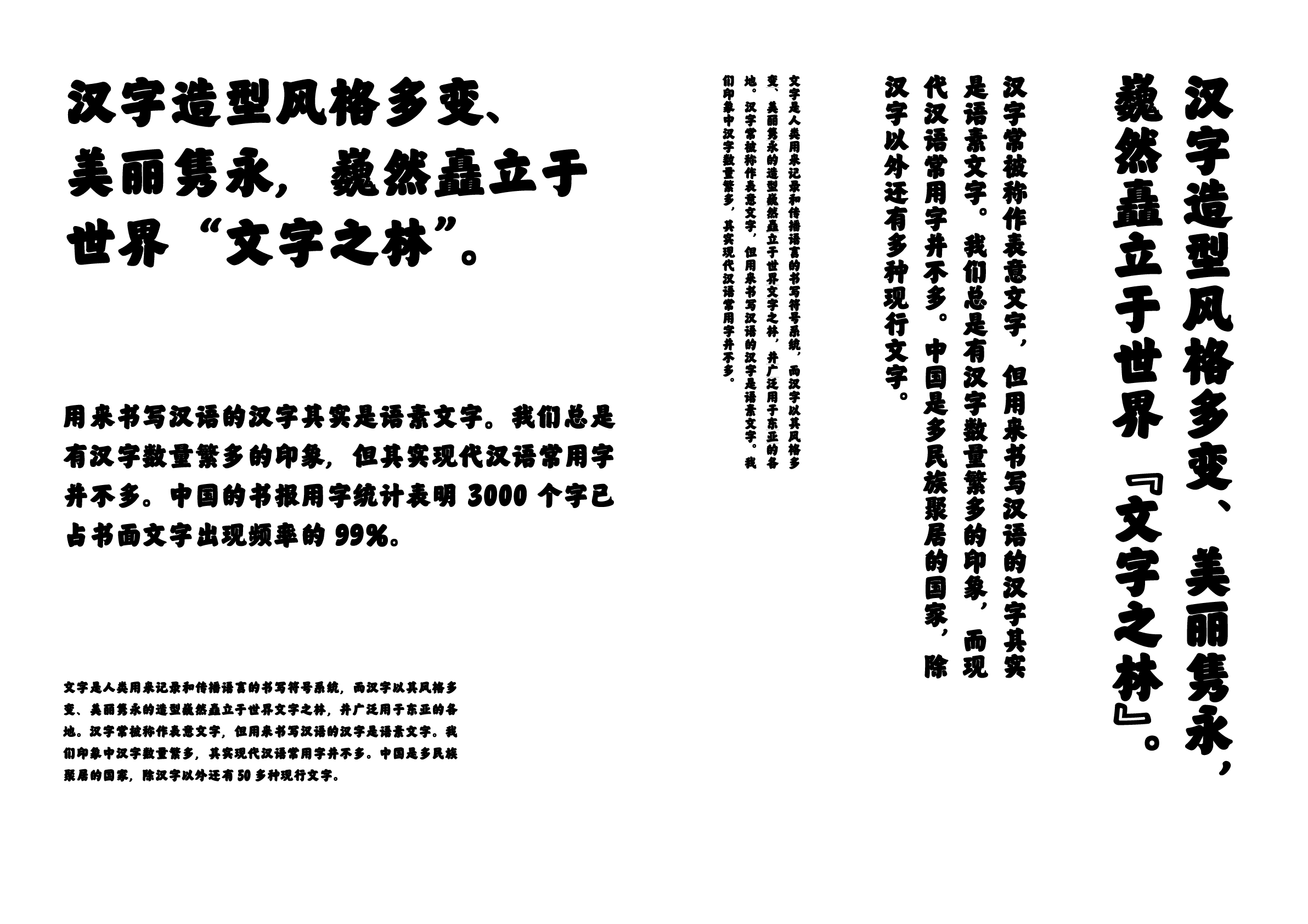
TangMoBang (唐墨榜) was inspired by Yan Zhenqing (顔真卿)’s large-character writing (榜書), which is characterized by its combination of strength and dignity, and the soft roundness within the squares. The bold strokes of this typeface evoke a sense of power and spirit. This work was designed to achieve a sense of regularity and harmony through the unification of brush strokes and simple shapes. The character structure contains a sense of dignity and stability, while the extra-bold weight adds a sense of warmth and richness, exuding the atmosphere of the golden age of the Tang Dynasty.
Winner’s Comment
First, I am thrilled to have received this award and to have my work recognized by the judges. This award is a great encouragement to me and has further strengthened my determination to pursue a career in type design. I will continue to strive to create even better works that many people will love.