
Simplified Chinese category Morisawa Award
Honorable Mention
Duo
Designer
Zhengyou Gu
China
Born in China. A winner of the 2016 Founder Award for Type Design First Prize, and a two-time winner of the 2016 and 2018 Hanyi FontStar Design Competition First Prize. A member of the Chinese Character Letterforms Committee of the Chinese Information Processing Society of China, and a member of the Shenzhen Graphic Design Association.
Judges’ Comments
-
Zhu Zhiwei
Even at a glance, one would immediately sense the remarkable depth and character of this typeface. In terms of the visual impact of a work being proportional to the actual level of design, this typeface certainly conveys a strong impact with its solid structure. The block style is characterized by its roundness due to the brush strokes, while Wei Bei is characterized by their squared shape to be engraved on stone; this typeface skillfully incorporates both of these characteristics. It has a high degree of perfection and practicality.
-
Chen Rong
Among the many entries in the competition with block style typefaces, this is one of the most beautiful works. It is a formal block style with a medium boldness suitable for body text, but bolder and larger character face than the traditional style, giving the overall typeface a laid-back and tranquil feeling. The consistency of the character face creates a good amount of spacing and is pleasantly legible even when set in long sentences.
-
Liu Xiaoxiang
Every detail in this work speaks to a refined and meticulous approach to creation. The beauty of the characters is not affected by the size of the typeface, even if it is relatively bold, as it is legible when small, and has a distinctive character when enlarged. Its value can be appreciated from a practical standpoint as well, because punctuation marks play a very important role in Chinese typesetting in terms of legibility and blackness within the composition. While there were other submitted works where the Chinese characters are meticulously crafted, but the punctuation marks lack the same level of refinement, this work strikes a good balance between the punctuation marks and characters.
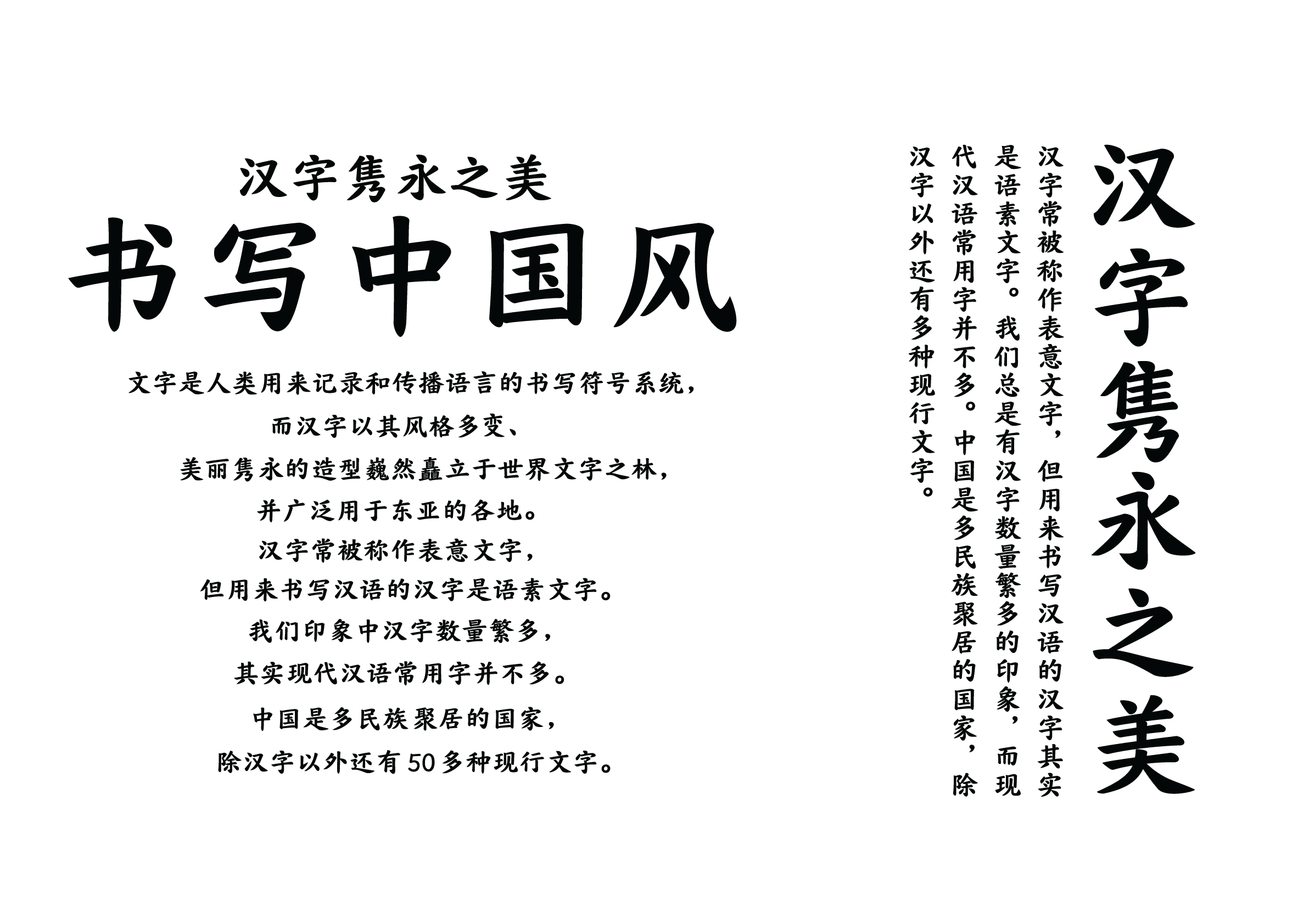
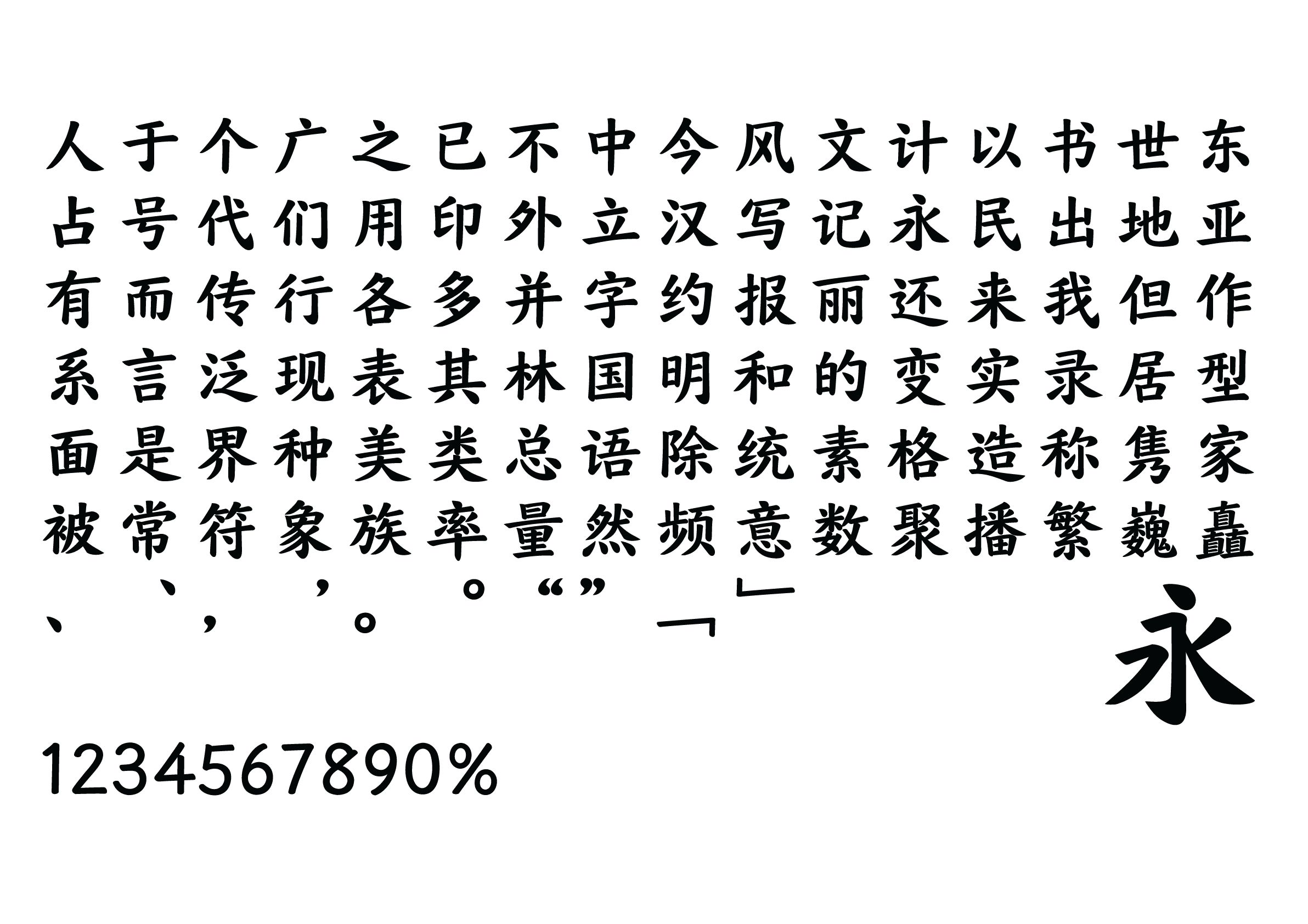
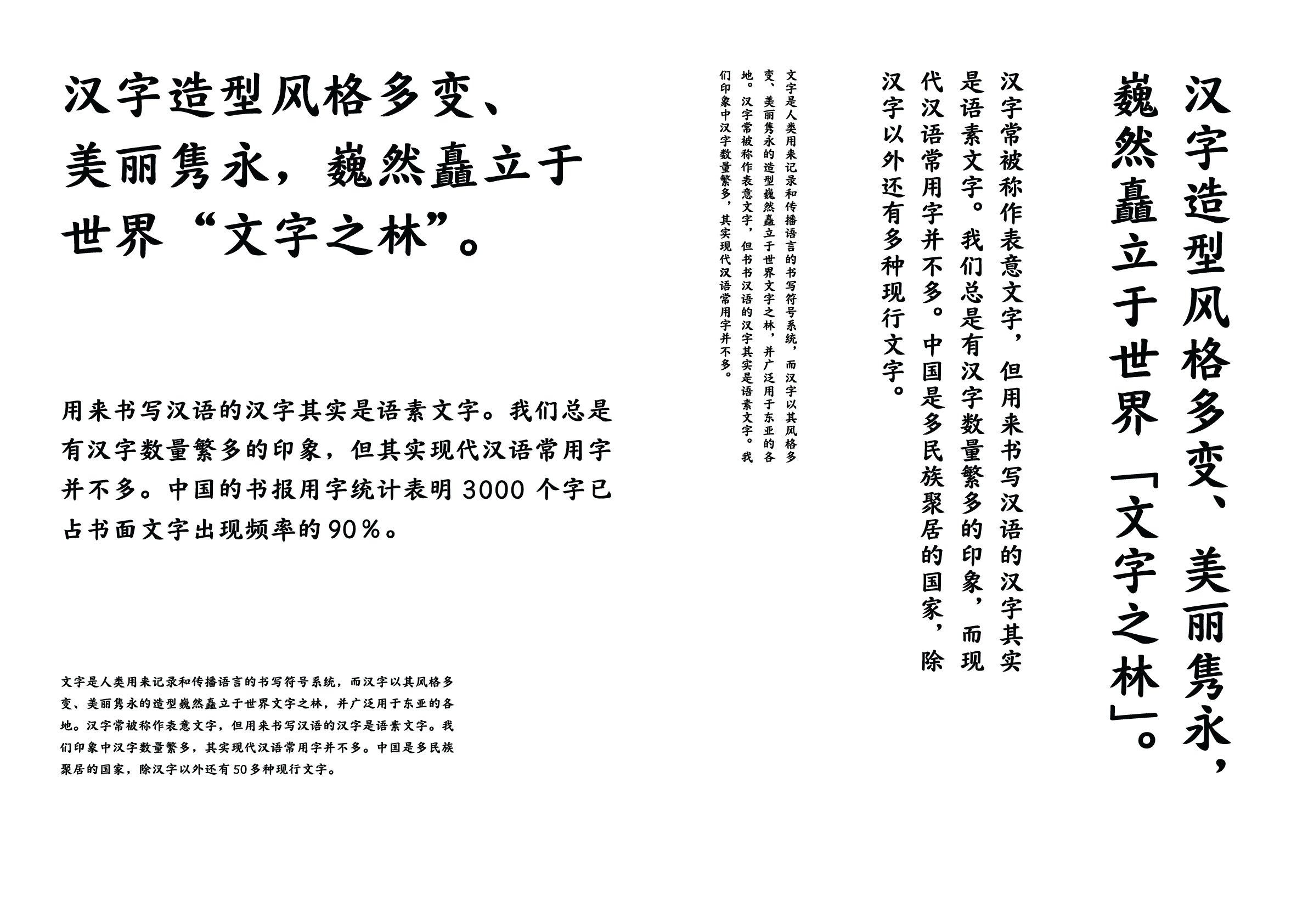
Intention of the work
This is a block style typeface that can be used for both display type and body text typesetting. In addition to its refined shape, it also has a gentle and elegant appearance, making it suitable for a wide range of uses in various situations.
Winner’s Comment
This was my first time participating in the Morisawa Type Design Competition, and I am thrilled to have received an Honorable Mention.
This typeface was created to strike a balance between classical elegance and modern simplicity, emphasizing the flow of brush strokes and the harmony of the structure to meet the practical needs of contemporary typesetting. At the same time, it inherits the beauty of traditional calligraphy.
When I look at my work again, I see that many things still need work. I want to continue to devote myself to this work.