
Simplified Chinese category Morisawa Award
Honorable Mention
HaoBoTi
Designer
Hao Qian
China
Born in China. After graduating from Inner Mongolia University, he has been collaborating with multiple font manufacturers on typeface design as a freelancer while suffering from a rare genetic disorder (limb-girdle muscular dystrophy). Has developed two font products to date, and has won the third prize in the 2020 Hanyi Fontstar Design Competition. He is the author of Writing Characters: Practical Typography Methods (做字:实用字体设计法).
Judges’ Comments
-
Zhu Zhiwei
Not only with its simple and smooth line quality, this typeface also has a bold and powerful character, with a sense of dynamism and dignity. It combines a high degree of perfection and practicality. As the top and bottom of the letters are well aligned in horizontal settings, and little left-right inconsistencies in vertical settings, it will look beautiful either way. Achieving such outstanding typesetting effects demonstrates the designer’s skillful control of the center of gravity and the size of the letter face in a precise and systematic manner.
-
Chen Rong
There is an elegant impression combined with softness and richness within solidity. A hint of Wei Bei style can also be felt in this block style. The overall balance of black and white within the space is just right, and at the same time, the detailing shows a skilled hand. However, some of the characters consisting of left and right sides could use a little more adjustment of the center of gravity. The right sweep stroke has a rich expression in the brush endings, while the left sweep stroke seems a bit monotonous, therefore adding a little more variation to the beginning and end of the strokes would definitely bring out the best of it.
-
Liu Xiaoxiang
The most difficult part of the bold type design is the visual balance of brush strokes, and the readability in small sizes. This is especially the case with Chinese characters that have many brush strokes. In this work, all of these challenges have been successfully overcome. It also has beautifully designed alphanumeric characters, which harmonize well with Chinese characters.
Intention of the work
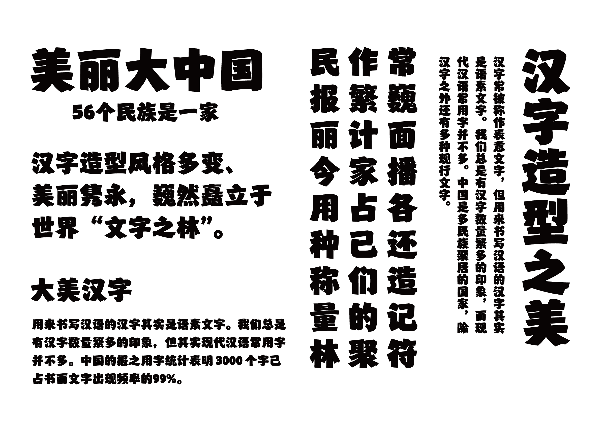
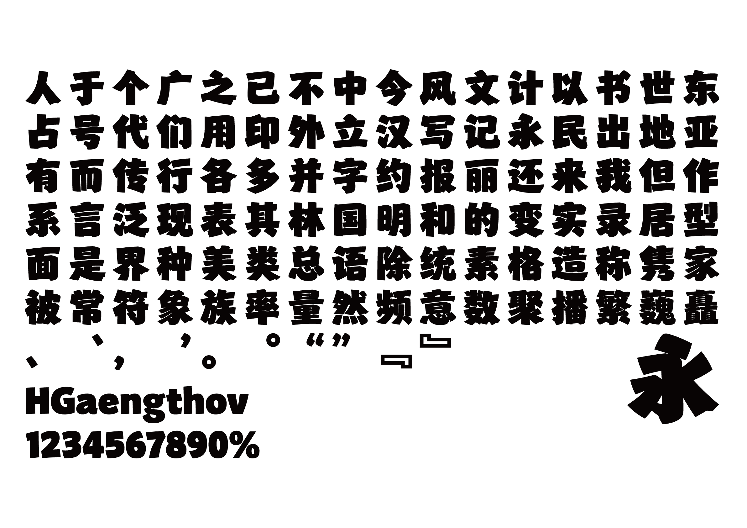
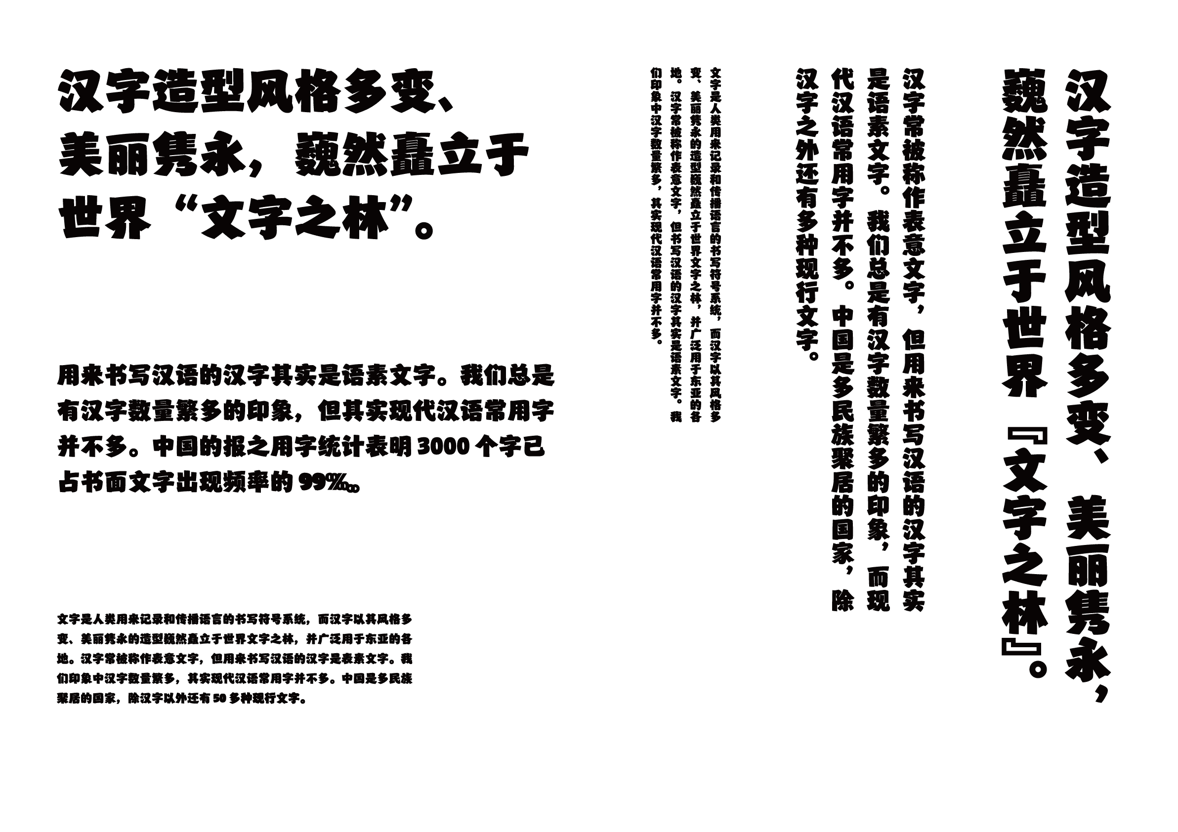
This modern yet antique-looking bold typeface is a simple fusion of plain Yan Zhenqing (顔真卿) block style and the rustic Wei Bei style type, characterized by its strength and softness. The bold, simple brush strokes incorporate a handwritten-style structure, and the generous character box has a harmonious balance of black and white. There is a sense of grandeur and dignity in the typeface.
Winner’s Comment
The more I learn about type design, the more I realize how immature I am. I want to sincerely thank my teacher, Wenqiang Cao, for teaching me the importance of attention to detail. I would also like to express my deepest gratitude to the judges who recognized my work. This award has greatly encouraged me to pursue the path of type design further. Finally, I hope that the Type Design Competition will gain more momentum in the future and produce many outstanding works.