Simplified Chinese category Morisawa Award
Honorable Mention
YAHEI
Designer
Mengyi Luo
China
A type designer born in Hunan Province, China. Graduated from the Beijing Institute of Fashion Technology with a major in Comprehensive Design, and is currently working at Hanyi Fonts. A member of the China Creative Designer Salon (CDS). Apprenticed to Zhu Zhiwei.
Judges’ Comments
-
Zhu Zhiwei
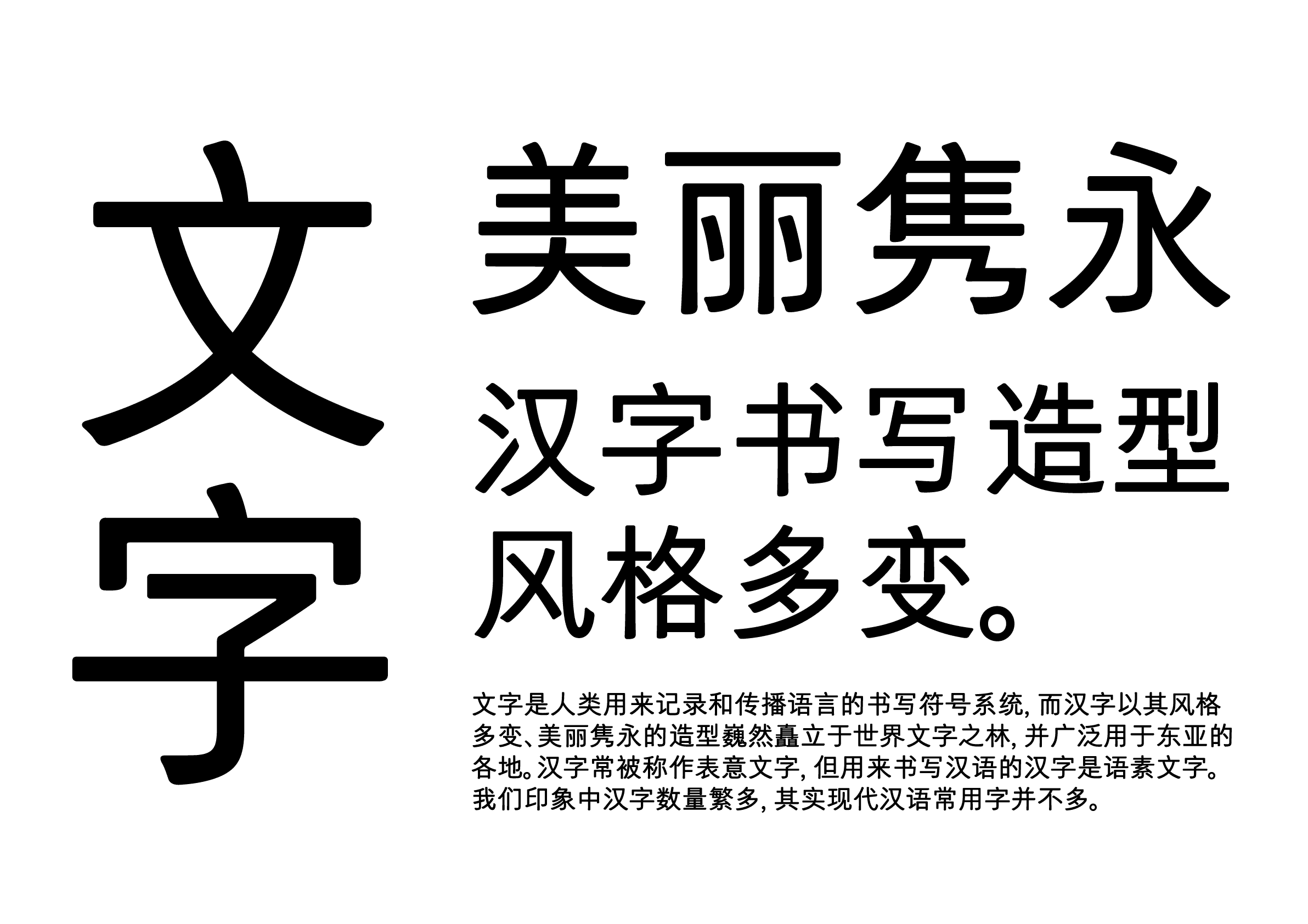
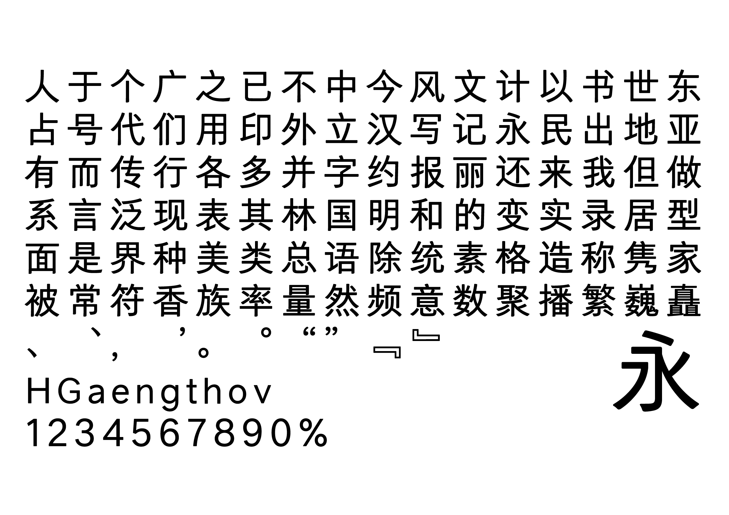
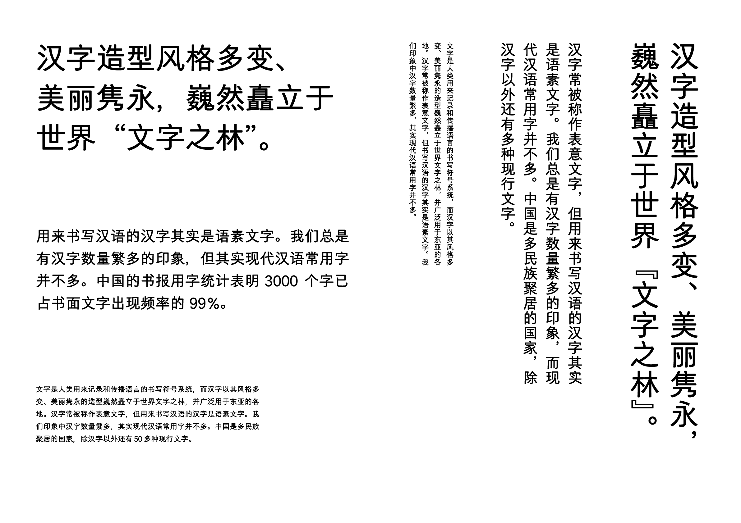
The style has a sense of unity and stability throughout. The combination of a strict and orderly structure with smooth curves creates a warm and calm Humanist impression. The rounded brush beginnings and endings as well as the corners of each brush stroke create a sense of unity and accentuate the harmony of straight lines and curves. It would be suitable for a wide range of typesetting in text and display.
-
Chen Rong
The overall impression of this typeface is soft and natural. The slightly narrowed counter and slightly elongated face create a fresh, elegant, and somewhat retro appearance. The rich detailing in the brush endings, including vertical lines, sweep strokes, and flick strokes, gives the impression of softness and natural movement. On the other hand, there is a slight lack of variation in brush beginning and ending, as well as angles of horizontal strokes. At the same time, the balance of blackness in some characters with many brush strokes could use some work. The Latin typefaces could also be improved to enhance harmony with Chinese characters.
-
Liu Xiaoxiang
The beautiful design and smooth stroke give this typeface an elegant look. It would be suitable for use as body text in a variety of media, including screen display and paper. It has a typical characteristic of Latin typeface, while the alphanumeric characters are in harmony with Chinese characters.


Intention of the work
The goal was to create a modern geometric sans serif typeface with simplicity, a Humanist impression, and a warm, handwritten feel suitable for body text. Its orderly appearance is perfect for the screen display, while also giving it a friendly impression.
Winner’s Comment
This award holds great importance for my future creations. It has boosted my confidence, and I am determined to invest more effort into my work. I will pay more attention to details and strive for even higher quality. I sincerely hope that the Morisawa Type Design Competition judges will continue to evaluate each entry fairly from a professional perspective.