
Simplified Chinese category Morisawa Award
Honorable Mention
Yourong Type
Designer
Congyu Zhang & Yue Chen
China
Congyu Zhang: A type designer, working as a type-design director at Shake Up Laboratory. A winner of the New York TDC69 and TDC70 type design awards.
Yue Chen: A multiscript type designer. Received a Master’s degree in Typeface Design from the University of Reading, and is currently a PhD student. An author of The Possibilities of Typography (文字设计的可能). A winner of the New York TDC 70 Type Design Award.
Judges’ Comments
-
Zhu Zhiwei
Rich with a solid feel, this design gives a calm and beautiful impression. The contrast between black and white remains sharp even in its boldest font style, ensuring that each character is distinctly visible. While it is a decorative typeface, it also carries a similar feel to the style of the Qing dynasty calligrapher Liu Yong (劉墉). “At first glance, it appears soft and airy like cotton, but the structure is like steel, giving the impression of a strong core.” This critique of Liu Yong’s work may also apply to this typeface. It is a versatile typeface suitable for advertisement, packaging, and events.
-
Chen Rong
The technique of filling an entire square with thick brushstrokes is extremely challenging in the design of Chinese characters. This typeface, however, has skillfully tackled this challenge by modifying the stroke shapes to create space. Admittedly, it may not be a practical match for body texts, and thus was the topic of lengthy discussion among the judges. Nevertheless, this ambitious effort deserves recognition. Its ability to maintain legibility at small font sizes is also another outstanding aspect of this typeface.
-
Liu Xiaoxiang
This is one of my personal favorites from this year’s selection. The generous spacing and rhythmic design make it particularly appealing. Used in large font sizes, its visual impact stands out, and even more impressively, it maintains clear legibility at small font sizes. The characters “繁,” “巍,” and “矗” in particular showcase exceptional talent and ingenuity.
Intention of the work
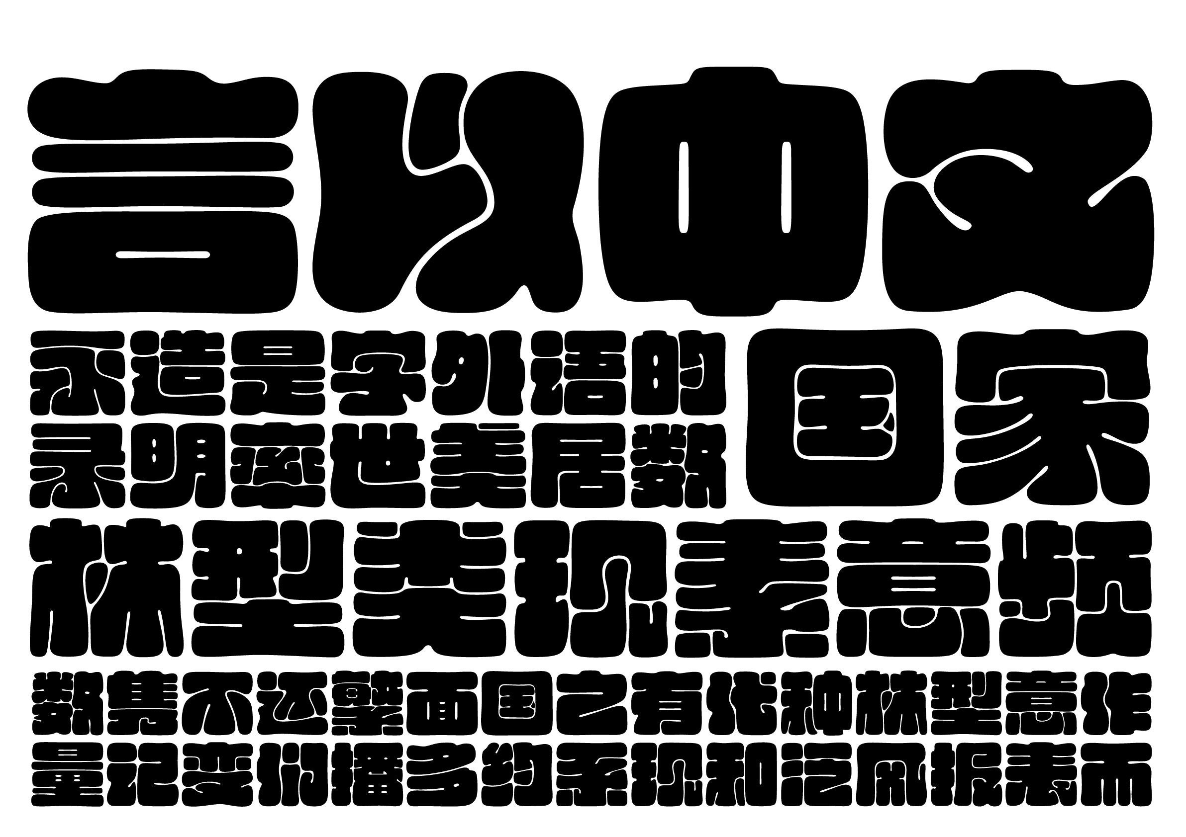
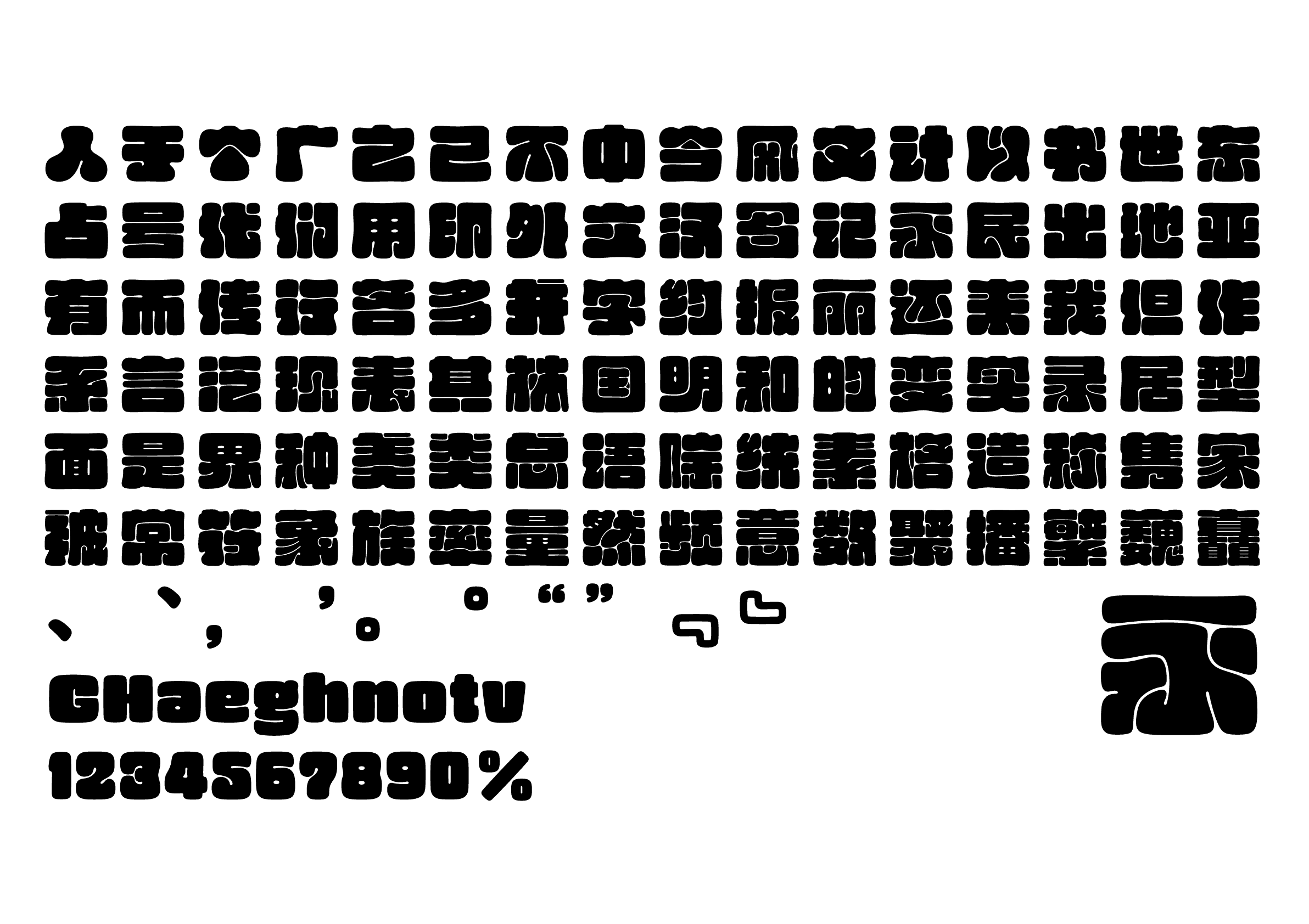
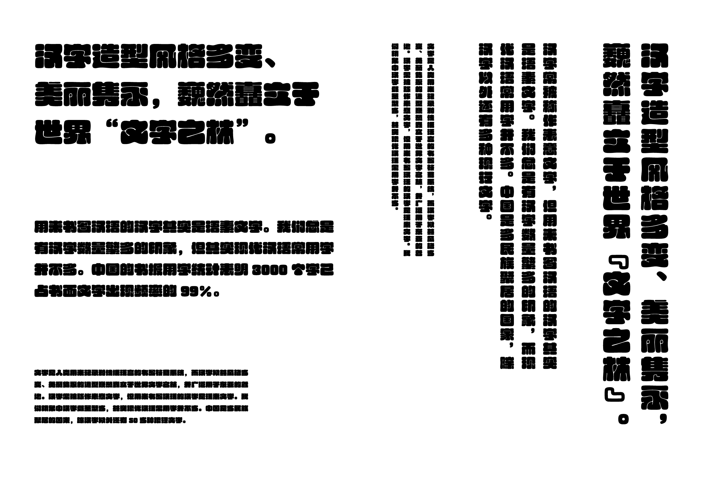
Yourong Type (有容体) is designed as a display typeface. Among the various structures of Chinese characters, this typeface, with its distinctive form, is made through the free transformation of Chinese characters that are poured like water into a square character box—the very image of the old saying, “The sea embraces all the rivers.” This approach allows for the pursuit of a beauty of creativity that is liberated from the traditional structure of Chinese characters, while ensuring legibility and enabling the free arrangement of strokes and structures.
Winner’s Comment
I feel that the recognition as an Honorable Mention acknowledges my efforts and tireless commitment to the field of typeface design and is a sign of high expectations for my future work. As I navigate the world of typeface design, it is essential to have the courage to break new ground while also respecting tradition. I will keep exploring new possibilities and make the font industry even more exciting.