
Simplified Chinese category Morisawa Award
Honorable Mention
wenhuayanshanxinwei
Designer
WenHuaZiXing
China
A font manufacturer established in 2020 that specializes in font design, font product development, research on typeface information technology, and font application solutions. Based in China, the company works with a specialist design team dedicated to efficiently creating fonts that meet the diverse needs of China, Japan, and Korea, and is globally delivering the appeal of typefaces and fonts.
Judges’ Comments
-
Zhu Zhiwei
This typeface has a unique style that is well-designed and balanced. It is highly legible both at small and large font sizes, with outstanding control over the structure and weight distribution of the characters. The cohesion and flow of words and sentences, as a whole, especially stand out in horizontal settings. This typeface would be well-suited not only for advertisements and packaging, but also for fashion and sport-related content.
-
Chen Rong
The outlines are slightly flattened, creating a trapezoidal shape. It uses the Wei Bei brushwork style, giving a sturdy impression by allowing each character to have stability. The trapezoidal shape, however, can cause uneven spacing in horizontal settings, which slightly disrupts the flow. The design feels a little abrupt and rigid, which can become conspicuous as well as slightly lose its cohesion in style when multiple characters are placed together. The distinct approach to handling the corners however is very unique.
-
Liu Xiaoxiang
This typeface exudes bold strength. While it is based on Wei Bei calligraphy, the approach to angles and other elements is highly unique, showcasing the designer’s unique creativity. Latin characters, which are usually difficult to combine with the Wei Bei style, have been skillfully adjusted so that they can be utilized without additional composite fonts.
Intention of the work
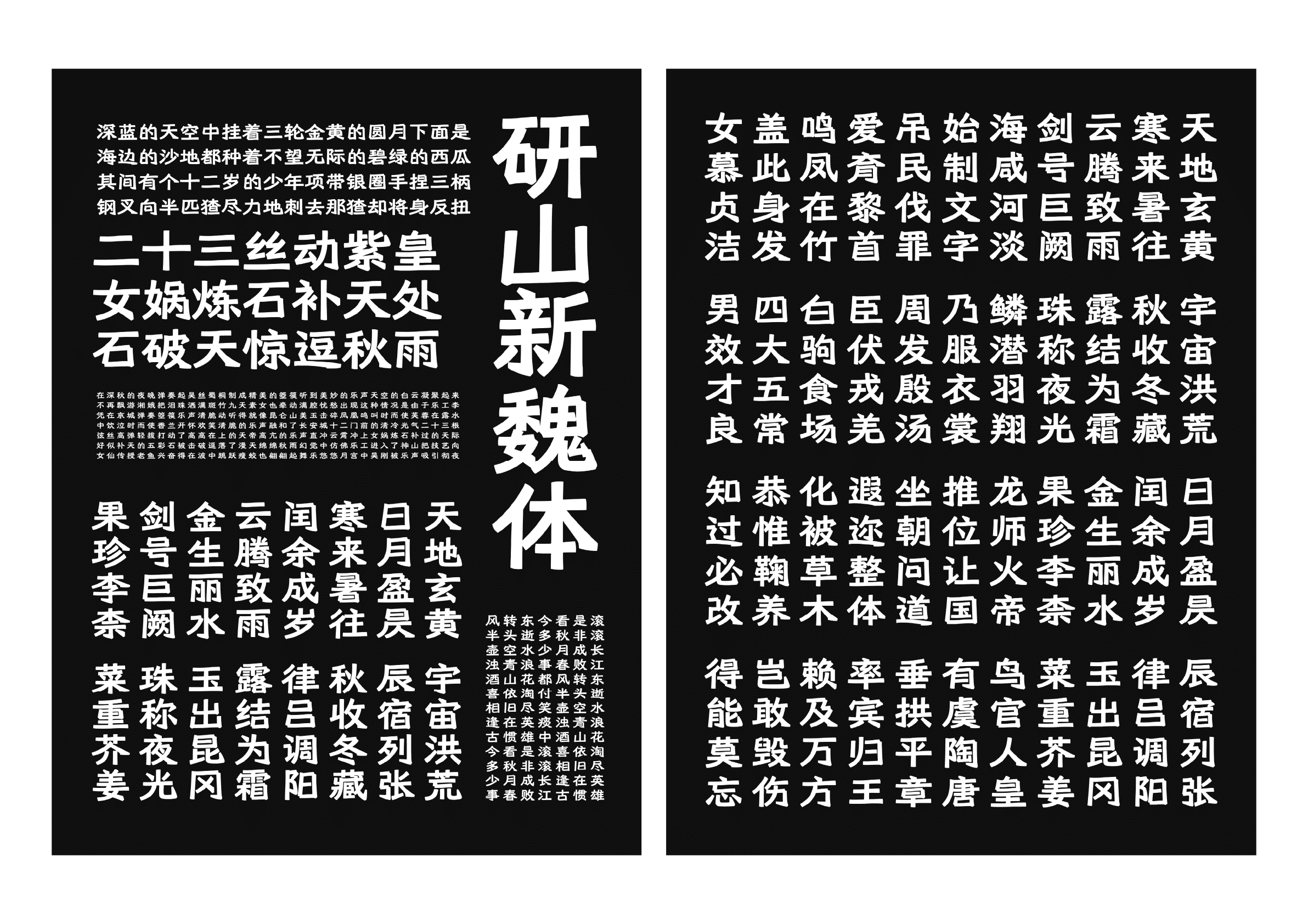
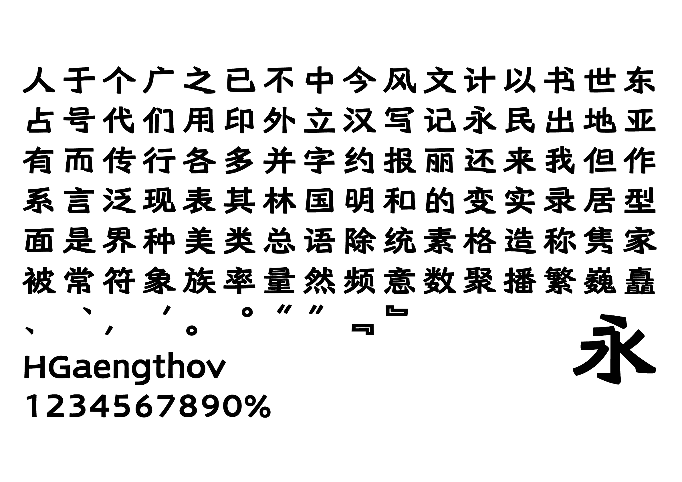
Inheriting the simple, powerful, and unrestrained characteristics of the Wei Bei style, wenhuayanshanxinwei (文华研山新魏) adds emphasis to the corners of the brush strokes, such as the stop, horizontal, vertical, and sweep strokes, while maintaining a sense of unity as a font. Created from a combination of a unified structure and modern letterforms, this new typeface is characterized by its narrow top, wide bottom, elongated left and right sweep strokes, and wide counters. Suitable for a variety of uses, including modern typesetting of body text and display types.
Winner’s Comment
Each letter of the award-winning work became a shining medal for the Wenhua style. I want to say “Thank you” to myself for not giving up and continuing to improve my script. As the saying goes, “A journey of a hundred miles begins with the first step, but the last ten miles are the most important,” I will strive further to meet your expectations, never forgetting my passion and commitment to the world of typography. Finally, I want to extend my deepest thanks to the organizers of the Morisawa Type Design Competition too.