
Simplified Chinese category Fan Favorite
2nd Prize
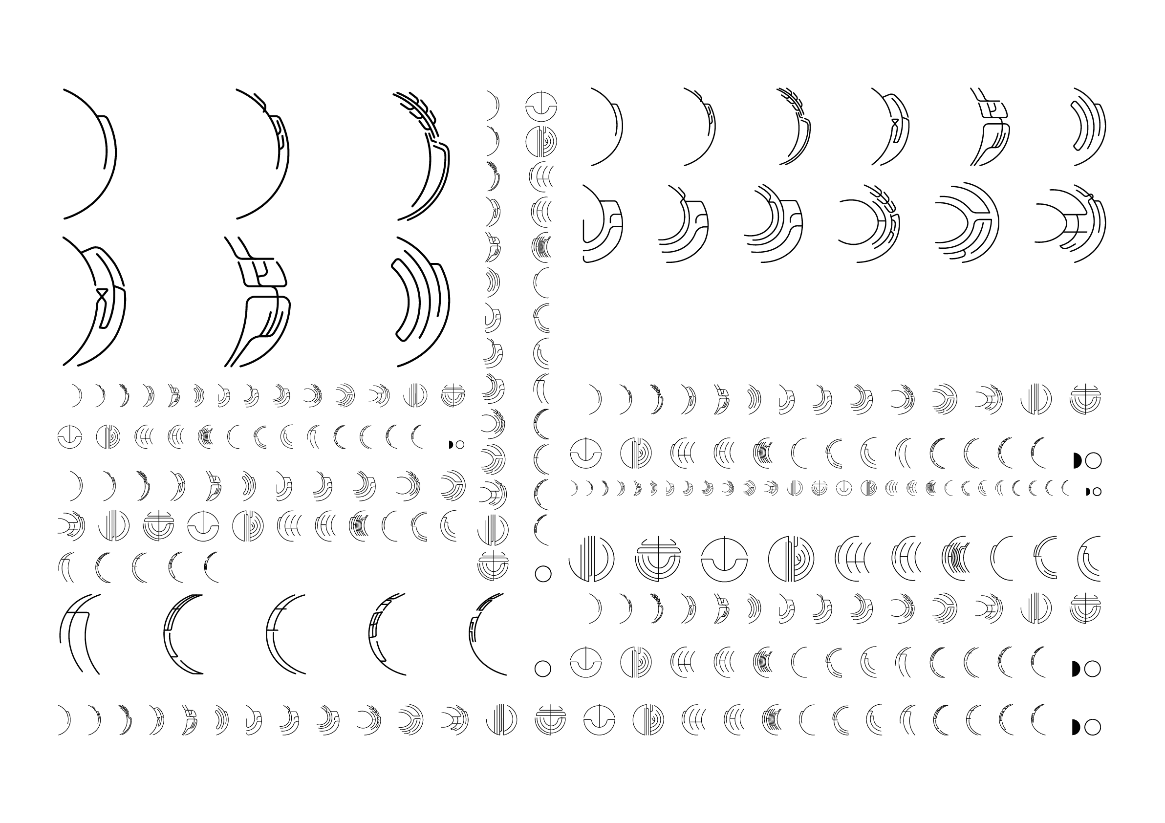
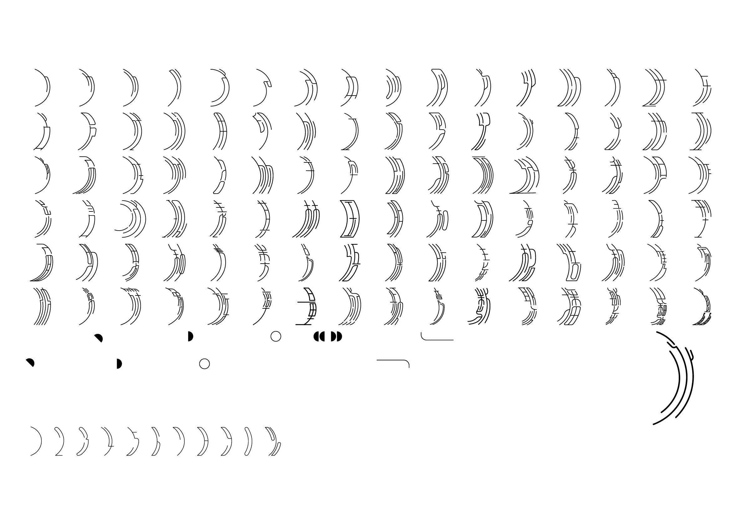
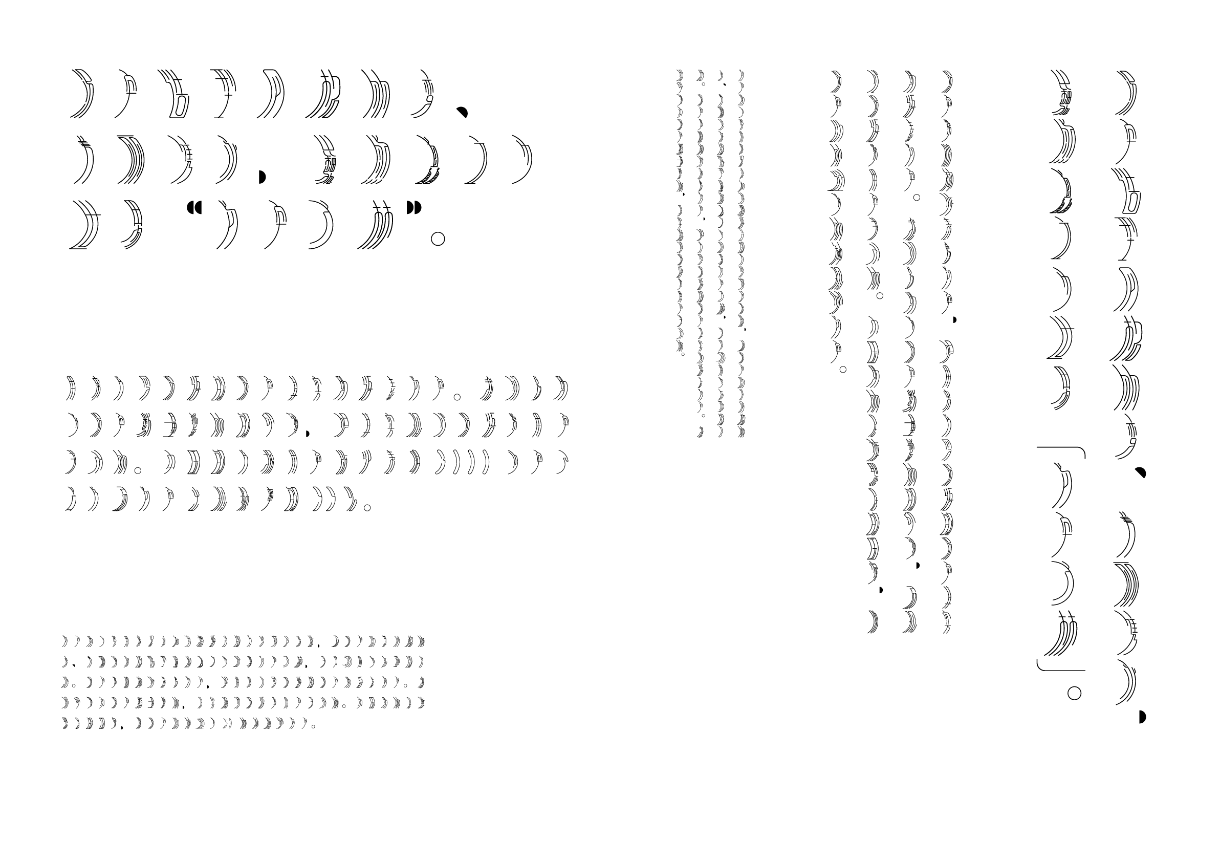
Waning moon fine black type
Designer
Yang Gao
China
Born in Jiangsu Province, China. Studied at the School of Visual Communication, Studio A10, of the Suzhou Art & Design Technology Institute, and currently operates a design studio in his hometown.
The displayed work, profile, intention of the work, and winner’s comment are based on the information submitted by the creators.
Intention of the work
This is a sans serif typeface with thin, soft lines. It was inspired by a phrase in the poem Shuidiao Getou (水調歌頭, Water Melody) by Su Shi, “Men have sorrow and joy; they part or meet again. The moon is bright or dim and she may wax or wane.” Focusing on the shape of the letters, I designed the typeface to represent the phases of the moon. It is an experimental typeface, in which the brush strokes were transformed and reduced to incorporate seal script brush strokes in the production process. Given its limited legibility, it is best suited for display or decorative use.
Winner’s Comment
I am stunned that this piece won an award, as I learned about this contest just before the deadline and finished it in a hurry. I apologize for the lack of detail and being unable to fully adjust the design, even though I noticed that the text’s balance was uneven when the types were set in the body of the text. I hope this typeface will inspire people to explore ancient literary works and diversify their written expression. I sincerely thank you for your encouragement. I will keep pushing myself to create even better work.