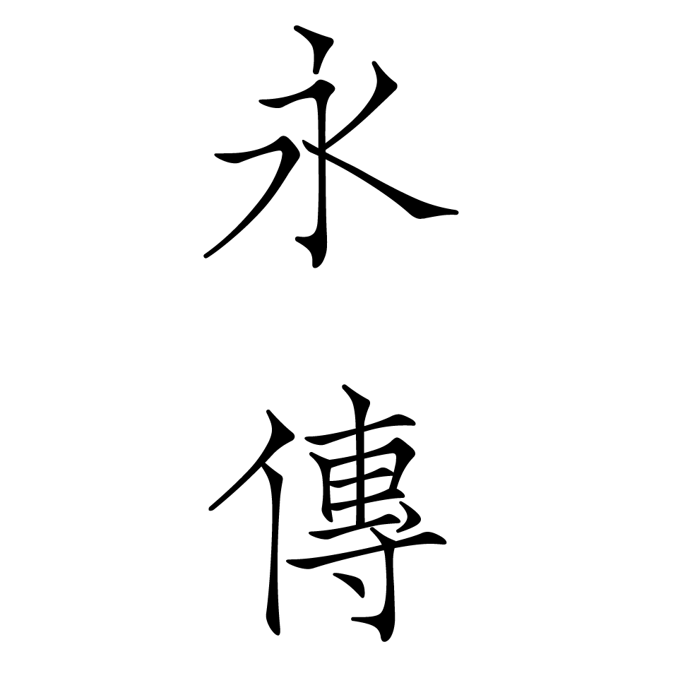
The typeface is elegant and graceful, with an Ou style (Ouyang Xun’s Calligraphic Style), and it was derived from Zhou Mi’s Cao chuang yun yu (草窗韻語, Rhymes in the Grass Window), a classical book from the Song Dynasty. This style is very rare among engraved typefaces and is not only thin but also has an air of elegance in its thinness. In the process of reprinting, the thin, tight, and neat style of Latin script was incorporated while at the same time preserving the relative liveliness and lightness of the letters to maximize the bewitching nature of the original manuscript typeface.
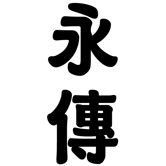
Bi Tai Bak (米苔目) is a fusion of rounded sans serif and Chinese clerical script, inspired by Taiwanese street signs and the shape of a traditional snack, bee tai bak (silver needle noodles). The typeface is characterized by a broad, flat skeleton and soft brushstrokes, combined with the stroke shapes and placement of the Chinese clerical script, creating a nostalgic cultural atmosphere. Taiwanese pronunciations are used for this English name to express local characteristics and cultural backgrounds.
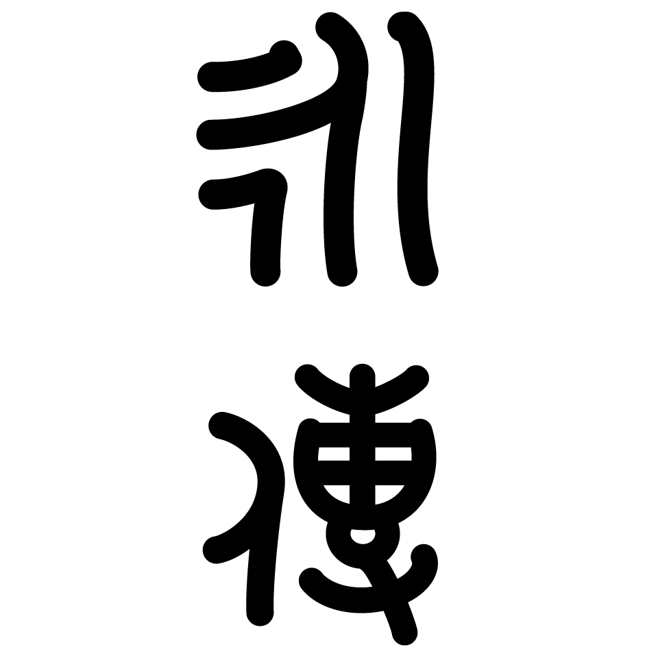
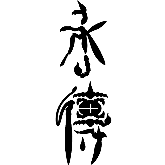
This was designed with rounded sans serif like lines based on the bronze script, which was used for inscriptions on bronzeware in the Shang and Zhou Dynasties in China. The goal was to create a font that would bring to the fore a kind of cuteness and pop that exists within the complex and bizarre appearance unique to ancient scripts.