
Traditional Chinese category Morisawa Award
Gold Prize
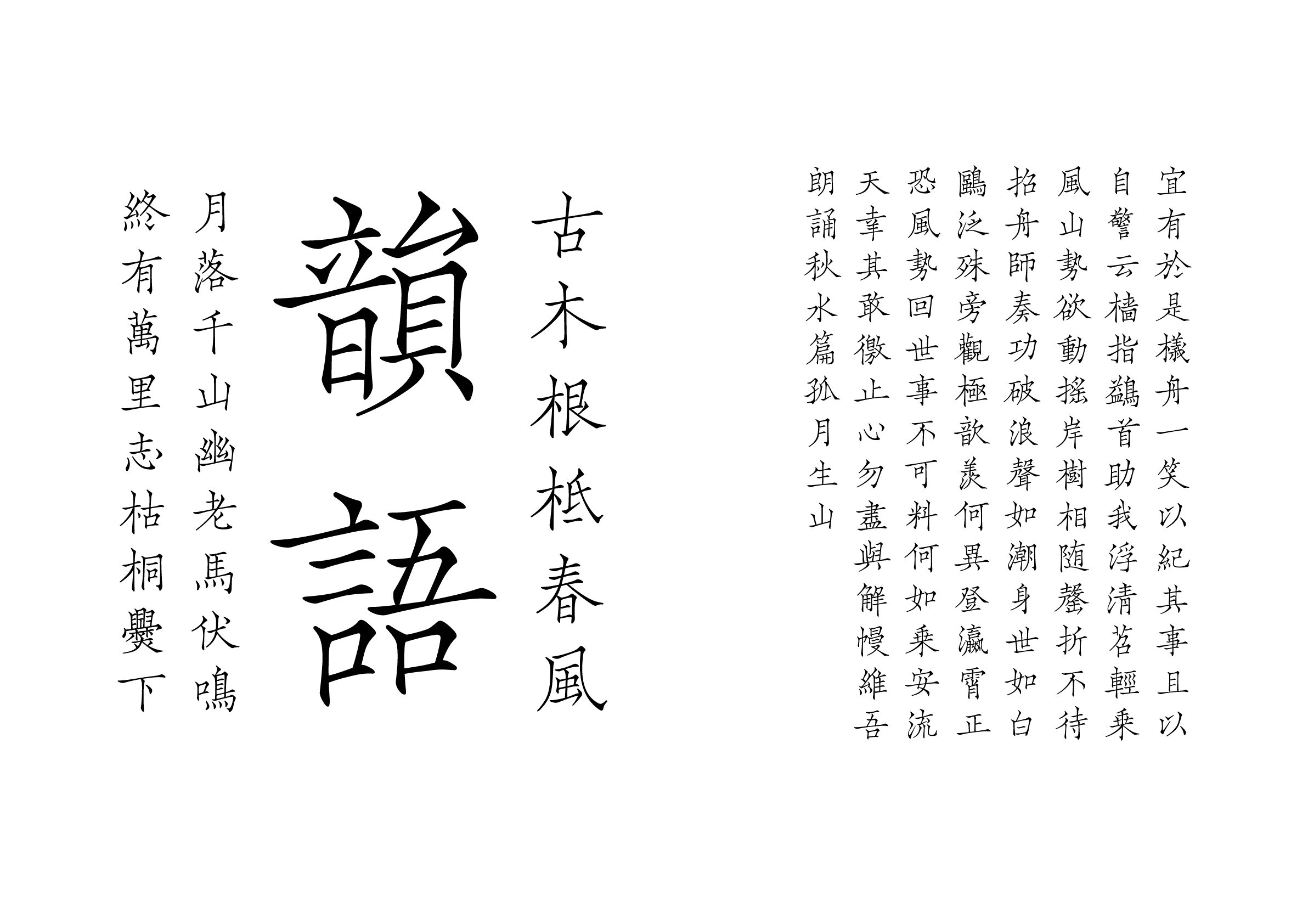
Cao Chuang Gu Yun
Designer
Rongrong Gu
China
Born in Taiyuan, Shanxi Province. Graduated from the Department of Visual Communication Design in 2018. Launched the ZiKe Typetime project in Shanghai at the end of 2023, five years after having focused on studying the development of typefaces in Shanghai, and has been engaged in research and reproduction work on engraved characters at ancient ruins.
Judges’ Comments
-
Masaaki Hiromura
A highly refined typeface, in which each character is beautiful and well-balanced, whether set in small or large size. The entire jury voted for this work as qualified for the Gold Prize. I was impressed by the outstanding beauty of the typeface, not only in terms of the appearance of individual characters, but also when set—something that is important from a graphic designer’s perspective, those who actually use typefaces. While it has a classic and traditional design, it is highly versatile.
-
Julius Hui
It is a very elegant and pleasing typeface to look at. The work is well designed in terms of structure, boldness, and balance, all of which I always pay attention to as a type designer. The balance between signs of bold creativity and overall harmony is superb. Legible in small characters, and even when characters with varying stroke counts are mixed, the text maintains a natural appearance. Personally, I find it to be highly commendable.
-
Wan Chun Ho
Creating something new within an orthodox style is harder than creating a distinctive design typeface, but this work bravely takes on this challenge. There is a sense of familiarity, but you can also see a modern aesthetic and discreet innovation. From a designer’s perspective, I can quickly picture the situations in which this font would be most effective. I think it’s a wonderful typeface that exudes a relaxed vibe.
Intention of the work
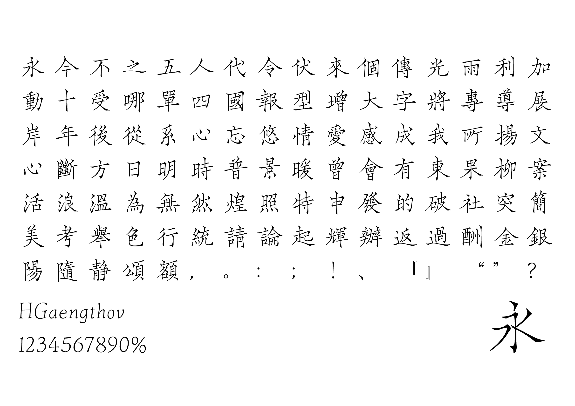
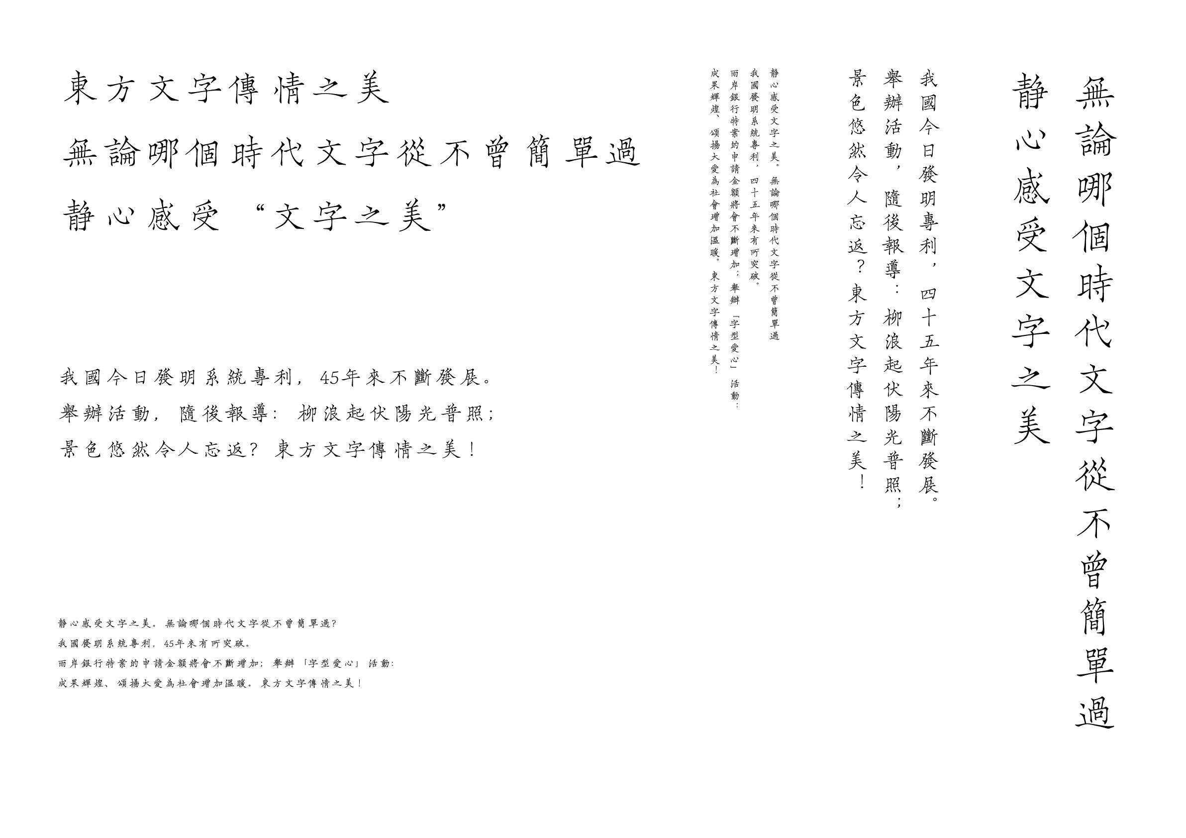
The typeface is elegant and graceful, with an Ou style (Ouyang Xun’s Calligraphic Style), and it was derived from Zhou Mi’s Cao chuang yun yu (草窗韻語, Rhymes in the Grass Window), a classical book from the Song Dynasty. This style is very rare among engraved typefaces and is not only thin but also has an air of elegance in its thinness.
In the process of reprinting, the thin, tight, and neat style of Latin script was incorporated while at the same time preserving the relative liveliness and lightness of the letters to maximize the bewitching nature of the original manuscript typeface.
Winner’s Comment
I am incredibly honored to receive the Gold Prize! This award is a strong affirmation of my efforts in reviving engraved typefaces. I am even more convinced of the value of the ancient ruins culture, with its history spanning nearly a thousand years. I will continue dedicating myself to exploring the beauty of the ancient ruins and their cultures through typeface design and deliver even higher quality work in the future.