
Traditional Chinese category Morisawa Award
Silver Prize
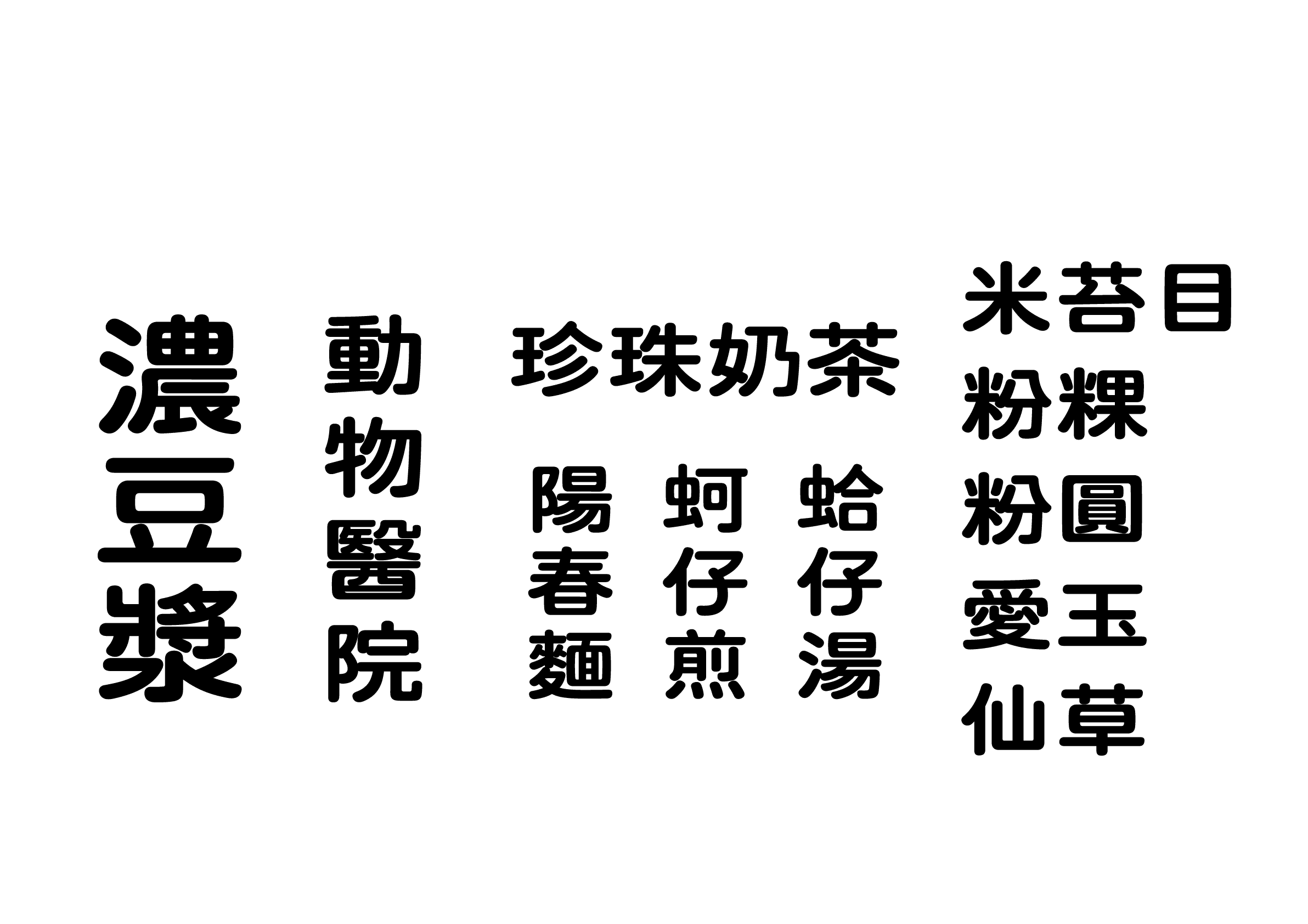
Bi Tai Bak
Designer
Chingchan Kao
Taiwan
Born in 2002 in New Taipei City, Taiwan. After graduating from the Department of Visual Communication Design at the National Taiwan University of the Arts, he is currently working as a freelance designer. In 2022, he won the first prize in the Justfont Encouragement Award for Chinese Character Creation (Justfont造字鼓励元).
Judges’ Comments
-
Masaaki Hiromura
I nominated this bold, rounded sans serif typeface, reminiscent of the signages you see on the streets of Taiwan. I find the flat proportions and handwritten quality of the characters very attractive. It neither feels outdated nor overly emphasizes novelty, but has a nostalgic and friendly feel to it. If you look closely, you’ll see some inconsistencies in the stroke thickness, yet the characters with varying stroke counts are well-balanced. It has a charm that makes me, a designer, want to use it.
-
Julius Hui
The first impression was one of a “familiar, everyday kind of typeface,” but it gradually stirs a profound sense of warmth and tenderness. The style of the characters, which you would often see on signage when wandering around Taiwan, gives a sense of familiarity. The quality of the characters is not perfect, lacking consistency in stroke thickness and balance in the density between characters, yet the appeal of this typeface goes beyond such shortcomings.
-
Wan Chun Ho
This typeface has a very traditional Taiwanese street stall signboard feel to it, one that locals would surely feel a sense of familiarity with. Written in a bold rounded sans serif typeface with a handwritten feel, it has a very relaxed and friendly impression. It makes me, a designer, tempted to use it. The competition required many characters to be created, but I think it is a highly refined typeface—every character accurately reflects the intended style.
Intention of the work
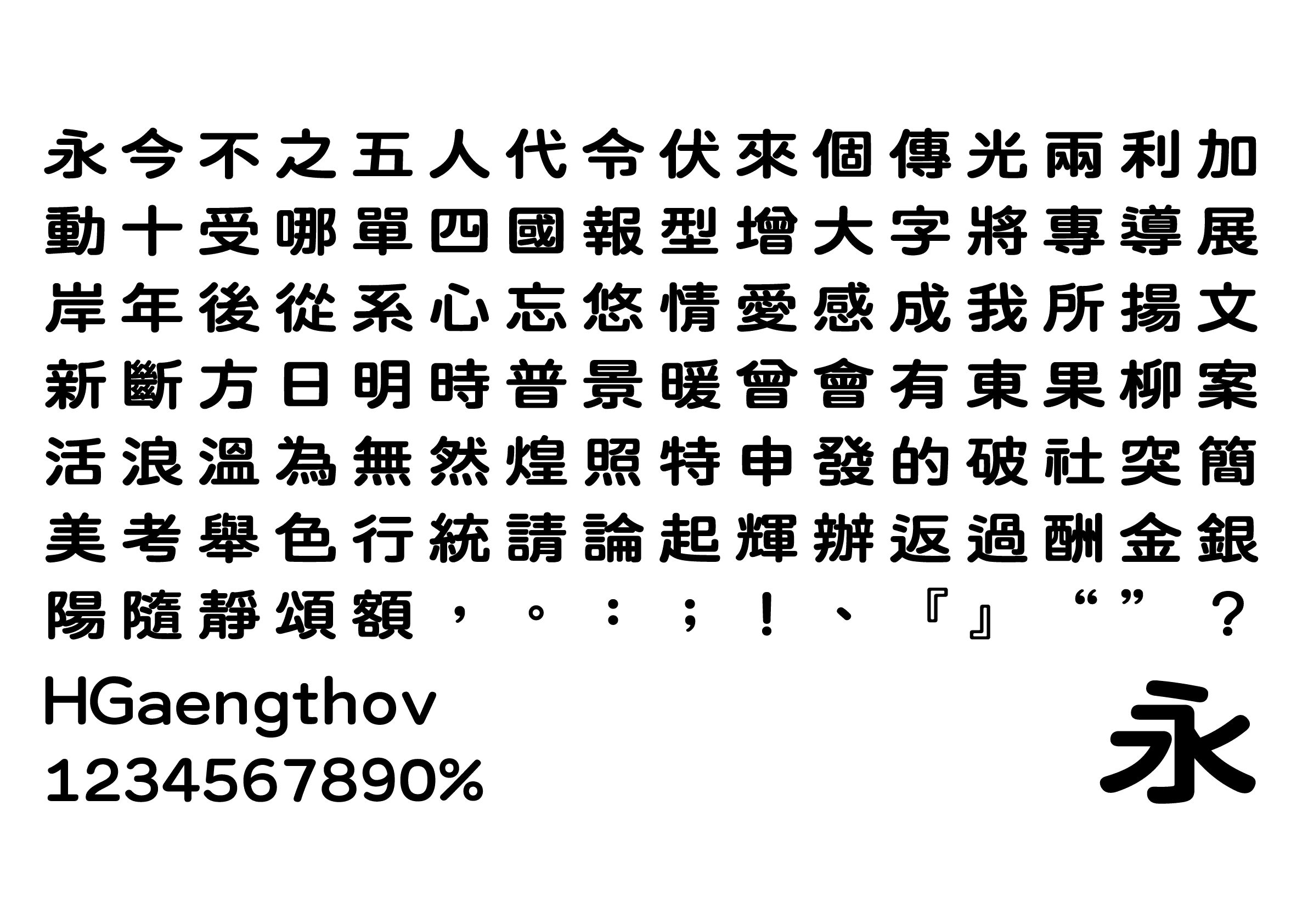
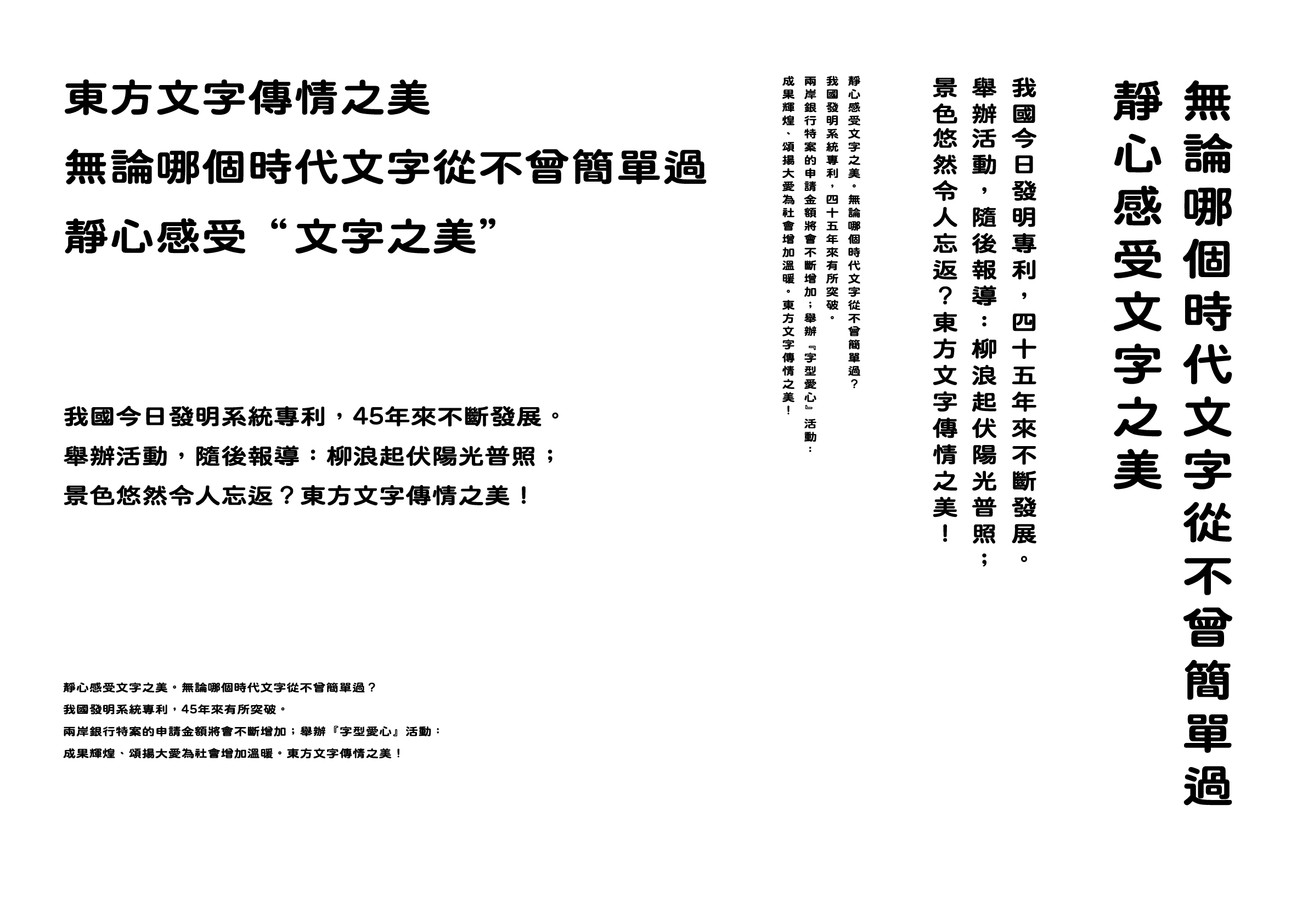
Bi Tai Bak (米苔目) is a fusion of rounded sans serif and Chinese clerical script, inspired by Taiwanese street signs and the shape of a traditional snack, bee tai bak (silver needle noodles). The typeface is characterized by a broad, flat skeleton and soft brushstrokes, combined with the stroke shapes and placement of the Chinese clerical script, creating a nostalgic cultural atmosphere. Taiwanese pronunciations are used for this English name to express local characteristics and cultural backgrounds.
Winner’s Comment
This rounded sans serif is a project I began after graduating from university, and it is my first attempt to create a rounded sans serif. I am honored to have received the judges’ recognition for my work, which underwent many revisions. In the future, I aim to continue working towards a career as a professional type designer.