Traditional Chinese category Morisawa Award
Bronze Prize
rounded Kinbun
Designer
Taichi Saito
Japan
Born in Ibaraki Prefecture in 1993. After completing a master’s degree at the University of Tsukuba, he is currently researching and creating works that apply classical Chinese calligraphy to typeface design as part of his doctoral research. He is a director of ARARE STUDIO.
Judges’ Comments
-
Masaaki Hiromura
An exceptionally unique work that I was personally intrigued by from the very beginning of the judging process. Although it appears to have been created in accordance with all the rules, the mysteriousness that comes from some of the characters merely looking like symbols will surely captivate the viewer. The design is like hieroglyphics, in that even if you can’t read the characters individually, you can read them as a sentence thanks to the context of the other characters. It is a very eye-catching typeface that seems to only become a language and make sense when characters are combined.
-
Julius Hui
Visually, it has a graphic design quality, with a combination of reader-friendly characters and symbol-like characters. From a type designer’s perspective, it is clear that this typeface was designed by someone with a deep understanding of the historical background of characters and the skills to create a bold typeface. The way the curves of the “申” character are drawn, with thicker lines on the outside and thinner lines on the inside, requires considerable skill, making this a very well-made typeface with a wonderful balance of black and white.
-
Wan Chun Ho
Although I found this typeface intriguing from the very first stage of the judging process, its legibility was the only concern for the three judges, including myself. After repeated discussions on whether each character and sentence was legible, the work was evaluated as worthy of the Bronze Prize for its originality and creativity. I think it is a highly refined work that also fits in with the spirit of the Morisawa Type Design Competition, which pursues originality and aesthetic beauty.


Intention of the work
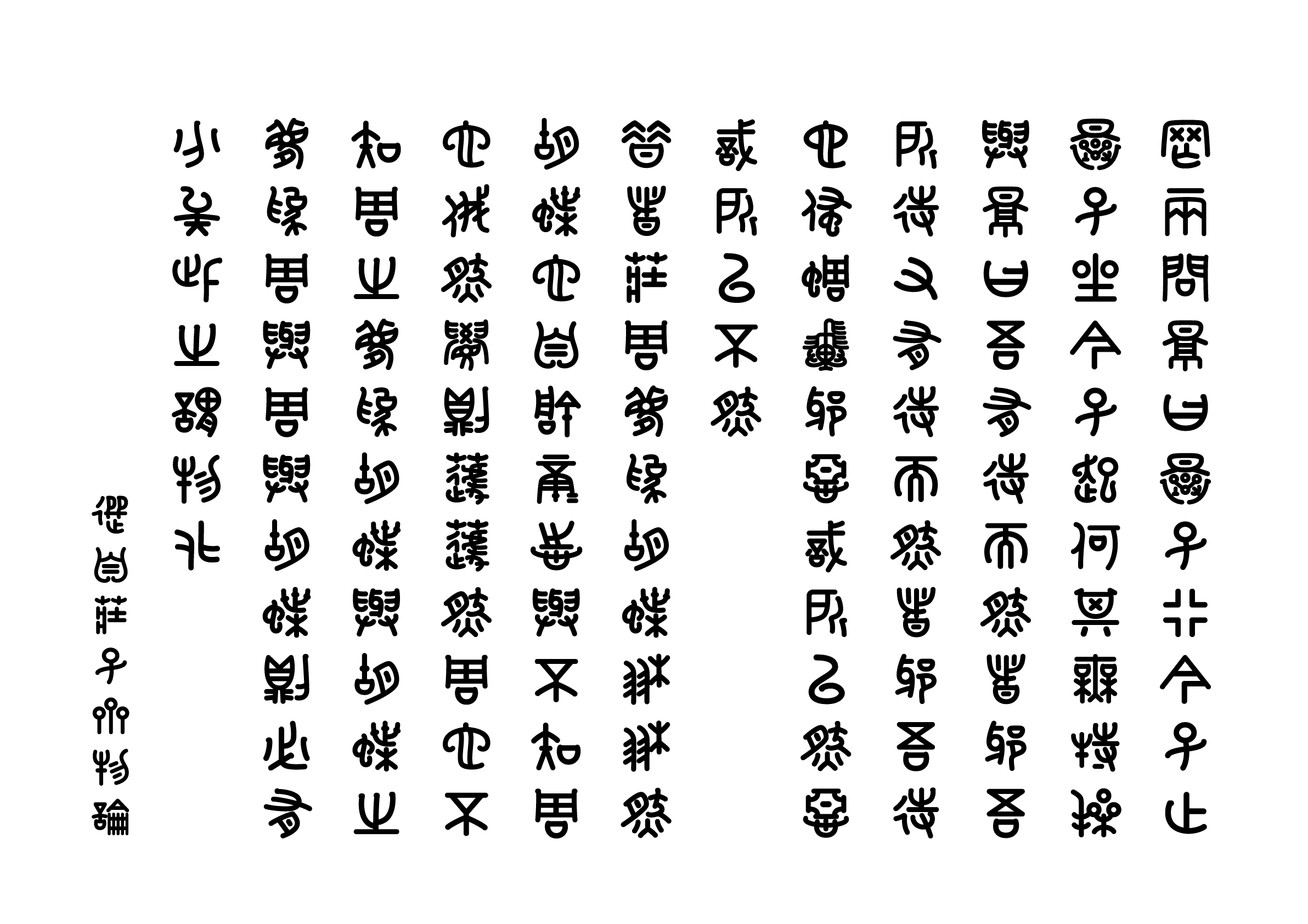
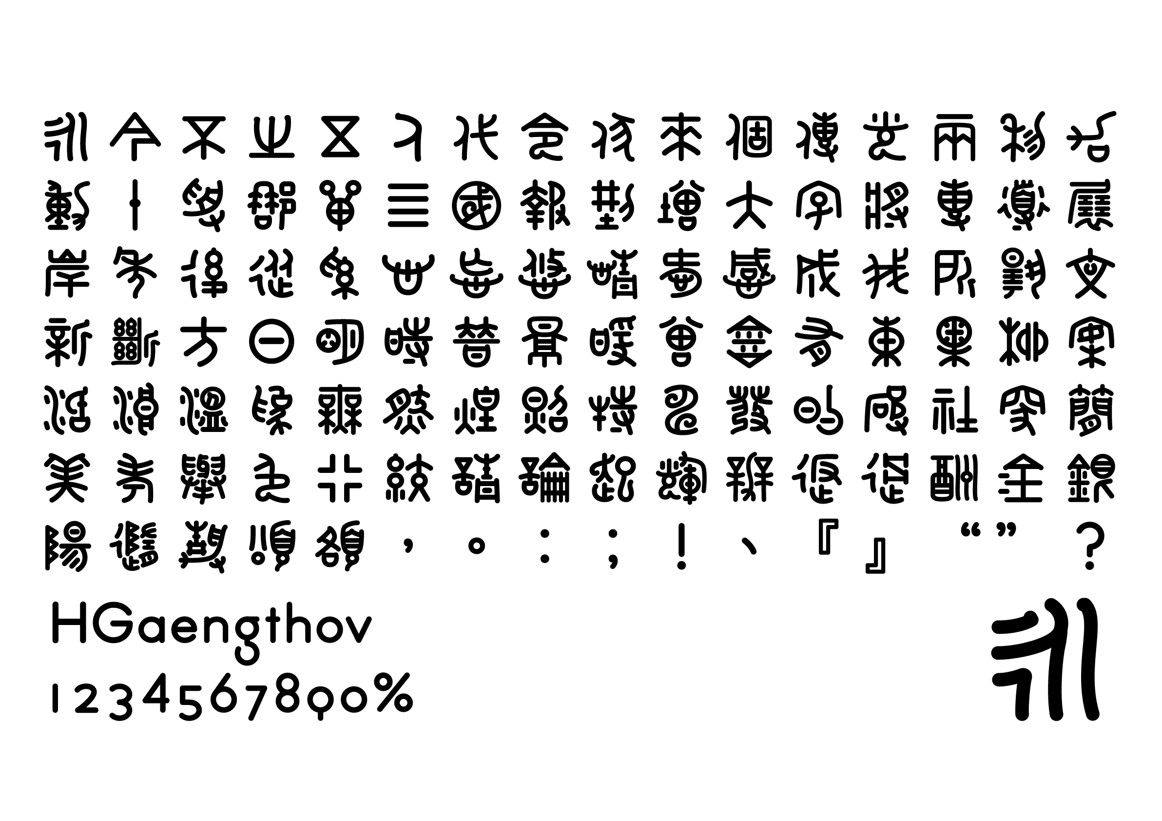
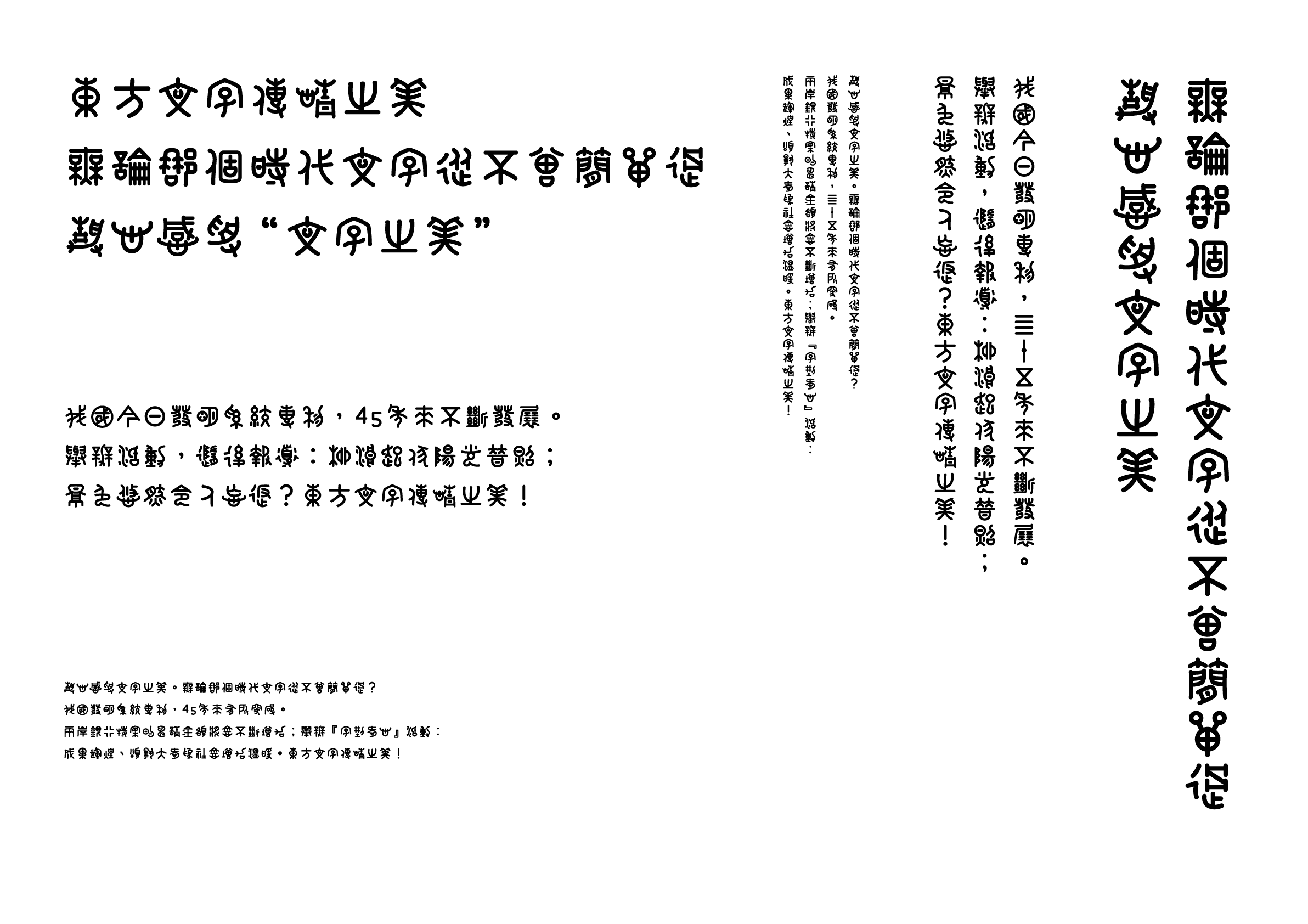
This was designed with rounded sans serif like lines based on the bronze script, which was used for inscriptions on bronzeware in the Shang and Zhou Dynasties in China. The goal was to create a font that would bring to the fore a kind of cuteness and pop that exists within the complex and bizarre appearance unique to ancient scripts.
Winner’s Comment
This work is based on a character dictionary by Lianchi Dong, Chinese Bronze Inscriptions (New Edition), so I am just tapping my head to this famous edition. I feel it is very significant that I have been able to connect the achievements of epigraphy to the field of type design through this award. I hope that the results of epigraphy and paleography will be utilized in typeface production in the future, and if this work provides an opportunity to do so, I will be thrilled.