Traditional Chinese category Morisawa Award
Honorable Mention
Ricebeam
Designer
Taijiang Lin
Taiwan
Born in Changhua County. After pursuing a passion for typeface design while in graduate school, he now works as a freelance graphic designer. Focusing on typeface design, illustration, and brand identity planning, he aims to create beautiful and enjoyable works.
Judges’ Comments
-
Masaaki Hiromura
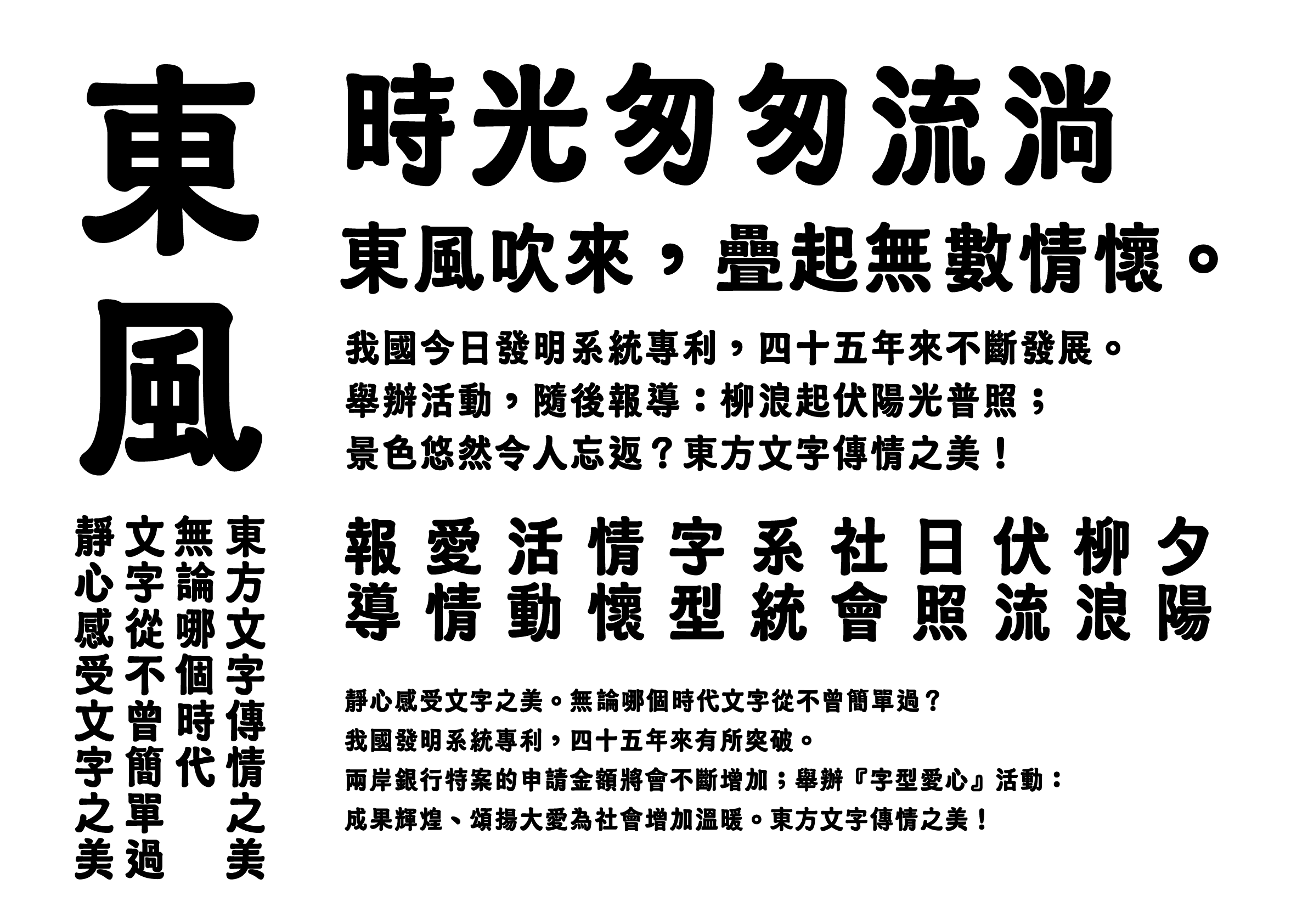
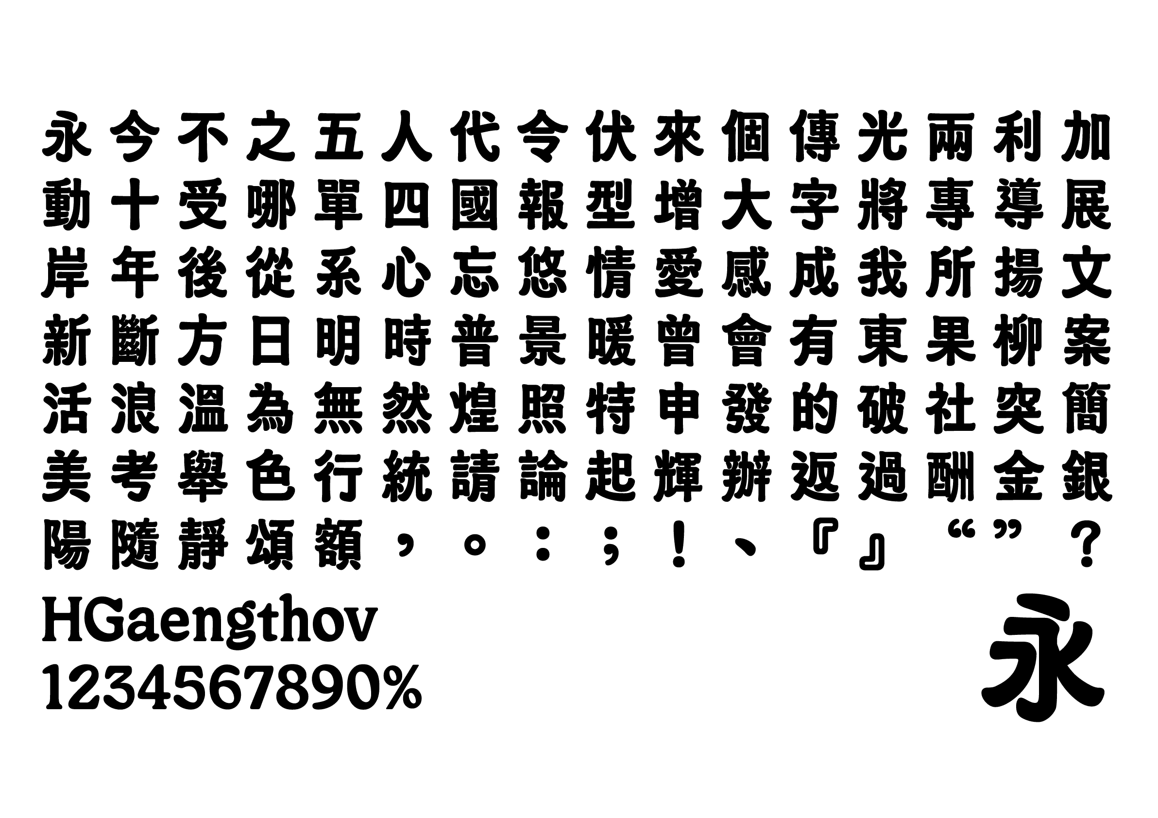
The soft, square outlines of the characters give a cozy, pleasant impression with an overall neat aesthetic and well-aligned character boxes.
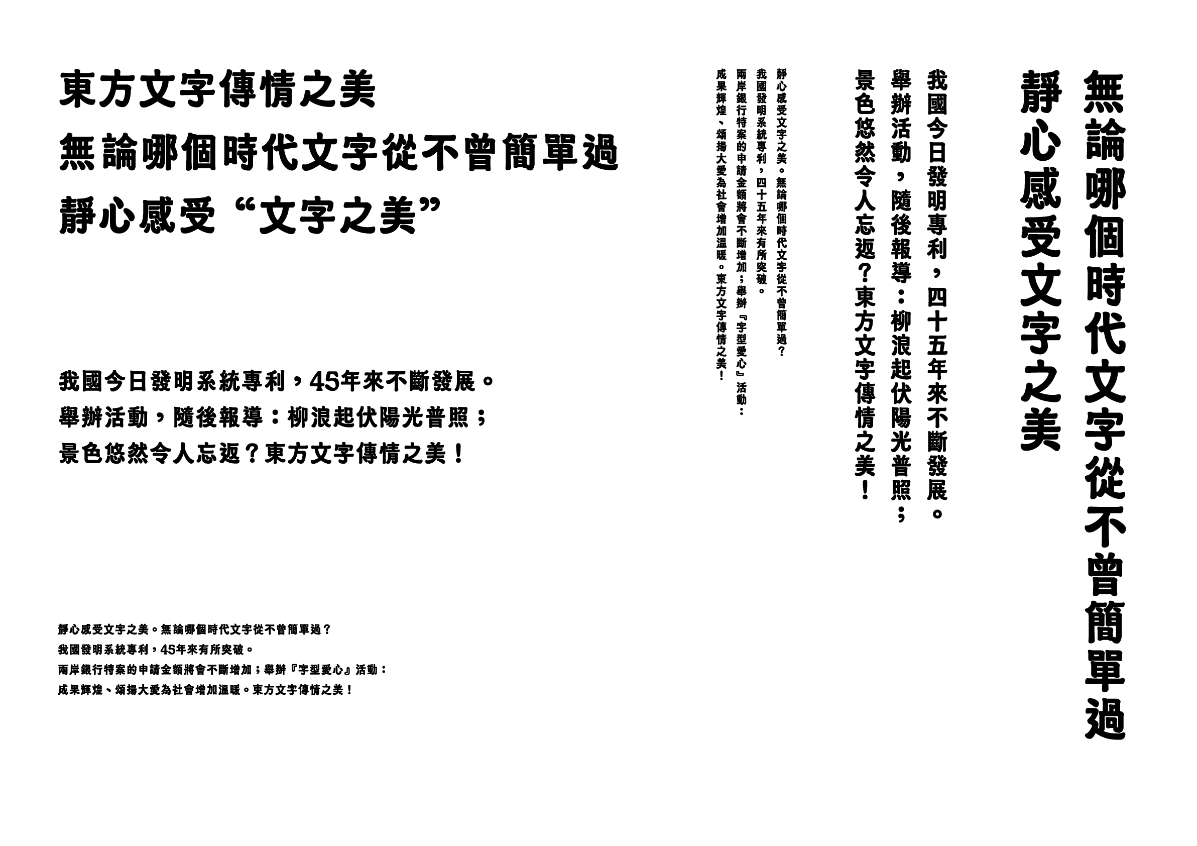
Its high center of gravity also provides elegance to the design. It maintains excellent legibility at small font sizes and is well-suited as a display type. The alphanumeric designs blend well with the Chinese characters, resulting in a unified finish. -
Julius Hui
The composition in vertical setting is stunning, and the legibility in the horizontal setting is also relatively stable. The charming and quirky brushstrokes strike a balance between legibility as a display and lively expression. The selected weight for this typeface effectively displays the flow of different brushstrokes while highlighting its rounded design. A truly outstanding work.
-
Wan Chun Ho
This typeface evokes nostalgia, with naturally flowing, smooth brushstrokes exuding a warm, personable feel. The proportions and spacing of the letterforms are perfectly balanced, further highlighting the handwritten feel of this typeface. It is a highly attractive design with distinctive features yet not overly flashy.


Intention of the work
Inspired by Taiwanese street scenes, Ricebeam (本丸楷體) is a typeface that combines the elegance of block style with the roundness of rounded sans serif. The typeface design is dense and fluffy, reminiscent of the delicate texture of a grain of rice. It exudes a classic flavor that harmonizes Taiwan’s sweet and salty tastes, and its unique style is especially suited for title designs and short text layouts.
Winner’s Comment
Inspired by the small moments of everyday life, I aimed to capture the textual landscape of the contemporary street corner. These works are like newly sprouted seeds, and I am incredibly grateful for everything that happened during this competition. It has given me great encouragement and confidence to develop my work further into a more mature form.