Traditional Chinese category Morisawa Award
Honorable Mention
mi
Designer
Mubing Lang
China
A graphic and type designer born in Sichuan, China, with nearly 20 years of experience in graphic design. A long-time fan of typefaces, who prefers calligraphy and hand-drawn POP, and is currently focusing on typeface design. Received three excellence awards and a jury award in the 5th Hanyi FontStar Design Competition, and an excellence award and two jury awards in the 12th Founder Award.
Judges’ Comments
-
Masaaki Hiromura
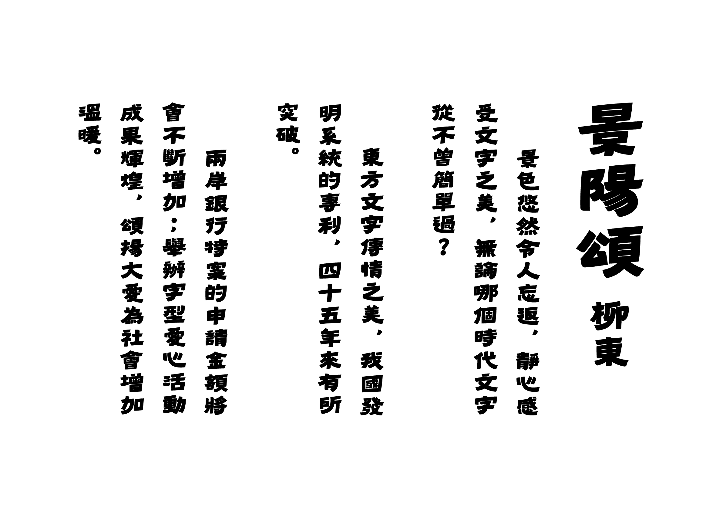
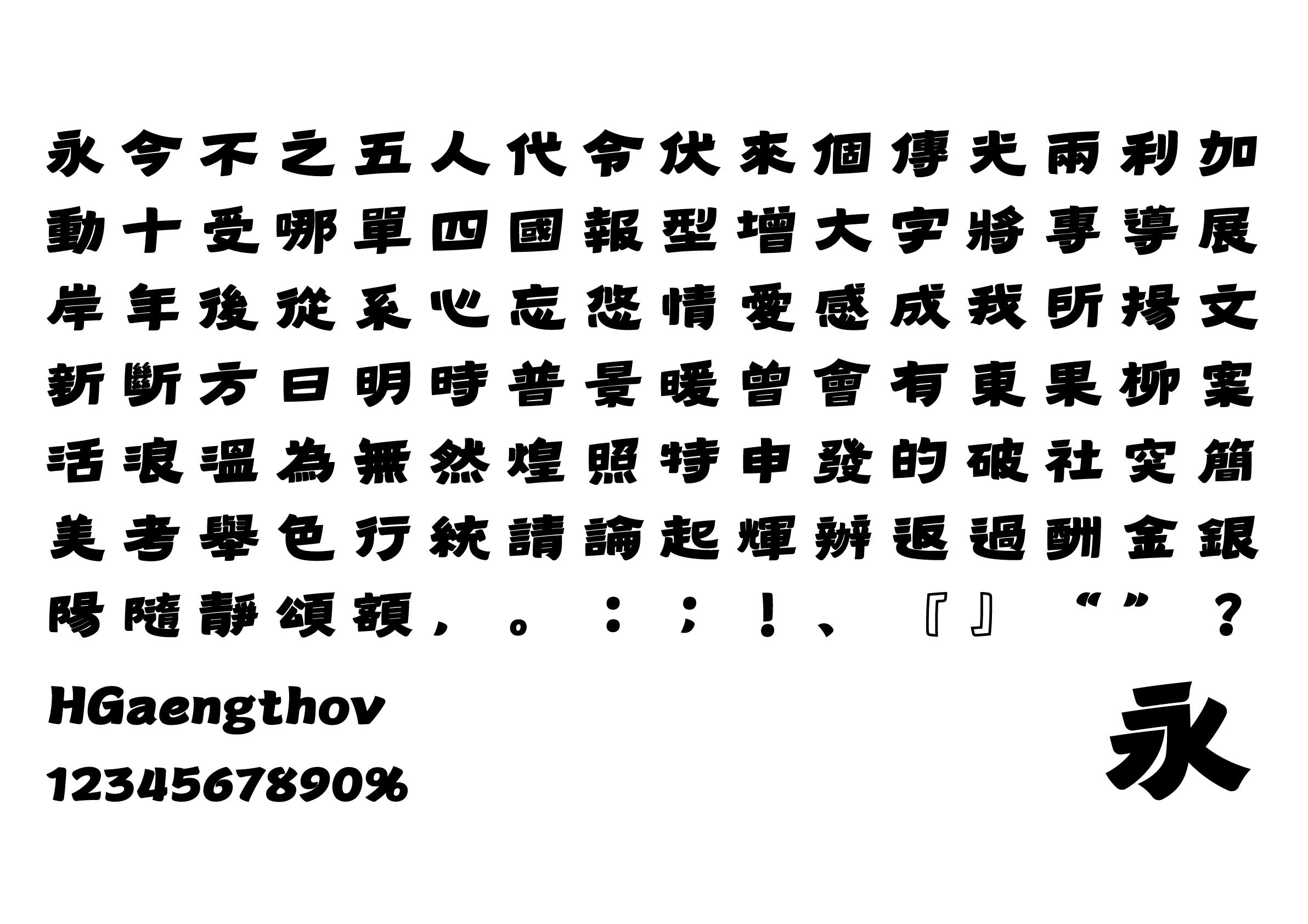
An exquisite typeface with emphasized Harai (sweep strokes) that add charm to its well-balanced design. While some areas may be difficult to read due to its narrow counters, the unique upward slant to the right is an eye-catching feature that reflects the designer’s attention to detail. The deliberate lack of alignment in the center of gravity adds a playful touch and character to this typeface.
-
Julius Hui
We were particularly pleased with the designer’s challenge in placing the “center of gravity towards the right” in the Chinese character structure. This may occur naturally in many other characters, but the structure of Chinese characters is highly diverse, making it difficult to incorporate this concept into the characters that are visually balanced through symmetry. We were happy to see the designer’s effort to conceptualize this as much as possible. The brushstrokes that modernize and visualize the carving tools used in Wei Bei inscriptions are one of our particular favorites.
-
Wan Chun Ho
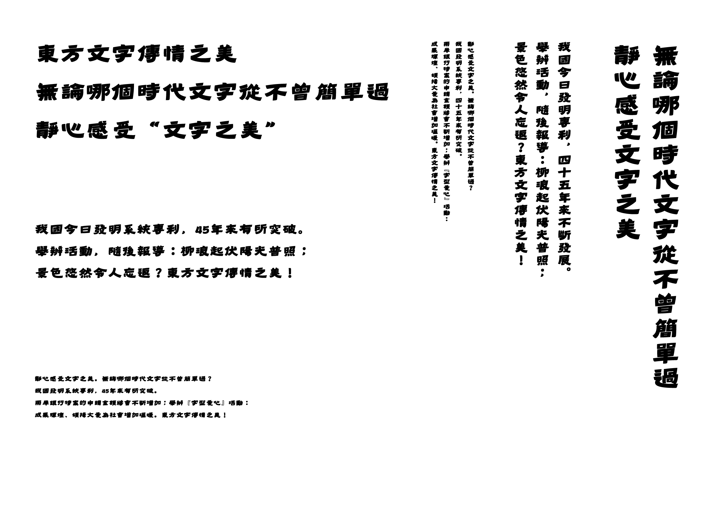
This typeface is reminiscent of handwritten letters written with a marker pen. The design of the strokes and letterforms is masterful and interesting, with a sense of depth already present in the contrast. With a few adjustments to detail, the overall quality can be further refined. With a clear style, the design is energetic and interesting.


Intention of the work
The “old and new” appearance is expressed by blending the ancient Chinese Han Dynasty’s clerical style with modern sans serif, maintaining the balance in structure and adding precise changes to the brushstrokes. Using a contemporary approach to simplify the Han Dynasty’s clerical style and adding more weight, it is in harmony with modern aesthetics. Suitable for display types, posters, and other applications.
Winner’s Comment
I want to thank the judges from the bottom of my heart for this award. This work is one of my personal favorites. I hope that you will continue to hold these superb type design competitions in the future. If the opportunity arises, I would like to participate again.