
Traditional Chinese category Morisawa Award
Honorable Mention
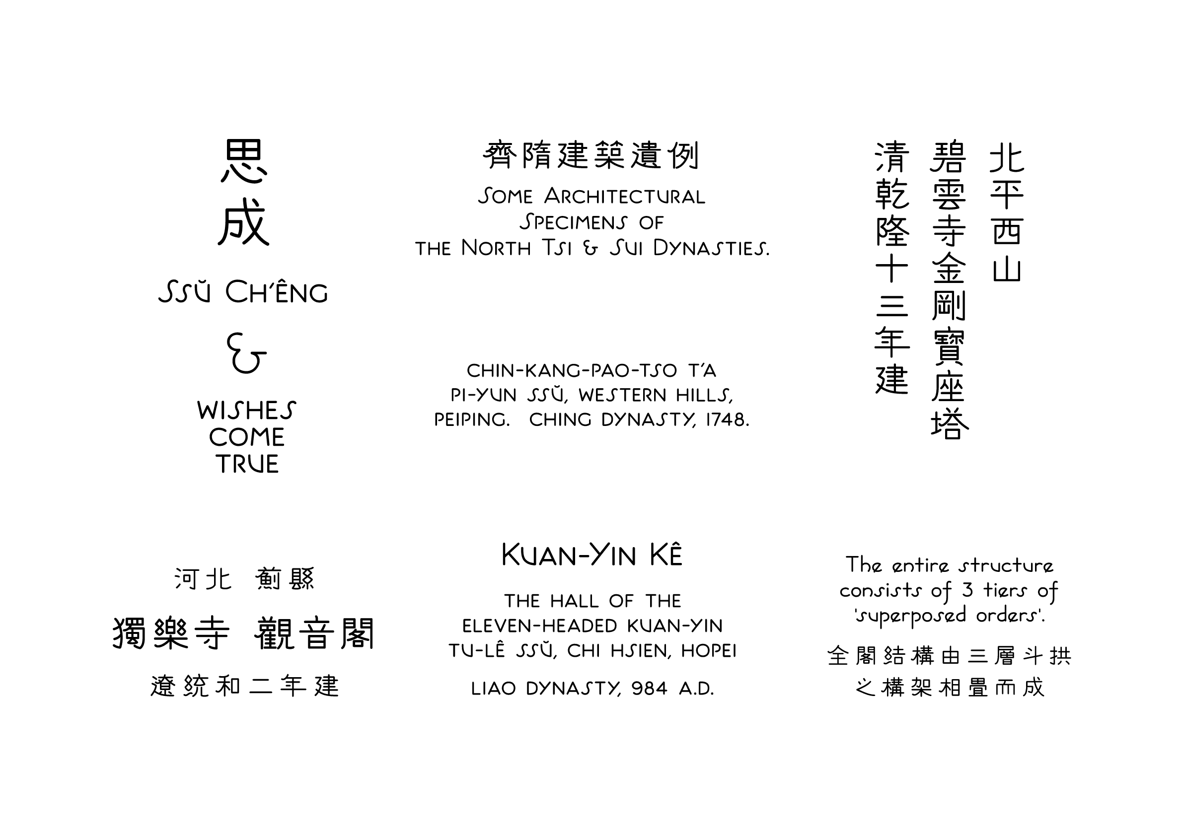
SuSeng
Designer
Chìhông Tân
China
Shenzhen-born graphic designer. With a love of writing and photographing letters while traveling, he has a keen interest in characters from all over the world. His past awards include an excellence award in the Suzhou Numeral Font Design Competition. He acquires his knowledge of typeface design through the Internet and books.

Judges’ Comments
-
Masaaki Hiromura
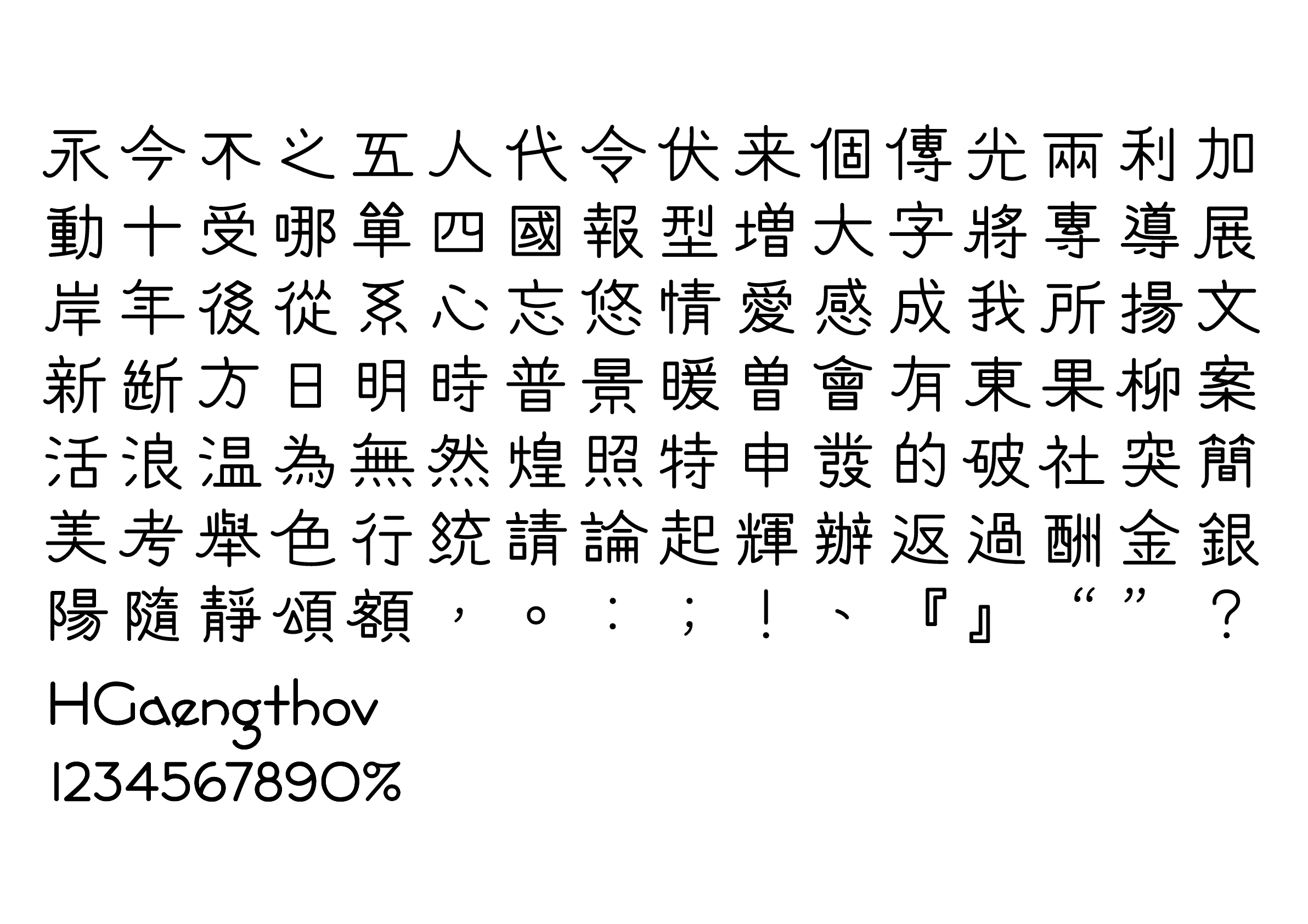
This typeface echoes the ancient seal script carved into stone in a more modern, refined, light, and graphical design. By incorporating elements of seal script into a contemporary sans serif, it perfectly blends its historical elegance with a modern sensibility. It is suitable for logos. The uniqueness and originality of the design stand out.
-
Julius Hui
Each character in this design has distinctive features and is highly creative, with the treatment of the characters “心” and “後” showing elements of clerical script. The cohesion in its setting remains unclear until seen in actual application. The unique and playful feel of the typeface is what makes this design truly interesting. It has a certain airiness along with its cultural features. The designer’s imagination and creativity are clearly reflected in the work.
-
Wan Chun Ho
With a refreshing design, this typeface combines geometric elements with handwritten elements, creating a visual effect that is light yet literary. The skeleton of the letterforms is unique, with attention to detail in the extended parts of the Latin characters. Its artistic essence will be effectively highlighted in highly creative applications.
Intention of the work
The name SuSeng (思成) was inspired by the handwriting in illustrated books written by architect Sicheng Liang. The typeface has a structure with an archaic elegance and is suitable for caption text layout, unlike traditional typefaces, which have a substantial thickness variation. The positioning of this typeface provides a different spirit for manuscript text layouts and short text layouts, with an emphasis on conveying warmth and a humanistic nature. Avoiding the impression of being overly fussy or old-fashioned, it has a disposition to play between tradition and modernity.
Winner’s Comment
Sicheng Liang’s handwritten manuscripts are very popular and shared by many people on the Internet. I had seen it before I got involved in design and have never forgotten it. I have not had many opportunities to participate in a design contest for traditional Chinese characters, so this time, I wanted to realize an idea that had been in my mind for many years. I learned a lot from this competition and was greatly impressed. I am thankful for the judges’ recognition, which helped me feel more confident. I will continue to bring to life the various ideas in my head.