
Traditional Chinese category Morisawa Award
Honorable Mention
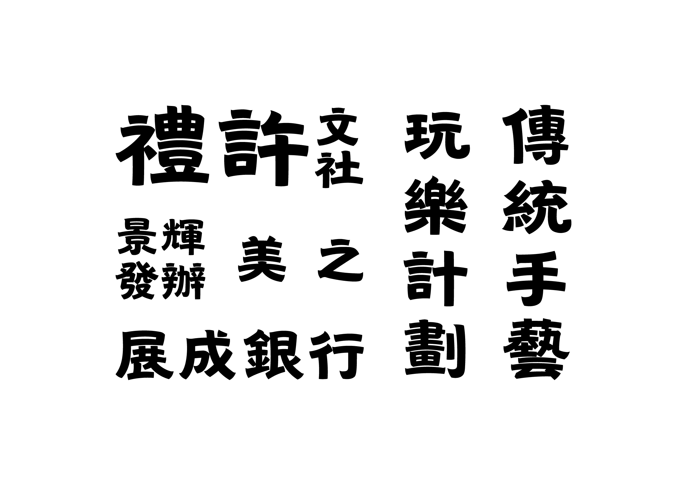
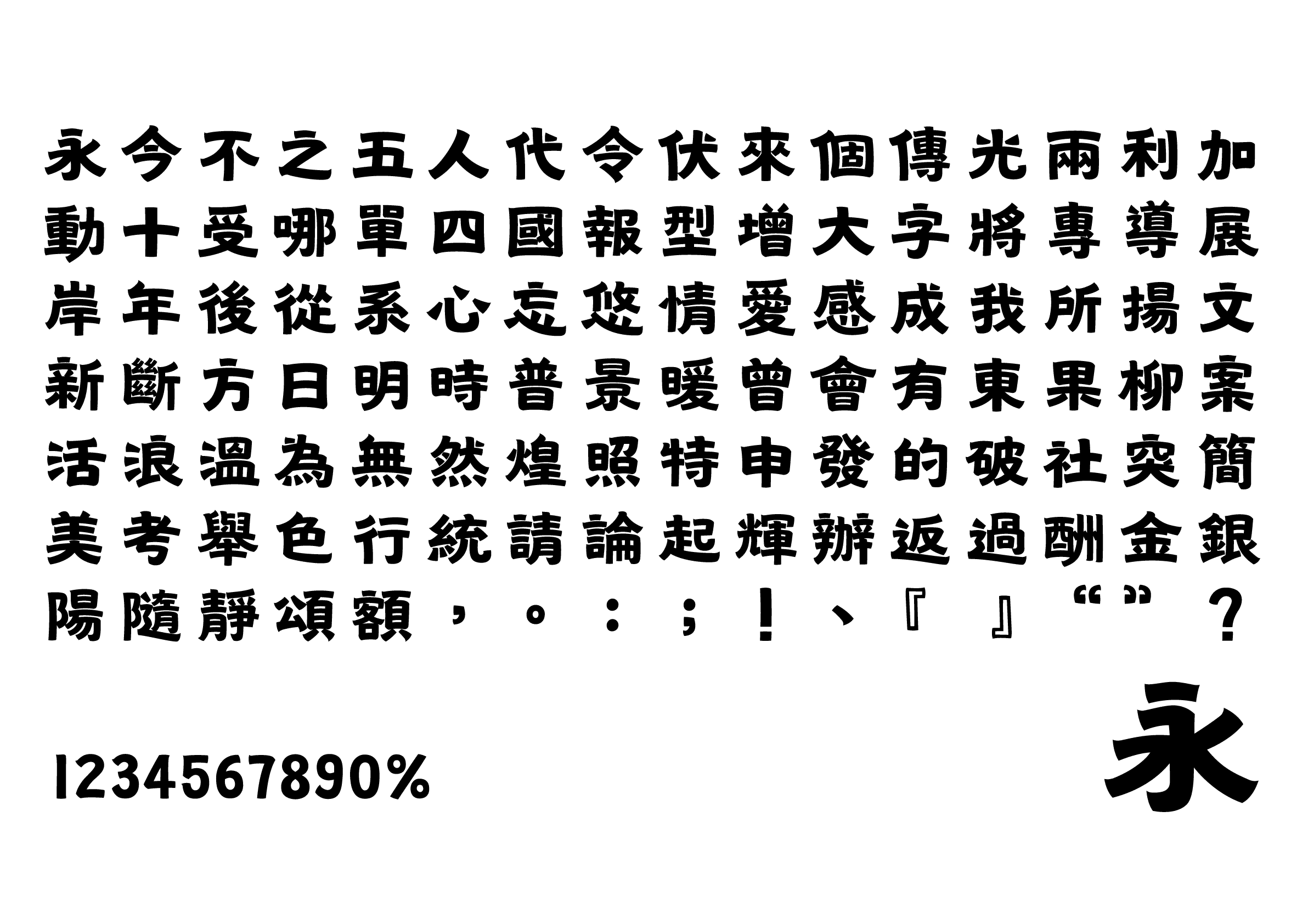
Wei Gothic
Designer
Chinghin Chan Roy
Hong Kong
Born in Hong Kong, he founded his own independent typeface brand, Moodmen Font, in 2019 to produce fonts for the traditional Chinese display type. He has designed and marketed two fonts so far. He currently resides in the UK. Studied for a master’s degree in Typeface Design at the University of Reading in 2024-2025, where he focused on the compatibility of Latin and multiscript typeface design. The work for this competition was created prior to enrollment.
Judges’ Comments
-
Masaaki Hiromura
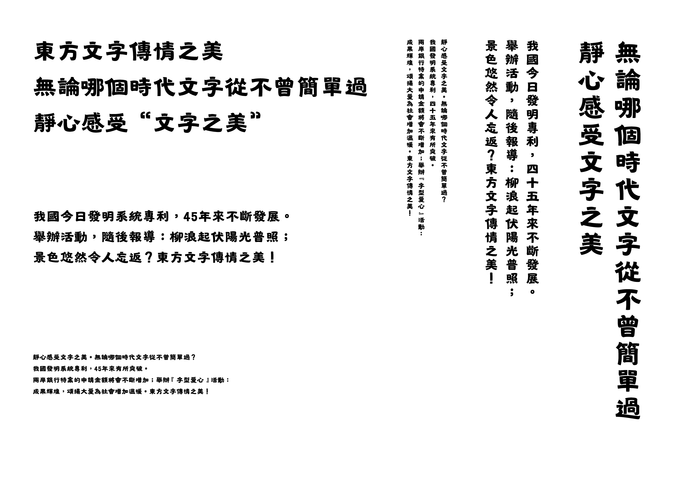
A typeface that is easy to read with a light, wave-like rhythm that naturally flows when used in flows when used in horizontal text. Reminiscent of the hand-painted lettering of traditional signs created by sign makers, it radiates warmth filled with care and affection. This is a memorable design with a touch of nostalgia.
-
Julius Hui
The Chinese character design of this typeface is highly appealing. The treatment of the curves in each character is exceptional, especially in the radical of “心.” There is room for improvement, however, in the treatment of stroke weight in Chinese characters with many brushstrokes. It performs well in practical applications, evoking a scene of Dihua Street in Taipei where there is a cultural blend of old and new shops. This is a design with great potential.
-
Wan Chun Ho
This typeface evokes a retro signboard-like feel, with cleverly designed horizontal strokes of the letterform that accentuate the font’s distinct features. Adjusting the contrast and size of the letterforms would further refine the design. The setting samples for the open assignment effectively showcase the uniqueness of this typeface.
Intention of the work
Inspired by the stone inscriptions of the Northern Wei Dynasty, this typeface merges the strength of calligraphy with the simplicity of a modern sans serif typeface. The design replicates the texture and serenity of ancient stone carvings while meeting contemporary design’s practical needs. It creates a new balance between ancient calligraphy and contemporary design contexts, providing designers with a design tool that blends historical depth and contemporary creativity through timeless visual communication.
Winner’s Comment
At the time of my participation in the competition, I was still researching the history of typefaces, having not yet studied typeface design in my master’s program. As I learned more about the transition of Chinese characters from handwriting to wood engraving and then to letterpress printing, I felt as if I had been born in a parallel world of Hong Kong with the Northern Wei Gothic (北魏黒体). I have put my efforts into rewriting the history of typefaces and working on transforming the Northern Wei calligraphy, stone carvings, and art characters on the streets into various digital fonts. I aim to ensure that Hong Kong’s glorious Eastern charm continues to thrive in the future.