
Traditional Chinese category Morisawa Award
Honorable Mention
li kai
Designer
Mubing Lang
China
A graphic and type designer born in Sichuan, China, with nearly 20 years of experience in graphic design. A long-time fan of typefaces, who prefers calligraphy and hand-drawn POP, and is currently focusing on typeface design. Received three excellence awards and a jury award in the 5th Hanyi FontStar Design Competition, and an excellence award and two jury awards in the 12th Founder Award.
Judges’ Comments
-
Masaaki Hiromura
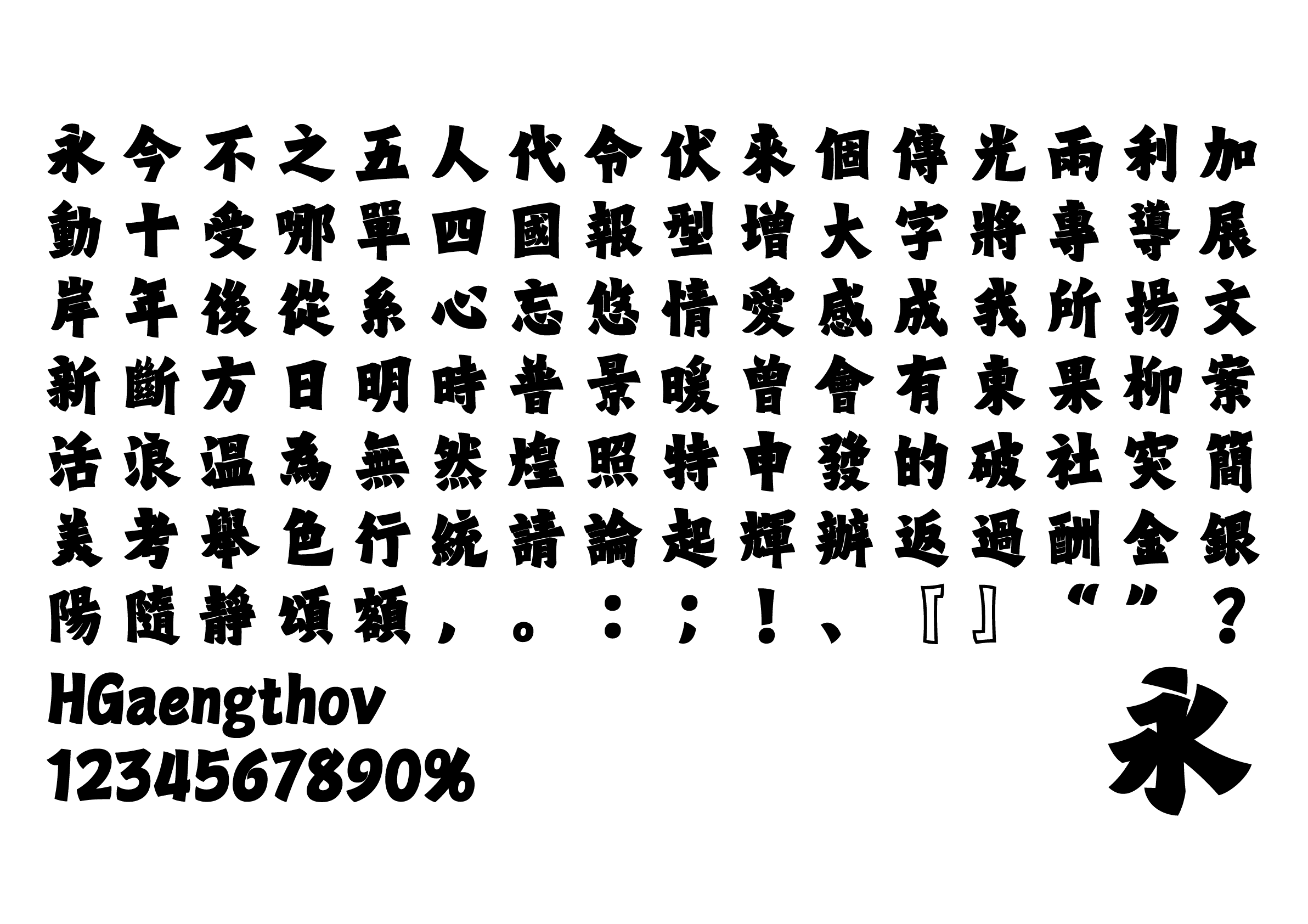
A typeface with a bold and striking aesthetic that has removed the rounded ends of the brushstrokes typical in the block style typeface. Its sharp outline maintains legibility even with narrow counters. Well-suited for poster and flyer titles. The characteristics of the Chinese characters are cleverly incorporated in the alphanumeric design, resulting in an overall consistent look.
-
Julius Hui
The brushstroke design evokes Yang Guo(楊過)’s “Heavy Iron Sword (玄鉄重剣),” making this a rare and intriguing bold block style. The overall structure is compact and fascinating, where even small fonts remain relatively clear. Visual cohesiveness in the font size and uniformity in the slant of the block style characters would further improve the typeface.
-
Wan Chun Ho
This typeface merges the classics with the modern, with a personal feel. The proportion and spacing of the letters are perfectly adjusted, where the subtle spacing adjustment within the characters prevents them from blurring at smaller font sizes. Overall, an impactful bold design.
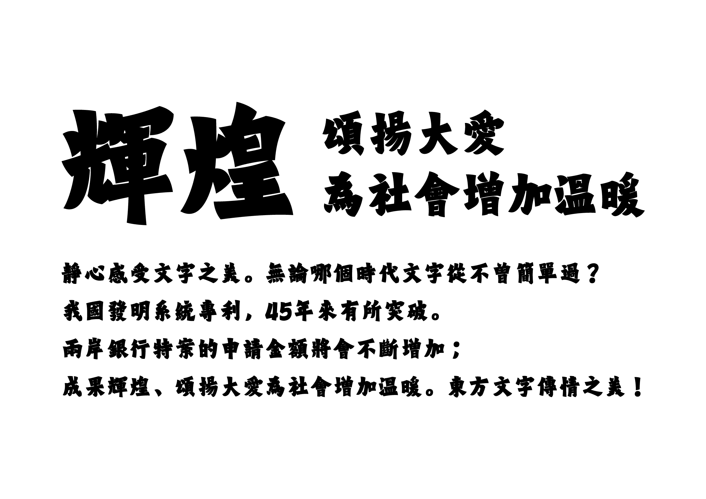
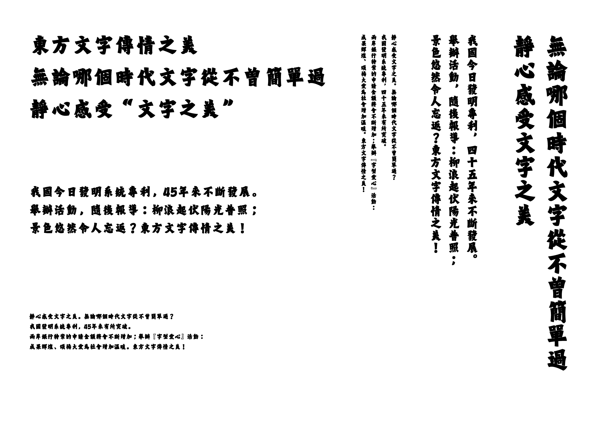
Intention of the work
The design is based on Sweet Spring at Jiucheng Palace (九成宮醴泉銘), a block style by the Chinese Tang Dynasty calligrapher Ouyang Xun (欧陽詢). Initially, I aimed for a modern feel by merging the block style and sans serif. However, as I made more revisions, the elements of the Wei Bei style became stronger, and the result was a return to the basics. Nevertheless, the typeface has a unique flavor deriving from this process.
Winner’s Comment
I am thrilled to have received this award. From the initial idea to its completion, I came close to giving up many times. Creating a new typeface based on traditional calligraphy was challenging, but I truly enjoyed the opportunity. I hope this exceptional type design competition will continue to be held in the years to come. If given the chance, I would be happy to participate again.