
Latin category Morisawa Award
Gold Prize
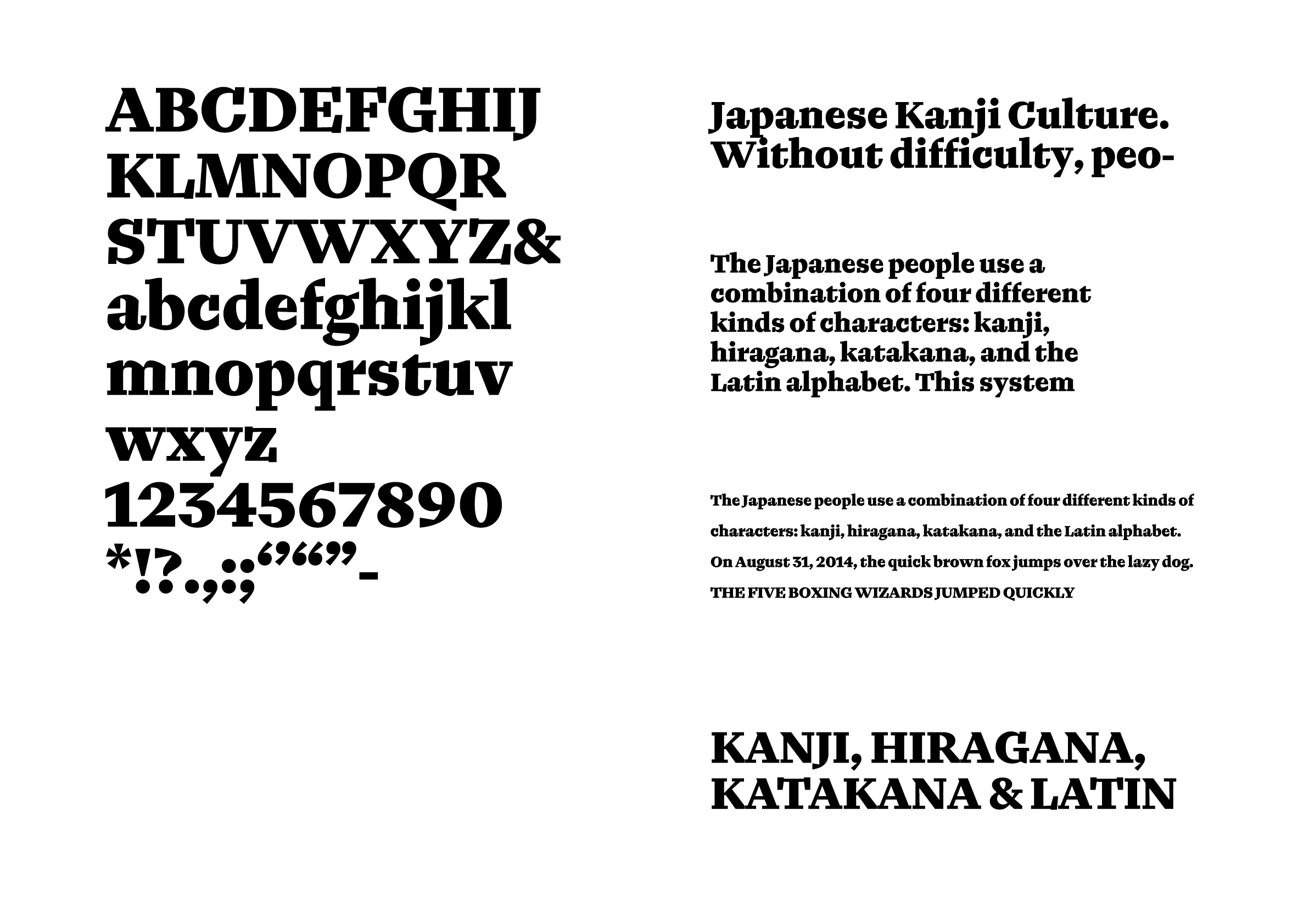
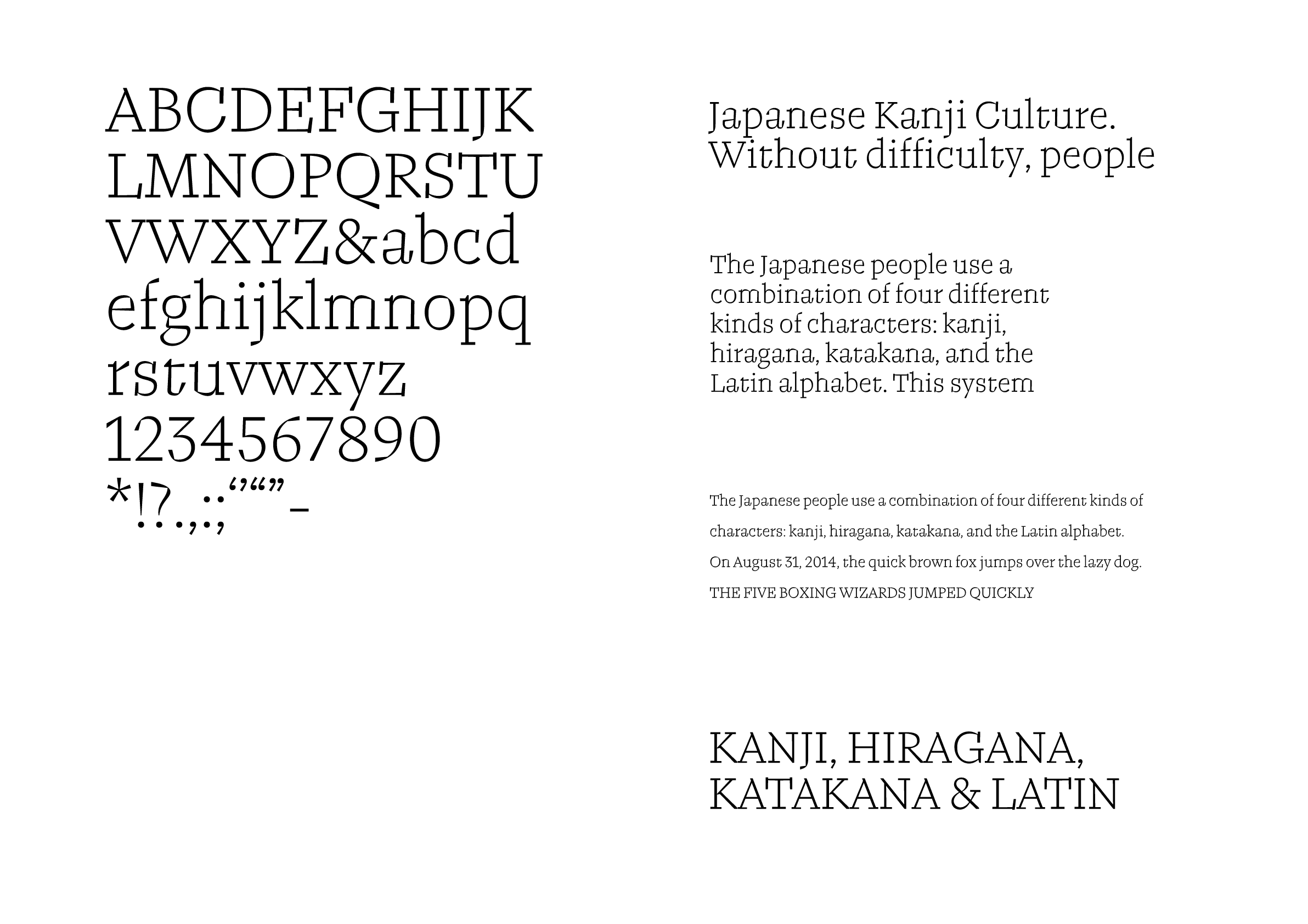
Nimonic
Designer
Naiqian Wang
China
Naiqian Wang is a graphic designer and type designer born in Nanjing, China. He holds a master’s degree in Type Design from ECAL (University of Art and Design Lausanne) and a BFA in Graphic Design from Rhode Island School of Design. having previously worked in Shanghai and New York, he is currently freelancing in Lausanne, Switzerland.
Judges’ Comments
-
Laura Meseguer
The evaluation for this prize centered on three key aspects: the cohesiveness of weight variations within the type family, the consistency and quality of character structure, and the successful expression of a simple yet effective design concept. This typeface stands out for its playful nature, particularly in the intricate details of each letterform. The uniquely angled serifs, and the spaces created within and outside the characters add creative flair, making this an interesting typeface.
-
Ilya Ruderman
For this competition, the Gold Prize wasn’t an immediate decision; rather, it was chosen based on what felt most deserving at this moment. Among the contestants, this serif typeface stood out as particularly fascinating. The expressive drawings and detailed design elements are exceptional. The letter “o,” for example, is typically drawn symmetrically, but the asymmetrical design of this typeface is cleverly executed. It is a new typeface that reinterprets classical elements with a modern twist.
-
Indra Kupferschmid
It was interesting to see how these letters successfully make a typeface, despite the very different inner and outer curve progressions in the letters. When we look at typefaces, we donʼt typically focus on each individual letterform, but each character feels unique in this font. It works surprisingly welly, even in smaller sizes. Despite its high stroke contrast, I think it would make a good text typeface when printed on uncoated paper.
Intention of the work
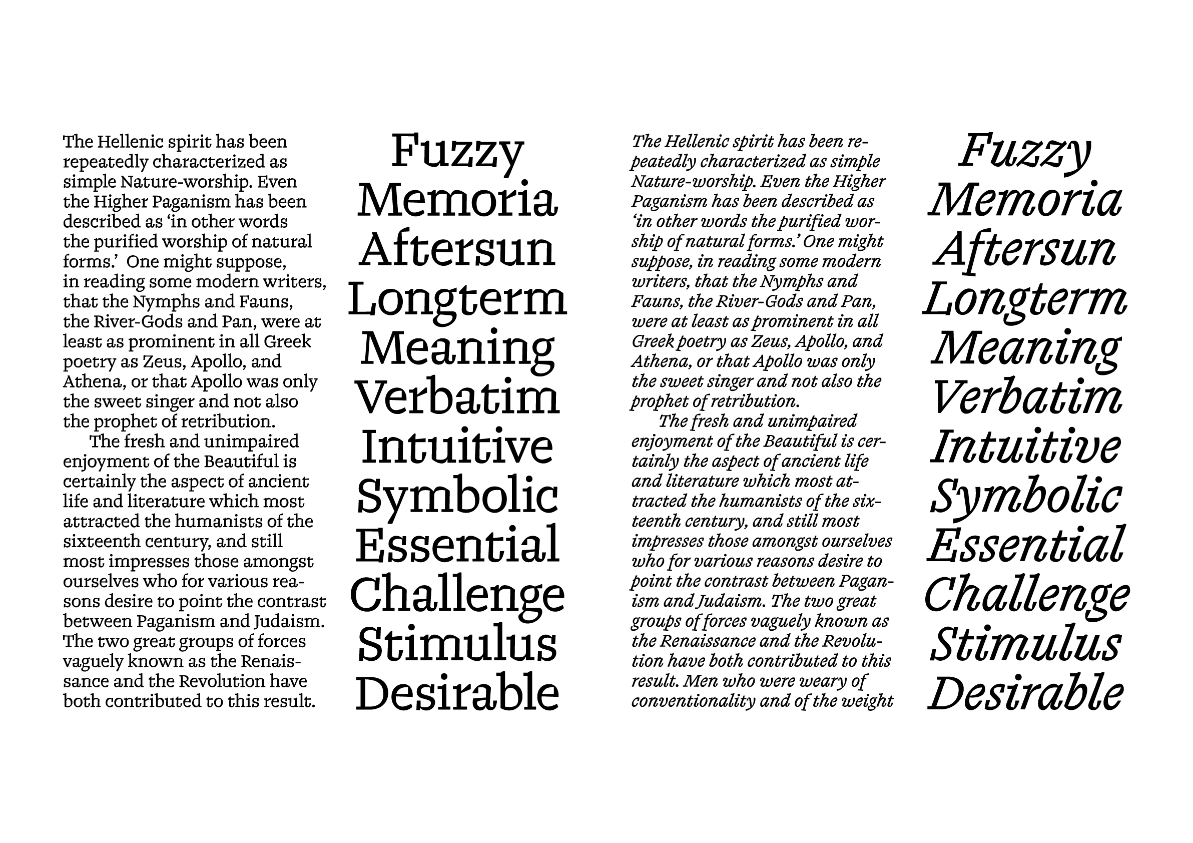
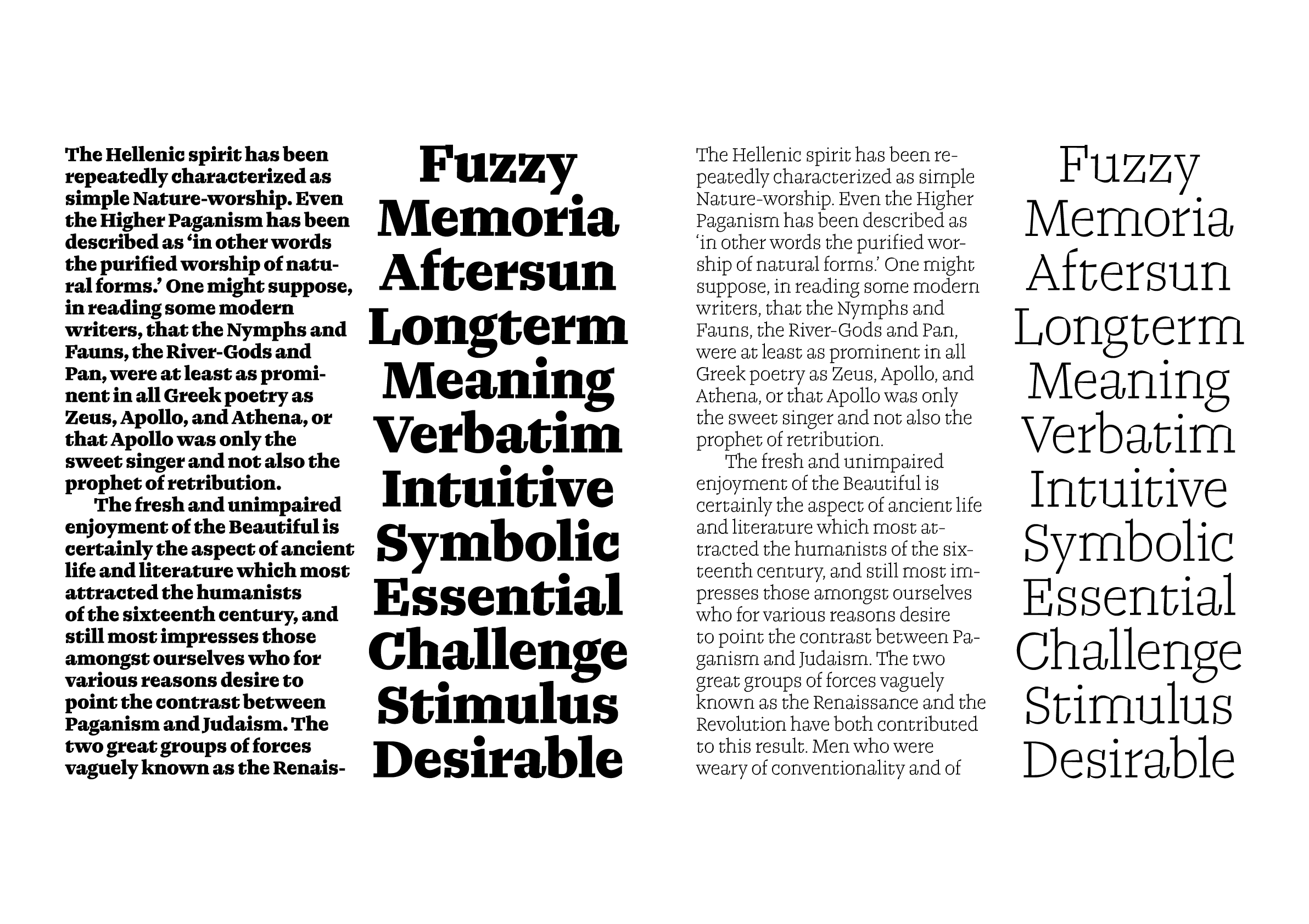
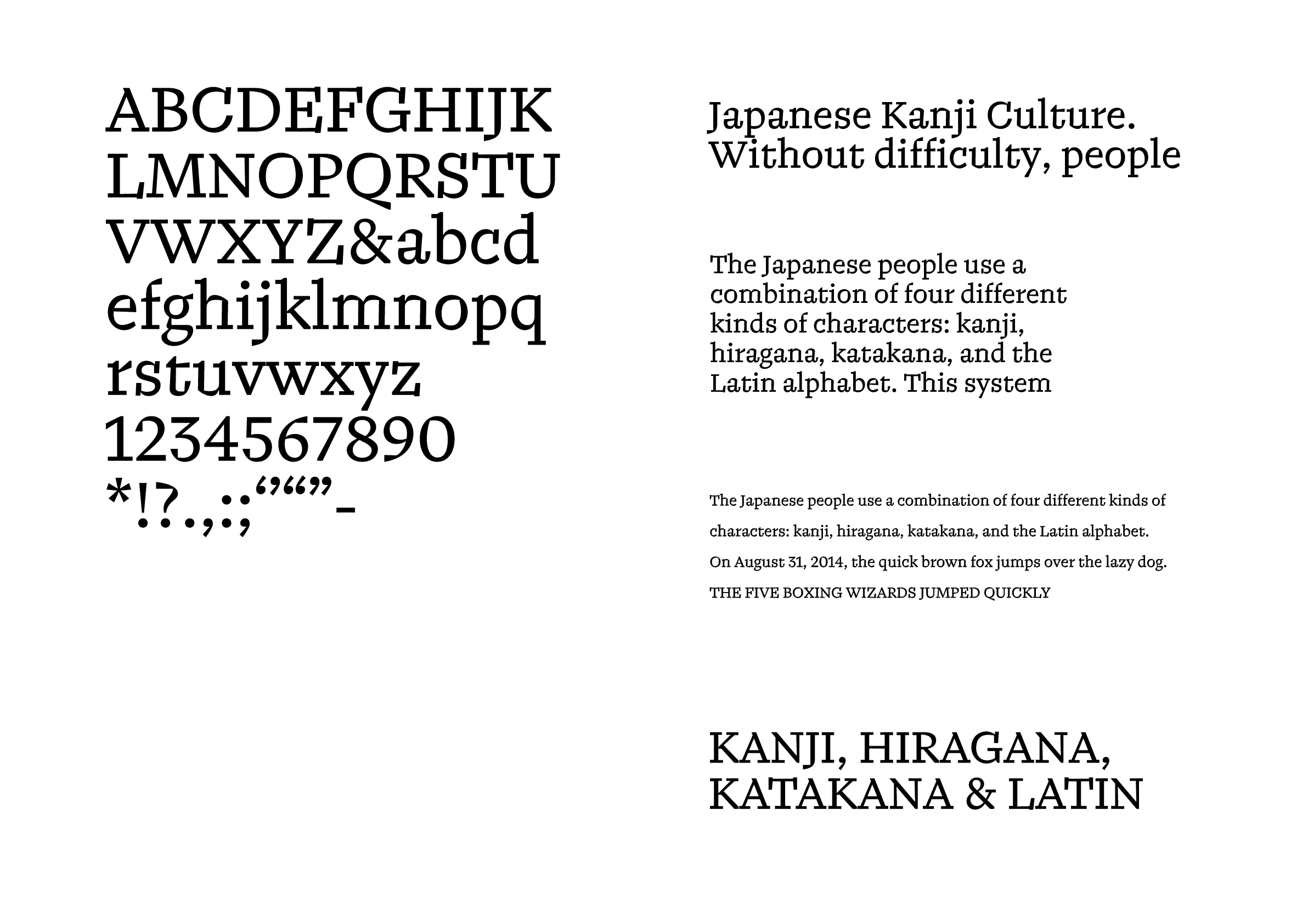
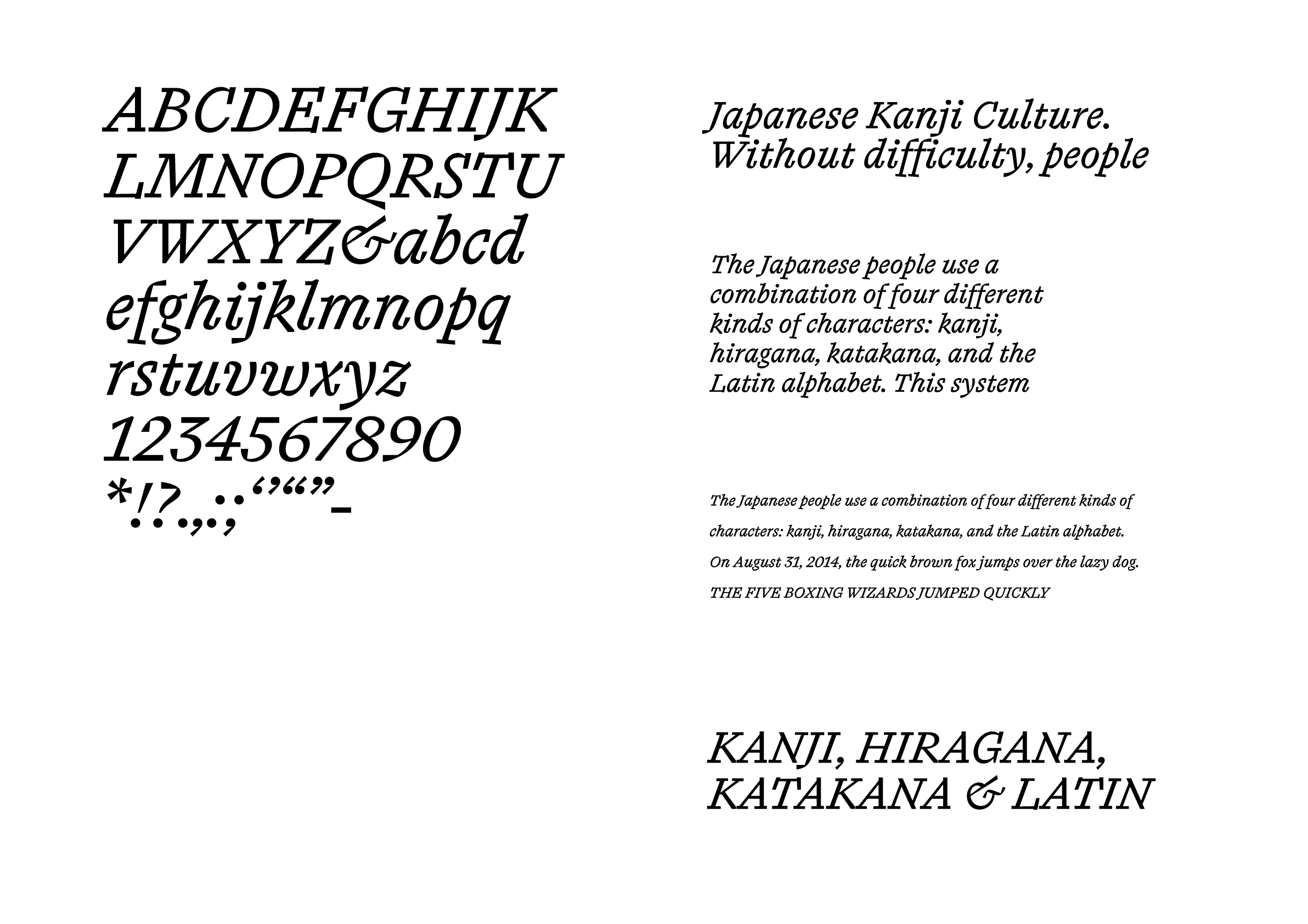
Nimonic is a typeface designed from memory for memory. Based on letter identification and legibility research, the letterforms are drawn to emphasize their idiosyncrasies, resulting in subtle yet quirky features that purposefully slow down the learner’s reading process. The combined technical and aesthetic considerations allow Nimonic to maintain a familiar first impression while hosting many unorthodox details, like having a vague gist memory instead of a vivid verbatim memory.
Winner’s Comment
Nimonic was the most recent and extensive project I’ve worked on so far, it carries a lot of personal significance which at times even hinders the design process. Upon finishing last summer, I had very conflicted feelings towards it: a mix of pride and shame, gratitude and regret. For me getting this recognition is an important step in starting to embrace my identity as a type designer, something I had avoided for as long as I could. After all, we design to make room for dialogues. I am very grateful for the doors that may open from this recognition, and I intend to carry this momentum forward.