
Latin category Morisawa Award
Silver Prize
Vol.
Designer
Naiqian Wang
China
Naiqian Wang is a graphic designer and type designer born in Nanjing, China. He holds a master’s degree in Type Design from ECAL (University of Art and Design Lausanne) and a BFA in Graphic Design from Rhode Island School of Design. having previously worked in Shanghai and New York, he is currently freelancing in Lausanne, Switzerland.
Judges’ Comments
-
Laura Meseguer
This typeface takes a sculptural approach to design, shaping characters by carving away black space rather than filling it in. The subtle details are particularly appealing, with some characters resembling a mix of lowercase and uppercase, or a unicase approach. The uniform square form used for closed counters like “o,” rather than angling them in italics, demonstrates a creative design solution.
-
Ilya Ruderman
Depending on the design process, typefaces can either be designed with analog writing tools in mind or based on the designer’s logic. In this design, it is clear that the designer followed their constructed logic throughout the creation process. It was fascinating to follow their approach. The letter “X” aligns perfectly with that logic, resulting in a very simple yet beautiful form. This is an incredibly imaginative typeface.
-
Indra Kupferschmid
What was notable with this design was the variation in font width and direction – upright, forward and backwards italic. With this you can create varied and unique effects. Furthermore, the addition of entry and exit strokes that act like median spurs gives the typeface a unique dynamic with horizontal and vertical emphasis at the same time.
Intention of the work
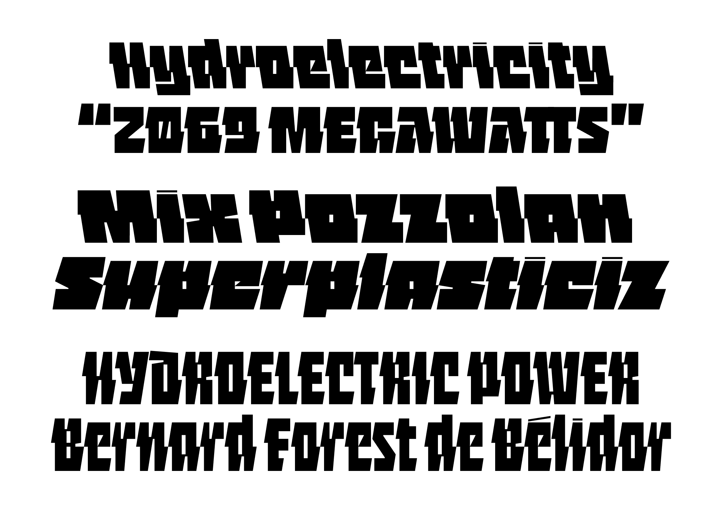
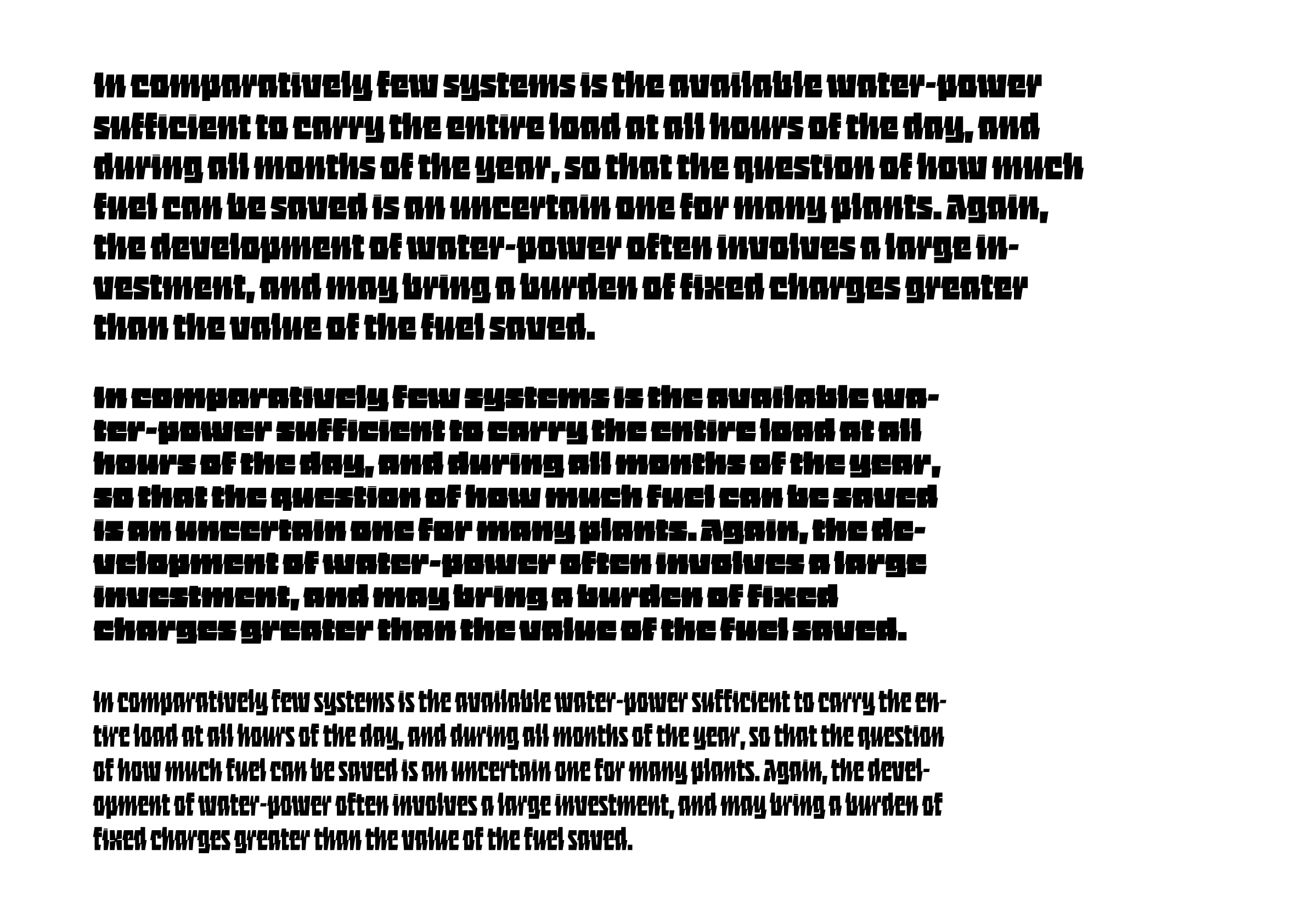
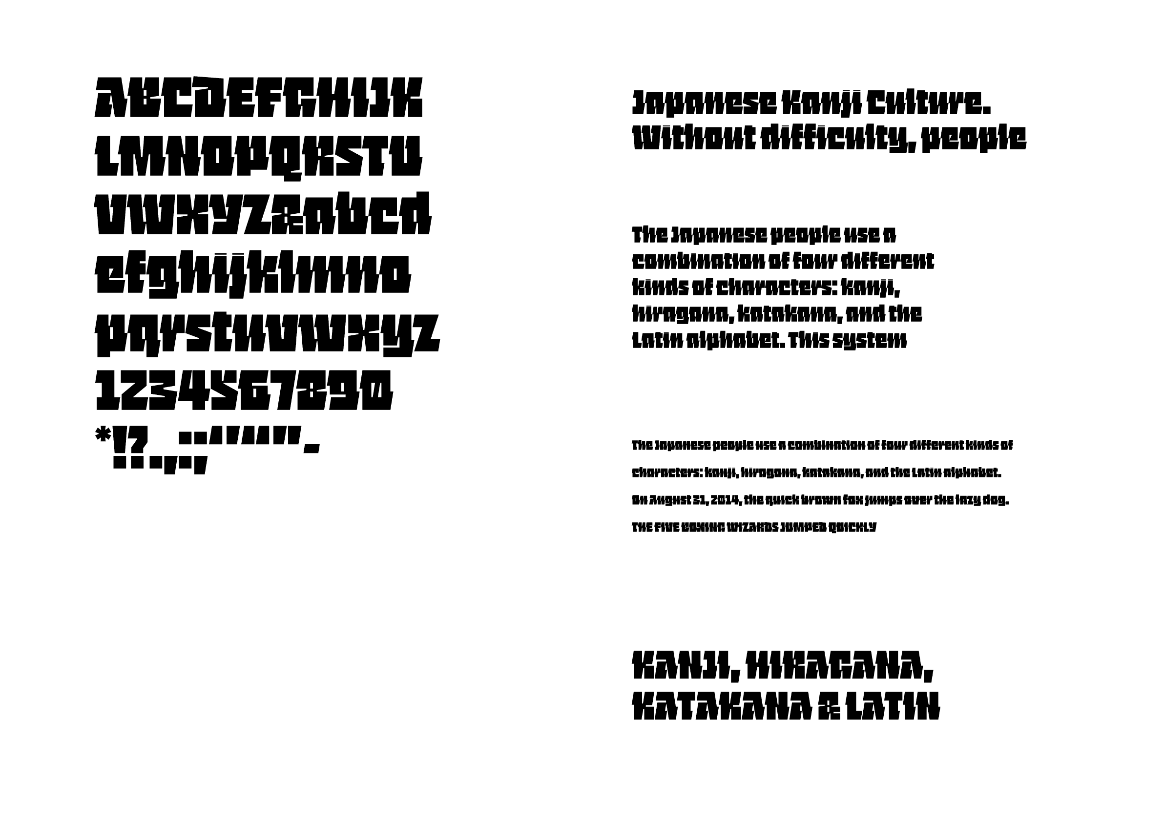
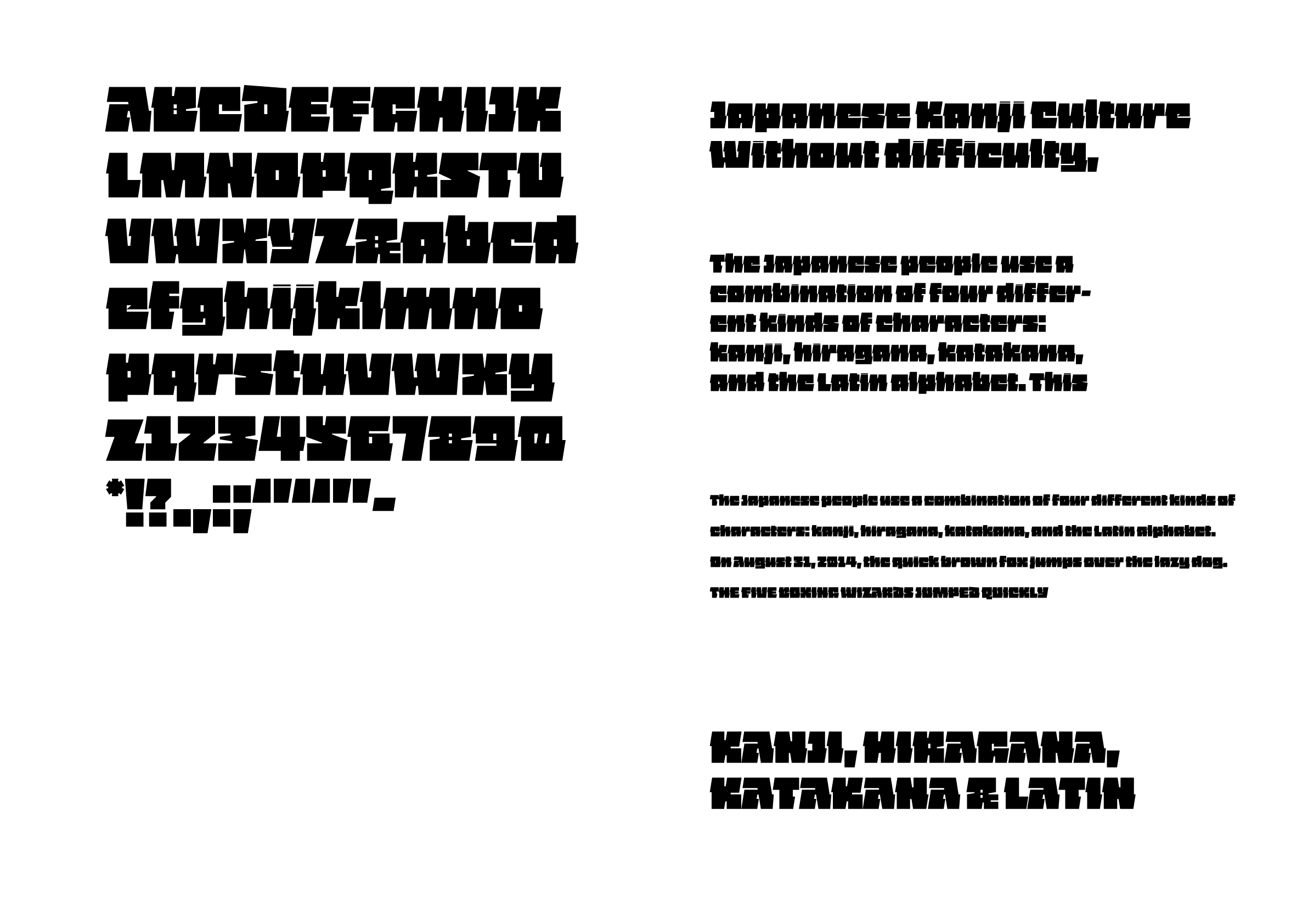
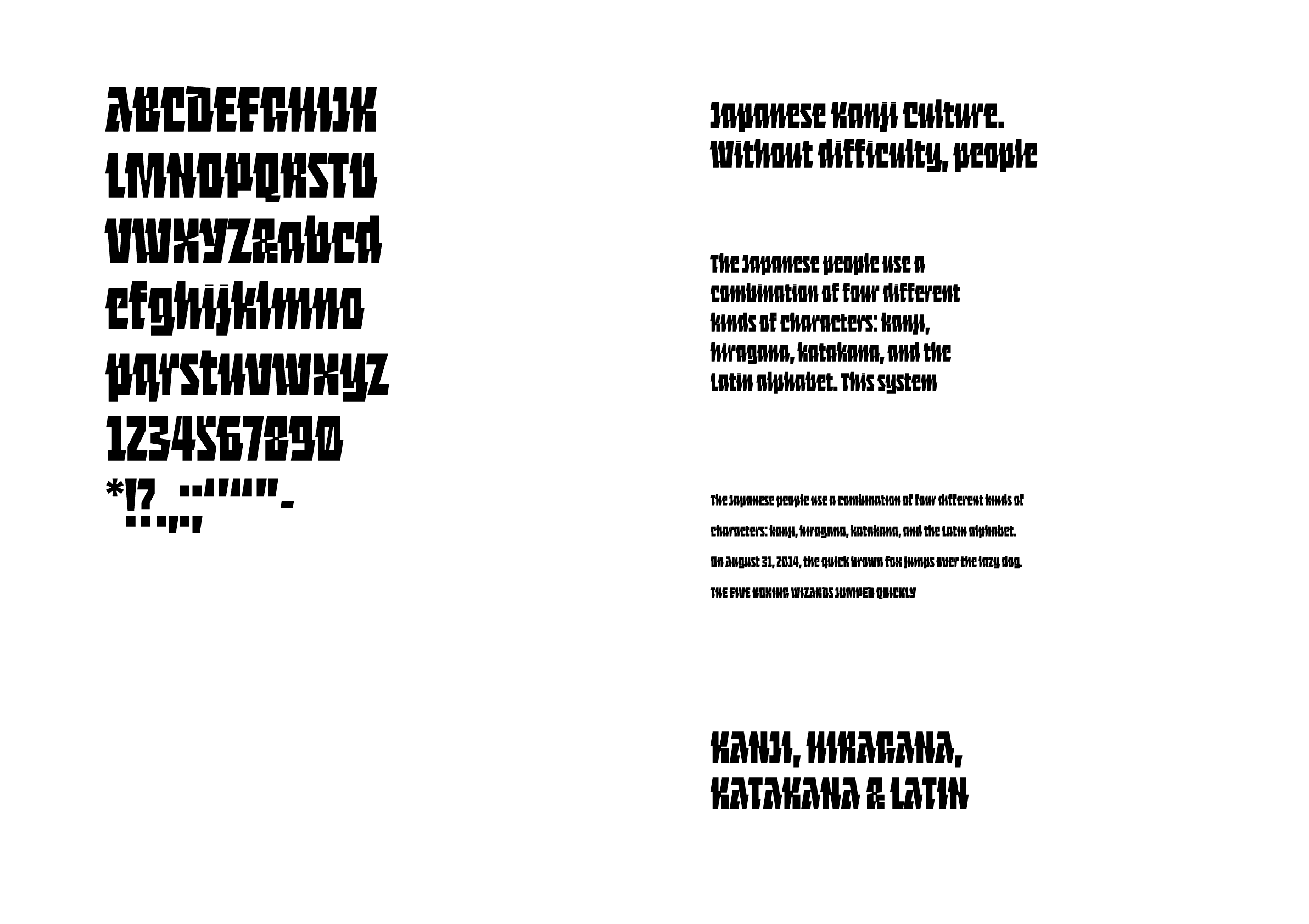
Vol. (short for volume) is a display typeface that combines the structural integrity of a concrete exterior and the inherent electricity of a fluid interior. Letters are drawn using a consistent slant angle that creates two connecting points on both sides of the letters. This allows the seemingly brutalist shapes to maintain a sense of speed and direction that is unique to script letterforms.
Winner’s Comment
Vol. was the first project where I tried to sketch without a typographic reference in mind. This process was very natural and freeing for me at the time, and the result reflected that. The recognition from Morisawa further convinces me to continue exploring more diverse methods of type design, and always trust the trust instead chasing any preconceived ideas. More immediately, I plan on making Vol. fully variable, expanding the character sets, and finding a good range for the italic and reverse-italic cuts.