
Morisawa’s Fifth Special Seminar “Global Type Designs” was held at UDX Theater in Akihabara, Tokyo on Thursday, May 11, 2017.
Bringing major font makers from Japan, Taiwan, China, Korea, and the US under the common theme of “Global Type Design,” the seminar took place on the same day and at the same venue as the Type Design Competition 2016 award ceremony. The presentation lasted for about two hours centering on the latest information about fonts and technological development regarding Japanese, Simplified Chinese, Traditional Chinese, Korean, and European languages.
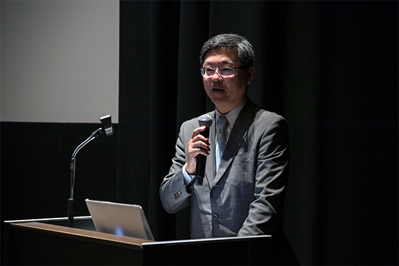
The first session was on Japanese fonts. The presenter, Akihiko Morisawa, CEO and President of Morisawa Inc., positioned Japanese as “a unique language that uses Latin characters and Arabic numbers in addition to kanji, hiragana, and katakana.” He explained that in order to conform to Adobe-Japan1-6, a Japanese font must contain 23,058 characters (glyphs). Morisawa showed that many of the basic Mincho and Gothic types in the Morisawa font series conform to Adobe-Japan1-6, and described how the enormous number of characters are made as he went through the work flow of the font production process.
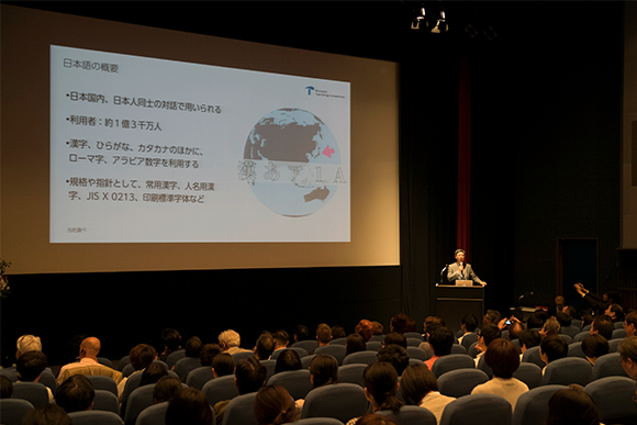
“There are four distinct parts to font production: basic design, expansion, inspection, and digitalization. First a designer draws the main 500 or so characters based on the design concept. These 500 characters contain various elements and parts that compose the different characters. This is the basic design. Next, based on the basic design, the font is expanded to 23,058 characters if it is to be a Adobe-Japan1-6 conforming font. The font production doesn’t end when all the characters are drawn. The important part comes next.”
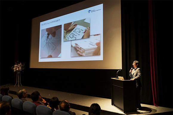
Characters go through typesetting tests using tens of thousands of patterns, as well as checks for and inspections of their density. During the testing and inspection process, minute adjustments are made again and again to improve the quality of the design. Morisawa illustrated what happens behind the scenes in font production using photos of hand-drawn sketches and bundles of print test produced during the check and inspection process.
Next, Morisawa talked about past Akashi Award-winning fonts released by Morisawa fonts and touched upon their work pertaining to multi-lingual fonts.
He then began a discussion about type design by artificial intelligence. “We are now undertaking basic research on applying AI to type design. We are considering using AI to optimize the ‘expansion’ phase, the most laborious phase of font production.”
To close the presentation, Morisawa showed sketches of a Gothic typeface that was created by AI, based on a Mincho type, thus giving us a glimpse of what the future holds for font production.
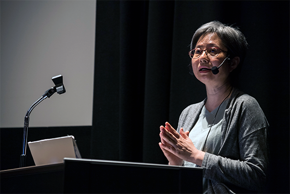
Next up was the Chairman of the Board of Arphic Technology Co., Ltd. of Taiwan (Arphic hereafter), Grace Yang, who gave a presentation on Traditional Chinese fonts.
Yang began by explaining the areas and the population where Chinese language is used. Chinese is spoken by approximately 1.45 billion people worldwide, and as it is with Japanese, Chinese writing uses not only kanjis and symbols, but also Latin characters and Arabic numerals. The standard for characters used for government registries and names of people and places (CNS11643) contains a whopping total of 108,007 characters. A video presentation showed the workflow of font production using Arphic’s proprietary tool that adds efficiency to the creation of the enormous number of characters.
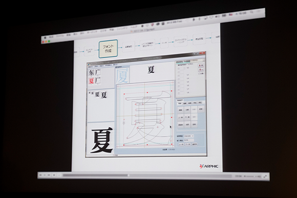
Using Arphic’s Mincho-type Traditional Chinese Font AR ShuYuanSong [書苑宋体] Heavy as an example, the process begins by modularizing the basic strokes and deploying them on other characters. Yang showed the workflow for producing AR ShuYuanSong “Medium” from “Heavy” by varying the weight of the horizontal strokes. The video continued to show the process of interpolating “Heavy” and “Medium” weights to create three additional weights: Demibold, Bold, and Extra Bold.
Next, Yang talked about UD Jingxi [晶熙] Gothic, a typeface created as a response to the needs of globalization. Containing 360,000 characters and able to handle 70 languages, this typeface is used for two different types of output: print and screen display. Yang added that the typeface is used on the Canterbury Earthquake National Memorial, and by companies with a global presence such as Cathay Pacific Airways, HP, and Intel.
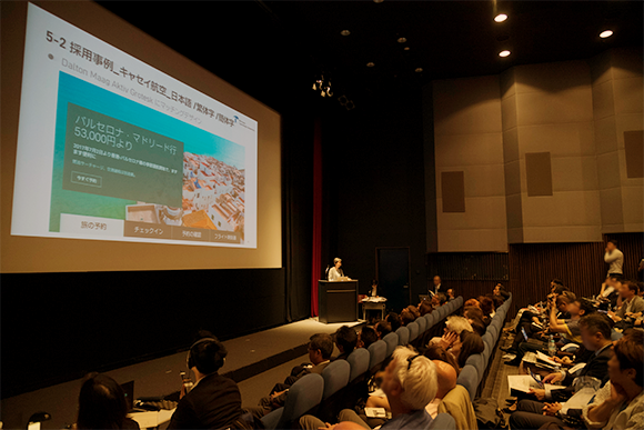
Lastly, Arphic’s variable font was discussed, using AR ShuYuanSong as an examle. A video showed characters as their weights changed, while Yang discussed how 3D-esque font variations were generated by interpolating from two fonts, changing the three main variables: the weight (the vertical strokes’ line weight), the line weight of horizontal strokes, and the visual size (for print and for display). Yang ended the session by explaining that because the line weight of the horizontal strokes can be adjusted, the fonts can be used on displays with a variety of resolutions.
