Judges
Japanese category
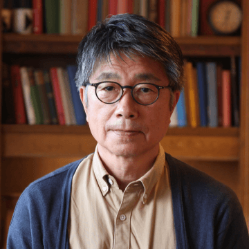
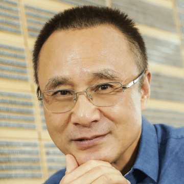
Osamu Torinoumi
Ryoko Nishizuka
Issay Kitagawa
Latin category
Laura Meseguer

Ilya Ruderman

Indra Kupferschmid
Simplified Chinese category
Zhu Zhiwei

Chen Rong
Liu Xiaoxiang
Traditional Chinese category

Masaaki Hiromura

Julius Hui

Wan Chun Ho
Hangeul category
Wujin Sim

Sulki Choi

Bon Min
Emeritus Judges
Cyrus Highsmith
Matthew Carter
Japanese category
Osamu Torinoumi
Typeface Designer
In recent years, I believe that the control by PCs has broadened the field of typeface design. Amid this, I have focused on creating typefaces for reading, that is, body text typefaces, so it’s natural for me to expect a high level of completion in these typefaces. However, I can’t help but feel that the use of PCs tends to result in harder lines and a colder character appearance. As a result, I find myself longing for rich typefaces comprised of beautiful curves and a warm atmosphere based on handwriting, and even more, I would like to see typefaces that are fun and exciting to create, brimming with the creator’s energy. I encourage you to bravely take on such challenges.
Profile
Born in 1955 in Yamagata Prefecture, he is a type designer at JIYUKOBO Ltd. He has been involved in the development of over 100 typefaces, focusing on basic styles such as the Yu Mincho and Yu Gothic series for his company, and the Hiragino series for SCREEN Holdings Co., Ltd., and Koburina Gothic. As JIYUKOBO, he won the first Sato Keinosuke Award in 2002, the Good Design Award in 2005 for the Hiragino series, and the Tokyo TDC Type Design Award in 2008. In 2022, he held a solo exhibition “Osamu Torinoumi Making Type: Like Water, Live Air” at the ddd gallery. His book “Moji wo Tsukuru Shigoto (The Work of Making Characters)” published by Shobunsha won the Japan Essayist Club Award, and he has also co-authored “Hon wo Tsukuru” (Making Books) published by Kawade Shobo Shinsha and “Minchotai no Kyoshitsu” (The Classroom of Mincho Typeface) published by Book&Design. He is the head of the private school “Matsumoto Moji Juku”.
Japanese category
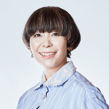
Ryoko Nishizuka
Principal Designer of Adobe
Japanese is a language with about a 2% usage rate worldwide, yet it ranks 13th in terms of the number of speakers, which is not a low ranking at all. It may seem like there are already more than enough fonts available each year. If you think so, you’re narrowing your perspective! As long as the Japanese language exists, there is infinite potential for fonts to embellish it. I still have many ideas queued up in my mind, waiting to be brought to life. Fundamentally, fonts are materials used by users other than oneself in design. Whether you prioritize readability or impact, consider where it can be most effective and design with the intention of conveying that. I’m looking forward to seeing many entries.
Profile
Born in 1972 in Fukushima Prefecture, a Principal Designer at Adobe. After graduating from Musashino Art University’s Department of Visual Communication Design in 1995, joined Adobe in 1997. Under the guidance of Masahiko Kozuka, she was involved in the development of “Kozuka Mincho” and “Kozuka Gothic,” and later created numerous typefaces. These include “Kazuraki,” “Source Han Sans / Noto Sans CJK,” “Source Han Serif / Noto Serif CJK,” “Ten Mincho, Ten Mincho Text,” “Higumin,” and “”Ten Mincho Antique.”
Japanese category
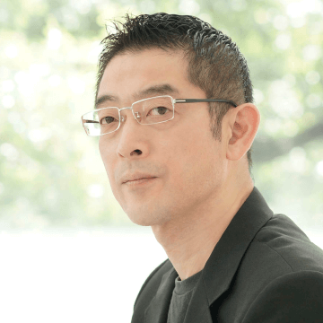
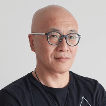
Issay Kitagawa
CEO of GRAPH / Designer / Artist
I make my living by devising symbols for corporations and brands. I believe that creating good symbols is essentially about creating good negative space. In typeface design, the skill of a designer is shown in how they create the negative space surrounding (and intertwined with) the typeface. I see that typefaces (symbols) gain flavor and emotional nuance when this interaction of space is masterfully handled. I am eagerly looking forward to seeing the masterpieces submitted to the Morisawa Type Design Competition and the exquisite interplay of negative space within them. I am excited to rigorously judge the entries on the day of the competition.
Profile
President of GRAPH. Born in 1965 in Kasai City, Hyogo Prefecture. Graduated from Tsukuba University in 1987. Member of AGI (Alliance Graphique Internationale). Served as a judge for NY ADC and D&AD Awards. Recipient of numerous awards, including TDC Awards and JAGDA New Designer Award. Gained support from clients ranging from local small and medium enterprises to famous international luxury brands through the pursuit of technology aimed at creating “printed materials that can’t be thrown away” and proposing “the role of design as a management resource” from both the perspectives of business leaders and designers. In winter 2016, the “Henn na Hotel” (Odd Hotel), for which he was responsible for naming and branding, was recognized by the Guinness World Records as the “First hotel to employ robots as staff.” Has appeared on TV Tokyo’s “Cambria Palace” (Ryu’s Talking Live), NHK’s “Business Shin-Densetsu Luzon no Tsubo” (Business Legends: The Jar of Luzon,” and many others. (Photo: Tateo Shinnosuke)
Latin category
Laura Meseguer
Type and Brand Designer
Hey Latin Type Designers! 😉
Have you designed a great typeface recently? At the Morisawa Morisawa Type Design Competition 2024 we want to see it. Send your special fonts to Morisawa Awards and let them sparkle, we are looking for the best ones.
No need to be shy! Your typeface could be the next big thing, earning recognition that everyone will associate with your talent. Morisawa is all about quality and rigor, appreciating fonts crafted with care and precision. So, dust off those typefaces, give them a final polish, and send them to the competition.
Winning here means your typeface doesn’t just stand out – it’s got serious relevance. Ready to participate?
Go for it 🙂
Profile
Based in Barcelona, A type and brand designer who has created custom lettering and type design for brands, cultural institutions, and publishers for over 20 years. Her work is characterized by craftsmanship and collaboration, infusing traditional techniques with an experimental twist. Rigor and joy are my guiding principles. For more than 15 years, she has taught and produced several accomplished professionals. Since 2019, she has served as the academic director of Tipo-g, connecting Barcelona’s type design scene with future professionals. Her typefaces are available through my own type foundry, Type-Ø-Tones. I have received numerous awards, including the New York TDC Excellence Award, the ADG-FAD Laus Prize, and, in 2018, the Premio Gràffica for pioneering work in the Spanish typography field. (Photo: Maria Mira)
Latin category
Ilya Ruderman
Type and Graphic Designer
Dear future participant,
You may already be aware of the prestigious Morisawa Type Design Competition, a beacon for typographic excellence. Since its inception in 1984, this competition has been at the forefront of shaping the global landscape of multilingual typography. With a rich history rooted in fostering innovation and pushing creative boundaries, the Morisawa Competition has become a benchmark for international excellence in type design.
As we open the doors for submissions once again, I encourage you to consider being part of this illustrious tradition. Your unique perspective and artistic vision could be the next chapter in the captivating story of the Morisawa Competition.
Don’t miss this opportunity to showcase your talent on a global stage and join a community of trailblazing typographers who have left an indelible mark on the world of design.
I look forward to witnessing the brilliance you undoubtedly bring to the table.
Profile
Born in 1979 in Moscow. A type and graphic designer based in Barcelona. After graduating from the Moscow State University of Printing Arts in 2002, he studied under Alexander Tarbeev and earned a Master’s degree in type design from the Royal Academy of Art in The Hague in 2005. He actively engage in educational activities, teaching at the Master Type and Media program in Barcelona and the Tipo-g workshop, among others. In 2007, he contributed to the development of the type and typography curriculum at the British Higher School of Art and Design in Moscow. In 2014, he co-founded CSTM Fonts, and in 2016, opened the Type Today font boutique store. He has received numerous awards, including the European Design Award, Granshan, Modern Cyrillic, among others, and have collaborated with several renowned font studios.
Latin category
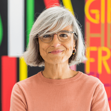
Indra Kupferschmid
Typographer / Professor
I am so glad and excited that the typeface design contest was relaunched this year, with more possibilities to enter than before. Surprise us with your inventive designs, thoughtful reimaginations and technological explorations! I’m especially looking forward to seeing entries from a diverse group of designers, identities, backgrounds, locations or education, united by an interest in letterforms and communication.
Profile
Indra Kupferschmid is a professor of typography at HBKsaar, University of Arts Saarbrücken, Germany. For many years she has been teaching type, typography and communication design at design schools in Germany and abroad. As a freelance designer, researcher, writer and consultant she has been working for various publications, magazines, type designers/foundries and companies, from very large to very small. Research fields are the younger history of type technology, sans-serif typefaces, type classification and choosing fonts, among others for the German Institute for Standardisation.
Simplified Chinese category
Zhu Zhiwei
Type Director
The charm of font design lies in its unique beauty, functional practicality, and the role it plays in enhancing the emotions and meanings conveyed by characters. This is not only the allure of fonts but also the core value of font design. With the advancement of technology and the changing times, the societal landscape, people’s mental and material lives are undergoing significant transformations, including the mediums that incorporate text. This implies that fonts too must evolve to adapt to the modern era. To imbue fonts with new beauty and functionality, font designers need to deeply understand the contemporary context and fully grasp the new needs and changes that technological development brings to fonts. Therefore, establishing the goals and directions for innovative font design requires deeper thought. I look forward to seeing more excellent works emerge in this competition.
Profile
Born in 1955 in Beijing. Graduated with a major in Calligraphy Arts from the Capital Normal University. In 1971, joined “北京外文印刷厂” (the Beijing Foreign Languages Printing Factory) as a type carving staff member. In 1991, joined FounderType, appointed as the Font Design Director, with notable works including “粗宋,” “北魏楷书,” “铁筋隶书,” “博雅宋,” “雅宋家族,” “风雅宋,” “韵动黑家族,” among others. In 1996 and 1999, won the Morisawa Award at the Morisawa Award International Typeface Design Competition. Has been serving as a visiting professor at the School of Design, Beijing Institute of Fashion Technology from 2015 to the present. From 2016 to 2023, served as a Font Art Consultant for Hanyi, and from 2017 to 2020, worked as an external lecturer at the Tsinghua University Shenzhen International Graduate School.
Simplified Chinese category
Chen Rong
Associate Professor / Art Director
During my time at the Graduate School of Musashino Art University, my mentor, Professor Mitsuo Katsui, was a judge for the Morisawa Award International Typeface Design Competition, and an Art Director for Morisawa’s magazine “Tategumi Yokogumi” which was an invaluable resource for my typography research. China and Japan, both being countries that use Kanji, have a long history of cultural exchange in Kanji type design. I am very pleased that Morisawa is introducing a new Simplified Chinese category this year, and I am honored to have been invited as a judge. I look forward to receiving your submissions. I hope this competition will be a feast of cultural exchange in Simplified Chinese type design, and I am excited to encounter outstanding works.
Profile
Associate Professor at Shanghai Institute of Visual Arts, co-founder and Art Director of Interdesign. Born in Shanghai in 1974 and graduated from Shanghai Academy of Fine Arts in 1996. Completed his master’s degree at Musashino Art University in 2002, receiving the Graduation Design Award. He has been engaged in a wide range of design research and educational activities centered on typography for many years. His works have been selected for Tokyo TDC, the Japan Typography Annual, China Design Exhibition, Shenzhen GDC, and are permanently collected by the National Hangeul Museum of Korea and Shenzhen Guanshanyue Art Museum. He developed the “Hanyi XinRenWenSong” typeface, winning the Bronze Award at the China Star Design Award. He authored “発見与解決:社会創新設計” (Discovery and Solution: Social Innovation Design) and supervised the Chinese editions of “欧文書体” (Latin Typeface,) “欧文書体 2” (Latin Typeface 2) “欧文組版” (Latin Typesetting), and translated “Mojibu” (Font Club Activities) and “Designing for Essential Values” into Chinese. He is a judge for the Hanyi’s typeface design competition Font Star.
Simplified Chinese category
Liu Xiaoxiang
Art Director of XXL Studio
Fonts and typesetting are the foundation of graphic design. As a judge for this competition, I am looking forward to the entries. I eagerly await the emergence of font designs that will impact the future and hope all participants achieve great success. I sincerely wish for the success of this event.
Profile
Born in China in 1963.
Member of the Alliance Graphique Internationale (AGI)
Art Director of XXL Studio
Works
“From a character to a book: Chinese Typography” 2017
”11×16 XXL Studio” 2018
“Chinese Typography Grid Systems & Composition” 2023
Traditional Chinese category
Masaaki Hiromura
Graphic Designer
Traditional Chinese characters are beautiful! Despite their complexity and numerous strokes, they strongly convey the original meanings of the characters. I would like to see new typefaces that maintain a unique balance inherent to their complexity, as well as typefaces that highlight the deep historical meanings and visual intrigue of the characters. I look forward to seeing a broader expression of Traditional Chinese characters, one of the sources of Asian culture.
Profile
After working at the Ikko Tanaka Design Studio, he has handled numerous projects mainly in graphic design, including CI plans, VI plans, and sign designs for museums, commercial and educational facilities. Key projects include the National Museum of Emerging Science and Innovation (Miraikan) in Japan, Beijing Jianwai SOHO, Sumida Aquarium, 9h Nine Hours, Tianjin Library, National Taichung Theater in Taiwan, Washi Rakukatsu, Ishikawa Prefectural Library, World Design Conference Tokyo 2023, and development of the Tokyo 2020 Sports Pictograms. Major awards include the Mainichi Design Award, KU/KAN Award, SDA Grand Prize, and the Good Design Gold Award, among others. Key publications include “JI BORN” (ADP) and “From Design to Design” (ADP). He serves as a visiting professor at Tama Art University and Nagoya University of Arts and Crafts, and is a member of AGI.
Traditional Chinese category
Julius Hui
Typeface Designer
For over the past decade, Chinese font design has once again garnered interest from around the world, leading to the release of new typefaces thanks to substantial support and high expectations. Morisawa is a leading font company with global influence, and the scale and expertise of the MOTC (Morisawa Type Design Competition) had already earned its fame since my teachers’ younger days. The addition of the Traditional Chinese character category reflects Morisawa and everyone’s proactive efforts to advance the font industry and provide all font designers with opportunities for self-challenge. I am extremely honored to participate as a judge and look forward to, through MOTC, seeing everyone embrace and transform the legacy of Chinese fonts in the face of the world’s technological and lifestyle revolutions. I am eager to share contemporary pioneering works and am looking forward to seeing your creations!
Profile
Chinese Typeface Designer. Born in 1984 in Hong Kong. Graduated from the Visual Communication Design Program at Hong Kong Polytechnic University. Founder and Font Director at Kowloon Type. After graduating from university, worked for three years as an apprentice in Chinese font production before joining the British company Dalton Maag. Later, served as a Senior Font Designer at Monotype in Hong Kong, working on custom Chinese fonts and font libraries for corporate clients, including Hewlett-Packard, Intel, Nike, New York Times, and Bloomberg Businessweek. Returned to Hong Kong from KMS Team in Munich in 2020 to establish Kowloon Type. The first project, “Ku Mincho,” was a crowdfunding success, raising over $700,000. Recipient of numerous awards, including the Hong Kong Design Centre DFA HKYDT, American Communication Arts Awards, Taiwan Golden Pin Design Award, and Tokyo TDC. (Photo: Rico Okaniwa)
Traditional Chinese category
Wan Chun Ho
Graphic Designer
The Morisawa Typeface Design Competition holds significant importance in the font industry. This year, three categories have been added: Traditional Chinese, Simplified Chinese, and Hangul. I look forward to designs that blend functionality with beauty and encourage font designers to actively participate. By focusing on font development for a better design environment and resources, we hope to increase attention on Kanji.
Profile
A co-founder and art director of HOUTH. HOUTH is a creative studio based in Taipei focusing on brand strategy and design. We communicate with the world through the works completed for clients, from strategy, art direction, visual design to production.
Hangeul category
Wujin Sim
Typographer / Type Director / Writer
When you stare at the letters, you realize that a lot of ingenuity has been put into each short stroke. It is beautiful. However, we live in an age when there is a lot to read. There are letters everywhere. At times, I worry that the detail of the letters will be buried by the breakneck speed, or that people who are tired of reading will become bored with the letters. On the one hand, I think that there is no need to create letters so carefully, but on the other hand, when I touch a well-crafted font, I immediately feel the difference. I am convinced once again. “In an age of so much to read, we need well-crafted fonts!” I create letters in this way, repeating doubt and conviction. What was the process of detailing for all of you? I look forward to seeing them. I have created letters in this way, repeating the process of doubt and conviction. What process did your detailing go through? I look forward to seeing them.
Profile
A typographer, type director, and writer who creates, questions, tests, and talks about letters. Currently president of mulgogi(design studio), president of the Korean Society of Typography(KST), and adjunct professor at the Department of Design, Hongik University. (i) Writing ⸺“The Third Lumbar Vertebra of Characters—Low-Temperature Aged Essays on Typography”, “Easy-to-Find InDesign Dictionary,” “Looking for a Text Typography Reference Book”; (translation) “Hiromu Hara and Modern Typography—Photography and Printing in Japan in the 1930s” (ii) Type direction⸺Since 2017, general manager of Sandoll Jeongche, Sandoll GretaSans, Sandoll Chilseong Shipyard, BM EULJIRO, IBM Plex® Sans JP, and Sandoll Lava.
Hangeul category
Sulki Choi
Graphic Designer
This year, the Morisawa Type Design Competition introduced a new Hangeul category. My role, I believe, is to introduce Hangeul as a new guest and promote harmony with other languages. If Hangul is the new guest, then I am a guest in the world of type design, because I am not a creator of type but a user. In type design, the impact of a striking slogan, an immutable truth, or the name of an idol group is as important as the structure and system of the characters. Imagining these impacts is also part of my role. Recently in Korea, young independent creators are constantly releasing new Hangeul fonts. I hope that such Hangeul type creators will take an interest in this competition and participate.
Profile
A graphic designer based in Seoul, Korea. Together with her partner Choi Sung Min, she has worked on various projects for clients from Korea and abroad. They have exhibited their work internationally, and held solo exhibitions at Perigee Gallery, Seoul (2017); Whistle, Seoul (2020); AVP Lab, Seoul (2021); and Chulalongkorn University, Bangkok (2023). Their work is included in the permanent collection of MMCA, Gwacheon; M+, Hong Kong; Cooper Hewitt, Smithsonian Design Museum, New York; Musée des Arts Décoratifs, Paris; and Victoria & Albert Museum, London. The first mid-career survey of their work was held in 2021 at the Kyoto ddd Gallery, Japan, and the second one is scheduled to open at Transtage, Hangzhou, in 2024. She is an associate professor at the Kaywon University of Art and Design.
Hangeul category
Bon Min
Type Designer / Professor
I believe that the Morisawa Type Design Competition has played a significant role as a true hub for cultural exchange in typography, encompassing not only Eastern and Western cultures but also the transition from analog to digital media. I am already looking forward to the convergence and creativity that will occur through this competition and its influence. I warmly welcome participants from diverse cultural backgrounds in advance.
Profile
Born in 1981. A professor of visual design at Hongik University in Seoul. Earned a Master’s in Typeface Design from the University of Reading, UK, a Master’s in Typography from the University of Barcelona, Spain, and a Bachelor’s in Visual Design from Seoul National University, South Korea. Throughout visits to Spain, the UK, the USA, China, Korea, and more, he has been exposed to various writing cultures, forming the foundation of my research and work. For six years starting in 2013, he worked as a designer with the font and design teams at Apple’s headquarters in the USA. He was involved in the design of Latin alphabets, numbers, symbols, and icons used in Apple’s operating systems (iOS, MacOS, WatchOS). Since 2019, he has been teaching and researching at Hongik University in Seoul, serving as an advisor on custom font design and typography in UX environments, while collaborating with companies like Hyundai and Kakao through industry-academia partnerships.
Emeritus Judges
Cyrus Highsmith
Type Designer / Graphic Artist
In 1984, Morisawa held its first international type design competition. 40 years later, as Morisawa celebrates the 100th anniversary of the invention of their phototypesetting machine, the competition is still going strong. Typesetting technology and the methods for producing fonts have undergone many changes during this time. Naturally, the competition has changed too. In addition to the traditional categories for Latin and Japanese, there are new categories for Hangul, Traditional Chinese, and Simplified Chinese. It’s a modest acknowledgement of the increasingly international nature of type design and typography. I hope it can include even more writing systems in the future. The new jury reflects this expansion with members from Germany, Spain, Russia, Korea, Taiwan, China, Hong Kong and of course, Japan. They are notable type designers, experienced graphic designers, as well as dedicated educators, with sharp eyes and strong opinions about typography. For this group, the task of finding the best typefaces among all the numerous entries is not taken lightly. Winners receive more than just prestige. The gold prize is worth ¥1,000,000 JPY. There are no entry fees. All the intellectual property rights to any entries remain with the entrants. Submissions arrive in Osaka from the Americas, Europe, Africa, Oceania, and Asia. Everyone is welcome. Technology keeps evolving but creating a high quality typeface still takes time and commitment. The human needs for communication and connection are stronger than ever. The Morisawa Type Design Competition is here to support the hard work type designers are doing all of the world.
Profile
Type designer, teacher, author, and graphic artist. Operates his own type foundry, Occupant Fonts, which features numerous original typefaces. Teaches typography at the Rhode Island School of Design (RISD). Authored and illustrated the highly acclaimed primer, “Inside Paragraphs: Typographic Fundamentals.” In 2015, was awarded the Gerrit Noordzij Prize in recognition of his significant contributions to type design, typography, and type education. In 2017, became the Creative Director for Latin typeface development at Morisawa USA.
Emeritus Judges
Matthew Carter
Type Designer
The Morisawa Type Design Competition has a long history of rewarding the best in contemporary Latin type design. The prestige of the competition attracts entries from all over the world and from designers of a wide range of experience, from novices to established professionals, all of whom compete on equal terms. The selection of jurors ensures the critical evaluation of type designs at the highest professional level. As a long-serving juror (now retired to an Emeritus position) I always found the process of working with the other jurors to distill a large field of entries down to a small group of winners to be endlessly fascinating. Each competition turns out to be different in its combination of text types, display types, scripts, serifs, sanserifs — and every other variation of which the Latin alphabet is capable. The discussions among the jurors over two days are always amicable and become more intense as the final decisions are made. In my experience the choice of the eventual winners has always been unanimous. One thing that has changed over the 40 years of the Morisawa Competition is the number of entries from students. The increase is no doubt a reflection of the fact that type design is now taught at several schools, with good results to judge by the success of student entries in recent competitions. I hope this trend of rewarding emerging talents will continue to flourish.
Profile
Type designer with 60 years of experience in typography technology, from punchcutting to computer fonts. After a long collaboration with Linotype, became a co-founder of Bitstream Inc. in 1981. Currently a principal partner at Carter & Cone Type Inc. Notable type designs include Verdana, Georgia, Bell Centennial, Tahoma, Miller, and Helvetica Compressed. A Royal Designer for Industry in Britain and a Senior Critic at Yale University’s Graphic Design program. Recipient of the MacArthur Fellowship, the Smithsonian National Design Awards Lifetime Achievement Award, among many others.