On August 28, 2018, the Morisawa’s sixth Typeface Design Competition Special Seminar was taken its place at Tokyo International Forum. It was the pre-event for the upcoming entry call of the competition. The presentations started by the type designer Cyrus Highsmith who is also the jury of the competition for Latin font category. The second session was the discussion between the type designer Osamu Torinoumi who is also the jury of the competition for Japanese font category and the previous award winners. The last presentation was by the art director Kaoru Kasai who spoke about letters from the user’s point of view.
Click to see the report of session1.
“When Letters Become A Font”
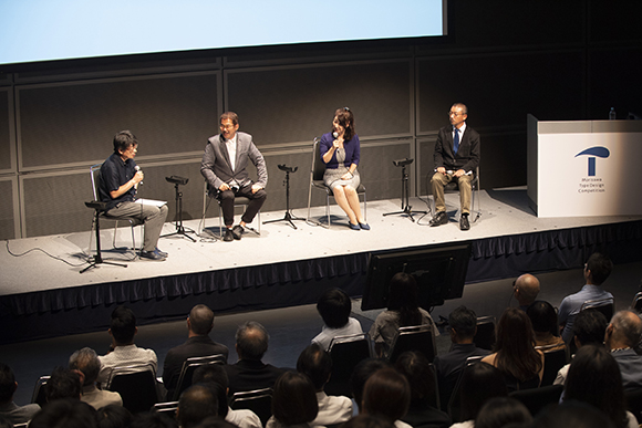
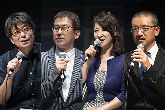
The next session was a discussion between Osamu Torinoumi, the chairman of the discussion and the past competition winners. The award-winning fonts “Kinrei Gyosho” by Hirofumi Iguchi & Birei Kitahara (2014 Akashi award winners in Kanji category) and ”Rocio” by Koichi Namimoto (2014 Akashi award winner in Latin category) are both released by Morisawa in 2016.
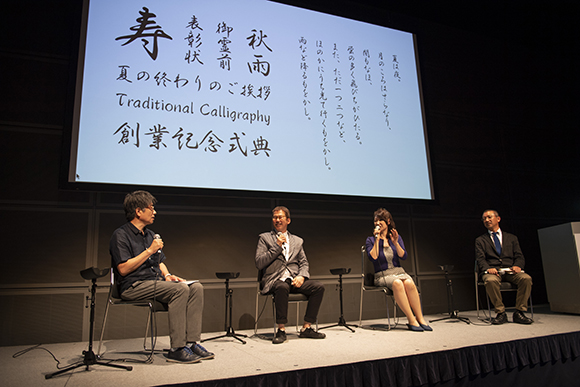
“Kinrei Gyosho” is a calligraphic typeface based on the calligraphy by the professional calligrapher Birei Kitahara. Then the graphic designer Hirofumi Iguchi carefully digitised the outlines of the original entry work “Kitahara Gyosho” without losing its freeness of the strokes and the beauty of the hand-written features one by one. This typeface was the result of their excellent teamwork. When they found about winning the award, they were exulted and had a party to celebrate their achievement. But when they faced the production of the fonts, there were tons of letters to produce. At the later stage, Hirofumi struggled to meet the deadlines and even regret of winning the award. However, after the release of the font, they now feel delighted to see their typeface being used in posters or magazines.
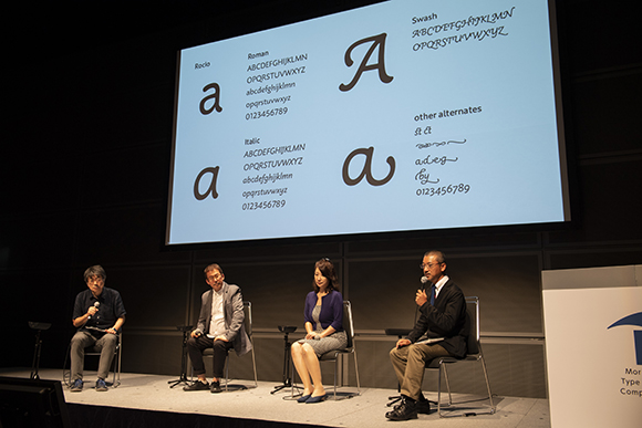
“Rocio” was originally designed to be used with Koichi Namimoto’s other winning typeface “Wakatsuki Maru Gothic (2014 Morisawa Award Gold Prize)”. This typeface has calligraphic roundness at the terminals which creates softness and cuteness. The name Rocio means dew in Spanish. As Osamu Torikai asked Koichi why he started to design typefaces, he shared the memory with his father― “My father was a designer, and he typed my name in phototypesetting. I was thrilled by the experience”.
When Osamu asked a question “What was the challenge for designing Latin type as a Japanese?”, Koichi replied that “Of course it was not easy, but the end of the day, it is all about making “Letters” no matter if that is Japanese or Latin. So I thought I am Japanese but why not?” He also suggested that he think competition is the chance for you to challenge and if you are trying to enter the competition, you should try freely and not limit yourself.
〈Text:Chiyo Date (TART DESIGN OFFICE) Photo: Mitsuru Hirota〉