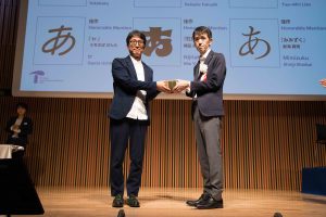
The jury Hiromura Masaaki (left) and the winner Yoshihide Okazawa (right) received a trophy for the gold prize in the Kanji category.
Type Design Competition 2019 sponsored by Morisawa Inc is the award that is specifically for type design. This time, the total numbers of 813 entry works of both Kanji and Latin category broke the record since the start of the competition. The award ceremony was held at Kanda Myojin hall (Tokyo, Ochanomizu) on September 3. The winners of Morisawa awards (gold, silver, bronze, and honorable mention award), were selected by the juries from Japan and overseas, as well as the winners of the fan voting on the website. This is the report on the award ceremony and the special lecture by the type design director Masahiko Kozuka.
The Type Design Competition 2019 was held to seek superior design from Japan and overseas. The 13 winners out of 15 award winners, including those who have won two awards were attended to the ceremony on September 3 at Kanda Myojin Hall.
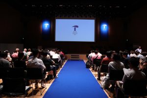
The venue of the Type Design Competition 2019 Award Ceremony
The gold prize for Morisawa Award was “Hogetsu Kaisho,” designed by type design studio Yoko Kaku. The jury Hiromura Masaaki, who is also a graphic designer, handed the trophy to the representative of Yoko Kaku, Yoshihide Okazawa. Okazawa expressed his gratitude to the jury and commented—”I want to keep designing typefaces with encouraged by this great opportunity.”
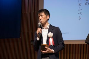
Yoshihide Okazawa, the representative of the design studio Yoko Kaku holding the gold prize trophy for the Morisawa award.
The silver prize was “Nibu Shibu” by Daisuke Hukushi. This was his second entry in the competition. He commented—”receiving the award is a huge encouragement, and I want to keep my passion on the multi-script type design.” The bronze prize was “Ribaasu” by Tien-Min Liao from Taiwan. Tien commented—”I hope this opportunity brings more attention to type design to the graphic designers around me.” The honorable mentioned prize winners were “tr” by Ganta Uchikiba , “Nijitako Tengoku” by Mie Yokota, and “Mimizuku” by Shinji Shinkai.
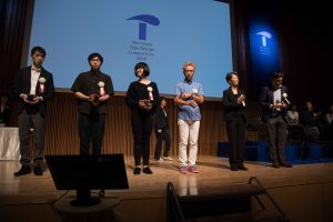
The winners for Morisawa awards in Kanji category
The gold prize for the Morisawa award in Latin category was “Areon” designed by multi-script type designer Noheul Lee from South Korea. Holding a trophy in her hand, she expressed her gratitude—”It is my pleasure to receive this wonderful award with the other such talented designers.”
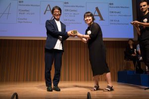
Masaaki Hiromura (left) and Noheul Lee, the winner of the gold prize of Morisawa award in Latin category holding the trophy.
The silver prize was “Kolektiv” by Ondřej Báchor from the Czech Republic, who now based in Lausanne, Switzerland. Ondřej expressed the concept of the competition is “beautiful” as it accepts a wide range of type designs.
The bronze prize was “Easy” by Théo Guillard from France, who now based in Barcelona. Théo commented that he had always wanted to visit Japan and was honored to be invited.
The honorable mention prizes were “Courbe” by Olga Pankova (Russia), “ER Canto” by Garcia Rennó Pereira (Brazil, Portugal), and “DR Kruk” by Dmitry Rastvortsev (Ukraine).
There were also People’s Choice Awards that are selected by fan voting on the website. The 1st and the 2nd place of the works received the trophy from Akihiko Morisawa, the CEO of Morisawa Inc. The 1st place of the Kanji category was “The Big Jaw” by Fang-Ping Lin, and the second place was “Kanraku Mincho” by Furantsu Sumi. For the Latin category, the 1st place was “Courbe” by Olga Pankova, and the 2nd place was “Apogee” by Michael Aronson.
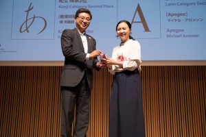
Akihiko Morisawa (left) and Fang-Ping Lin (right) holding the trophy for the 1st place of the people’s choice award in the Kanji category.
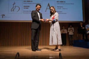
Akihiko Morisawa (left) and Olga Pankova (right) holding the trophy for the 1st place of the people’s choice award in the Latin category.
The award ceremony was closed with the general comment by Masaaki Hiromura, the chief jury of the competition. Masaaki commented that “Before starting the evaluation, I was worried that if I could not find any new and fresh typefaces in this competition as we have so many typefaces in the world. However, we received many designs, and my task to chose the winning works was not easy.” And Masaaki gratitude to all the winners “Our juries mainly evaluated where the design of the typefaces are up to date, and what kind of typefaces are picked by people in the flow of the times. It was a great opportunity for me to meet many typefaces, and I want to show my sincere gratitude to all with the hope of more new typefaces.”
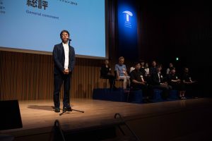
Masaaki Hiromura, the chief jury of the competition, gave general comments on the stage.
Special Lecture by Masahiko Kozuka
The award ceremony was followed by the special lecture on “Vertical typesetting vs. Horizontal typesetting and the remaining tasks of Japanese Typesetting―Hiragana” by the type design director Masahiko Kozuka who designed famous Japanese typefaces “ShinGo,” “Kozuka Mincho,” and “Kozuka Gothic.”
Masahiko began his talk with his experience of the first “ATypI working seminar” held in 1974 in Basle, Switzerland. Masahiko reminisced that the seminar gave a chance to the technical development of typeface design and its improvement. In the lecture, examples of the bezier fonts and the technology of the phototypes were raised as topics. Masahiko discussed with the Japanese attendees about how the technology can evolute for the Japanese script, which includes more than a hundred thousands of characters.
In his lecture, he looked back on the history of the types from the invention of the movable types in Gutenberg in the mid 15th century. And he introduced how the printing technology was brought to Japan by Ryuki Ingen in the 17th century. He mentioned the history of the digital fonts for the newspaper industry, and spread of Morisawa’s phototypesetting machine in the ’50s to the digital era in the ’80s.
Masahiko also talked about Hiragana typefaces “The important point for handling Hiragana is the origin of each letter.”He showed the example of the hiragana character ‘ま,’ which is designed from the Chinese character’ 末.’ He stated that, therefore, he wants designers to create Hiragana by keeping the original Chinese characters for each Hiragana.
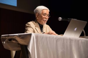
Masahiko Kozuka on the stage at the special lecture.
Masahiko said, “Types should be designed within the square and be able to set in both vertical and horizontal typesetting. However, Hiragana should be free from the constrains. As a new possibility for Hiragana typefaces, he suggested designing Hiragana without fitting in the square.
By showing some images of Hiragana in horizontal typesetting, he explained that the angles of each character are stands out in horizontal typesetting, which is less noticeable in vertical typesetting. Masahiko emphasized that “Hiragana is originally designed for vertical typesetting” and showed his design of Hiragana types for horizontal typesetting and talked about his efforts in developing fonts that can work well in both vertical and horizontal typesetting.
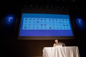
Masahiko Kozuka explaining with the example image on the screen.
Masahiko talked about his experience of working at newspaper company Mainichi Shinbun Sha and explained his failure in trying horizontal typesetting for newspapers. Then he pointed out that most of the handwriting today is written horizontally, and it became more natural for the Japanese people. He suggested that there should be Japanese fonts, specially designed for horizontal typesetting.
Lastly, Masahiko explained the possibilities of typefaces for horizontal typesetting and gave the message to the audience, “try to design Hiragana Fonts for horizontal typesetting.”
The reception after the lecture was filled with a very friendly atmosphere. Juries, winners, and many of the guests gathered and passionately discussed the future of the typefaces.
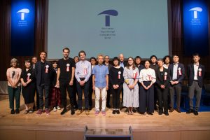
A group picture of the juries and the award winners of Type Desing Competition 2019
Coverage cooperation:BIJUTSU SHUPPAN-SHA CO.,LTD.
