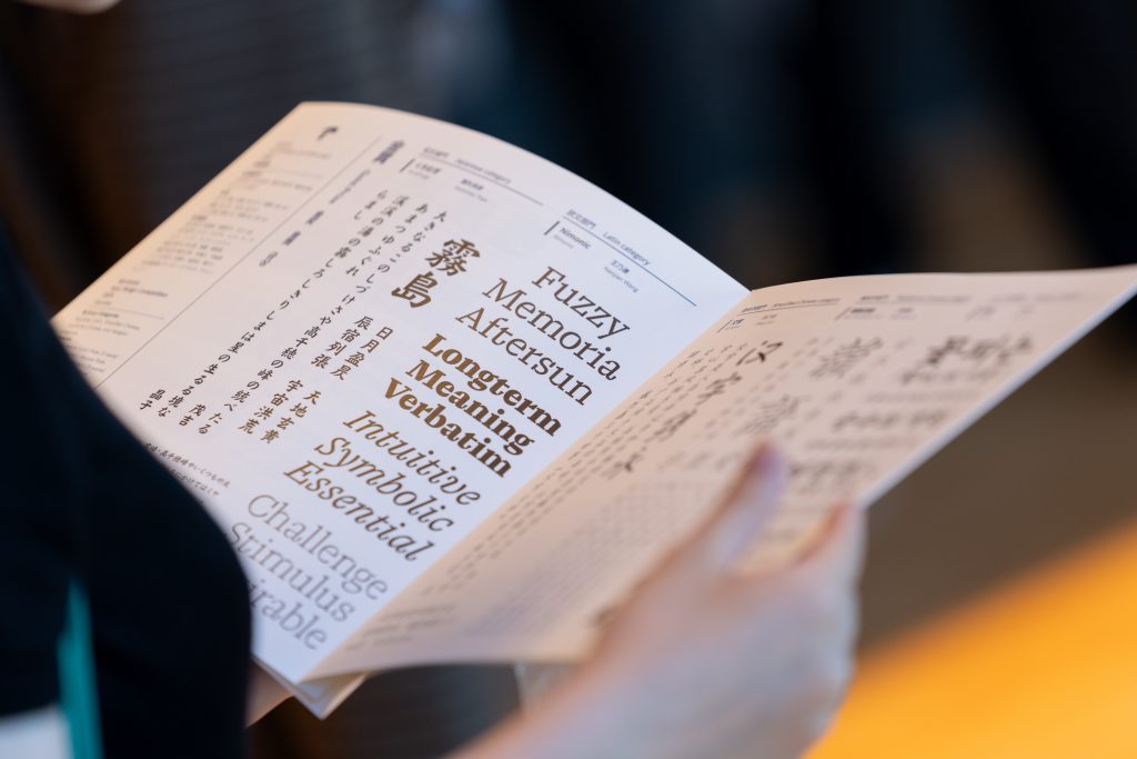
The 2024 Type Design Competition, now in its fifth edition, once again celebrated bold creativity and craftsmanship in type design. This year introduced three new categories—Simplified Chinese, Traditional Chinese, and Hangul—attracting an impressive 1,092 entries from 45 countries and regions around the world.
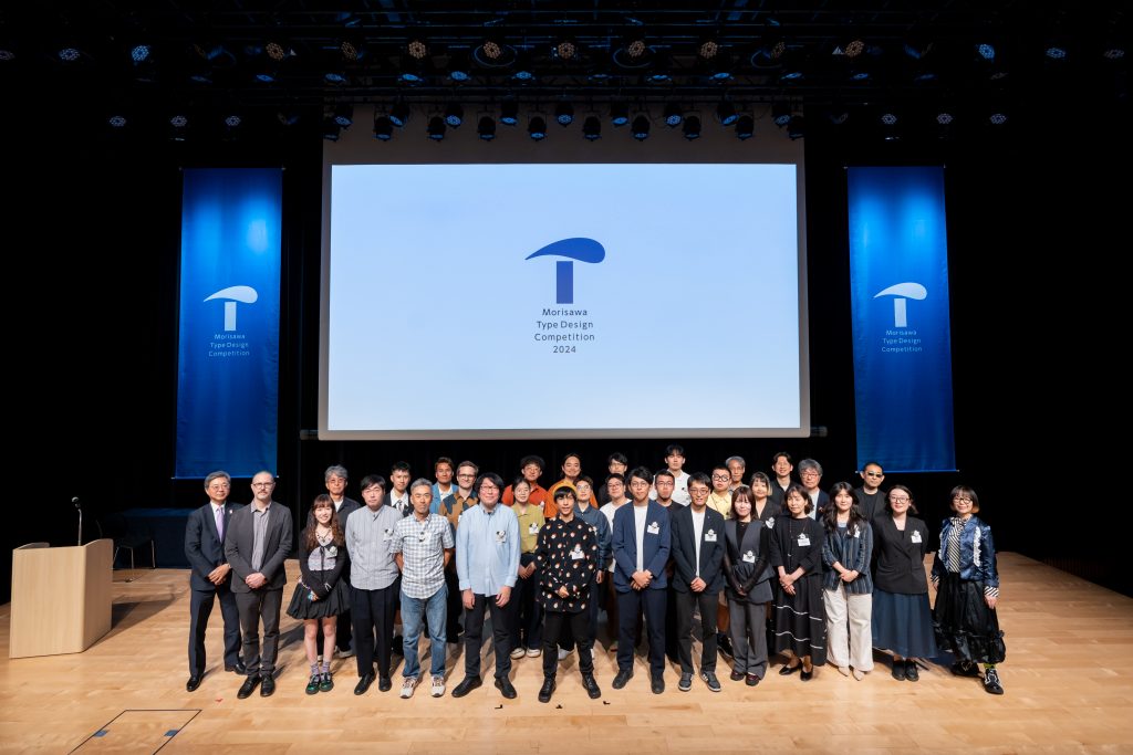
After a careful and thorough judging process, 50 works across five categories were selected for awards. The winners were honored on June 5, 2025, at the Kanda Myojin Hall in Tokyo. The event also featured a special keynote by acclaimed art director Issay Kitagawa.
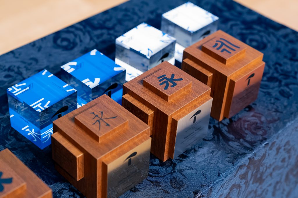
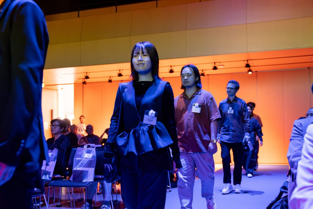
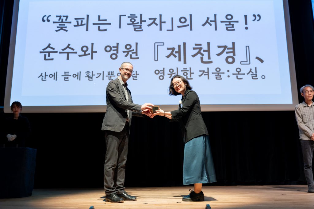
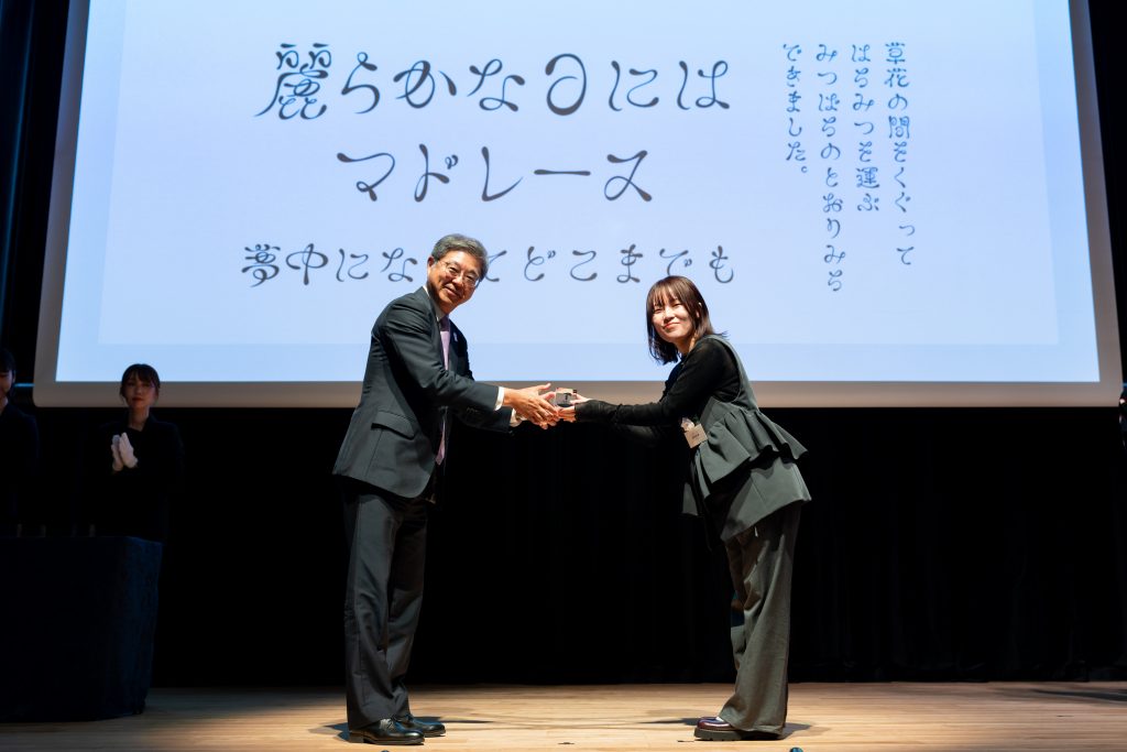
The ceremony began in a relaxed and celebratory atmosphere, with 26 of the award recipients attending in person. Trophies were presented to winners of the Morisawa Awards, which were selected by a panel of 17 judges, including international experts and special guest jurors. Winners of the Fan Favorites were also recognized.
The Gold Award went to Kuromugi by Yoshihiko Toya. After four previous attempts, Toya finally received the Gold prize. Accepting his trophy from special juror Cyrus Highsmith, he shared, “I created this typeface with the hope of unlocking new potential within the kaisho style. I want to continue approaching type with sincerity.” His words were met with warm applause.
Silver was awarded to Insho by Daisuke Fukushi, while Bronze went to kt by Ganta Uchikiba. Honorable Mentions were given to lamp cyousou by Hiraki Ajino, Norentai by Koki Hayashi, Suzutake by Oma Kobayashi, 4S by Takuya Nakazawa, and Shiratsuyu Kaisho by Jin Nagase.
For the Latin Catergory, Chinese designer Naiqian Wang swept the top awards, winning Gold for Nimonic, Silver for Vol., and an Honorable Mention for Celcius. “I’m deeply grateful for all the support that made this moment possible,” Wang said in his acceptance speech.
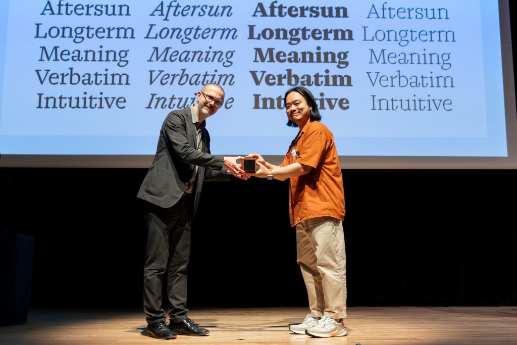
Bronze went to Loica by Chile’s José Solé. Other Honorable Mentions included Kyoot by Craig Eliason (United States of America), Path Grotesk by Tien-Min Liao (Taiwan), Lobulo by Oscar Guerrero (Colombia), Florocine by Carlos Ávila (Colombia), and Celcius by Wang.
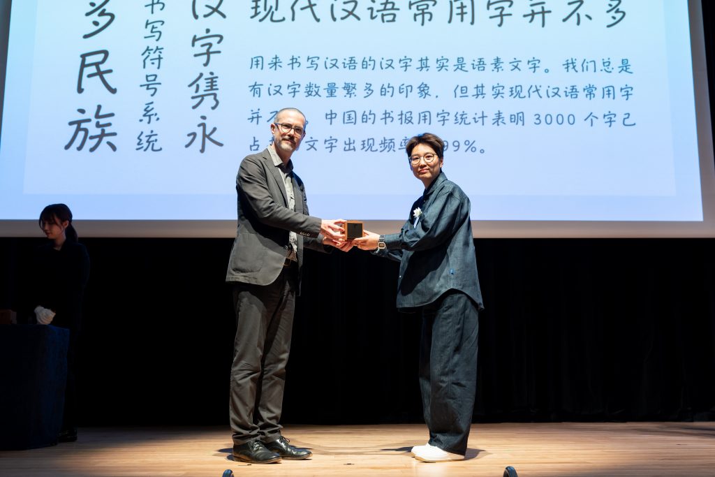
The newly introduced Simplified Chinese category saw strong entries from Chinese font designers. The Gold Prize went to WENKAI by Dingci Sun. “I hope to see the font industry continue to grow, providing better environments for designers to thrive,” he said, closing with a thank-you in Japanese.
Silver was awarded to Xin Feng VF by Yixuan Wu, and Bronze to TangMoBang by Yujian Wang. Honorable Mentions went to Duo by Zhengyou Gu, HaoBoTi by Hao Qian, YAHEI by Mengyi Luo, Yourong Type by Congyu Zhang and Yue Chen, and wenhuayanshanxinwei by WenHuaZiXing.
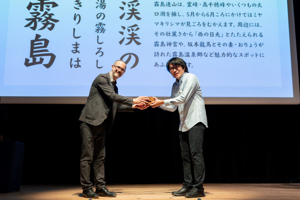
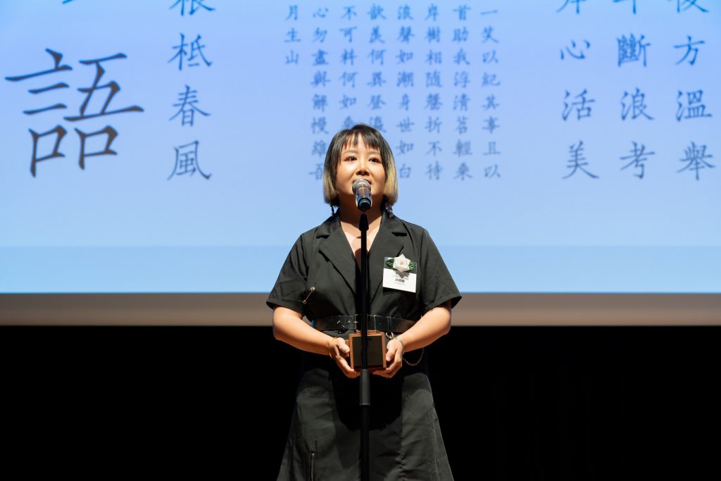
In the Traditional Chinese category, the Gold Prize went to Cao Chuang Gu Yun by Rongrong Gu from China. A longtime researcher of classical typefaces, Gu declared, “I’ll continue working to connect traditional styles with modern digital fonts.”
The Silver Prize went to Bi Tai Bak by Chingchan Kao (Taiwan), and Bronze to rounded Kinbun by Taichi Saito(Japan). Honorable Mentions were awarded to Ricebeam by Taijiang Lin (Taiwan), mi and li kai by Mubing Lang (China), SuSeng by Chìhông Tân (China), and Wei Gothic by Chinghin Chan Roy (Hong Kong).
The Hangul category featured a wide range of unique designs by Republic of Korea creators. The Gold Prize was awarded to wanwan by Yejin Wi. Gazing at the trophy in her hands, she said, “I hope to carry this joy with me as I continue toward the release of my typeface.”
The Silver Prize went to sanmun by Samyeol Ahn, who also received an Honorable Mention for Neoguri. The Bronze Prize was awarded to Space-Block by Seunghyub Lee. Other Honorable Mentions included Han-saem by Soorinn Park, Code Square by Juyeon Kim, Kyulgu Sans by Soonhyung Kwon, and Candlelight by Saebin Lee.
Trophies for the Fan Favorite winners were presented by Morisawa Inc. President Akihiko Morisawa. The top-ranked entries in each category were:
- Japanese
1st: Honeybee Path by Ami Sako(Japan)
2nd: Suzutake by Oma Kobayashi(Japan) - Latin
1st: Tachechi SemiBold by Chaochên Chou (China)
2nd: RR-Trivium by Rafael Ramirez Lozano (Mexico) - Simplified Chinese
1st: Chang Kong Ti by Tujun Zeng (China)
2nd: Waning moon fine black type by Yang Gao (China) - Traditional Chinese
1st: Egyptian Hieroglyphs by Hoying Wong (Hong Kong)
2nd: Alinsect typeface by Kaihei Liu Anson (Hong Kong) - Hangul
1st: Kkot-pyeonji by Minjoon Choi (Republic of Korea)
2nd: Kyulgu Sans by Soonhyung Kwon (Republic of Korea)
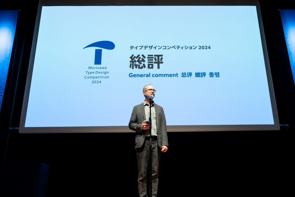
At the end of the ceremony, special juror Cyrus Highsmith shared his thoughts on the competition. He commented on the addition of the three new categories, saying it reflected the increasingly global nature of type design. “The diversity of perspectives and deep expertise among the judges allowed us to give each submission the attention it deserved. I’ve been involved in this competition for 12 years now, and this year’s results were especially remarkable,” he said. “I hope the outcomes will inspire the next generation of type designers and encourage more people to take part in the future. I’m deeply grateful to all the talented creators who shared their work.”
Special Lecture: “Issay Kitagawa’s Typographic Philosophy and Artistic Development”
After the ceremony, a special lecture was held by graphic designer and art director Issay Kitagawa, one of this year’s judges. Titled “Issay Kitagawa’s Typographic Philosophy and Artistic Development,” the talk offered an engaging look at his approach to design and branding, presented with humor and sharp insight.
Kitagawa shared four key ideas that shape his creative work. First was the importance of leaving a lasting impression. He explained that the brain tends to remember only what it hasn’t seen before. So even though legibility is important, familiar-looking fonts aren’t always memorable. “Branding is about making people remember you. To do that, you have to create something they’ve never seen before.”
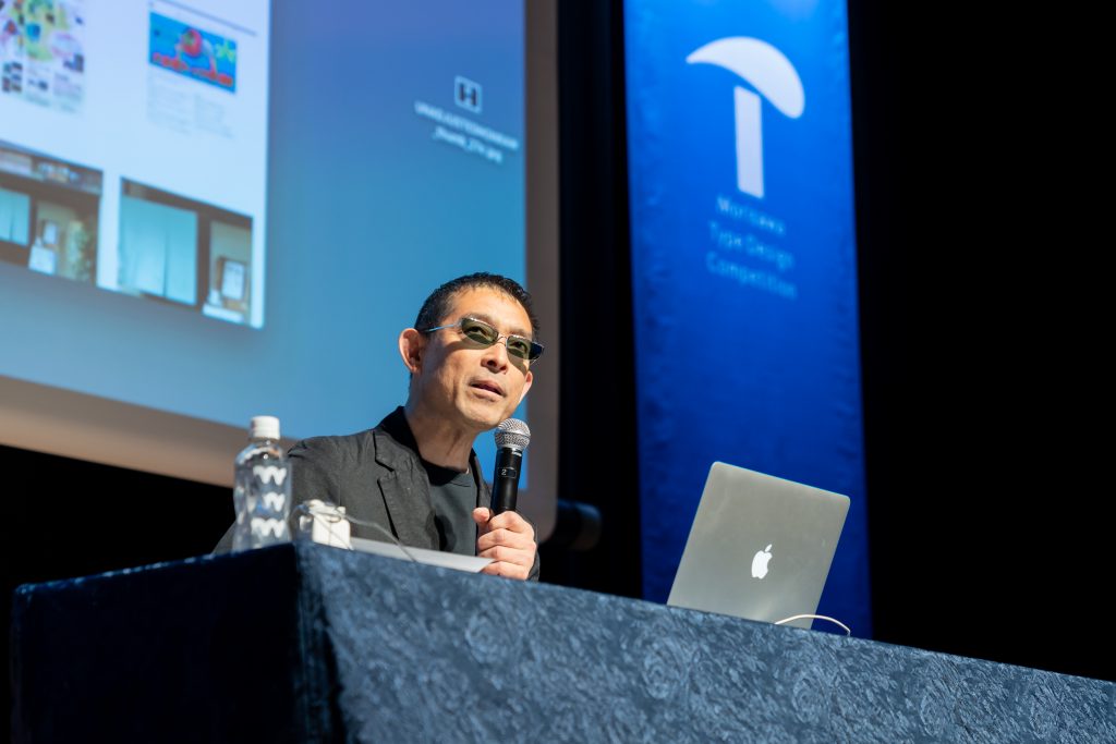
The second idea, what he called “Zero to One,” was about originality. “Art shouldn’t imitate,” he said. “You have to aim for something completely unique.”
Third was the value of space and margins. Referring to type design, he noted that it’s not just the shape of the letters that matters, but also the shapes created by the empty space around them.
Lastly, he emphasized science. “People tend to think design relies on intuition, but it’s also important to use data and evidence to find what communicates most effectively. That’s how you raise your batting average in design.”
Using slides, he shared real-world examples of how these principles come to life in his projects. One involved a redesigned company logo that received criticism online for being hard to read and oddly spaced. But that sense of unfamiliarity ended up sticking in people’s minds, leading to a significant boost in both sales and video views. The story drew laughter and applause from the audience.
After the lecture, attendees gathered for a reception. With a toast by type designer Osamu Torinoumi, the room filled with conversation as winners, judges, and guests exchanged thoughts on type design in a relaxed and friendly setting.
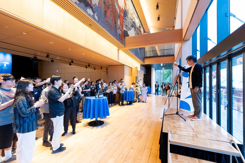
Reception attended by guests, award winners, and jury members