
This lecture series, which enjoyed the participation of numerous individuals interested in letters, typeface, and fonts, was held in conjunction with the Awards Ceremony for the Morisawa Type Design Competition 2014.
The lecture featured three presentations by typeface designers, one group and two individuals, who discussed their approaches to the subject as well as production processes.
The first session, entitled “The Birth of Pan CJK Font,” covered the creation of the Pan CJK series of fonts. It was led by Taro Yamamoto of Adobe Systems, who served as a judge for the Latin Category of the Type Design Competition 2014, along with Ryoko Nishizuka and Masataka Hattori. As the name indicates, these fonts are intended for universal use with the Chinese, Japanese, and Korean languages.
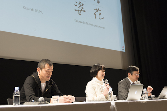
Source Hans Sans, a Pan CJK font jointly developed by Adobe Systems and Google, features several distinguishing characteristics: it accommodates Japanese, simplified Chinese, traditional Chinese, and Korean; it has an integrated design for all four languages; and it is open-sourced. It is known in Japan as “Gen-no-kaku Gothic.” Yamamoto, Nishizuka, and Hattori explained the development process and objectives; design; and font production aspects respectively, using slide shows and video.
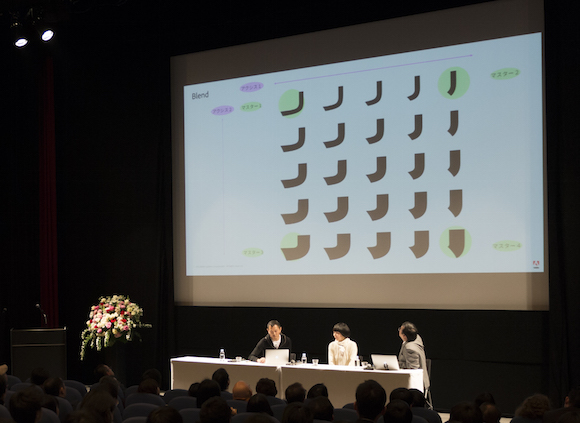
According to Hattori, subtle differences in stroke processing between the languages constitute “an important element in expressing the specific regional characteristics of the different languages.” With the assistance of Chinese and Korean font vendors, the font creators successfully compiled a total of 458,745 characters in seven different weights. In light of the fact that the font is open-sourced, which has allowed the emergence of derived fonts based on the originals—the session suggested that the fonts have potential uses in a variety of different situations.
The second session, featuring Aki Toyoshima, was entitled, “The Story behind My Typeface, the Relationship between Typeface and Me.”
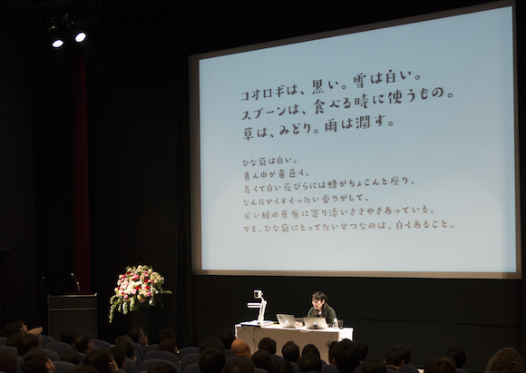
Toyoshima claimed three separate prizes for “Suzumushi” at the Morisawa Type Design Competition 2012: the Morisawa Award Kanji Category Bronze Prize; the Akashi Award (first place), and the People’s Choice (first place). She also took second place for “En-so-ku” in the 2014 Competition Kanji Division People’s Choice. Suzumushi was released by Morisawa in 2014, earning high marks for its familiar, accessible look.
The session began with a self-introduction by Toyoshima on her collection and personal pursuits, from which she moved on to the topics of her interest in typography, her type design projects, and an overview of the fonts she has worked on through the course of her career. She then talked about the production process for Suzumushi: “Suzumushi expresses the world view of the art of rakugo (traditional Japanese story-telling). I created this font with the idea of conveying the essence of the daily life of the people of our traditional shitamachi (old town) areas—particularly the scenery and inherent warmth of the people—but I wanted to do it not with yosemoji-style characters or kantei-style calligraphic fonts, but instead with more of a pop-art, cuter look.”
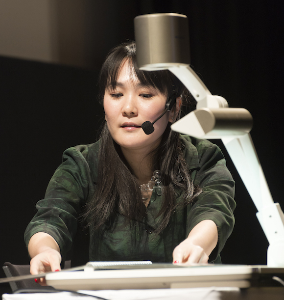
Toyoshima then talked about own special strategy for creating fonts. Showing the audience her notebook, she said, “Though I may take some notes or write a draft down in my notebook with a general idea of the kind of look I want to create, I don’t make detailed sketches.” Instead, she noted that she devises all his Chinese kanji and hiragana characters directly on her Mac, working from an image she has in her mind ahead of time. She added that her hiragana creations come out smoother when she bases them on kanji that she’s already got in mind.
In closing, Toyoshima touched on the fact that she created Suzumushi while working in a café, adding: “Anyone can create characters, and in fact they can do so easily. Though it is important to have both knowledge and technique, I believe the first step is to try and create something working with your current circumstances. Some characters have to come out of virtually no foundation—and this represents an opportunity to devise invaluable new fonts. What we need is the imagination to want to make something new, and the dynamism to move ahead with it—plus a little bit of perseverance.”
The last session, led by Osamu Torinoumi of Jiyukobo Ltd., who served as a judge for the Morisawa Type Design Competition 2014 Kanji Division, was “What Are the Important Things for Typeface Creation?” Torinoumi began his lecture with the words, “Today I’d like to talk about putting your heart into making things.” He then launched into a discussion of fonts he created during his seven-year stint as a lecturer at Kyoto Seika University.
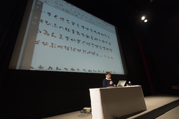
He described three fonts: “Cream Stew,” which was first created by placing ink on cream stew ingredients—such as potatoes and carrots—and using these as a type of stamp to write characters on different kinds of paper; “Oyasumi Ryokan,” rooted in Zen poet-priest Ryokan’s “Aigo” (compassionate speech); and “Okaasan,” based on Japanese classic calligraphy. About “Okaasan,” which means “mother,” Torinoumi introduced the font’s production team leader’s word that she thought of the font “as her own child” the moment it was completed. Torinoumi added jubilantly that this was precisely how he hoped university students would perceive the creative process: “this is the feeling you get when you really make something with your own hands.”
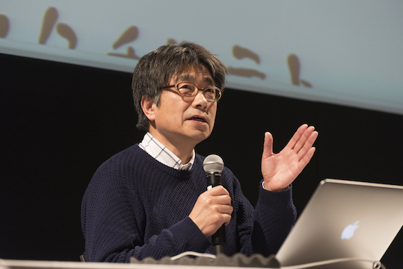
Concluding his talk, Torinoumi clarified what it means to him to “put your heart into something,” adding that “it was extremely important that type design or characters should be drawn by hand, because body and mind are connected, and any wavering of the heart can transfer to wavering of the hand. Even though computers have developed to the stage where they’re extremely convenient to use, and you can easily draw a perfect straight or curved line using a computer—first and foremost it’s all rooted in the fact that you can write the characters by hand.” He concluded with the hope that people would apply for the Morisawa Type Design Competition 2016 with “handwritten fonts.”
The Morisawa Type Design Competition has been held in 2012 and 2014, two years apart. The Special Lecture ended with the MC’s announcement that the next competition would be held in 2016.
