This is the report of the special lecture which was given at Akihabara, Tokyo on July 2nd, 2013.

Latin Text and Display Types, Matthew Carter
Matthew Carter has led the field of type design for fifty years. During his career, typographic technologies have evolved from letterpress to photocomposition to digital typesetting, and Carter has consistently been—and still is—at the forefront.
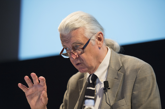
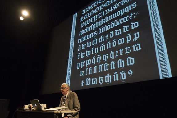
Carter opened his presentation with slides of some typefaces from the hot-metal era. He described, for instance, how old script types were used for extended text in the past but are now no longer used for this purpose. Similarly, in earlier years blackletter types were legible and everyone could read them, but nowadays people are no longer in the habit of reading them in continuous text.
Showing slides of the New York Times and the International Herald Tribune nameplates, he pointed out that it is an interesting tradition that blackletters are selected for newspaper nameplates. Presenting other typefaces, he said that some of them were once legible in texts, but because people have lost the habit of reading them, their usage is now limited to display in large sizes on posters, for example.
Carter then presented some of the typefaces he has designed. Among them, the Miller font family has various versions for use in tabloids and general newspapers. For one client newspaper, he prepared different versions with a change in weight of just a few percent. He showed examples of using different weights based on the printing technology employed (amount of ink used) or the amount of page space allocated to illustrations.
For Newsweek magazine, Carter was first commissioned to design three versions of a typeface—for text, subhead, and headline. Later he was asked to develop a fourth version for banners (large headlines), as well as other versions with much heavier weight and for reverse type (lighter text on darker background).
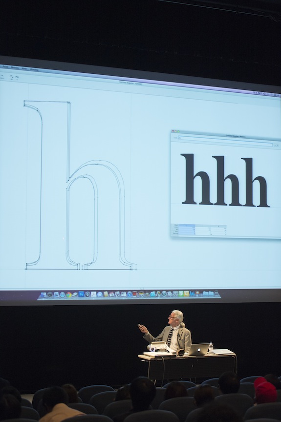
Carter then moved on to the topic of digitization. Taking the example of the typeface Monticello, he said that there were problems with some of its glyphs because of the technical limits inherent in movable type. When he was asked to make a new digital version, he redesigned the typeface to look more elegant. Showing other examples of the conversion of a typeface from metal to digital, he mentioned that no matter how good a typeface might be in metal, it is quite difficult to make a digital version and have it perform as well as its metal counterpart by simply scanning the metal images and digitizing them as they are.
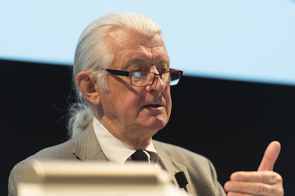
With its logical progression and many examples, Carter’s presentation was full of insights and had much to offer not only type designers but also other designers who use typefaces.
Designing Waran, Kunihiko Okano
Waran won the gold prize in the Kanji Category at the Morisawa Type Design Competition 2012. Kunihiko Okano, the designer of Waran, told us how he became interested in type design and the behind-the-scenes story of making Waran.

Okano was first inspired to design typefaces when he was studying graphic design at university. Tasked with a class assignment to make a poster, he had difficulty finding a typeface that suited his purposes. That was when he came up with the idea of designing typefaces himself. Later, he encountered Matthew Carter’s Sophia which is what inspired and motivated him to become a type designer.
The impetus for designing Waran came when he was studying type design in the Netherlands. Museums, such as Escher in Het Paleis and the Royal Picture Gallery Mauritshuis, have custom typefaces for their signs, pamphlets, and other materials to ensure consistency in presentation. The Japanese versions of such materials, however, failed to create the same image because of the infelicitous selection of the Japanese typefaces. That made Okano think about designing typefaces with a consistent look between Japanese and Western texts. Learning of foreign companies’ need for Japanese typefaces that were well suited to their corporations’ Latin types, Okano decided to develop a Japanese typeface using a completely new concept.
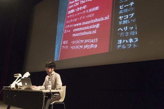
In Waran, Okano aimed to use the same design concept for both the Japanese and Latin letters while giving the Latin letters a more central role. In contrast to the dominant trend in Japan, he did not want the Latin letters to be subordinate to the Japanese characters, and he decided he would even adjust the Japanese characters to suit the Latin ones, if necessary. In addition to drawing a Latin type based on a trial design he had made earlier, he designed a Japanese typeface from scratch to suit the Latin counterpart. He then entered the result in the Morisawa Type Design Competition.
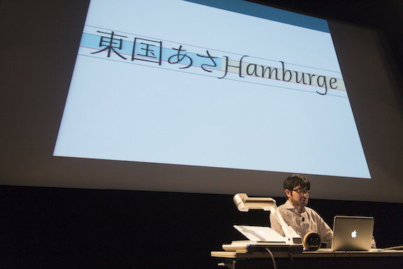
In designing Waran, he focused on the waist position of the letters. He first tried raising the waist only of the small letters in the Latin alphabet, but this resulted in giving the Latin letters a subordinate role to the Japanese characters. He then drew Japanese letters with a low waist and a slight broadening toward the base. Overall Waran puts emphasis on suitability for horizontal typesetting, by intentionally making the horizontal strokes align flatly while letting the vertical strokes flow freely. To develop a novel Japanese typeface, one not in either Ming-cho or sans serif style, he placed an accent on the left edge of the horizontal strokes unlike traditional Japanese letters which have an accent on the right edge of the horizontal lines.
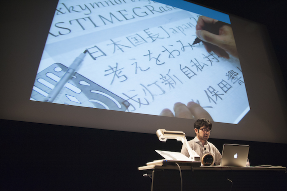
Using slides of handwritten sketches and production data, Okano explained how the initial design had evolved in the course of production and showed simulations he had conducted using mock advertisements to examine compatibility with photographs. His presentation made it clear how long and hard a journey it was to design Waran.
Having won the gold prize, Okano is now once again studying Japanese type design. At the end of his talk, he announced that his next goal is to release Waran within ten years’ time as a combination of Japanese and Latin typefaces.
_
My Thoughts about Hiragana, Masahiko Kozuka
The last speaker of the seminar was type design director Masahiko Kozuka, who has been in the field since 1950.
His lecture on hiragana began with a slide of Typos, the pioneer of the new Japanese typeface boom in the 1960s and the 1970s. He noted that Yasaburo Kuwayama, one of the Typos designers, was the one who first envisaged Typos as a kana typeface family like that of the Latin alphabet. Until that time, it was commonly thought that kanji and kana should be regarded as one integrated whole and never be considered separately.Kozuka shared that seeing kana as independent from kanji was a revolutionary idea in that era when it was taken for granted that Ming-cho kanji and kana should be two parts of a single unit. He also pointed out that another significance of the new typeface was to create patterns in developing letters.
In Typos, each hiragana was broken down into its component elements to create patterns. This was impossible in metal types. He gave the example of the hiragana は that is derived from the kanji 波. He said that it was revolutionary at that time to view は as a collection of different parts of vertical lines, horizontal lines, and an ending loop.
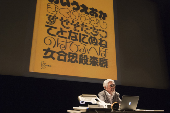
Yet at the same time he wondered whether it was appropriate to modularize the parts of kana. He thought that modularization should be limited to typefaces for display purpose and instead he focused on how to deal with kana for use in texts.
When people take notes in Japanese, they write horizontally from left to right, while Japanese books have both vertical and horizontal settings. Since hiragana was originally developed for vertical setting, it was not enough to simply arrange it sideways for horizontal setting. He stated that to date very few typefaces have resolved the challenge of developing hiragana for horizontal writing.
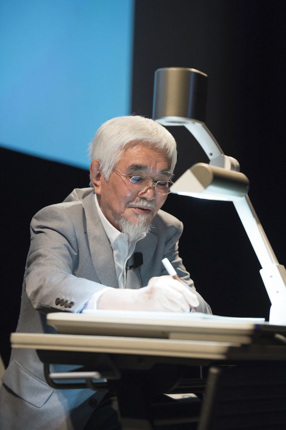
Kozuka then talked about design elements that are part of his own design concept—(1) weight, (2) waist position, (3) counter space, (4) appearance and characteristics of elements, and (5) line quality. Based on this, he gave a detailed explanation using handwriting. Taking the hiragana は for example, since its origin is the kanji 波, the vertical line on the left comes from the water radical (氵). On the other hand, the hiragana ほ comes from the kanji 保. This means that the left vertical line indicates the person radical (亻). He said that we should question whether it is appropriate that these radicals have the same form. In light of this, he explained, while offering many examples, the points that need to be considered in redesigning kanji-derived hiragana for horizontal setting in the modern era, focusing on the design elements mentioned above.
Kozuka concluded his presentation by defining the functions of typeface as follows: (1) making aligned lines, (2) conveying information accurately, and (3) expressing visual images. It is important for both graphic and editorial designers who use letters to remember these points and go back to them, as necessary, when they are choosing a typeface.
