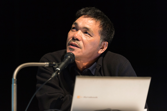
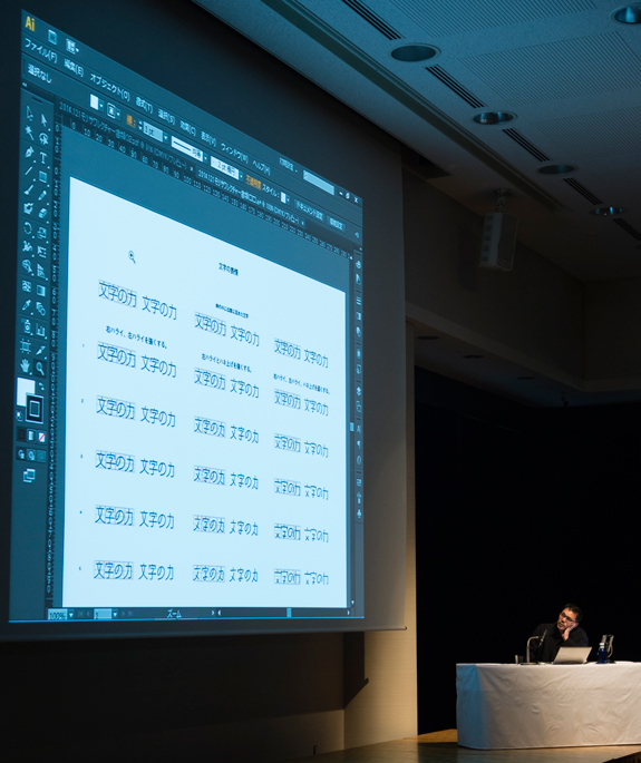
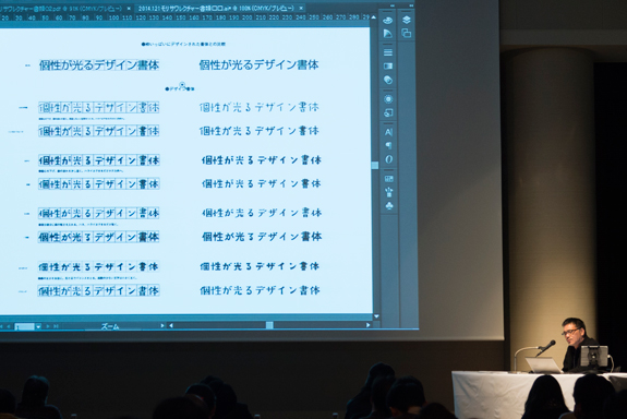
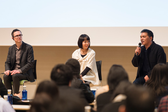
This is the report of the special lecture which was given at Iidabashi, Tokyo on January 21, 2014.
■ Similar but different: Cyrus Highsmith
● My job is to “draw.”
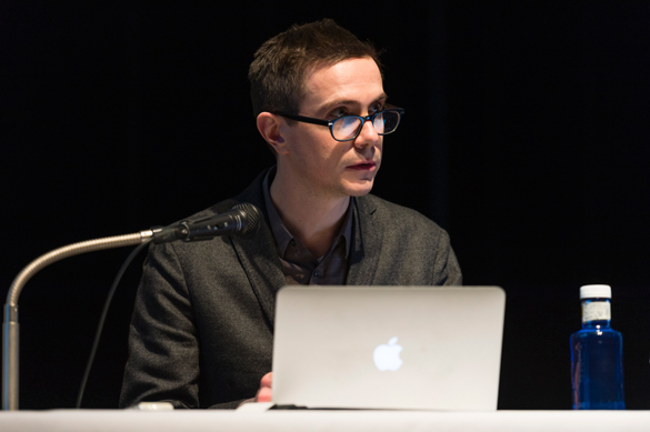
Cyrus Highsmith, a type designer at the Font Bureau, teaches typeface design at the Rhode Island School of Design (RISD). He is also known as the author of Inside Paragraphs: Typographic Fundamentals (its Japanese translated version is published by Graphic-sha Publishing).
Highsmith began his presentation by stating the following.
“When I am asked, ‘Does your work require much reading?’ I first answer, ‘No.’ It is true that I look at letters all day long. But I think that it is different from reading. Of course, I like reading books very much, but it is not my job. In addition, I have written a whole book, even though it is short. But my job is not to write but to draw.”
● Typeface design is similar to prints.
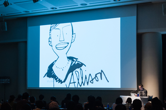
Highsmith suddenly displayed figure paintings on the screen.
“I started drawing portraits of students quickly. The reason was that I am not good at remembering people’s names. Instead of remembering names, I drew portraits in this way. Then, I became highly interested in portraits, so I began drawing figure paintings at parks and airports.”
Then, Highsmith showed engraved portraits of his daughter and niece. Prints are one of mediums that he is serious about.
“When I came across prints during my youth, I felt that this was what I wanted to do. But I thought that graphic design is more practical, more story-telling, and more mature than fine art, which cannot break away from theory and politics.”
Highsmith was fascinated by graphic design, and this led him into the world of typography. He claims that there are similarities between prints and typeface design.
“To draw letters with contour lines, the only important thing is shape. And through this process, I can learn to draw. By that time, I had become good at drawing, but I was able to get closer to the heart of it by drawing letters. Typeface design is similar to prints.”
Highsmith said that the keywords are “combination” and “repetition.” He claims that these two keywords represent similarities between typeface design and prints.
● Three approaches to typeface design.
Highsmith claims that there are three approaches to typeface design.
The first approach is based on history. Highsmith said, “Many new typefaces are based on prior typefaces. We can acquire new ideas from the past.” But on the other hand, he also said, “Prior materials are limited, and there is a high possibility of creating similar typefaces.”
The second approach is related to calligraphy. Highsmith said that it is good to “learn the correct stroke orders and angles” by using a calligraphic approach. “Good things cannot be created by ignoring calligraphic principles,” he said. But “If everything is based on a calligraphic approach, it will then become a restriction.”
The third approach is to think how typefaces are to be used. Highsmith said, “The more detailed, the better. It is necessary to look deeper than functions and to think about roles. A type designer’s job is to create typographies and to produce elements that are used for expressions.”
“This method brings about an interesting side effect. When a typeface is created for one purpose, it at least achieves that one purpose even though its use may be restricted. Moreover a well-designed typeface can be used for other purposes. A typeface created for one purpose can be used sometimes in various unexpected circumstances.”
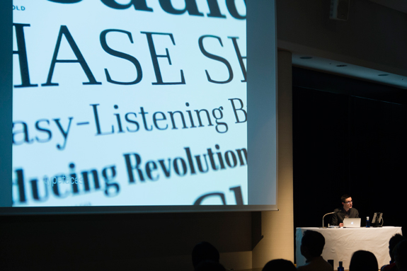
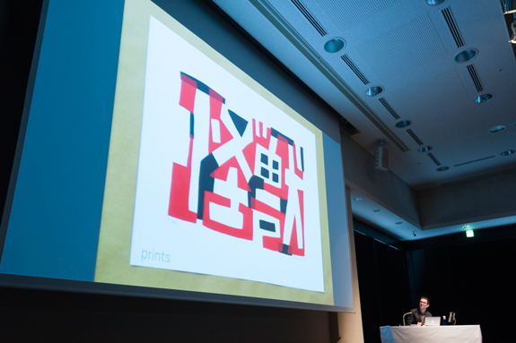
Highsmith explained while showing several examples of typefaces that he actually created.
Highsmith spoke at a good pace by changing topics continuously. He spoke about his book, portraits, prints, and typeface design. We were able to learn that Highsmith believes that these topics are similar but different, but they are closely linked to each other.
■ Creation of typefaces: Ryoko Nishizuka
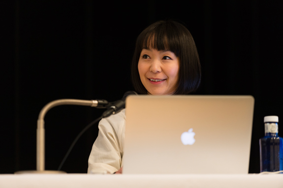
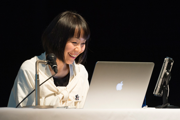
In the second part, Ryoko Nishizuka spoke about her work to create typefaces. She is involved in creating typefaces at Adobe Systems and received prizes in the type design competition in the past.
● The handwriting of Fujiwara no Teika has changed her destiny.
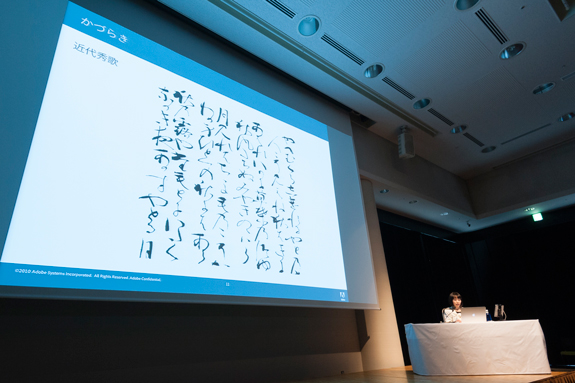
Nishizuka joined Adobe Systems around the time when the development of the Kozuka Mincho typeface reached a final phase. She has created the Ryo and Kazuraki typefaces at Adobe Systems. She received an honorable mention for the Branch Letter typeface in the Morisawa Type Design Competition in 1999. In addition, she received a silver prize for the Teika typeface in 2002. The Kazuraki is an evolved version of the Teika.
“Almost all information and documents used to create typefaces are not kept,” Nishizuka said while laughing. She presented the process to create rounded corners for the Branch Letter. One of the characteristics of the Branch Letter is that it slants upward to the right, and when lines are parallel, their angles are different. “This requires much time and labor,” she said. But the reason for taking much time and labor is clear. She explained, “Unless two horizontal lines in a letter are angled to create a larger space to the right between them, the letter looks mechanical. For the Japanese letter ‘書,’ the lines of the first and second strokes are angled to create a larger space to the right between them, and then, accents are placed.”
Nishizuka said that as for the development of the Teika, it all started when she was a senior college student. When she was doing research on what theme should be used to create typefaces, she came across the handwriting of Fujiwara no Teika. She said, “I had been preoccupied by it for over 15 years since I was a senior college student, and my wheels of destiny turned in a different direction at that time.” In her graduation project, she made a proposal including letter-spacing information and other functions. But the font creation environment at the time is different from the current environment. She said, “It was difficult to make a proposal despite the fact that there were no technologies that could be used to put it to practical application. From there (after the development of the Teika), it took me 15 years to create the Kazuraki.”
● She has always thought about “Kawaii”.
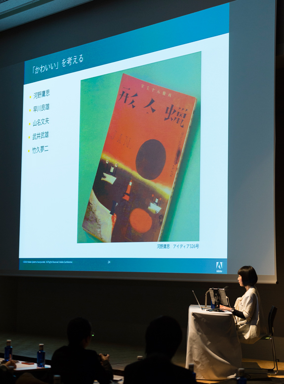
What kind of typeface does Nishizuka like? She said, “I have for a long time thought about fashion and Kawaii (hereinafter referred to as “cuteness” or “cute”). I think that cuteness is hidden in human things.”
Then, what is cute? Nishizuka provided keywords such as “not neat,” “too freewheeling,” “shape that cannot be found in this day and age,” “old or old looking,” “bad printing,” and “childish and adult-like.” She also said, “There is only a fine line between cute and unfashionable.”
As for existing fonts, Nishizuka said that the Marumin Old, the Bokutoh, and the Arare are some of the examples of typefaces that are “cute and easy to use.” As for handwritings, she mentioned Takashi Kono, Yoshio Hayakawa, Ayao Yamana, Takeo Takei, and Yumeji Takehisa. She also said, “In addition to graphic design, letters on tile-block prints are also cute.” She recently began taking calligraphy lessons and “feels that letters in calligraphy are also cute.” “As to Fujiwara no Teika, I believe I saw his handwritings cute in accordance with my standards at that time,” she looked back.
Nishizuka said in a self-reflective manner, “I think that I consider old letters that do not fit in a regular square and are unfashionable or compressed and letters that are beyond my imagination to be cute.”
● Significance of the Morisawa Type Design Competition
On top of cuteness, usability is added to the Chidori typeface family. The typeface was developed under the condition that “it can be used for not only titles but also catch-phrases and text in picture books and other works, and it can be developed faster than the Kazuraki.”
The Chidori was put on the Morisawa Type Design Competition. Nishizuka could not receive a prize, but she said, “The type design competition is a good opportunity to put typefaces in the conceptual phase into shape. If the competition is not continued, there will be fewer opportunities for good typefaces to come into the world.”
Nishizuka concluded her presentation with the following comment.
“I had long wanted to become a graphic designer who creates Japanese logos, instead of becoming a font designer. Recently, I finally decided to live as a type designer. I just recognized that type design work will not disappear as long as there are languages. Even when there is an excess of supply, letters are necessary for languages, and new typefaces are sought. Even if there is technical advancement, or there is progression or regression, history is not wasted. This is what makes type design interesting.”
■ Worksites to create highly-designed typefaces: Yasushi Saikusa
Yasushi Saikusa, who has created many highly-designed typefaces, received a gold prize and a judge’s prize in the sixth Morisawa Awards International Typeface Design Competition. His speech theme was “Worksites to create highly-designed typefaces.” He spoke about his efforts in creating highly-designed typefaces, which are different from basic typefaces, and about backgrounds incorporated in typefaces.
● Sweep strokes and hook strokes are important.
Saikusa said, “Typefaces used in body text give importance to readability, while typefaces in titles give importance to presentment. Highly-designed typefaces call up the images of language backgrounds and circumstances.” As for important elements for the creation of letters, he stated the following.
“Among typeface elements, the most important are sweep strokes and hook strokes. By appropriately combining these two strokes, it is possible to give character to letters.”
Then, Saikusa showed what letters look like with different sweep strokes and hook strokes on the screen. He illustrated what they look like with a longer sweep stroke, a stronger or weaker hook stroke, which gives different character to them.
The relationship between the black space and the white space changes depending on sweep strokes and hook strokes. Saikusa said, “I preferably try to create an informal and relaxed style. I try to leave appropriate space between letters when solid settings are used, creating an open and airy feeling.”
● Saikusa gives importance to the backgrounds of creating letters.
In the first place, what is the conceptual basis of creating unique characteristics of typefaces by combining sweep and hook strokes? Saikusa spoke about the backgrounds of letters, and he first mentioned the Haruhi Gakuen typeface as an example.
“I created the Haruhi Gakuen typeface, thinking about school life. I felt that in school life, tall people, small people, smart people, people who are not good at studies but are good at sports, and others gather together. Therefore, I started creating the typeface based on the image of things that are irregular but well-organized. When I was working on the typeface 14 to 15 years ago, a trend for low-waist pants was appearing among young people. This style was also incorporated in the typeface. One of its characteristics is that vertical sweep strokes are used as much as possible.”
When setting up Japanese letters, which are irregular in size and shape, what impression do they give? Saikusa said, “It is important to pay attention to the overall effect. You can see the characteristics of a typeface only after setting up its letters. It is important to make good use of the visual intensity of black and white.” He continuously explained about detailed examples including how to deal with a letter with many stroke counts and a hiragana letter with much open space.
For example, the Haikara typeface and the Bankara typeface have similar but different backgrounds.
Saikusa said, “As for the Haikara, when I came to Tokyo and was drinking at the Kamiya Bar, I saw cool old men drinking. And I thought that I would try to create a modern stylish typeface.” On the other hand, he said, “The Bankara is based on the image of people standing and drinking at a bar. In the Kyushu region, the word ‘kaku-uchi’ is used to describe the act of drinking with dry snacks, standing outside the front of a liquor store before going home. This playful spirit is expressed in the typeface.”
Saikusa came from Ikinoshima Island. He explained that the Haikara and the Bankara are based on his experience of drinking alcohol around the time when he moved up to Tokyo.
The samples of the highly-designed typefaces that were introduced on the screen during this seminar can be viewed at Saikusa’s website. The texts used for various typefaces are not typical product samples but are prepared specifically to suit the style of each typeface. The text enables readers to know the background of the typeface, even though descriptive explanations are not provided.
If we pay attention to the character and “expressions” typefaces show us and their backgrounds, which were explained by Saikusa, we will enjoy choosing a highly-designed typeface a lot more.


