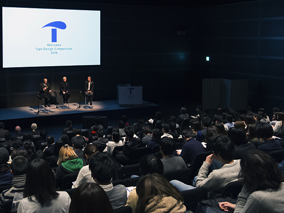
Morisawa Inc. held the 4th Morisawa Type Design Competition Special Lecture at Hall D7 of the Tokyo International Forum (Yurakucho, Tokyo) on Wednesday, February 17, 2016 with the theme of “The Perspective of Type Designers”.
This seminar took place to celebrate the Morisawa Type Design Competition 2016, which called for entries of creative typefaces from all across the world. Many people with an interest in letters, typefaces and fonts attended the seminar.
During the seminar, two type designers and a graphic designer gave speeches on the processes of typeface creation and their approaches, as well as their ideas about typesetting.
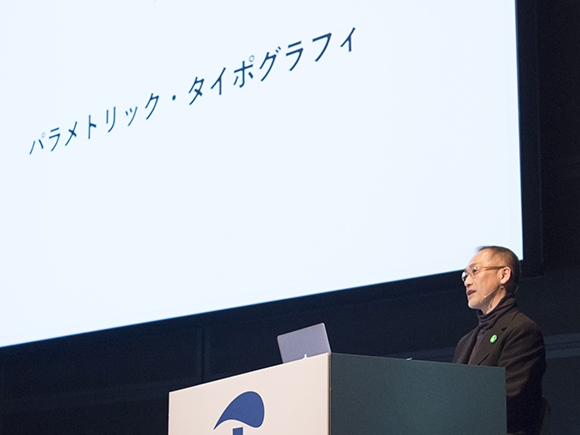
The third session of the Perspective of Type Designers was a speech, titled “Parametric Typography” by Mr. Yasuhito Nagahara.
Mr. Nagahara is a graphic designer who has been working on design with computers from the early days as well as conducting his own research and practice in the field of typography. He has authored many books, including Japanese Language Design (Bijutsu Shuppan-sha Co., Ltd.) and The Stream of Information Graphics (Seibundo Shinkosha). He also produced a font called Finger (TypeBank) that displays letter strings which naturally flow from one character to another. He has demonstrated his success across technology and design.
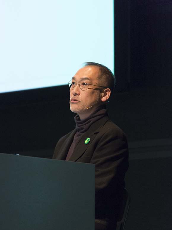
He began his speech by defining the range of his work, saying, “My specialty in graphic design is especially to design with computers, or in other words, the area of graphic design that has been expanded by the use of computers.” He then continued with an explanation of the term “parametric typography,” used as the title of his speech.
He explained that “parametric” means parameters or variables of an algorithm, while an algorithm can be considered as a process. Algorithms and parameters are often seen as a set. In short, they are processes and variables. For example, an algorithm is a recipe and the parameters are the amount of seasoning and degree of doneness in terms of cooking. The algorithm and the parameters are then combined to make a program.
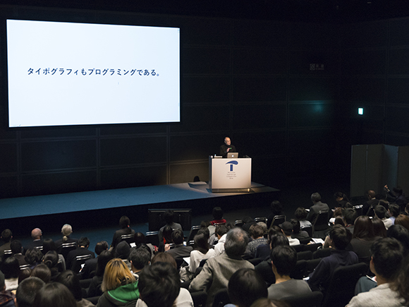
According to Mr. Nagahara, typography is also a type of programming. For this topic, he briefly mentioned his article, “Algorithms for Typesetting” (the first lecture), available under Methods of Typesetting on the Morisawa website. He then moved on to the topic of typesetting and computing.
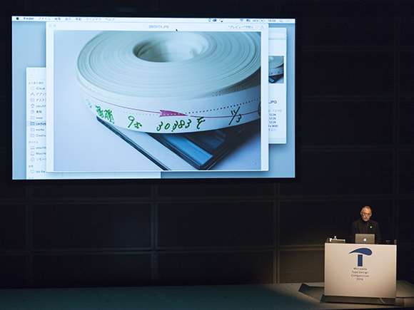
He stated that typography and computing are very compatible and that typesetting using programming has been carried out for a long time. He showed a photo of a line casting machine (Linotype) from the 1950s, followed by a photo of some puncture tape. He mentioned the processes used in the casting and typesetting of letters which were recorded by the patterns of the holes on the tape and explained that typesetting by puncture tape can be considered programming.
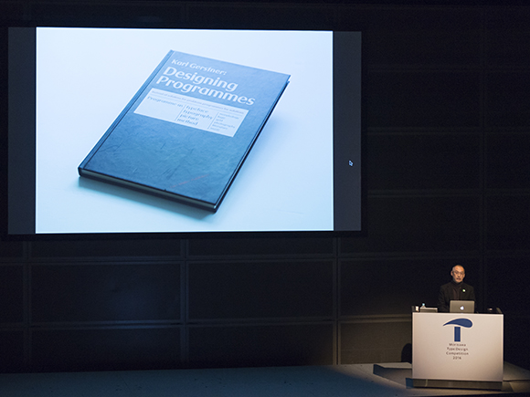
Mr. Nagahara went on to introduce a book called Designing Programmes, written by Karl Gerstner in 1964. He put up a photo of an inside page on the screen and explained that Karl Gerstner was a designer representing the Swiss style who was well known for his Swissair logo and for creating the corporate identity of the Shell Oil Company. This book by Gerstner is not about designing with computers but about designing the formative process. He introduced methods to expand the variations of letters and shapes by changing their shape and size.
Mr. Nagahara summarized, “The Swissair logo was inspired by the various shapes created by adding variables to the cross on the Swiss national flag. Gerstner did not specifically use computers for calculations. He produced his various designs by designing the conceptions and the methods.”
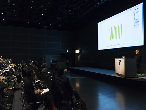
He introduced the symbol mark for Aichi Triennale 2016 as a design that used actual computer programming. Mr. Nagahara is the official designer of this mark. This symbol mark does not have a constant shape but instead has a parametric design that is generated by source code.
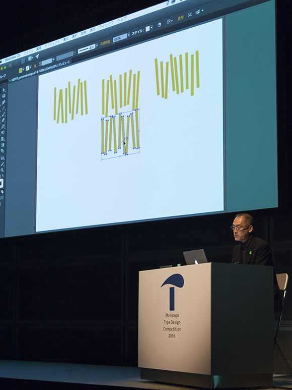
According to Mr. Nagahara, “The shape of the mark changes every time by adding variables to the angles, lengths and widths of the nine bars. Although the shape differs every time, the mark looks the same due to its strength.”
What he designed was a program for forming shapes. Despite the changing shape, the identity stays intact because the structure does not change. This is the main feature of this symbol mark. Mr. Nagahara explains, “This symbol mark has a fluctuating, gentle identity. For instance, when you look at people, you recognize them as humans despite the completely different faces that each one of us has. The same goes for dogs and cats. Essentially, an identity is also supposed to be that way. It is no longer natural when it is forced in a uniform shape, such that a logo is not considered authentic when there is a difference of even a millimeter.” He showed the flexibility of a design that was made possible by the parametric approach.
In the end, Mr. Nagahara talked about a font created with the neural network (neural circuit) by Erik Bernhardsson.
The font vector, which is the structure that humans recognize as letters, is the basis of this font. It decides the shapes of the letters. Mr. Nagahara showed the alphabets that are generated by the font vector and characters that do not actually exist but can be recognized as kanji characters. He then concluded his session by saying, “As an extension of the human brain, attempts to understand letters are conducted in this way with the use of computers.”
See also other articles;
“Restless wind inside a letter box” by David Berlow
“The Typeface, and Me.” by Naoyuki Takeshita
