
Morisawa Inc. held its Type Design Competition 2016 award ceremony on Thursday, May 11, 2017, at the UDX Theater in Akihabara, Tokyo.
Surpassing the previous competition, 739 entries were received for the Type Design Competition 2016, with 205 in the Kanji category, and 534 in the Latin category. Judging took place in November 2016, and from among these entries, works that strove for creativity and aesthetics were selected to receive Morisawa Awards (Gold Prize, Silver Prize, Bronze Prize, and three Honorable Mentions), and those with excellent suitability for commercialization by Morisawa were selected to receive the Akashi Award. In addition, two award winners in each category received the People’s Choice award via fan voting on the web. Eleven of the seventeen prize winners (including one two-person team) attended the award ceremony.
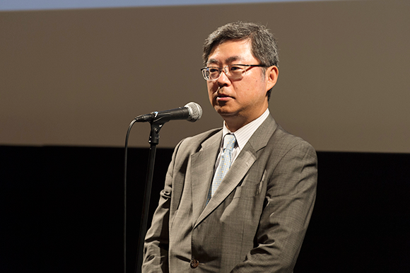
Akihiko Morisawa, President and CEO of Morisawa Inc., gave a congratulatory message to the prize winners at the start of the award ceremony, speaking about the increased interest in type design. “There were numerous entries from many countries for the Type Design Competition this time, with about twice as many as for the Type Design Competition of 2014 in both categories, showing significant growth. The contest was revived in 2012, ten years after the previous Morisawa Award International Typeface Design Competition, and I’m sensing a renewed level of interest.”
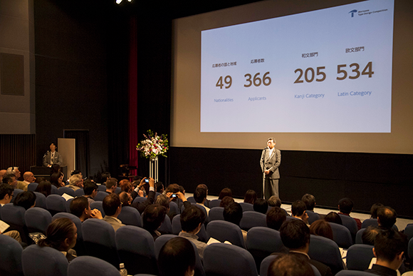
He also commented on “Global Type Design,” the special seminar to be held after the award ceremony and concluded by saying, “Today, Japan is caught up in a wave of globalization, and is facing a major turning point in font production as well. We’ve been focusing on developing Japanese language fonts, but we are also engaged anew in the challenge of expanding to languages of other countries. Currently, the number of languages included in Morisawa Passport, etc. has reached approximately 170 languages, and going forward, we need to continuously increase the variety of our fonts. It’s my hope that this special seminar will allow us to talk about what kind of work is being done, and what kind of work will be done going forward in terms of font production amidst this kind of change.”

The award ceremony started with the Morisawa Awards in the Kanji Category. Matthew Carter, who served as the chair of the judging committee, was the presenter. He introduced the six winners one by one: Junko Matsumura, Gold Prize winner for “Shimanami,” Naoko Ozawa, Silver Prize winner for “Tsukibae,” Aki Toyoshima, Bronze Prize winner for “Natsume,” Miki Ooba, Honorable Mention winner for “Gan Kaisho,” Yokokaku, Honorable Mention winner for “tgk02,” and Ryotaro Tada, Honorable Mention winner for “Kuretonbo.” Each prize winner came on stage to receive a trophy from Matthew Carter inscribed with their name and the winning work title.
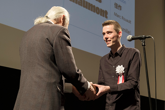
In the Latin Category, awards were received respectively by Bart Vollebregt, winner of the Gold Prize for “Vonk,” Jitka Janeckova, winner of the Silver Prize for “Rododendron,” and Michel Derre and Julien Priez, winners of the Bronze Prize for “Abelha.” With the People’s Choice awards following that, of the four prize winners, Sayaka Takegami who won the award for “Madori font,” was handed a trophy by Akihiko Morisawa, President and CEO of Morisawa Inc.
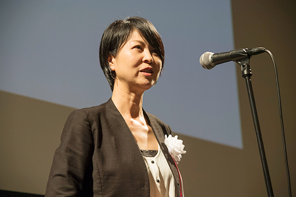
For the Akashi Awards, Tsunehisa Morisawa, President and CEO of Morisawa Bunken Inc., served as the award presenter, with Junko Matsumura, winner of the Akashi Award in the Kanji Category for “Shimanami,” and Bart Vollebregt, winner of the Akashi Award in the Latin Category for “Vonk” taking the stage again. There was a big round of applause from the audience when it was announced that this was a double award with the Morisawa Award Gold Prize in both categories, as both artists received a second trophy.
After the awards, both winners gave acceptance speeches. In addition to the surprise of winning double awards, Matsumura expressed happiness, saying, “Normally I do graphic design work, and this is my first experience with type design. Being able to see this kind of result for a typeface I enjoyed creating makes me feel truly happy.” She then explained how she created “Shimanami” with an image in mind of Shimanami Road, which connects Onomichi City in Hiroshima Prefecture and Imabari City in Ehime Prefecture. She then spoke about her current progress in creating commercial font products, saying, “I am working hard to make high quality fonts that everyone will want use.”
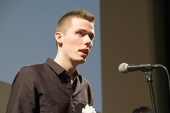
Vollebregt said, “It is a great honor and makes me very happy to be able to receive this wonderful award.” He expressed his thanks, saying, “This is a typeface I worked on in the Type and Media Master’s Program at The Royal Academy of Art (KABK) in The Hague, Netherlands. I created a variety of ideas and sketches there. I feel that my professors and colleagues pulled me up to a professional level.”

The award ceremony ended with Mathew Carter’s conclusion, “This is the third time in the new series of the Type Design Competition. All of the competitions were wonderful successes, but what was remarkable this time was that there were double the number of entries compared to the last time. I believe this is a result of Morisawa representatives visiting many schools around the world to raise the visibility of the competition. Also, works given prizes were not limited to a single style because of some current trend, and there was a wide variety of winning entries, which I feel is a very good sign. We judges were very happy to be able to select from among a large number of entries. There were truly outstanding entries, and we gave prizes to them. I believe this competition is building an international standard at a truly high level. We look forward to receiving a large number of high quality entries that judges will marvel at again for the next competition.”
The seminar report of “Global Type Design” is coming soon.
