
Morisawa’s Fifth Special Seminar “Global Type Designs” was held at UDX Theater in Akihabara, Tokyo on Thursday, May 11, 2017.
Bringing major font makers from Japan, Taiwan, China, Korea, and the US under the common theme of “Global Type Design,” the seminar took place on the same day and at the same venue as the Type Design Competition 2016 award ceremony. The presentation lasted for about two hours centering on the latest information about fonts and technological development regarding Japanese, Simplified Chinese, Traditional Chinese, Korean, and European languages.
Click to see the first half of the seminar.
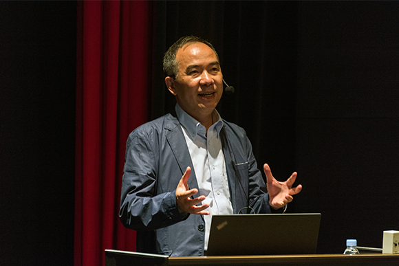
Wen Shensheng, Vice President of Beijing Hanyi Keyin Information Technology Limited Company (Hanyi hereafter) presented the third session on Simplified Chinese fonts.
Wen began by introducing Hanyi’s new logo. The logo is made by deconstructing the character 字. “The elements of the letter ‘字’ may look calligraphic, but the individual strokes have a mechanical feel. The logo represents handwriting and technology, the two elements of font production,” explained Wan. After briefly discussing the character sets of Simplified Chinese and the history of Chinese fonts, he began describing Hanyi’s font production process.
“We developed the tool we use for our font production. It has the functionality of the existing font production tools but we also added kanji logic,” Wen explained, and continued to show the four processes of font production. First, the hand drawn design is scanned and digitalized, then its parts, such as strokes and left-hand and right-hand radicals, are standardized. The requisite characters are created using these standardized parts, and then they are checked by printing, etc., after which the design is fine-tuned. “Using this method really sped up the process of the expansion of character types, and made it easy to standardize designs,” said Wan. However, he continued, “it still takes ten people one whole year of production time to produce 20,000 characters. Even with a great tool, font production is still a time-consuming process.”
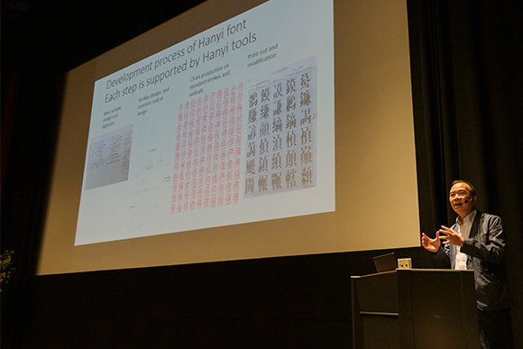
How does one optimize the production of a massive number of kanji? Wen introduced a method that is being developed by Hanyi that models the character’s form, its virtual body ratio (square/vertical length/horizontal length), the width of the spaces within the character, and the shapes of strokes. He showed a font called Qi Hei [旗黒] along with an automobile ad that uses the font.
Wen closed the session with a success of his font production optimization. He explained that five fonts had to be created within one month for a particular client, and Hanyi was able to produce the font family in only one week using their modeling tool.
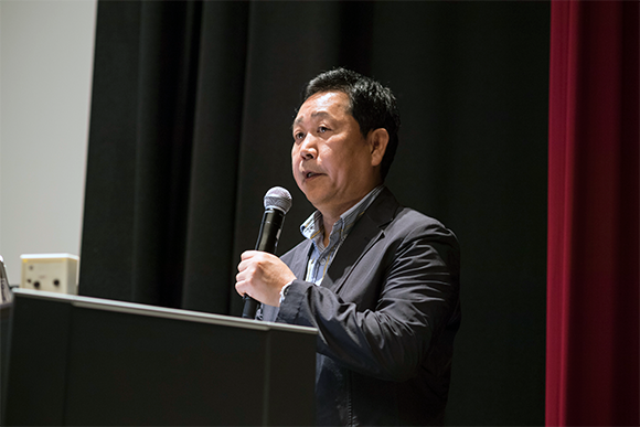
The fourth session was on Korean fonts, presented by the CEO of Korea’s Sandoll Communications Inc. (Sandoll hereafter), Seok Geum Ho.
Seok started the session by showing the regions and the population where Hangul is used, and explained the structure of Hangul characters. “Hangul characters are made by combining consonants and vowels, and so paying attention to each part of the character is important,” he stated.
Seok showed two font families, Sandoll Myeongjo Neo1 and Sandoll Gothic Neo1/2/3, that are used worldwide, adding that, “These fonts are used worldwide on a variety of products such as Apple’s iPhone and iPads.” Next, Source Han Sans, jointly developed with Adobe Systems and Google, and the brand-new Source Han Serif, released in April of 2017, were presented as examples of multilingual CJK fonts. Seok showed how Sandoll fonts are currently used widely in many environments.
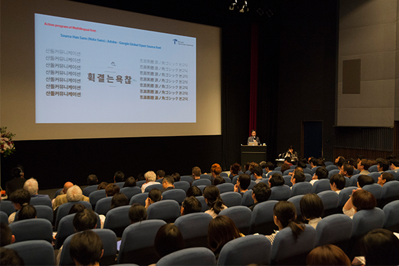
Next, Seok discussed Sandoll’s cloud font service that enables the use Sandoll’s fonts on the cloud via computers and mobile devices, and in different environments by providing the fonts as APIs. This system has allowed Sandoll to transition their business model from one that sells fonts to a monthly or yearly subscription model.
Seok ended the session by noting the users’ response to the new business model: “Within 37 months since we started the service in 2014, the service subscription grew to 180,000 accounts, making Sandoll the top font provider in Korea.”
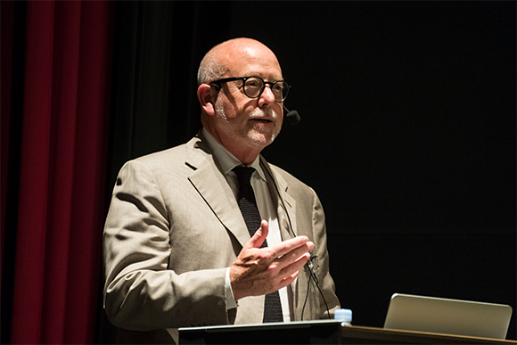
The fifth and final session covered Latin type, which was given by Roger Black, Director of Type Network based in the U.S.
Black, who is one of the founders of Font Bureau, talked about Type Network, a one-year-old company that sprouted from Font Bureau, and which has many partnerships with font manufacturers around the world. Black showed samples of Type Network fonts, and stated that his company released 50 new type families within the past year.
While Latin fonts “are used by 131 languages and 70% of the population,” they have lot fewer characters compared to Japanese or Chinese, and this is one of the reasons so many fonts can be released.
Other important factors for the increased productivity, he noted, was the company’s collaboration with design partners and the existence of RoboFont, which he said was a large factor.
“RoboFont is a new open platform for type designers. It can develop fonts from designers all over the world—providing advanced tools that are essential for that,” Black explained.
When discussion moved to the future direction of Latin fonts, Black quoted the words from John Hudson, “A single font that behaves like multiple fonts,” and continued to describe the direction of his company: “Just as these words say, we aim to create single fonts that can act and can be used as multiple fonts.”
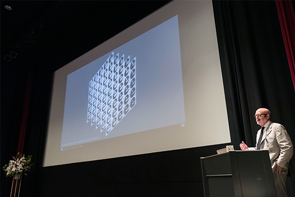
To illustrate his point he presented a variable font whose line weight, width, and size, as well as the shapes of the strokes and serif can be changed. Providing variations with a single font has many merits, Black noted, such as proving for richer expression, allowing faster website loading by a reduced font file size, and easier handling of fonts overall.
As he described what a variable font can do, Black demonstrated its capability by typing in a small space, showing off how the font automatically narrowed to fit into the limited space. In another demo, strokes of the font and the shapes of their end points were selected to show how the font design can be changed. “This is the direction of font technology. It is not something for the future; it’s happening now,” Black said in conclusion.
