On August 28, 2018, the Morisawa’s sixth Typeface Design Competition Special Seminar was taken its place at Tokyo International Forum. It was the pre-event for the upcoming entry call of the competition. The presentations started by the type designer Cyrus Highsmith who is also the jury of the competition for Latin font category. The second session was the discussion between the type designer Osamu Torinoumi who is also the jury of the competition for Japanese font category and the previous award winners. The last presentation was by the art director Kaoru Kasai who spoke about letters from the user’s point of view.
Click to see the report of session1.
Click to see the report of session2.
“Letter, Words, and Story”
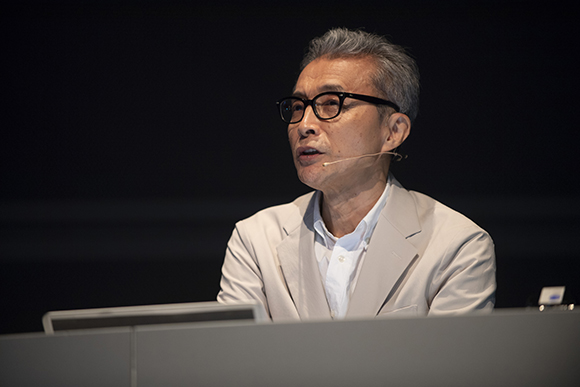
The last Seminar was the presentation by Kaoru Kasai who participated in many TV commercials, corporate identity design, and creation of advertisements and the art directions for Sun-Ad Co.
Kaoru became obsessed by the lettering correspondence course when he was a high school student and became interested in the jobs related to letters. This experience leads to the opportunity where he felt that he was “helped by the letters” when he started making TV commercials. He recited that “letters are for words, words become text and text makes a story”.

Kaoru showed some graphic works he was influenced by, and explained what makes him fascinated to letters; where the nobility, the glamorousness, or the tensity come from the typefaces; and introduced his works and gave comments on each of them.
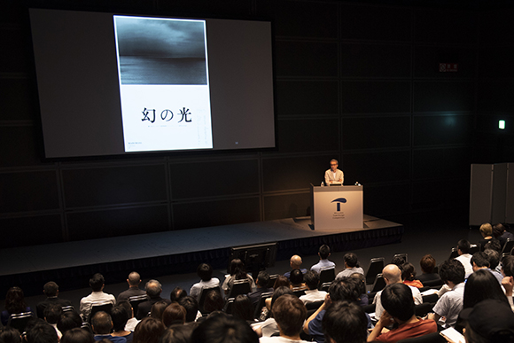
In the poster for the movie “Maborosi (1995, the director Hirokazu Koreeda’s first movie)”, he used reproduction proofs (printed on photographic paper) to make the letters for the title. Kaoru said it was thrilled to see how the radicals entangled in the kanji “幻”.

In the Chinese version of the TV commercials for Suntory oolong tea, minimal and sophisticated slogans such as “One, Two”, “You are Good”, “?” are used. The letters for the slogans were designed in different ways: drawn by Kaoru himself, by Chinese letterer, or by an illustrator to bring various stories. Although these TV commercials are made over twenty years ago and only last for thirty seconds each, they have full of stories and do not look old at all. Watching these commercials was almost like watching good movies, and the great feeling filled the event hall.
〈Text:Chiyo Date (TART DESIGN OFFICE) Photo: Mitsuru Hirota〉