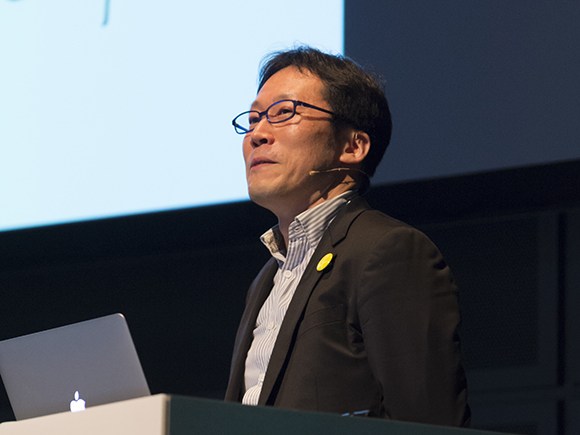
Morisawa Inc. held the 4th Morisawa Type Design Competition Special Lecture at Hall D7 of the Tokyo International Forum (Yurakucho, Tokyo) on Wednesday, February 17, 2016 with the theme of “The Perspective of Type Designers”.
This seminar took place to celebrate the Morisawa Type Design Competition 2016, which called for entries of creative typefaces from all across the world. Many people with an interest in letters, typefaces and fonts attended the seminar.
During the seminar, two type designers and a graphic designer gave speeches on the processes of typeface creation and their approaches, as well as their ideas about typesetting.
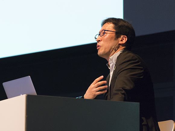
The second speaker of the Perspective of Type Designers was Mr. Naoyuki Takeshita who gave a speech titled, “The Typeface, and Me.”

Mr. Takeshita had worked for Morisawa before founding Takenoko Design Room. He was awarded Silver Prize in the Morisawa Typeface Competition in 1993. He is the type designer who created the Morisawa fonts of Take (Bamboos), Iwata UD Newsletter Mincho and Minna no Moji.
His session opened with a handwritten slide showing the seminar title, “The Typeface, and Me. / Naoyuki Takeshita” and continued on to the presentation of his four themes: Penmanship, Lettering, Letterpress printing and the Cities. Then he provided commentaries on these themes in turn.
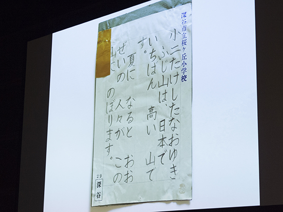
For the first theme of Penmanship, he began by stating, “Penmanship is a contrast to calligraphy which uses brushes,” and presented his early works such as those that he wrote using pencils when he was an elementary school student and those he wrote using pens when he was a junior high school student. His writings were presented at a penmanship exhibition every year. He explained his formative experience with letters by saying that he had always been in a position to write letters as a grade representative in school. Therefore, he had the experience of “facing the letters” since an early age. He believes that the roots of his career in type design can be traced back to those early experiences.
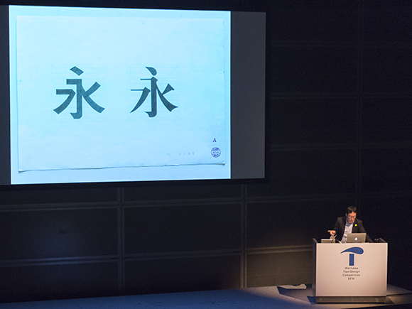
His second theme, Lettering, centered around the classes he took at the Tama Art University. Mr. Takeshita was a student there in the 1980s to the beginning of the 1990s, just before the time when computers were introduced to the classroom. It was a time when most things were written by hand and when lettering was a mandatory course for all students in the graphic design department. He showed and explained each lettering project that he completed as a class assignment. He then explained how he started his career in lettering by saying that he later selected a typography class as a specialized course and found that such an occupation existed. That was how he ended up finding employment at Morisawa.
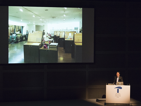
Letterpress printing was his third theme. Mr. Takeshita, who is a member of the printing workshop, Printing House, in the Printing Museum, introduced his various works that use letterpress printing. He placed two copies of his name side by side, one printed in a solid setting and one with spaces between the letters, and asked, “Do you see something wrong here? It does not look balanced even though there are spaces between the letters.”
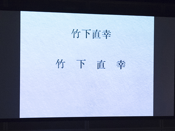
He gave the reason for the unbalanced look by explaining that the character representing “Shita (下)” has an opening on the left whereas the character representing “Nao (直)” has an opening on the right. Therefore, it looks like the space between “Take (竹)” and “Shita” looks bigger while the space between “Shita” and “Nao” looks crammed. He then showed the printed name that has been adjusted to look balanced.
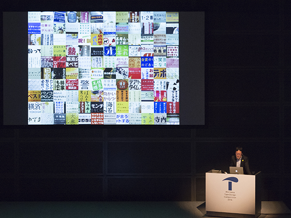
For his last theme, the Cities, Mr. Takeshita introduced his blog, Typefaces Found in The City that he continued with for a year, starting in 2006. After recent research, however, he found that about 80% of the cases he documented at the time have now disappeared. He also commented that this result was more than he actually expected, having suspected that more would have disappeared by now. He felt that only the unique letters with a strong character have remained. He then showed examples of letters in “cities where a bunch of definitely distinctive typefaces are found,” such as Asakusa, where Edomoji is frequently seen, Yokohama Chinatown, where the usage of a semi-cursive style and clerical scripts is prevalent, and Jinbocho, where Mincho style with thick horizontal lines is often used. He concluded this fourth theme with the comment, “It is very interesting to observe the cities.”
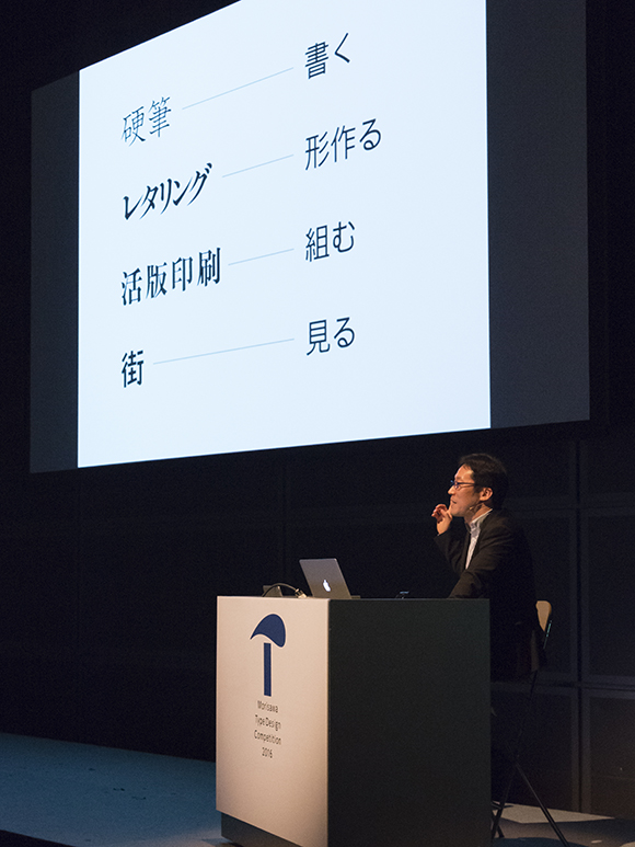
After explaining the four themes, Mr. Takeshita clarified the actions hidden within each theme: “Penmanship is to write simply. Lettering is to form shapes. Letterpress printing is to set types. The cities are to observe.” He then added that these represent his relationship with letters and are closely linked with letter and typeface design.
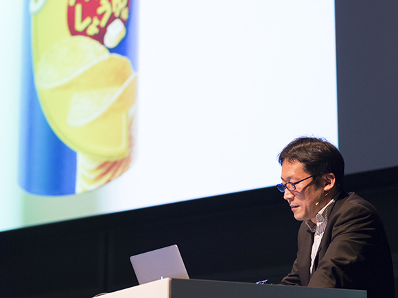
At the end of his speech, he introduced examples that use his Take and Minna no Moji fonts. He mentioned that Take is often used for the packaging of snacks and expressed his satisfaction as a type designer with the last comment of his speech, “I suppose this typeface has gained recognition as a font for snacks. That makes me happy.”
The last article will be posted on next Monday.
Entry Guideline of the competition is here. Please check it out.
