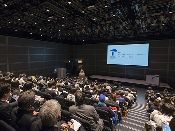
Morisawa Inc. held the 4th Morisawa Type Design Competition Special Lecture at Hall D7 of the Tokyo International Forum (Yurakucho, Tokyo) on Wednesday, February 17, 2016 with the theme of “The Perspective of Type Designers”.
This seminar took place to celebrate the Morisawa Type Design Competition 2016, which called for entries of creative typefaces from all across the world. Many people with an interest in letters, typefaces and fonts attended the seminar.
During the seminar, two type designers and a graphic designer gave speeches on the processes of typeface creation and their approaches, as well as their ideas about typesetting.
This article is retranslated version.
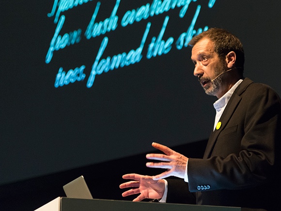
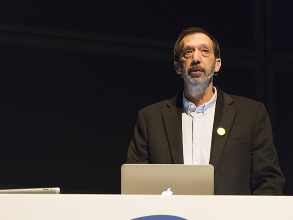
The first session was the keynote speech, “Restless wind inside a letter box” by the owner and director of The Font Bureau, Inc. and Webtype, Mr. David Berlow, who has a career of close to 40 years as a type designer.
Mr. Berlow began his speech by saying, “My ideas of typeface, typography and font development are all shaped by my past projects, including those that were unsuccessful as well as the successful ones.” He then went on to explain the process of font development using slides.
He stated that glyph type design involves creating a small world by placing all the glyphs in a letter box through a repetition of design and review. There are several phases to pass through before a typeface concept reaches the users.
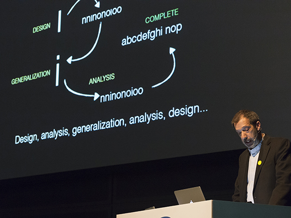
There are seven phases in total: Management, Design, Analysis, Generalization,
Productization, Publication and Monetization. He explained that the development of a typeface most definitely goes through the cycle of design, generalization and analysis processes. The generalization mentioned here refers to properly incorporating the technical components, such as letter thickness and width, side bearings (the spaces before and after a glyph), kerning data settings, hinting information and glyph substitution tables. Whether the optimum level of generalization has been achieved can be verified by arranging approximately 1,000 words of the target language. Explaining the process of font development, Mr. Berlow remarked, “It is through such a framework that we can create the best fonts.”
The next topic Mr. Berlow talked about was the “wind” as mentioned in the theme of his lecture. He sees the fonts as “placing virtual characters called glyphs into a virtual box called a letter box.” He then went on to explain that the letters give different impressions to the readers depending on the style or the way they are written, and that “winds” exist between letters, the type designer and the ideas expressed by the typography.
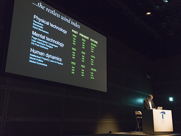
According to Mr. Berlow: “These winds can be strong or weak, as well as good or bad. There are many different winds, representing not only the technical elements such as resolution, download speed, description language, UI, character code and OS, but also the politics, economics, human relationships and their histories. I have been working for a long time on such restless winds that blow through the letters and have been pondering the influences of such winds on glyph styles and typefaces, font families and product planning.”
As examples of his endeavors, Mr. Berlow introduced three projects with specific conditions.
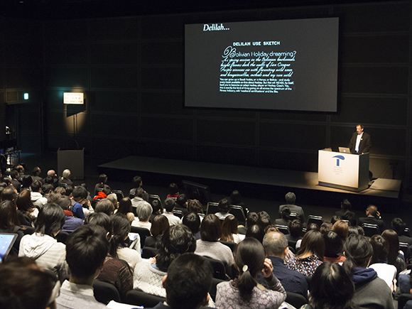
The first project was a script typeface called Delilah, designed for wearable devices. He introduced the verification processes of letter design that can be reproduced on small devices. For example, where to add lines when designing letters with a thick weight and whether or not these lines will disappear when displayed on low resolution devices.
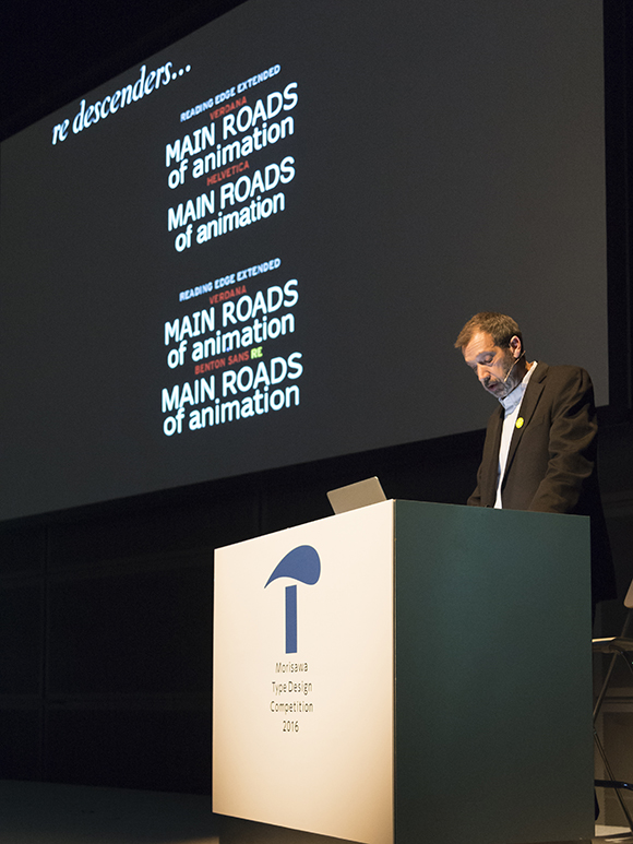
The second example was a web font that has increased readability on screens, called the Reading Edge (RE) font series. He explained that a high x-height, width and enough white space are all necessary in order to retain adequate legibility even when the letters are small. Examples of fonts that meet such requirements include Verdana, designed by Matthew Carter, as well as Benton Modern RE, Benton Sans RE, and Poynter Serif RE, designed by Mr. Berlow himself. He added that these types were designed to be optimized at 9px on Mac without hinting and at 11px on Windows with hinting.
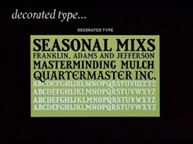
The third one was a project to digitize the old American decorated letters. Mr. Berlow displayed the images from Almanac, an annual calendar that included information such as weather, climate and dates for crops and livestock, and pointed out the shaded and decorated letters used in these publications. After analysis, however, it turned out that these letters had different shade depths and light angles so that achieving design consistency for digitizing was difficult. Because of this, a change in logo style was inevitable.
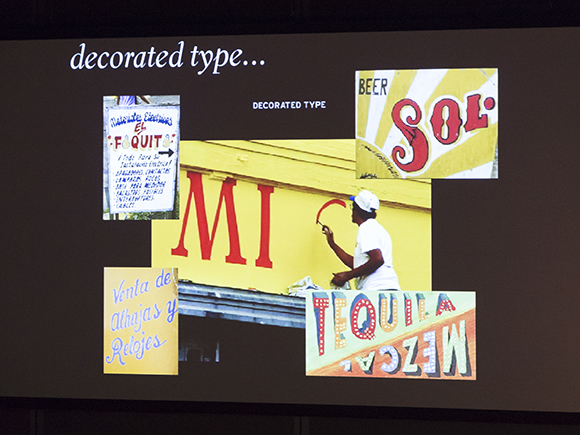
However, having been impressed by the handwritten signboards he came across when he visited Mexico, Mr. Berlow started to design decorative types of letters that combined geometric and organic shapes with the basic classical Roman letters by seeing the typeface design for text and the decorative typeface for logos as a continuous spectrum rather than thinking about them as two separate things.
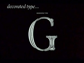
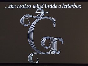
Mr. Berlow concluded his speech with this comment about the project: “It takes almost a full day to complete each letter. This project is planned to be completed by 2020 or 2025. By the time it’s completed, I suspect I will understand the struggles of the Japanese type designers (who have to create designs for a large number of letters).”
The next article will be posted on coming Friday. Stay tuned.
Entry Guideline is here. Please check it out.
